
Bootstrap is an amazing CSS framework for those who struggle with design, css, or need to build something quickly.
But the Bootstrap components you copy and paste from the documentation have flaws.
These flaws are holding back your designs!
Here are 5 design tips to correct those flaws and improve Bootstrap.
1) Bring attention to alerts
Add dark borders and svg icons to draw user's attention.

<div class="alert alert-primary rounded-0 border-0 border-start border-primary border-4" role="alert">
    <p class="fs-6 mb-0 d-flex align-items-center">
        <!-- https://heroicons.com/ light-bul-->
        <svg xmlns="http://www.w3.org/2000/svg" class="me-1" width="16" height="16" viewBox="0 0 20 20" fill="currentColor">
            <path d="M11 3a1 1 0 10-2 0v1a1 1 0 102 0V3zM15.657 5.757a1 1 0 00-1.414-1.414l-.707.707a1 1 0 001.414 1.414l.707-.707zM18 10a1 1 0 01-1 1h-1a1 1 0 110-2h1a1 1 0 011 1zM5.05 6.464A1 1 0 106.464 5.05l-.707-.707a1 1 0 00-1.414 1.414l.707.707zM5 10a1 1 0 01-1 1H3a1 1 0 110-2h1a1 1 0 011 1zM8 16v-1h4v1a2 2 0 11-4 0zM12 14c.015-.34.208-.646.477-.859a4 4 0 10-4.954 0c.27.213.462.519.476.859h4.002z" />
        </svg>
        <span>A simple primary alert—check it out!</span>
    </p>
</div>
2) Tables don't have to match your database
HTML tables don't have to be a copy of your database structure. Remove column names, id's, and combine fields when it makes sense.
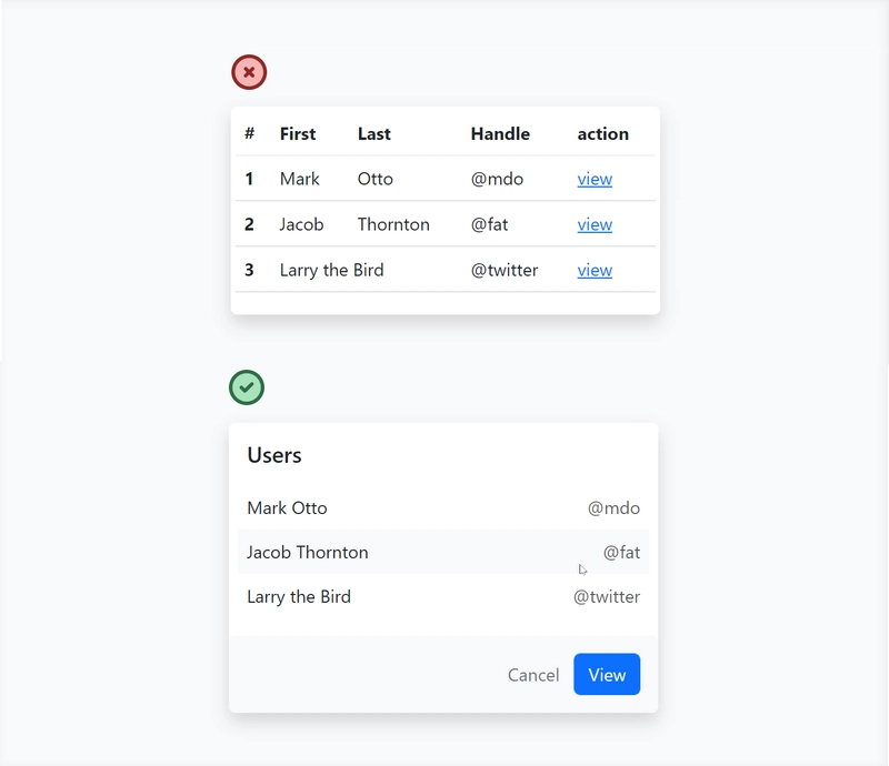
<div class="border-0 shadow bg-white rounded">
    <h3 class="fs-5 px-3 pt-3">Users</h3>
    <div class="px-2 pt-2">
        <table class="table table-borderless fs-6">
            <tbody>
                <tr>
                    <td>Mark Otto</td>
                    <td class="text-end text-muted">@mdo</td>
                </tr>
                <tr class="bg-light rounded-4">
                    <td>Jacob Thornton</td>
                    <td class="text-end text-muted">@fat</td>
                </tr>
                <tr>
                    <td>Larry the Bird</td>
                    <td class="text-end text-muted">@twitter</td>
                </tr>
            </tbody>
        </table>
    </div>
    <div class="p-3 bg-light rounded d-flex justify-content-end">
        <buttons class="btn btn-link text-secondary text-decoration-none">Cancel</buttons>
        <buttons class="btn btn-primary">View</buttons>
    </div>
</div>
3) Secondary buttons don't need a background color
Giving primary actions a background color and secondary actions no background color will establish a heirarchy of importance.
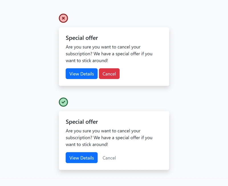
<div class="card border-0 shadow p-2">
    <div class="card-body">
        <h5 class="card-title">Special offer</h5>
        <p class="card-text">Are you sure you want to cancel your subscription? We have a special offer if you want to stick around!</p>

        <buttons class="btn btn-primary">View Details</buttons>
        <buttons class="btn btn-link text-secondary text-decoration-none">Cancel</buttons>
    </div>
</div>
4) Stop labeling everything!
Devs love to label values. Stop it! Display information as if it were a sentence in a book, not a key value pair.

<div class="card border-0 shadow">
    <img src="..." class="card-img-top" alt="...">
    <div class="card-body">
        <h1 class="card-title fs-5">Rocky Mount, MI</h1>
        <h2 class="card-title fs-6 text-muted fw-light">100 miles away</h2>
        <p class="card-text fw-light"><span class="fw-bold">$150</span> night</p>
    </div>
</div>
5) Shadows > Borders
Card borders often feel clunky. Shadows emphasize elements and give the page depth, making the element feel closer to the user.

<div class="card border-0 shadow p-2">
    <div class="card-body">
        <h5 class="card-title fs-5">Collaborate</h5>
        <p class="card-text">
            Share your work with hundreds of like minded individuals around the world!
        </p>
    </div>
</div>
More Bootstrap design tips??
If you enjoyed this, consider checking out my new project - Better Bootstrap
There you will find a free book containing more Bootstrap design tips like the ones in this article.

Top comments (24)
Very useful, I love how much the UI improves with very small but well thought changes. Great stuff for us full-stack devs that are too focused on logic and performance and miss the more important user experience
This give me a flash back when I was a fresher, the manager was yelling at me when having no knowledge about the UI/UX and the he hire a designer and I learn so much about UI/UX so now I can understand what look good 👍
This is nice!
Thanks, this is great!
Regarding tables - I think you should add the id (or alternate row id) to the table to allow dynamic sorting of the table
Great stuff!
Nice!
That is a great article @wes_walke
I totally see the point of shadows>borders.
what is the best way to translate shadows>border design when it comes to dark theme? White shadows look a bit off and black shadows aren't really providing the visual separation that borders provide in dark theme...
Hi Jeet!
Making something a lighter gray in dark mode gives the illusion of elevation. Spotify is a good example of this!
That's actually great advice, thank you!
Some very cool tips, illustrated in a nice way :) thanks!
A lot of these recommendations go against what would typically be advised to make content more accessible:
Love how much you take into account accessibility. Especially the high contrast part.
Thank you for that great analysis Ian!