
This is a Series of Posts where I'm sharing my journey (sort of) while I craft my Portfolio.
Now, since I prepared base in previous post, Time to add a layout, as per Nuxt terms. It is going to be the base template, sort of, that will hold the UI elements that are going to be shared by all the pages and the UI elements that are going to be injected into it. The shared UI element won't change much and even if they do, that won't be big of a change. The injected UI elements will change, like on Home, About etc. they'll have different content.
Layout
Hmm... as per Nuxt Docs on Layouts, they say
If you only have a single layout in your application, we recommend using app.vue instead.
Now currently this portfolio of mine is gonna have only 1 layout, yes. This is the base one to view all pages, sharing the Nav, Footer etc. But going further, I might want to add a Blog in there with a bit different layout. Like for Blog with a sidebar section showing recent posts. So I want to be prepared for it, and that's why I'll go with layouts approach instead of app.vue approach.
Now the first thing to do is add a layout, which I will name Default and add an index page, the entry page of my Portfolio and delete the initial app.vue page since I'm gonna use pages now. To do that, I'll use nuxi to generate a layout and page for me.
npx nuxi add layout default
which will give me
<script lang="ts" setup></script>

<template>
  <div>
    Layout: default
    <slot />
  </div>
</template>

<style scoped></style>
and for index page
npx nuxi add page index
and I'll get
<script lang="ts" setup></script>
<template>
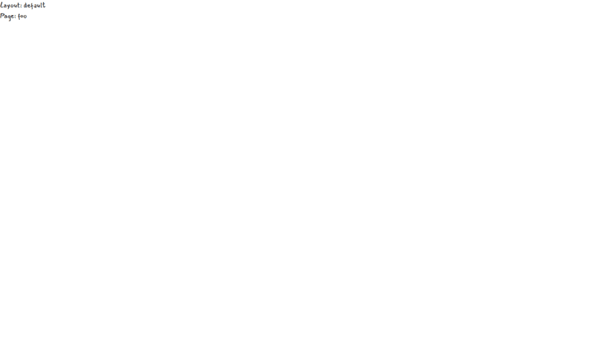
<div>
Page: foo
</div>
</template>
<style scoped></style>
and delete the app.vue. Btw, adding a page activated the router functionality in Nuxt 3. In case you don't know, Nuxt takes care of everything behind the scene and allows the developer to focus on building the application rather than configuring, the majority of it not everything. Like activating store only if store is needed, activating router only if pages are defined, auto import plugins and also auto importing components. End of all Headaches.

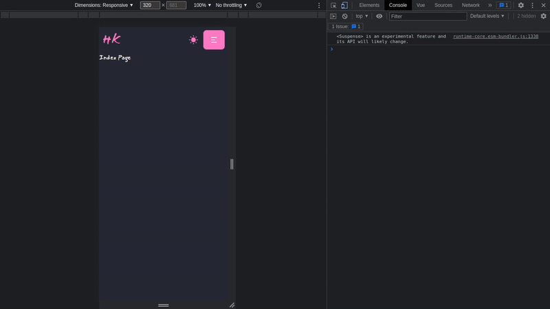
Doing all this gave me this Astronomical UI which is.... empty... very.
Well, for now, I'll add some pointers to it, so I can tell what and where I'm gonna put them. A 'Navbar', a 'Footer' and a 'to up' floating button.

Icons
I'll be using Icons at many places like Menu, Social, etc. So I'm gonna add some icons to my project first. I love Remix Icons. I always use them in the majority of my things. But many times there is a need to use some other icons which are not in one Icon provider, like, say an 'x' icon is not in Remix Icons but is in Box Icons. So either copy SVG file or install them as well. Quite cumbersome.
Solution? Oh, Vue Icons!. (No, I mean, that's literally the name. Come on I not joking 😑) It come with 20 Icon packs including Bootstrap, Font Awesome and even Remix Icons. I can import only the icons i will use of just dump all of them, I'll use the first approach btw. (no Box Icons, sadge but soon will) Check their docs for more. To install, I'll just
yarn add --dev oh-vue-icons
and all set. For now at least.
Nav/Drawer
Since I'm building a responsive Site (of course, who doesn't do so in year 2022) well do I need to even say? Of course first Mobile UI then Desktop. I decided to go with Hamburger Menu with full screen Menu panel on Mobile. And used this as an inspiration material. As for desktop, I'll just keep it simple, 3-4 links in a line as usual.
I'm going to use the Drawer component from DaisyUI for creating my mobile Navigation. and as for Desktop, I'll just use the typical links in a strip on top as usual. This Drawer markup is closer to what I want, I'll use this one then.
Hmm... so I'll take the Boiler then add it all in layouts/default.vue Refactor it and separate portions into components. Then update it as per need. Good. I'll create few components before hand. I'll use a folder approach, or so I call it. Basically I'll create a folder with the name NavBar then add an index.vue file as components/NavBar/index.vue. This file will be the entry point of the NavBar component. Then I'll create a new component in it as named Drawer as components/NavBar/Drawer.vue where I'll keep drawer sidebar code. I'll also add ability to switch themes. I'll make it such that It'll be in loading state intially so that I can better track theme change and what theme is currently active. Chop-Chop, Time to wear Developer Cap on.
npx nuxi add component NavBar/index
npx nuxi add component NavBar/Drawer
# layouts/default.vue
<script lang="ts" setup></script>

<template>
  <div>
    <div class="drawer drawer-end">
      <input id="mainDrawer" type="checkbox" class="drawer-toggle" />
      <div class="drawer-content flex flex-col">
        <!-- Navbar -->
        <NavBar />

        <!-- content -->
        <slot />
        <!-- content -->
      </div>
      <NavBarDrawer />
    </div>
  </div>
</template>

<style scoped></style>
# components/NavBar/index.vue
<script lang="ts" setup>
import { OhVueIcon, addIcons } from 'oh-vue-icons';
import { RiMenu2Fill, RiSunFill, RiMoonFill } from 'oh-vue-icons/icons';
import { themeChange } from 'theme-change';

const themeLoaderSet = ref(false);

onMounted(() => {
  themeChange(false);
  themeLoaderSet.value = true;
});

addIcons(RiMenu2Fill, RiSunFill, RiMoonFill);
</script>

<template>
  <div class="w-full navbar bg-base-100">
    <!-- Brand -->
    <div class="flex-1">
      <NuxtLink to="/" class="normal-case text-3xl text-primary">HK</NuxtLink>
    </div>

    <div class="flex-1 hidden lg:block">
      <ul class="menu menu-horizontal menu-compact gap-1 p-1">
        <!-- Navbar menu content here -->
        <li>
          <NuxtLink to="/" active-class="active">Home</NuxtLink>
        </li>
        <li>
          <NuxtLink to="/" active-class="active">About</NuxtLink>
        </li>
      </ul>
    </div>

    <!-- start:Theme Toggle -->
    <div class="flex-none">
      <div
        class="btn btn-circle bg-transparent border-none loading disabled text-primary"
        v-show="!themeLoaderSet"
      ></div>

      <div
        class="btn-circle swap swap-rotate"
        data-toggle-theme="pastel,dracula"
        data-act-class="swap-active"
        v-show="themeLoaderSet"
      >
        <!-- sun icon -->
        <OhVueIcon
          name="ri-sun-fill"
          class="swap-on fill-primary"
          scale="1.2"
        />

        <!-- moon icon -->
        <OhVueIcon
          name="ri-moon-fill"
          class="swap-off fill-primary"
          scale="1.2"
        />
      </div>
    </div>
    <!-- end:Theme Toggle -->

    <div class="flex-none lg:hidden">
      <label for="mainDrawer" class="btn btn-primary"
        ><OhVueIcon name="ri-menu-2-fill" class="text-white"
      /></label>
    </div>
  </div>
</template>

<style scoped></style>
# components/NavBar/Drawer.vue
<script lang="ts" setup>
import { OhVueIcon, addIcons } from 'oh-vue-icons';
import { RiCloseFill } from 'oh-vue-icons/icons';

addIcons(RiCloseFill);
</script>

<template>
  <div class="drawer-side">
    <label for="mainDrawer" class="drawer-overlay"></label>
    <div class="w-full bg-base-100 md:w-80">
      <div class="flex justify-end m-2 lg:hidden">
        <label
          for="mainDrawer"
          class="m-2 p-1 border border-primary rounded-full cursor-pointer"
        >
          <OhVueIcon name="ri-close-fill" scale="1.2" class="text-primary" />
        </label>
      </div>

      <ul class="menu p-4 gap-2 overflow-y-auto">
        <!-- Sidebar content here -->
        <li>
          <NuxtLink
            to="/"
            class="flex justify-center items-center"
            active-class="active"
            >Home</NuxtLink
          >
        </li>
        <li>
          <NuxtLink
            to="/"
            class="flex justify-center items-center"
            active-class="active"
            >About</NuxtLink
          >
        </li>
      </ul>
    </div>
  </div>
</template>

<style scoped></style>
Results
Viewport Height Issue
ViewPort Height is kinda funky on mobile devices. And as it is now , I don't like it. 'Cuz it's messing up my drawer plans. Now why is it funky and what is funky? Well.. Instead of me explaining it, just read this CSS Tricks article. It also gives the solution, which I'm gonna use actually.
The Issue.

To fix this funkiness, I'll reassign the viewport height to be the window height minus any browser UI. i.e, the inner height of the window. So first I'll get the innerHeight of window, then I'll assign the height to be the new viewport height. I'll also add an event listener for resize.
....
function setVH() {
  let vh = window.innerHeight * 0.01;
  document.documentElement.style.setProperty('--vh', `${vh}px`);
}

onMounted(() => {
  setVH();
  window.addEventListener('resize', () => {
    setVH();
  });
});
....
Now I need to tell TailwindCss to use my way of setting viewport height. I honestly don't know if this is the correct way to overide the default classes. I just wanted to overide only one, but doing so removed others so i used this default config file in their github repo to get the default values and add mine in combination. (Do tell me if there is a better way to do this.)
....
// overide height
height: (theme) => ({
  auto: 'auto',
  ...theme('spacing'),
  '1/2': '50%',
  '1/3': '33.333333%',
  '2/3': '66.666667%',
  '1/4': '25%',
  '2/4': '50%',
  '3/4': '75%',
  '1/5': '20%',
  '2/5': '40%',
  '3/5': '60%',
  '4/5': '80%',
  '1/6': '16.666667%',
  '2/6': '33.333333%',
  '3/6': '50%',
  '4/6': '66.666667%',
  '5/6': '83.333333%',
  full: '100%',
  screen: 'calc(var(--vh) * 100)',
  min: 'min-content',
  max: 'max-content',
  fit: 'fit-content',
}),

// overide min-height
minHeight: {
  0: '0px',
  full: '100%',
  screen: 'calc(var(--vh) * 100)',
  min: 'min-content',
  max: 'max-content',
  fit: 'fit-content',
},

// overide max-height
maxHeight: (theme) => ({
  ...theme('spacing'),
  full: '100%',
  screen: 'calc(var(--vh) * 100)',
  min: 'min-content',
  max: 'max-content',
  fit: 'fit-content',
}),
....
Result
Footer
Next up is Footer. There is nothing fancy to add here so one of the components from Daisy UI will work. I decided to use this one. Its got the Favicon, copyright text and some social icons too. Good enough for me. So I'll create a new component with nuxi and then update it as per my preference
npx nuxi add component Footer
# components/Footer.vue
<script lang="ts" setup>
import { OhVueIcon, addIcons } from 'oh-vue-icons';
import { RiGithubFill, RiTwitterFill, SiDevdotto } from 'oh-vue-icons/icons';

addIcons(RiGithubFill, RiTwitterFill, SiDevdotto);
</script>

<template>
  <footer class="footer items-center p-4 bg-neutral text-neutral-content">
    <div class="items-center grid-flow-col">
      <!-- Brand -->
      <NuxtLink to="/" class="normal-case text-3xl text-primary">HK</NuxtLink>
      <p>Copyright © {{ new Date().getFullYear() }} - All right reserved</p>
    </div>
    <div class="grid-flow-col gap-4 md:place-self-center md:justify-self-end">
      <a href="https://twitter.com/wrench1815" target="_blank">
        <OhVueIcon name="ri-twitter-fill" scale="1.2" />
      </a>
      <a href="https://dev.to/wrench1815/" target="_blank">
        <OhVueIcon name="si-devdotto" scale="1.5" />
      </a>
      <a href="https://github.com/wrench1815/" target="_blank">
        <OhVueIcon name="ri-github-fill" scale="1.2" />
      </a>
    </div>
  </footer>
</template>

<style scoped></style>
# layouts/default.vue
....
<!-- Footer -->
<Footer />
....
Yep, good enough for me.

Well Nav and Footer are done, for now. I'll start creating Home Page in next part.
Cover Credits: Jean-Frederic Fortier

Top comments (0)