
Wrike's experience
Using public APIs helps companies to increase the value of their own resources, create unique content, and meet the requirements of various business tasks. Wrike is no exception. More than 30,000 applications have been created based on the Wrike API. The number of product users is growing, which means that the requirements for the portal are getting higher every day.
In this article, I share my experiences with redesigning the Wrike developer portal interface and show you some changes worth noting.
During the redesign we managed to:
- Create intuitive navigation.
- Create a grid for optimal content display on both desktop and mobile devices.
- Upgrade the portal design according to the current design system and create the missing components.
- Reach the AA level of accessibility standards and implement them.
1. Intuitive navigation
We conducted a series of interviews with the main users of the portal — backend developers and the user support team, who gave us feedback from external users.
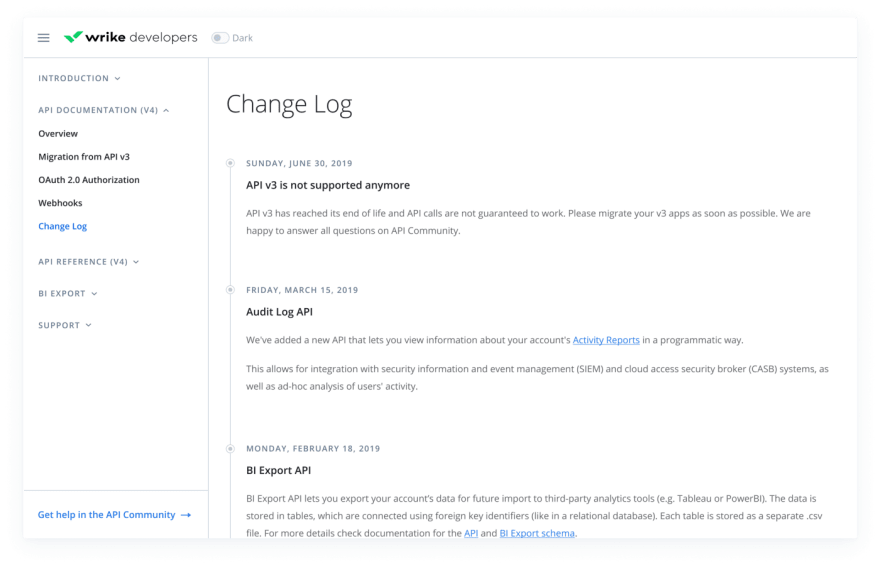
We learned that, in addition to technical problems with notifying and updating information, the portal had navigation problems: It was difficult for users to find important information such as references and documentation. It was also difficult to get to the sections located after the methods. For example, to find the BI Export section, you had to view all the methods first, and there was no option to collapse the section.

To optimize the portal structure, we highlighted the main sections and subsections, as well as separated the technical content from informational. In the new portal, we set five main sections: Introduction, API Documentation, API Reference, BI Export, and Support. The Community API section is a separate link at the bottom of the sidebar so that the user can quickly get help.
Placing the navigation in the sidebar helps users see not only the main sections but also the subsections. And the ability to hide methods makes it easier to work with the panel. If needed, the user can collapse unnecessary sections or go deeper into the ones they need. The logo, toggle, and search field are still in the top menu (under development).
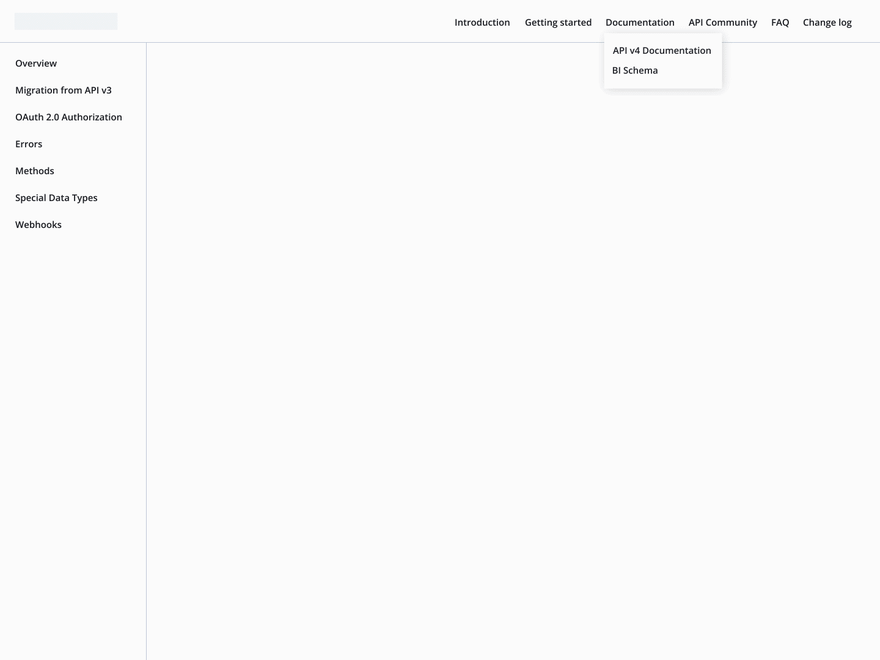
To simplify the interaction for the user, it’s better to show the structure of the portal with a level of nesting no deeper than two. Additional features (such as search) can be added to the top menu. If the user needs to log in to use the portal, you can also separate the login button from the main navigation. This way you can provide a quick search for the necessary information and easy navigation between pages.
2. Grid for optimal content display
The Wrike developer portal consists mainly of static pages with varied information content. Tables and text blocks take up the full width of the grid, so the number of columns doesn’t matter.
We paid special attention to the methods page. There are two ways to build this page:
- Divide the content part into two blocks: the description and tables on the left, and examples on the right.
- Make a single block with content: examples are inside each method.
The previous version of the portal used the first method.

We analyzed the Wrike API methods and decided to use the second option. It allows us to keep tables with their nesting in an easy-to-read form, as well as view the response and example without switching the slider.

It’s important to predict the grid behavior at different resolutions, so that the portal is correctly displayed from the screen of a computer, laptop, or tablet. There’s no need to stretch the content to full screen width, because reading text with a width of 2560 px can be uncomfortable. At the same time, you don't want to break the tables.
Create a fluid grid by setting the maximum and minimum width of the content area. Set the minimum margins from the content part and make a central alignment. The content display will change in proportion to the screen width, but the user will still be able to read text and tables.
You should also consider the option of hiding the sidebar, so that the user could expand the content area if necessary. This is especially important when working on devices with a screen width of 1024 px.

Most developers use devices with wide screens. Still, it’s better to provide the option of working with the portal on tablets. You can open the sidebar on mobile devices over the content area. It allows users to keep the information in a readable form.
3. Portal redesign in accordance with the current design system and creating missing components
Portal API entities differ from standard website entities. I highlighted several components that required special attention from the design team.
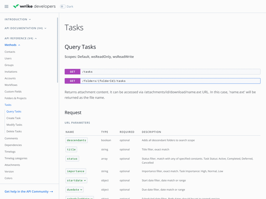
HTTP methods
HTTP methods (GET, HEAD, POST, PUT, DELETE, CONNECT, OPTIONS, TRACE, and PATCH) are one of the most important API entities. Depending on the type of action, the entity has a specific HTTP method. When designing HTTP methods, try to follow these recommendations:
- Assign a color ID to each of the nine existing HTTP methods so that you can visually distinguish them without confusing the user.
- Add a URL to the component of the HTTP method to make life easier for developers. They won’t need to perform additional actions to view this information.
- Make it possible to see both the query and the example at the same time. In the new version of the Wrike API portal, examples are placed inside the method instead of hidden in the slider.
- Don’t place methods that relate to the same entity on separate pages. In the old version, Query Tasks, Create Task, and Modify Task were separate pages. Instead, divide the pages by entities: Contacts, Users, Tasks, and so on. This will also simplify working with the portal.

HTTP methods on the new portal
Tables
All requests sent to the server are presented as tables with a large amount of data.

Try to avoid piling up information. In the previous version, the mandatory parameter was indicated by a badge with an inscription. This not only created visual noise but also contradicted the site's accessibility requirements. In the new version, a separate Required column is allocated for this parameter.
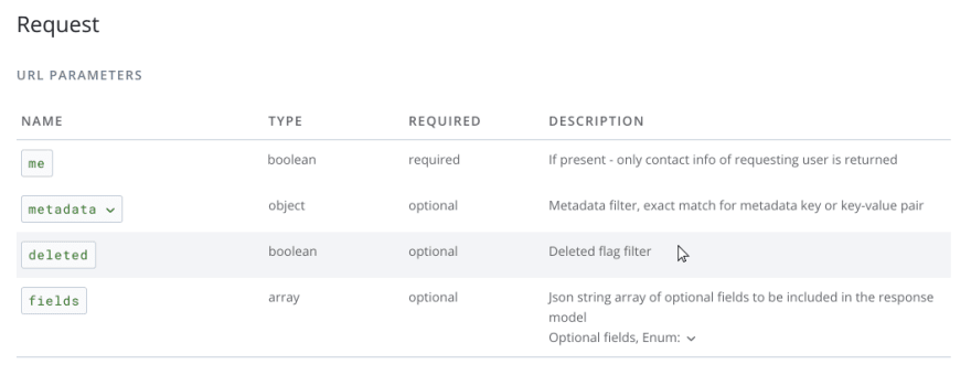
Try to make nesting as obvious as possible and specify which parameter it refers to. In the previous version of the portal, only the description column was highlighted in color, even though the nesting was related to the entire parameter.

In the new portal, a chevron refers to the parameter itself and helps the user understand that there’s content hidden inside.
Please note that the columns of a nested table are better to place under the columns of the parent table. It facilitates perception of information.
Let’s keep the focus on the selected information. The user might have problems focusing when working with a large amount of data. For more visual convenience, hovering the mouse over a line can be highlighted with color. Highlighting a nested table and keeping the ability to select a row inside it is also a good idea.

Examples
An example shows how to work with a specific method and what will be returned if the request is correct. The request is generated using CURL by specifying the necessary data.
Examples must be visually separated from the rest of the information and set with a fixed height so that the scroll is inside the components, not inside the page. It will save users from endless scrolling.
For comfortable work with the example, you can add an option of copying to the buffer.

4. Compliance with accessibility and theming
Sites should not only be logical, convenient, and good-looking but also accessible for users with disabilities. As mentioned above, most of the portal components comply with the AA accessibility level and the principles of inclusive design.
The contrast of plain text, titles, and graphic elements meet the WCAG standards.
We provide the ability of tabulation, i.e., the site is manageable and accessible for the keyboard.
Each graphic object has a description. For example, for buttons that copy information to the buffer, the text “Copy” is located next to the icon. When you click the button, the text changes to “Copied CURL example.”
If you make an error in the application registration form, in addition to a text message and highlighting the input in red, a graphic symbol appears in the input field so that the user understands which field contains the error and can easily correct the entered value.
Giving the user a choice of interface themes deserves special mention. It has become a great advantage of the new portal for several reasons:
- It's a friendly solution that conforms to one of the main principles of inclusive design: the principle of choice.
- Dark mode is the most popular among developers.
- Dark mode adjusts the screen brightness according to lighting conditions and reduces eye strain.
- Providing themes with improved contrast makes the site accessible to people with impaired vision or color blindness.
To summarize
To create a user-friendly developer portal interface, you should:
Make navigation logical, comfortable, and understandable by separating technical content from informational content.
Show the user the portal structure with a nesting level no deeper than two at first.
Predict the behavior of the grid at different resolutions for optimal display of content.
Pay attention to the design of methods by highlighting them in color.
Get rid of visual noise of icons in tables — text works better than symbols.
Keep the focus on the selected information.
Comply with accessibility standards and the principles of inclusive design.
You can see how we did it all on the Wrike developer portal.
I hope you’ve learned something useful about API portals and that this article will help you when designing or redesigning the API portal for your company. We won’t rest on our laurels but will continue to improve our portal.
//The article is written by Angelina Kulichkova, Web Designer @ Wrike

Top comments (0)