This is the thirteenth post in a series examining modern CSS solutions to problems I've been solving over the last 13+ years of being a frontend developer. Visit ModernCSS.dev to view the whole series and additional resources.
True container queries are a much asked for CSS feature that would be a complement to media queries but be placed on container elements instead of the viewport.
Here's Miriam Suzanne's container queries proposal which is being prototyped in Chromium
But the future is now! Using grid and flexbox, we can create styles that respond to container and content widths and overcome some of the pain points that container queries are proposed to resolve.
We'll cover:
- ⏸ Use of CSS grid layout and flexbox to achieve container dependent adjustments from equal-width columns to row layout
- 🏆 The "holy grail" solution to variable-width breakpoint columns
- 🚀 Implementing CSS custom variables to make the solutions as scalable as possible
Understanding the Problem
When Ethan Marcotte introduced the concept of Responsive Design, we became trained to adjust elements on the page across viewport sizes by using media queries.
I am a huge fan of Ethan's and recall reading that article within weeks of publish. It was easily one of the most transformative articles for the web.
P.S. - Responsive Design recently turned 10! Read Ethan's reflection >
Ten years ago, media queries made sense because we've always been bound to the tools available at the time.
But there remained one area where CSS didn't quite have an answer: how do you respond to changes within an individual container on the page instead of the whole viewport?
This gave rise to the 12-column grid and related frameworks such as Bootstrap as an intermediary solution of applying width adjustments on the fly without writing an every growing wall of one-off media queries.
And those addressed a lot of common frustrations, and almost got us there.
As a veteran of marketing website development, the biggest downside of relying on grid frameworks was still being bound to the tool. We would rarely intentionally design outside of a 12-col grid because of the cost of overhead in developing additional styles and wrangling custom media queries.
Too much blah blah blah for ya? Let's see an example from Bootstrap docs:
<div class="container">
  <div class="row">
    <div class="col-sm">
      One of three columns
    </div>
    <div class="col-sm">
      One of three columns
    </div>
    <div class="col-sm">
      One of three columns
    </div>
  </div>
</div>
The key here is the col-sm classes which are required to switch from "equal width columns" above a set "small" viewport width (540px for Bootstrap) to full-width on even smaller viewports.
But - what if these columns were within another column?
This is where we hit our issue: The col-sm columns won't go full-width until the viewport is reduced in size. Which means, the nested columns could be extremely narrow. To resolve this, you may have to add a bunch of extra utility classes to switch, switch, and possibly even switch again.
Wouldn't it be nice if those columns were somehow aware of their content, and break based on a minimum content width rather than rely on viewport width?
Welcome to the need for container queries 🙌
Note: The comparable solutions presented for grid vs. flexbox, unfortunately, are restricted to equal column widths, but this still helps reduce the need for media queries and fill in the gap for behavior to be based on container vs. viewport width. Skip to the "holy grail" solution for variable width columns.
Solutions
We will look at how to handle container queries with grid and flexbox as well as discuss the pros and cons of each.
Preview
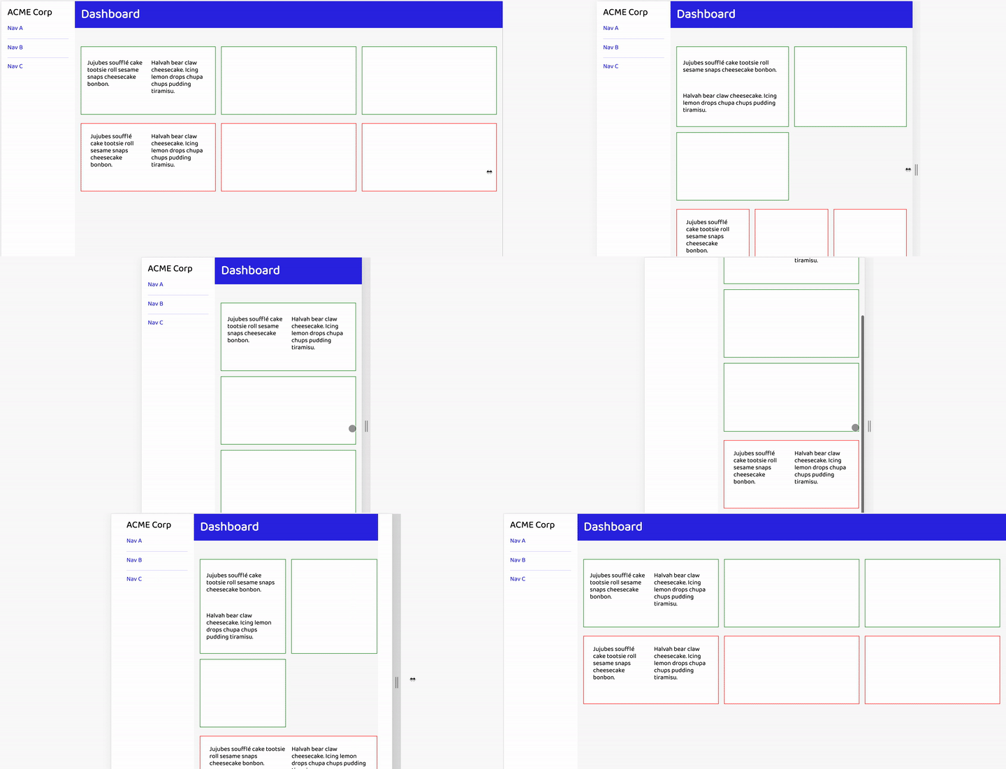
To further provide context for what we're looking to achieve, here's the final result:
Using only three classes and three CSS vars() - one of each for grid and each of the flexbox solutions - we have made the "cards" responsively switch from 1-3 across, and the card content switch from column to row layout with no media queries in sight 😎
Grid Solution
New to CSS grid layout? We're going to revisit a method that I've also described in Solutions to Replace the 12-Column Grid and that is explored in two of my egghead videos related to responsive grids.
We'll begin by creating the .grid class, setting the display, and adding a modest gap value:
.grid {
  display: grid;
  grid-gap: 1rem;
}
After that, we just need one line to initiate our container query magic:
grid-template-columns: repeat(auto-fit, minmax(20ch, 1fr));
The repeat function will apply the defined column behavior to all columns that exist. Right away, this makes it scalable to grow to any number of columns that could be created from any type of content.
Then, instead of an absolute number, we use the auto-fit value which is responsible for ensuring the columns stay equal-width by stretching columns to fill any available space.
After that, we use minmax() to set the minimum allowed column width, and then use 1fr as the max which ensures the content fills the column as much as room allows.
minmax() and in particular the 20ch is where we essentially have defined what in media query land would be our "breakpoint".
The ch unit is equal to the 0 (zero) character of the current font, which makes this extra sensitive to the current content.
You could certainly swap to rem to prevent the computed value from changing as fonts change. However, in the demo this value technically does use the font-size applied to body which would be equivalent to 1rem if you haven't changed it. That's because it's placed on the ul and not typography elements, so the ul defaults to inheriting font properties from the body.
The only unit you should not use would be % as that would prevent the columns from ever collapsing.
Cool, that takes care of the "cards":
Grid Container Content
Now to handle for the card content which we would also like to allow to be displayed in columns if room allows. But, the "breakpoint" should be smaller.
At first, you may reach for a utility class. In fact, I did too.
But modern CSS gives us a more flexible way: custom variables.
First, we have to set our initial variable value, which is assigned to :root. The value we are setting is the min part of minmax:
:root {
  --grid-min: 20ch;
}
And then update our rule accordingly:
grid-template-columns: repeat(auto-fit, minmax(var(--grid-min), 1fr));
We can then add our .grid class to the li which is our "card" container, and then use inline style to modify the --grid-min value:
<li class="card grid" style="--grid-min: 15ch">
  <p>Jujubes soufflé cake tootsie roll sesame snaps cheesecake bonbon. </p>
  <p>Halvah bear claw cheesecake. Icing lemon drops chupa chups pudding tiramisu.</p>
</li>
Resulting in our final grid solution. Notice how the card content independently adjusts from column to row layout as the card container narrows or widens.
Why Can't Grid Do Variable Width Columns?
What is the barrier preventing this solution handling variable width columns while maintaining the "container query" benefits of breaking to row layout without media queries?
The closest we can get to variable width columns with grid in the easiest way possible is to remove our previous work, and instead use:
grid-auto-flow: column;
Which flips the default axis and by default the created columns are indeed variable width.
However, this can't ever break down because there is no wrap property in grid. This means you will likely encounter overflow, which can be acceptable for predictably short content. It can also be placed within a media query to only trigger that behavior above a certain viewport width - which again, is opposite to the goal of "container queries".
I was very hopeful that our solution could be extended to this use case with:
style="--grid-min: min-content;"
Which would compute to updating our property definition to:
grid-template-columns: repeat(auto-fit, minmax(min-content, 1fr));
In theory, this seems like a near-perfect solve. Typically min-content means the content would be allowed to shrink to the minimum width required to hold the content (in a text block, this essentially means shrinking as far as the longest word).
Unfortunately, the repeat spec specifically prohibits this behavior:
Automatic repetitions (auto-fill or auto-fit) cannot be combined with intrinsic or flexible sizes.
Where min-content is considered to be one of the "intrinsic sizes". Bummer.
Read on to learn how flexbox can provide this behavior!
Flexbox Solution #1
The first flexbox solution I'm going to describe is an example of a technique created by Heydon Pickering called the "Flexbox Albatross".
Let's begin our rule:
.flexbox {
  display: flex;
  flex-wrap: wrap;
}
The notable thing here is ensuring flex-wrap: wrap is set, else the "breakpoint" effect would never actually occur.
Now, a big difference between flexbox and grid layout is that the sizing behavior of the flex children is not set on the parent.
To make our rule the most flexible, we will use the child combinator - > - in addition to the universal sector - * - to begin a rule that will be applied to immediate flex children of any element type.
Using Sass, we can neatly nest this under the previous properties:
.flexbox {
  // ...existing rules

  > * {
    // flex children rules
  }
}
Here's where the "Flexbox Albatross" magic happens. Let's add the rules and then discuss.
> * {
  flex-grow: 1;
  flex-basis: calc((35rem - 100%) * 999);
}
flex-grow: 1 ensures that the column will fill as much space as the algorithm and other property values will allow.
The flex-basis rule performs some math magic with the CSS property calc that essentially leads to the element being at minimum 35rem and below that minimum expanding to 100%.
The result is equal-width columns up until the minimum acceptable width.
Unfortunately,
calcdoes not allow thechvalue which takes away a bit of the ability to visualize when the column will break. In this demo,35remwas found to be nearly equivalent to20chin the given font and size.
Creating gap
As of writing, the flexbox gap property is gaining support but it's not quite reliably available yet.
We will adjust our rules to use margin as a polyfill for now.
Did you know: margins do not collapse on flexbox or grid children, so any supplied value will compound between children.
.flex {
  // ...existing styles
  margin: 1rem -0.5rem;

  > * {
    // ...existing styles
    margin: 0.5rem;
  }
}
These rules add .5rem around each child, the outer portions of which is negated with a negative margin on the .flex parent.
Adjusting Breakpoint
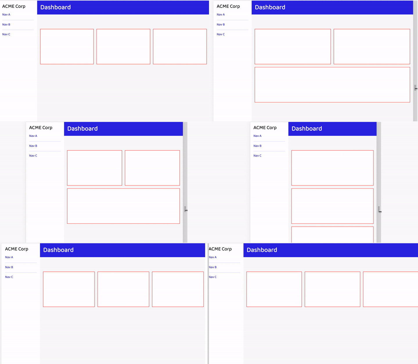
Unlike grid, this base solution means that all columns will "break" at the same time:
That is, until we add our friend CSS variables ✨
Let's add the variable and update flex-basis:
// Update on `:root`
--flex-min: 35rem;

// Update in `.flexbox`
flex-basis: calc((var(--flex-min) - 100%) * 999);
Now, we'll update it on the middle "card":
<li class="card" style="--flex-min: 50rem;"></li>
Annndddd - on resize, wait a minute - all three cards break at the same time, just earlier than before 🤔
What's going on?
flex-basis: 1 + the number of items is to blame.
Once the middle card drops, the other two cards expand full-width thanks to flex-basis: 1.
If we move our --flex-min adjustment to the first or _last card, then the remaining two cards keep their smaller "breakpoint".
Flexbox Container Content
Ok, now let's address the same idea of paragraph content that switches from column to row layout.
With our --flex-min variable already in place, we have what we need.
However, with the "gotcha" we just experienced, we will need to add a nested wrapper around the flex children's content:
<div class="flex" style="--flex-min: 18rem;">
  <p>Jujubes soufflé cake tootsie roll sesame snaps cheesecake bonbon. </p>
  <p>Halvah bear claw cheesecake. Icing lemon drops chupa chups pudding tiramisu.</p>
</div>
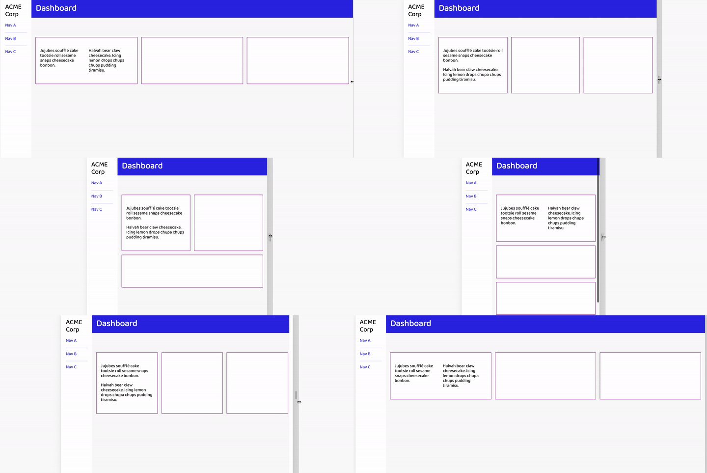
This essentially resets the context so it can't affect the parent containers. A minor annoyance compared to grid, but achieves nearly identical functionality:
Flexbox Solution #2
If you will not need multiple unique breakpoints for the flexbox items, we can instead use what Una named the "Deconstructed Pancake" to uniformly apply breakpoints with only flex-basis.
Benefits of this technique over the Flexbox Albatross:
- the
flex-basisbreakpoint is based on the individual item instead of the width allotted to the parent - items will start new rows independent of each other vs. all at once without needing to define unique breakpoints
- we can use
chbecause there's nocalcinvolved
One potential downside is the need for nested elements to resolve conflicts between setting of the width custom variable (--pancake-min), as shown on the demo when trying to set a new breakpoint for the card paragraph content.
Here's the essential CSS:
:root {
  --pancake-min: 20ch;
}

.flex-pancake {
  display: flex;
  flex-wrap: wrap;
  margin: 1rem -0.5rem;

  > * {
    flex: 1 1 var(--pancake-min);
    margin: 0.5rem;
  }
}
This looks similar to how we setup the Flexbox Albatross solution up until we get to the flex rule for the children.
The shorthand including the computed variable breaks out to:
flex-grow: 1;
flex-shrink: 1;
flex-basis: 20ch;
We're allowing items to both grow and shrink until the area is too narrow for all items to fit based on the flex-basis, at which point the items will begin to drop to new rows. This makes the behavior similar to the grid solution except the dropped item will expand to fill the available area.
This solution has become my preference in most cases.
Holy Grail: Variable Width Breakpoint Columns
Flexbox will allow us to create a method to designate that some columns should shrink to their "auto" width, while other columns have independent "min-width" behavior. This results in variable width columns that ultimately retain "breakpoint" behavior based on container width.
Two keys that enable flexbox as the solution:
- "column" width is able to be independently set on flex children
- "wrapping" is inherently triggered when content exceeds the available horizontal width which is based on the container
We will create a utility class to assign the "auto width" behavior:
> * {
  // ...existing styles

  &.flex--auto {
    flex: 0 1 auto;
  }
}
This shorthand computes to:
flex-grow: 0;
flex-shrink: 1;
flex-basis: auto;
Resulting in the behavior of only growing to what grid would consider max-content and being allowed to shrink indefinitely.
Coupled with other flex children that use the flexbox behavior, the .flex--auto items will appear to break into row behavior once their siblings actually break from hitting their allowed minimum width.
To illustrate this, we can setup the following inside one of our existing "cards". Notice the update on the --flex-min value. That can be adjusted to taste depending on content presented, and it will only apply to flex children without .flex--auto. We could move it to be applied on the span within the li to adjust more exclusively if needed.
<ul class="list-unstyled" style="--flex-min: 8rem;">
  <li class="flex"><strong class="flex--auto">Ice Cream</strong> <span>Butter Pecan</span></li>
  <li class="flex"><strong class="flex--auto">Musical Artist</strong> <span>Justin Timberlake</span></li>
  <li class="flex"><strong class="flex--auto">Painter</strong> <span>Vincent Van Gogh</span></li>
</ul>
Note this also works with the Deconstructed Pancake method.
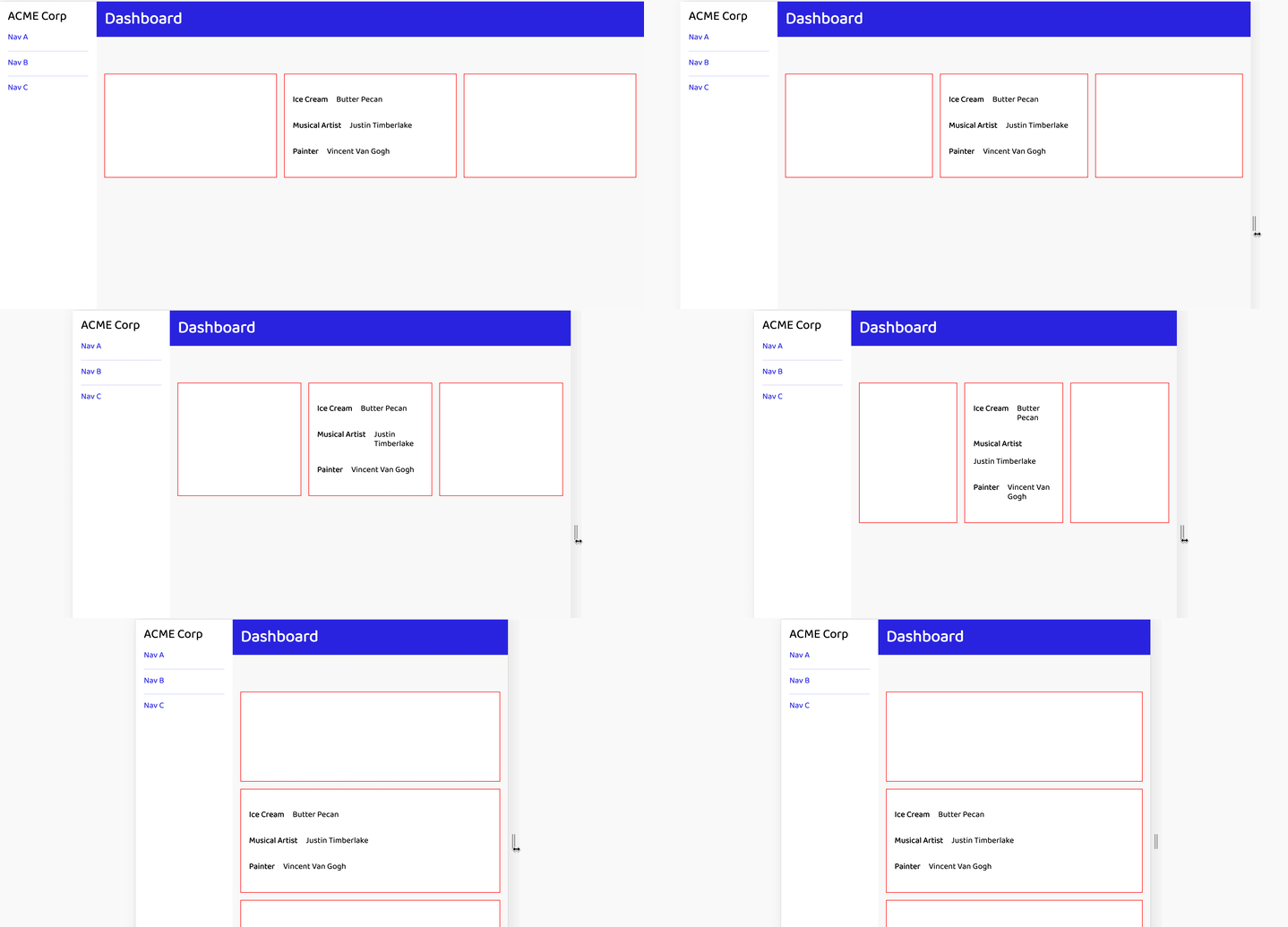
And here's the result:
You may feel this example is a little jarring, but it illustrates how each list item has independent wrapping behavior once the non-auto item hits the 8rem minimum width due to the container width shrinking.
More practically, this is also applied on the icon + title lockup in the demo. The demo also shows the same list using the albatross behavior to provide a way to compare the methods.
Demo
I encourage you to open this up in CodePen to be able to manipulate the viewport size.
The top row (green outline) uses the grid solution, the middle row (red outline) uses the Flexbox Albatross solution, and the bottom row (purple outline) uses the Deconstructed Pancake solution. The second card list for each flexbox solution demonstrates the "holy grail" solution per-list item.
When to Use Each Method
Choose grid if:
- Equal-width columns with more "reader friendly" minimum width settings are a priority (
chvs.rem) - It's more desirable for columns to break a bit more independently when they arrive at the minimum acceptable width
- "Orphan" columns for odd numbers of columns are acceptable (seen on the demo at a mid-size viewport)
Choose flex if:
- You need variable width columns that still have "breakpoint" behavior based on container size
- Lack of full
gapsupport is not an issue
Choose the Flexbox Albatross if:
- It's acceptable for columns to hit the breakpoint simultaneously
- Fallout of adjustment of that breakpoint is acceptable (possibility of extra columns breaking to rows as described)
- You want the
flex-basisbreakpoint to be the parent's width
Choose the Deconstructed Pancake if:
- You want the
flex-basisbreakpoint based on the item width - You want items to break to new rows on an individual basis
- You want to use CSS units like
chthat aren't allowed incalc









Top comments (1)
Thank you, Sophia! It's wonderful to hear what you find helpful ✨