
This is the sixth post in a series examining modern CSS solutions to problems I've been solving over the last 13+ years of being a frontend developer. Visit ModernCSS.dev to view the whole series and additional resources.
This technique explores using:
-
object-fitfor responsive image scaling - A CSS Grid "hack" for upgrading from position absolute
- CSS transforms for animated effects
If you've ever fiddled with a solution for image caption animations using jQuery and position: absolute or trying to deal with animating width or height - and that all happened before responsive images were even a concern - then this upgrade is very much for you!
For a helpful intro to object-fit for responsive image scaling, check out this earlier post from this series:

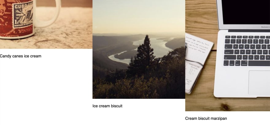
Gallery HTML
Here is our initial HTML, which is an ul where each li "card" contains the image and caption:
<ul class="gallery">
  <li class="gallery-card">
    <img class="gallery-card__img" alt="" src="https://picsum.photos/400" />
    <p class="gallery-card__caption">Candy canes ice cream
    </p>
  </li>
  <li class="gallery-card">
    <img class="gallery-card__img" alt="" src="https://picsum.photos/600" />
    <p class="gallery-card__caption">Ice cream
      biscuit
    </p>
  </li>
  <li class="gallery-card">
    <img class="gallery-card__img" alt="" src="https://picsum.photos/650" />
    <p class="gallery-card__caption">Cream
      biscuit marzipan
    </p>
  </li>
</ul>
I've used different image sizes both to showcase how object-fit works in terms of fitting its container, and also to lessen the chance of duplicate images from the picsum service.
Base Gallery Styles
Since we've used a list, we need to remove default list styles, and we will also set the list up as a grid container:
.gallery {
  list-style: none;
  margin: 0;
  padding: 0;
  display: grid;
  grid-gap: 2rem;
  grid-template-columns: repeat(auto-fit, minmax(20ch, 1fr));
  width: 100%;
  max-width: calc(40ch * 3 + 6rem);
}
These initial styles achieve placing our list items in a row, but does not constrain the images:
Gallery Card and Image Styles
If you're like me and have tried to do this in years past, you probably threw your rollerball mouse across the room trying to figure out why position: absolute wasn't playing nicely with your jQuery animations.
CSS Grid and CSS transforms are here to save the day! 🎉
We define that the card will use grid, and set a height. And we'll still use an old standby of overflow: hidden to help contain the image and ensure the caption is initially hidden.
.gallery-card {
  display: grid;
  overflow: hidden;
  height: 40vh;

  // Purely for visual appeal
  border: 1px solid #c9c9c9;
  border-radius: 7px;
  box-shadow: 2px 2px 4px rgba(0, 0, 0, 0.15);
}
Next, we apply object-fit to the image along with width: 100% and height: 40vh so that it scales to the size of the card. The magic of object-fit: cover is that no distortion occurs.
.gallery-card__img {
  object-fit: cover;
  width: 100%;
  height: 40vh;

  // removes pesky extra default spacing at the bottom of images
  display: block;
}

Positioning the Caption
Now at this point, the caption has flowed naturally, according to Grid, below the image because it's assumed that it should be in its own "cell" and by default grid items flow along the y-axis.
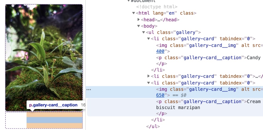
To resolve this, we create a named grid-template-areas for the .gallery-card, and assign both the .gallery-card__img and the .gallery-card__caption to live there. Then, we'll use grid positioning to set place-items: end on the card to move the caption to the bottom right of the "cell".:
.gallery-card {
  // ...existing styles

  grid-template-areas: card;
  place-items: end;
}

.gallery-card__img,
.gallery-card__caption {
  grid-area: card;
}
Resulting in the following:
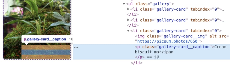
To place the caption, we use CSS transforms to set the initial position outside the cards, with:
.gallery-card__caption {
  margin: 0;
  transform: translateY(100%);
}
Since we used a paragraph element, we also remove the margin to prevent it adversely affecting the height of the caption. A value of 100% for translate will move the element 100% relative to the axis it's placed on. So, translateY(100%) effectively moves the caption "down" out of the initial view.
Animating the Caption
Our animation will trigger on hover, and we want it to smoothly animate in and back out again. There are two properties to help accomplish this: transition and will-change:
.gallery-card__caption {
  // ... existing styles
  transition: transform 800ms ease-in;
  will-change: transform;

  // visual styles to let it be more visible over the image
  text-align: right;
  padding: 0.25em 0.5em;
  border-radius: 4px 0 0 0;
  background-color: rgba(#fff, 0.87);
}
Here we define that we expect a transition on the transform property, and that the transition duration should be 800ms and use the ease-in timing function. We then use the will-change property as an extra hint to the browser that the transform property will be altered to allow a more buttery smooth transition if the browser is capable of optimizing for that property.
The :hover styles will actually be placed on the .gallery-card since it is the containing element, so we'll add a transform definition that moves the caption back to it's inherent starting point by returning it to position 0 on the y-axis:
.gallery-card:hover {
  .gallery-card__caption {
    transform: translateY(0);
  }
}
And ta-da! We have a basic animated caption:
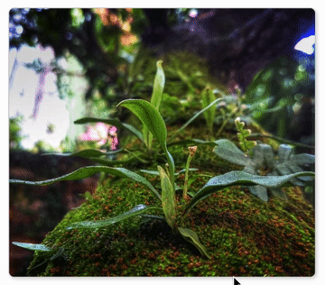
The gif is choppier than the real animation.
Ken Burns image effect
You may not have known the name, but you've seen the effect: a slow, smooth pan and zoom combo of a still image, so named due to being popularized by documentary filmmaker Ken Burns.
Using the principles we've already covered with the transition and tranform properties, we can again combine them on the .gallery-card__img to add this effect on hover as well.
We add an additional value to transform to scale the initial image up by a factor of 1.2. This is necessary to ensure that the image can be panned. If we left it at the simple width: 100%, once we panned it would no longer cover the card and the card background would show in the vacated space.
.gallery-card__img {
  // ...existing styles
  transform: scale(1.2) translate(5%, 0);
  transition: transform 1200ms ease-in;
  will-change: transform;
}
In addition, we start off by setting a x-offset of 5%, meaning the image is pulled 5% to the right. This is applied to the scaled size of the image.
Next we add the :hover transition into the .gallery-card rule, adding both a bit more of a scale up for the zoom-in effect, in addition to pulling it back left on the x-axis to -1% and also a bit up on the y-axis with -3%:
.gallery-card:hover {
  // ... existing styles
  .gallery-card__img {
    transform: scale(1.3) translate(-1%, -3%);
  }
}
You can adjust the translate values to your taste.
There's one more thing, which is that we have set our transition durations with a 400ms difference. We can add that value as a delay for the caption. Be aware that the delay applies prior to the transition on hover, and at the end of the transition out off-hover. Personally I like this effect since it means that in both directions the animations end together.
.gallery-card__caption {
  // update to add the delay as the first value
  transition: 400ms transform 800ms ease-in;
}
Don't forget about :focus
Hover is fine for mouse-users, but what about those who for various reasons use primarily their keyboard to navigate?
The li element isn't inherently a focusable element, so just adding :focus styles will not change behavior.
We first need to add tabindex="0" to each li which will enable them as focusable elements.
<li class="gallery-card" tabindex="0">
You can test this by tabbing and you will notice the standard halo border.
We will remove that, and then simply add in the :focus state to our existing hover rule so it is applied for both:
.gallery-card:focus {
  outline: none;
}

.gallery-card:hover,
.gallery-card:focus {
  // ... existing styles
}
Optional: Vignette
Another hallmark of this style is a vignette - the soft black gradient on the borders of the image. We can accomplish this with an inset box-shadow. The trick is that an inset box-shadow will not work on the image element directly, so instead we apply it on an :after pseudo element of the .gallery-card:
.gallery-card:after {
  content: "";
  grid-area: card;
  width: 100%;
  height: 100%;
  box-shadow: inset 0 0 2rem 1rem rgba(black, 0.5);
  z-index: 1;
}
The vignette is positioned by applying it to the single named grid-area and ensuring it has a height and width to take up the whole card in addition to a z-index to pop it above the image.
The side-effect is that it covers the caption, but we'll add one more z-index definition to bump it to 2 to take literal top precedence:
.gallery-card__caption {
  // existing styles
  z-index: 2;
}
Altogether with just a dash of additional body presentation styles:
This idea can easily be expanded for more than just image captions. Feel free to fork the pen and try it out!

Top comments (0)