
Eighteen years ago, at the turn of the Millennium, more people than ever before were buying their first computer with the expressed goal of getting online, and the internet was beginning to wedge itself into the flow of everyday life. When I first ventured online during this great migration, simple activities such as collecting pictures of my favourite things at the time felt like amazing game changers.
In web design, many of the best practices which developers now take for granted, such as clean layouts, performant code and a consideration for the user experience, had yet to reach the mainstream. Most were figuring it out as they went along, and through trial and error, led the way towards the internet we know today.
With the dial on our nostalgia goggles set to 11, let’s look back at some design patterns, functionality, and phenomena of the day, to see what users of websites and the developers who made them had to contend with.
You may be surprised how far we’ve come, because whilst some relics evolved into a modern-day equivalent, others are probably better left in the past.

1) Geocities

Back in these early days, second only to a royal knighthood, the title everybody wanted to claim was “webmaster”. Unlike a knighthood, being a webmaster didn’t require joining a cavalry charge against the French, it only meant that you had your own website.
Enter Geocities. Geocities let you build and host your own website for free with its suite of beginner-friendly tools. This helped users to create millions of websites — ranging from simple blogs, to educational material, to full-on Britney Spears fansites. Geocities was later bought out by Yahoo, then an internet powerhouse (emphasis on the then) and over time went out of popularity until the service was closed altogether in 2009.
Today, whilst services such as Wix and Squarespace provide the Geocities experience with a modern-day twist, in the great Internet Pantheon, Geocities will always be the one everybody remembers.
2) Website recommended browser & resolution
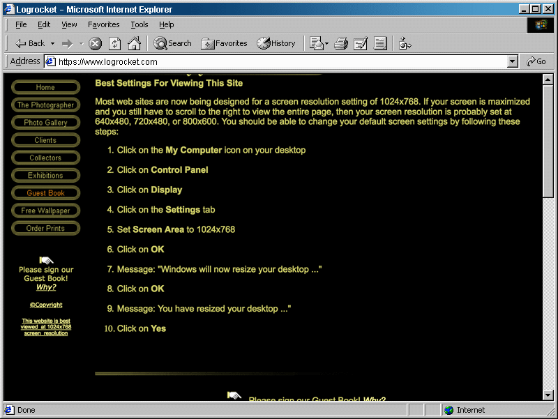
Often in a website’s footer, or even sometimes on a welcome page, you would find a comment saying something along the lines of:-
“This website is best viewed at 800x600 resolution in Internet Explorer 5”
Given that today, so much resource and development time is spent making websites cross-browser and device compatible, the idea that one would dictate how a user should configure their device for the best experience is amusing.
Would the modern day equivalent of this be:
“This website is best viewed on a Retina Mac or iPhone X in Safari.”
Thankfully, with the widespread adoption of responsive design earlier this decade, today’s developers recognise that users are entitled to a functional, readable website, no matter their device or screen size.
Progress!
3) Video game fansites

If you were into video games and had access to the internet, chances are you also visited video game fan sites. These were the go-to places for up to date coverage and discussion for your favourite video game series. I used to (virtually) hang around the RPG fan site scene and made friends who I still speak to occasionally to this day.
Today you’ll be hard-pressed to find active fan sites, as video game news and discussion has transitioned more to social media and the remaining large gaming websites, which are now mostly owned by even larger corporations.
4) Image heavy page layouts

During this time period, CSS usage and browser support were nascent, so developers had to find other ways to build attractive layouts. By far the most popular way was to design your layout as an image using software such as Photoshop or Paintshop Pro and then slice this into a collection of smaller images, which would then be reconstructed using HTML tables as scaffolding.
The designer in me looks back and thinks: “Wow, websites sure were creative back then”.
Meanwhile, the developer in me shudders. Even with the cutting edge 56k internet speeds of the day, you’d have enough time to make a few trips to the bathroom before the website was finished loading (probably).
Today, this approach isn’t necessary, as CSS provides us with everything we need to create great looking websites, whilst giving us the flexibility to support a multitude of devices.
5) Table-based layouts

In the previous relic, you may have read the sentence “Using HTML tables as scaffolding” and thought to yourself: “But aren’t tables meant for tabular data?”.
Nope, that’s what you think, n00b! Any true webmaster knows that HTML tables are the best way to solve all of your layout problems. Or rather, they were.
Back then, CSS float based layouts hadn’t caught on yet, and flexbox was still years away from being a thing. This left us with tables as the only reliable means of creating layouts. Even though they often left us in deep nested table hell, it was all we really had.
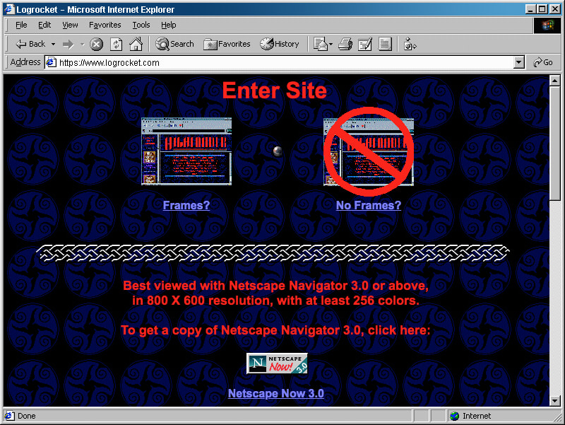
6) Frames

A popular method of structuring websites in these early days was through frames. These were introduced in 1996 to the then-popular Netscape Navigator browser, and allowed for new kinds of creative layouts.
Essentially, each frame was its own separate HTML file, and within one, you could use hyperlinks to change the content of another. For webmasters, the big advantage was the ease of maintenance. If you added a new page to your budding website, instead of having to update the navigation on all pages, you would only need to update the one HTML file with your header links.
For users, one common pattern involved making the navigation frame fixed, so no matter how much scrolling the separate content frame received, the website’s navigation always remained in view.
Typically, websites would offer the option to browse both frames and no-frames versions of the website, which probably led to a lot of confused web users in retrospect. Not so great.
In modern websites, we can very easily replicate anything which frames brought to the table with a mixture of CSS and your average templating language or framework. Much better.
7) Topsites

Topsites were special websites which set fan site against fan site, typically based on either page views or votes. It was a means of free advertising and also like a competitive version of Google Analytics.
The best part was the cool 88px x 31px banner you would get to place on your website, which would pull through your current numerical ranking. These — like the fan site — dropped off in popularity over the years before pretty much disappearing entirely.
8) Unusual navigation

Having a clear and usable navigation system is one of the most important factors when it comes to designing a successful website, as countless research has shown us over the years. Unfortunately, at the turn of the century, much of this research was yet to come, so surfing the web could sometimes be an exercise in frustration when trying to figure out how to get from one page to the next.
One particularly funny example is the Space Jam website, which somehow, someway, is still online after all these years. The homepage has planets linking to different parts of the website, with some pages having a form of navigation, whilst others don’t have anything. Your back button will get lots of use here!
9) Coloured scrollbars

Everyone loves coloured scrollbars!? Right? With a bit of non-standard CSS, you too could have tweaked the colours of your scrollbars in Internet Explorer 5.5+.
Have a look at the CSS:
https://medium.com/media/b0721e94a32f5df80b97cacaa74d1b2e/href
Whilst the thought of a website dictating the colour of my browsers UI now fills me with dread, back then it seemed pretty cool. Microsoft eventually came to its senses and removed support for this CSS many years ago.
Today, it’s still technically possible to achieve coloured scrollbars through vendor prefixes in certain browsers. Here’s an example:
https://medium.com/media/a75f2c358504158e4842899660a5f3e8/href
Though the question still remains: why would you?!
10) Auto-playing MIDI files

The first website I ever made had a MIDI version of the Dragonball Z theme playing in the background on load. There was no indicator this would happen, nor a way to stop playback once it started, so any unfortunate soul who happened to come across my corner of the web just had deal with it.
This kind of functionality was commonplace across Geocities neighbourhoods, with some going a step further to create actual jukeboxes where you could browse through a collection of MIDI tunes.
Today, a modern equivalent would likely be the universally loathed autoplaying videos which follow you down the page as you read articles on news websites. Which is worse? You decide.
11) Animated GIFs

Animated GIFs were a hallmark of the early internet. True webmasters knew that no website was complete without at least one animated banner, random skeleton, or dripping blood. It wasn’t unheard of to even have a dedicated animated GIFs page: a digital trophy cabinet showing off your collection.
For many years it seemed animated GIFs had followed coloured scrollbars and MIDI files to the great server in the sky, but in the past few years, have made a spectacular comeback as seemingly the primary form of communication for social media, with many mobile device keyboards even having a dedicated GIF button. Who would have guessed?
12) 1px transparent GIF

The 1x1 transparent GIF, or spacer GIF as it was sometimes known, was one of the earliest examples of a hack developers used to get around the limitations of the browser. Simply put, you throw it into a page, resize it using _width_ and _height_ attributes, and you suddenly have a reliable means of pushing elements around the page which is cross browser compatible.
Once the browser loaded it in, the GIF would be cached and you could use it hundreds of times without any additional requests. Thankfully, CSS has now evolved to the point where we can construct more complex layouts without the need for this fancy hack. Thank you flexbox and CSS grid.
13) Scrolling

Introduced as a proprietary extension to HTML in Internet Explorer, the marquee element was a bit of a rebel from the very beginning. It drew you in with its cutting edge animation, and then demanded your focus in order to read its content.
The marquee was generally regarded by early usability experts as an affront to all that is decent in the new digital world, so today even though it’s still technically supported by modern browsers, its not part of the official HTML spec at all.
If you’re determined, you can easily replicate this functionality using CSS animation, but to quote the last sentence in relic #9: Why would you?
14) Under construction
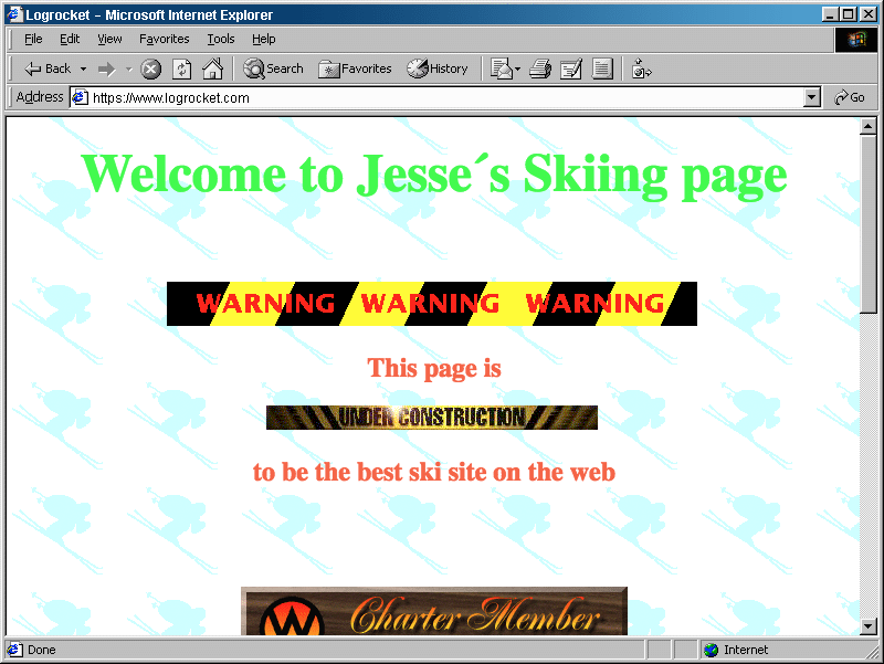
So you’ve signed up to Geocities and have a brand new website waiting for you at geocities.com/skiing4life. You have a blank canvas and you’re itching to go. You figure that you’d like 5 different pages, but so far only have content for the first one. No problem! You simply say:
“I’ll just place a temporary ‘under construction’ GIF on the remaining 4 pages and it will inform my users that my website is in an expansion phase. Surely they’ll come back once I’ve populated the remaining pages?!”
- Some webmaster’s famous last words.
15) Flash websites

Flash can be considered the granddaddy of rich content on the internet. For the first time, it allowed developers to create sophisticated interfaces which seamlessly integrated multimedia content such as audio and video. The HTML of the day just wasn’t up to the challenge, so Flash picked up the slack.
That might sound really great, but the reality was that on my Pentium 2 Windows ME desktop, I distinctly remember that flash websites were so slowwww. Visiting whatisthematrix.com should have been the amazing, transformational experience the developers intended it to be, but to be honest, most of my time was spent staring at its loading bar.
By the time HTML5 was widely adopted in browsers years later, Flash had had its day. And so it walked off into the sunset, its work complete, with the ending theme from the 1970’s Incredible Hulk TV show playing harmoniously in the background.
https://medium.com/media/f62ff4af1fd11bb5af7c477b95d0be15/href
16) Home pages
Typically, the term “homepage” usually refers to the first page of a website. It’s where users first land when visiting and it’s where they return to reorient themselves if they get lost.
On the old internet, the term “homepage” was more often seen as a literal home away from home. As when the new world was discovered, many flocked to these new digital lands to carve out a piece of it for themselves. “Welcome, this is my corner of the internet” was often seen on home pages, and the content within would stay true to that notion.
Today, it’s possible that the same human need which lead to homepages is being fulfilled by social media. You could say we’ve gone from building our own corner of the web, to squatting on somebody else’s.
17) Guestbooks

Following on from the homepage concept explored in the previous relic, the guestbook was for kindly visitors who journeyed to your corner of the internet, and wanted to leave a nice (or not so nice) message for you — their digital host.
No one respected a webmaster with an empty guestbook, and I can now freely admit, many years later, that I may have faked some entries in my own guestbook to remain popular with my peers. Times were tough.
This is one example of a relic which has no obvious modern day equivalent. Sure, you can comment on news posts and say “Love your website, very nice colour choices!”, but that would feel a bit off topic, no?
18) Message boards

Message boards aren’t a true relic of the old internet. They’re still around, albeit in an endangered species kind of way. You used to find that every fan site had a message board, and many of those had active communities with hundreds of posts per day. Today, only the strong have survived.
Like with so many other relics, it’s possible that people’s need for these types of communities is now being fulfilled by social media. Though let’s be honest, Twitter and Facebook can’t hold a candle to the Ezboards, Proboards, Invision boards, and the vBulletin boards of the day.
19) Hit counters

One regular element of early websites was the hit counter — essentially a way of sharing (or bragging) how many “hits” your website had received. Most were page view oriented. In theory, that made them very easy to “game” by refreshing the page over and over. Not that I’m sure that ever happened. Not ever.
These generally disappeared over time with the decline of the homepage era. Websites became more and more the realm of businesses, rather than about individuals and their corners of the web.
Today, the number of people visiting a website isn’t typically broadcast on the website itself. It’s a secret kept between you, Google Analytics, Google Adwords, any other miscellaneous Google services, the 3rd party services you’ve connected with Google Analytics, and then the shady hidden services which connect with Google Analytics that you know nothing about (maybe).
20) Early Internet Explorer
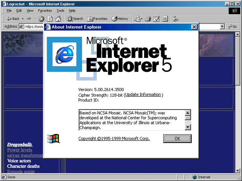
Many years ago, when the internet was starting to become increasingly mainstream, there was a browser called Netscape Navigator. This browser reigned supreme and was the most widely used web browser of them all, until Microsoft released its own web browser called Internet Explorer, which it eventually integrated into Windows. This was the beginning of the end for Netscape, and soon Internet Explorer claimed the majority of browser share and that was that.
From here on out, with most people using Internet Explorer, developers didn’t have to worry about how their websites looked in competing browsers. That sounds great in theory, but because Internet Explorer was left unchallenged for so long, the advancement of browser technology stagnated. It wasn’t until Firefox and Chrome gained significant market share years later that the advancement picked up again, which we can all be thankful for.
Have an early web design relic of your own? Share it in the guestbo… comments below.
Plug: LogRocket, a DVR for web apps
LogRocket is a frontend logging tool that lets you replay problems as if they happened in your own browser. Instead of guessing why errors happen, or asking users for screenshots and log dumps, LogRocket lets you replay the session to quickly understand what went wrong. It works perfectly with any app, regardless of framework, and has plugins to log additional context from Redux, Vuex, and @ngrx/store.
In addition to logging Redux actions and state, LogRocket records console logs, JavaScript errors, stacktraces, network requests/responses with headers + bodies, browser metadata, and custom logs. It also instruments the DOM to record the HTML and CSS on the page, recreating pixel-perfect videos of even the most complex single page apps.

Top comments (0)