No mouse? You’re in serious trouble.

Like many things that are incredibly important, accessibility is by no means easy. Not because it’s a mystery or anything—there’s tons of stuff written about rules for making accessible interfaces. There are accessibility linters and automatic audits. You can even run accessibility audits in Chrome DevTools now via Lighthouse!
However, for some reason accessibility seems to be one of the first things to go when project deadlines are slipping. Despite the excuse “we’ll add that in after we ship version 1”, it never gets added in.
In this article, we’re going to hone in on one aspect of making our interfaces inclusive for keyboard-only users: focus state.
Many people use the web without a mouse (or their thumbs, if they’re on a phone). For example, someone with a screen reader won’t be using a mouse to point and click around a website—instead, they’ll be listening to the screen reader announce what item they are currently on. Some people might be able to see where they are, but find it difficult to operate a mouse. Focus state is incredibly important because it helps a user know where they are in your website when they aren’t using the mouse.
However, having a good focus state is about more than accessibility. Many people simply find it faster to get through a website without reliance on a mouse because they don’t have to switch back and forth between the mouse and keyboard. Or they could be using an Apple Magic Mouse and forgot to charge it:

Rather than rattling off a big laundry list of rules to follow, I’d like to explore a few situations that can make sites awkward for users navigating a website without a mouse. I’m a firm believer that learning about accessibility has to be rooted in empathy for the people using your websites. It’s hard to build accessible interfaces if you don’t know what ways that your site might be difficult to navigate.
But before we get too far into it, one quick disclaimer: the point of this article isn’t to shame anyone who has broken the focus state of a website—that’s not valuable or constructive. In fact, over my time as a front-end developer, I’ve been guilty of all of these examples that we’ll go through. Instead, let’s try to investigate a few ways that our websites might be difficult to use. That way we can avoid making inaccessible interfaces in the future.
And with that, let’s look at our first scenario.

Hiding focus state completely
You might think that having a focus state is ugly. After all, you get that nasty ring around all buttons when a user clicks on them. You might be tempted to do this:
*:focus {
  outline: none;
}
Don’t do it! This is one of easiest ways to break your websites focus capabilities—anyone navigating with a keyboard no longer gets any visual indicators of what elements they are focused on. It may be “cleaner” from a design perspective, but it’s not empathetic of anyone outside of your point-and-click users.
If you don’t like the default focus states that come with the browser (in many browsers this is a fuzzy outline), that’s fair. It’s pretty common to have buttons with a border-radius, and outline actually won’t look great with those buttons (since you can’t give the outline a border-radius).
However, removing the defaults entirely isn’t the right solution. Instead of adding outline: none to your focus states, try replacing the default with something that does work with your design. For example, you could use a box-shadow instead of an outline to get a similar effect while preserving the border-radius:
*:focus {
  outline: none;
  box-shadow: 0 0 0 2px red;
}
Now instead of having an outline with a color and style to be determined by the browser, you’ve replaced the outline with a box-shadow to denote focus state. Using box-shadow gives you control over two important aspects of your focus state’s design: the color and the border-radius. The 2px in the above example control the spread-radius, which if we use 0 for all of the other values ends up looking identical to a border as well as inheriting the border-radius of the element itself. In addition, you can now control the color of the focus border to match your design scheme!
Skipping skip links
Skip links aren’t often accounted for in design mocks, but they’re a crucial part of making any web interface accessible to keyboard users.
If you’re not familiar with a skip link, check out this example from GitHub:

That “Skip to content” button only appears when focused by the keyboard. This allows keyboard users to do exactly what the button says—skip past the entire menu and go straight to the page content.
This can save users a ton of time since they won’t have to press TAB over and over again to get through all of the menu content. Skip links let them go straight to the content that’s unique to the page they visited.
It’s customary to have the skip link be the first tabbable element in the page—that way if a user is used to tabbing through when the page loads they see this option immediately.
Granted, you might end up with an interface that is too complex for a single skip link. Some interfaces have way more than content—for example, you might have nested submenus, filters, or multiple portions of your interface that combine to form the “main content”.
However, even these more complex interfaces can adopt the “skip link” mentality and adapt it to their own needs. One of the best examples of this that I’ve seen is the “Skip Menu” that shows up when you tab through Facebook’s interface.

Facebook has an incredibly complex interface with tons of moving parts, and yet they’ve provided an easy way for keyboard users to get around the page quickly. They’re a shining example that regardless of how complex an interface can be, it’s still possible to make something that’s inclusive of keyboard-first users.
Including off-screen focusable elements
Another way to break your website for keyboard-first users is to include a ton of off-screen focusable content. For example, allowing a user to tab all the way through a menu that is hidden off-screen (perhaps the menu is shown when a user clicks a menu toggle).
But wait! Wasn’t that one of the main reasons for even having a focus state? So that users on screen readers can know what element they’re currently focused on?
The thing is, that’s only one of the reasons to include a focus state. While having a focusable interface is crucial for screen readers, it’s also helpful to a whole host of other types of users.
Navigating many interfaces can be a little tricky using only the keyboard, but one of the most frustrating things is pressing TAB and all of a sudden see that little focus border disappear entirely.
Congratulations, you just struck gold! Or you’ve just hit an off-screen menu that’s hidden to point-and-click users. The only way to get through this menu without your mouse is to just blindly jam TAB until you see that focus border appear again.
If you’re not using a screen reader you might have no idea how long the menu is or what options you’re currently tabbing over.
This type of off-screen content is pretty common—it’s super easy to build menus that are hidden from the standard user via CSS transforms like this:
.menu {
  position: fixed;
  top: 0;
  bottom: 0;
  right: 0;
  width: 200px;
  transform: translateX(100%);
}
The sweet thing about this is that using transform to hide the menu off-screen allows you to later use transform: translateX(0) to bring the menu on-screen without triggering a browser repaint. Couple this with some type of transition and you’ve got an animated menu with some pretty sweet rendering performance.
The issue with this comes when you try to tab through the website and you hit one of these hidden menus. Then you’re back to the scenario where you’re tabbing through the menu until you see the focus state magically appear again.
The easiest way to make sure that keyboard users don’t have to tab through these hidden menus is simply not to render them to the DOM until they’re triggered. There’s a great guide on building these “flyout menus” with accessibility in mind on the W3 website.
In most cases, you shouldn’t come up on huge performance issues unless you’re painting a ton of DOM nodes at once. However, you might need to find a new solution for adding animations.
If you’re using a modern JavaScript framework like React I’d encourage you to see whether there’s a preferred solution to animating elements. Often you can animate an element as it is being inserted into the DOM rather than leaving it in the DOM and displaying it through a CSS transform.
For example, React has libraries like react-transition-group and react-pose to make animating elements super easy. These libraries tend to be fairly optimized for performant animations and give you the tools to make an awesome experience for all of your users (regardless of the way that they’re using your website). I’m most familiar with the React community, but feel free to share your favorite animating solutions for other frameworks in the comments!
Conclusion
Thanks for reading! By no means is this list an exhaustive way of ways to make inaccessible interfaces. In fact, there are probably tons of ways to break focus state that aren’t listed here. I’d encourage everyone to try going through their website only using your keyboard and see what things you come up against. How easy is it to get through your main user flows? What other common focus state problems have you come up against? As always, feel free to share them in the comments or reach out to me on Twitter!
Plug: LogRocket, a DVR for web apps
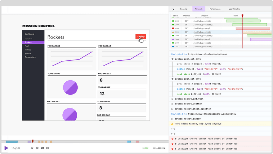
LogRocket is a frontend logging tool that lets you replay problems as if they happened in your own browser. Instead of guessing why errors happen, or asking users for screenshots and log dumps, LogRocket lets you replay the session to quickly understand what went wrong. It works perfectly with any app, regardless of framework, and has plugins to log additional context from Redux, Vuex, and @ngrx/store.
In addition to logging Redux actions and state, LogRocket records console logs, JavaScript errors, stacktraces, network requests/responses with headers + bodies, browser metadata, and custom logs. It also instruments the DOM to record the HTML and CSS on the page, recreating pixel-perfect videos of even the most complex single page apps.
The post 3 ways everyone breaks their website's focus state appeared first on LogRocket Blog.

Top comments (1)
Nice article. Thanks for the tips!