
Written by Nkere-Awaji Inwan✏️
When developing applications either small or large scale, form inputs are the primary source of collecting data from users.
As our application grows larger we find the need to reuse forms that capture similar data instead of creating redundant files by repeating the forms going against the DRY principle. To handle this growth or keep our codebase clean, we will be taking advantage of the vue-form-generator package.
vue-form-generator is a schema-based form generator component for vue.js, which can be used to create reactive forms based on data models or schema. It supports 21 field types, has a built-in form validator, can be easily customized, highly extensible, and lightweight in size.
To take this library for a spin, we are going to create a simple user management app that will demonstrate how we can perform CRUD operations on user records. We will also explore some fundamental Vue-form-generator features such as customization, validation, extension e.t.c. These fundamentals will enable us to learn how to better manage forms by generating reusable form components based on data models.

Prerequisites
To follow along with this tutorial the following are required:
- An IDE of your choice e.g Visual Studio Code
- Node.js (minimum Node v10x) installed on your PC
- Basic understanding of JavaScript and Vue
- Vue CLI installed on your PC
Installation
If not already installed, you can use this command to install the Vue CLI on your PC:
npm install @vue/cli -g
Now create a new Vue project with this command:
vue create user-management-app
Next, change the directory into your newly created project:
cd user-management-app
Install vue-form-generator:
npm install vue-form-generator
Let’s install additional packages we’ll need to complete the implementation of our project.
-
axiosto make API calls -
vue-routerto handle route functionality in our app -
vue-tel-inputto get the feature country code and phone number input
Install these dependencies by running the command below:
npm install axios vue-router vue-tel-input
The dependencies object in our package.json should look like this:
"dependencies": {
  "axios": "^0.19.2",
  "core-js": "^3.6.4",
  "vue": "^2.6.11",
  "vue-form-generator": "^2.3.4",
  "vue-router": "^3.1.6",
  "vue-tel-input": "^4.3.0"
}
Getting started
For demonstration purposes, a node-express backend was built for this article. This express based server will help us perform CRUD operations.
By the end of this tutorial we will have built an application that looks like the GIF below:

Setup
Let us add the package into our application, there are two ways of adding the package into our project it can be added manually or by importing it directly inside the project.
Doing it manually will require you to download zipped package, unpack it and add the vfg.css and vfg.js file to your project from /dist folder.
For this project, we’ll be using the import option. To do this, you will add the package to your main.js file, this way the form component can be reused across our application:
// src/main.js

import Vue from 'vue'
import App from './App.vue'
import VueFormGenerator from 'vue-form-generator'

Vue.use(VueFormGenerator);

Vue.config.productionTip = false;

new Vue({
  render: h => h(App),
}).$mount('#app');
Add Bootstrap
To get to some predefined styling in our application we’ll be adding Bootstrap via a content delivery network(CDN) like so:
// public/index.html

<!DOCTYPE html>
<html lang="en">
  <head>
    ...
    <link href="https://stackpath.bootstrapcdn.com/bootstrap/4.4.1/css/bootstrap.min.css" rel="stylesheet">
    ...
  </head>
</html>
Next up, we’ll add the navbar to our app by updating the src/App.vue as seen below:
// src/App.js

<template>
  <div id="app">
    <nav class="navbar navbar-expand-lg navbar-dark bg-dark">
      <div class="container">
        <a class="navbar-brand" href="#">VFG</a>
        <button class="navbar-toggler" type="button"
                data-toggle="collapse"
                data-target="#navbarNavDropdown"
                aria-controls="navbarNavDropdown"
                aria-expanded="false"
                aria-label="Toggle navigation">
          <span class="navbar-toggler-icon"></span>
        </button>
        <div class="collapse navbar-collapse" id="navbarNavDropdown">
          <ul class="navbar-nav">
            <li class="nav-item active">
              <a class="nav-link" href="#">Manage Users <span class="sr-only">(current)</span></a>
            </li>
          </ul>
        </div>
      </div>
    </nav>
    <div class="container my-5">
      <router-view/>
    </div>
  </div>
</template>

...
Configuring Vue router
In this section, we’ll configure the routes for our application by creating a router folder in our src directory like so:
$ mkdir src/router && touch src/router/index.js
The index.js file will contain all our routes logic and configuration. We will create the routes for our app like this:
// src/router/index.js

import Vue from 'vue'
import Router from 'vue-router'
import Users from '../pages/Users'
import CreateUser from '../pages/CreateUser'
import EditUser from '../pages/EditUser'

Vue.use(Router)

export default new Router({
  routes: [
    {
      path: '/',
      name: 'Users',
      component: Users
    },
    {
      path: '/create',
      name: 'CreateUser',
      component: CreateUser
    },
    {
      path: '/edit/:id',
      name: 'EditUser',
      component: EditUser
    }
  ]
})
In the snippet above, we’ve imported a couple of components that we’ve yet to create. These components will be created as we progress.
To bootstrap our routes to our application, we will add it to the Vue instance as seen in the snippet below:
// src/main.js

...

import router from './router'

...

new Vue({
  render: h => h(App),
  router, // add the router config to vue instance
}).$mount('#app');
In the coming sections, we will be creating the components imported earlier in our src/router/index.js file by creating a pages folder inside the src directory. This is where we will store all our router views.
User list view
For our user’s list view, we’ll create a file named Users.vue and add the snippet below:
// src/pages/Users.vue

<template>
    <div class="container">
        <div class="d-flex justify-content-between align-items-center">
            <div class="d-flex flex-column align-items-start">
                <h2>All users</h2><span class="text-muted">list of all users</span>
            </div>
            <router-link to="/create" class="btn btn-primary">Create new user</router-link>
        </div>
        <div class="table-responsive mt-5 bg-white">
            <div class="text-center" v-if="isLoading">Fetching Users</div>
            <table v-if="!isLoading && users.length" class="table">
                <thead>
                <tr>
                    <th>SN</th>
                    <th>First Name</th>
                    <th>Last Name</th>
                    <th>Email</th>
                    <th>Phone Number</th>
                    <th></th>
                </tr>
                </thead>
                <tbody>
                <tr v-for="(user, index) in users" :key="index">
                    <td>{{index+1}}</td>
                    <td>{{user.first_name}}</td>
                    <td>{{user.last_name}}</td>
                    <td>{{user.email}}</td>
                    <td>{{user.phone_number}}</td>
                    <td>
                        <div class="button-group">
                            <button class="btn btn-sm">view</button>
                            <router-link :to="`/edit/${user.id}`" class="btn btn-sm btn-secondary">edit</router-link>
                        </div>
                    </td>
                </tr>
                </tbody>
            </table>
            <div class="text-center" v-if="!isLoading && !users.length">No users found</div>
        </div>
    </div>
</template>

<script>
import axios from 'axios'

export default {
  name: 'Users',
  mounted () {
    this.fetchUsers()
  },
  data () {
    return {
      users: [],
      isLoading: true
    }
  },
  methods: {
    async fetchUsers () {
      try {
        this.users = (await axios.get('https://user-management-api.enkaypeter.repl.co/users')).data
      } catch (e) {
        console.log(e)
        alert(e.message)
      }
      this.isLoading = false
    }
  }

}
</script>

<style scoped></style>
In the snippet above, we’re creating a list view that displays the recorded details of our users. We are also creating a Create new user button which links to the create users form.
User creation form
Before we proceed to the user form creation, let’s go over some properties of the vue-form-generator component which we’ll be using in our form implementation.
Schema: The schema object is where we define our form fields. These form fields can either be grouped or ungrouped. For our create user form we will be using grouped form fields. To know more about the different schema formats available you can visit the documentation.
Options: Options for the Vue form component, these options can be used to define how validation is being run on the form.
Model: The model is a native JSON object. VueFormGenerator will modify this model if the values of the fields change.
Tag: This property can be used to change the main HTML element wrapper for fields and groups, the default value is a fieldset.
Now that we’re familiar with some fundamental vue-form-generator properties, let’s create our user form schema. We will do so by creating a folder named forms which will house our form schema userFromSchema.js like so:
$ mkdir src/forms && touch src/forms/userFromSchema.js
After that is done, we’ll import vue-form-generator into a schema file like this:
// src/forms/userFormSchema.js

import VueFormGenerator from 'vue-form-generator'

export default {
  groups: []
}

...
Our form will be made of four groups namely personal info, contact details, profile, and login details as defined in the sub-sections below.
Personal info
This group contains form fields which will be used to collect the user’s personal information with basic validation on each field as seen below:
// src/forms/userFormSchema.js
...

  {
      legend: 'Personal Info',
      fields: [
        {
          type: 'input',
          inputType: 'text',
          label: 'First Name',
          model: 'first_name',
          required: true,
          validator: ['string', 'required']
        },
        {
          type: 'input',
          inputType: 'text',
          label: 'Last Name',
          model: 'last_name',
          required: true,
          validator: ['string', 'required']
        },
        {
          type: 'select',
          label: 'Gender',
          model: 'gender',
          values: [
            {id: 'male', name: 'Male'},
            {id: 'female', name: 'Female'}
          ],
          selectOptions: {
            noneSelectedText: 'Choose One'
          },
          required: true,
          validator: ['string', 'required']
        },
        {
          type: 'input',
          inputType: 'number',
          label: 'Age',
          model: 'age',
          required: true,
          hint: 'Age is required & must be a between 18 and 35.',
          validator: ['number', 'required'],
          min: 18,
          max: 35
        },
        {
          type: 'input',
          inputType: 'text',
          label: 'City',
          model: 'city',
          required: true,
          validator: ['string', 'required']
        }
      ]
    }

...
Contact details
This section contains form fields to collect the user’s email address and phone number. This section contains a custom input field called tel-input. We will talk more about how this was defined in the “how to add custom input fields” section in this post.
// src/forms/userFormSchema.js
...

  {
      legend: 'Contact Details',
      fields: [
        {
          type: 'input',
          inputType: 'email',
          label: 'Email',
          model: 'email',
          required: true,
          validator: VueFormGenerator.validators.email
        },
        {
          type: 'tel-input',
          label: 'Phone Number',
          model: 'phone_number'
        }
      ]
    }
...
Profile
This group, as the name implies, contains form fields which we’ll use to collect the user’s profile information. A text area is used to collect information about the user and a checklist for collecting the user’s skills.
// src/forms/userFormSchema.js
...

  {
      legend: 'Profile',
      fields: [
        {
          type: 'textArea',
          inputType: 'textArea',
          rows: 4,
          label: 'About',
          model: 'about',
          required: true,
          validator: ['string', 'required']
        },
        {
          type: 'checklist',
          label: 'Skills',
          model: 'skills',
          values: ['Javascript', 'VueJS', 'CSS3', 'HTML5'],
          multiSelect: true,
          multi: true,
          required: true,
          validator: ['array', 'required'],
          selectOptions: {
            noneSelectedText: 'Choose One'
          }
        }
      ]
    }
...
Login details
This group is used to collect the proposed username and password of the user. This group also contains custom validation rules which will be expatiated on in “how to add custom validation rules” section in this post.
// src/forms/userFormSchema.js
...
  {
      legend: 'Login Details',
      fields: [
        {
          type: 'input',
          inputType: 'text',
          label: 'Username',
          model: 'username',
          required: true,
          validator: ['string', 'required']
        },
        {
          type: 'input',
          inputType: 'password',
          label: 'Password',
          model: 'password',
          required: true,
          validator: ['strongPassword', 'required']
        }
      ]
    }
...
These four groups make up our create user form schema and will determine how our form fields will be rendered. To see how they all come together, you can check out the project repository on GitHub.
Customizing vue-form-generator
Predefined input types and fields sometimes won’t cut it as not every form is generic. As such, vue-form-generator makes it possible to add custom input types as well as built-in custom features.
In this section, we will take a look at how we can add custom input types and also add custom validation rules for our form fields.
How to add custom input fields
In the Contact Details group located in src/forms/userFormSchema.js, we’re adding the custom field tel-input as seen below:
...

{
          type: 'tel-input',
          label: 'Phone Number',
          model: 'phone_number'
}

...
To create this field, we will create a file tel-input.vue inside the components folder and add the snippet below:
// src/components/tel-input.vue

<template>
    <vue-tel-input v-model="value"></vue-tel-input>
</template>

<script>
import { VueTelInput } from 'vue-tel-input'
import { abstractField } from 'vue-form-generator'

export default {
  name: 'TelephoneInput',
  mixins: [abstractField],
  components: {VueTelInput}
}
</script>
After this is done, we need to register the tel-input component as a global component in the src/main.js file like this:
// src/main.js
...
Vue.component('field-tel-input', TelInput)
...
How to add custom validation rules
As seen in the Login Details group, we added a strongPassword validation rule. This is because we want to define custom password validation rules which suits our applications requirements:
...

{
          type: 'input',
          inputType: 'password',
          label: 'Password',
          model: 'password',
          required: true,
          validator: ['strongPassword', 'required']
}

...
To create this rule, we will open up our main.js file and update Vue.use(VueFormGenerator); like so:
// src/main.js
...

Vue.use(VueFormGenerator, {
  validators: {
    strongPassword: (value, field, model) => {
      let regex = /^(?=.*[a-z])(?=.*[A-Z])(?=.*\d)[a-zA-Z\d]{5,}$/

      if (!regex.test(value)) {
        return [ 'Password should be a minimum five characters, at least one uppercase letter, ' +
        'one lowercase letter and one number']
      } else {
        return []
      }
    }
  }
})

...
In the snippet above, we use regex to check if our password has a minimum of five characters, at least one uppercase letter, one lowercase letter, and one number.
CreateUser components
The next step in our implementation will be to add our user creation page which contains the create form. We will do that by creating a file named CreateUser.vue inside the pages folder with the snippet below:
<template>
    <div class="container">
        <div class="d-flex justify-content-start     mb-3">
            <router-link to="/" class="btn btn-sm btn-outline-secondary">back</router-link>
        </div>
        <div class="d-flex justify-content-between align-items-center">
            <div class="d-flex flex-column align-items-start">
                <h2>Create User</h2><span class="text-muted">Add new user record</span>
            </div>
        </div>
        <div class="card pl-4 pt-5 pb-5 pr-4 mt-5">
            <form action="" @submit.prevent="submitUserDetails">
                <vue-form-generator tag="div" :schema="schema" :options="formOptions" :model="model" />
                <div class="d-flex justify-content-end mt-3 pr-4">
                    <button type="submit" class="btn btn-primary btn-lg">
                        {{ isSaving ? 'Saving...' : 'Submit'}}
                    </button>
                </div>
            </form>
        </div>
    </div>
</template>

<script>
import userFormSchema from '../forms/userFormSchema'
import axios from 'axios'

export default {
  name: 'CreateUser',
  mounted () {
  },
  data () {
    return {
      model: {
        first_name: '',
        last_name: '',
        gender: '',
        skills: ['Javascript', 'VueJS'],
        email: '',
        age: '',
        phone_number: '',
        city: '',
        about: '',
        username: '',
        password: ''
      },
      schema: userFormSchema,
      formOptions: {
        validateAfterChanged: true
      },
      isSaving: false
    }
  },
  methods: {
    async submitUserDetails () {
      try {
        await axios.post('https://user-management-api.enkaypeter.repl.co/users', {
          ...this.model
        })
        alert('Saved Successfully')
      } catch (e) {greate
        console.log(e)
        alert(e.message)
      }
    }
  }
}
</script>

<style></style>
As seen in the snippet above, we are importing the userFormSchema which we created earlier to help determine how our form fields will be presented as well as axios to help us make API calls.
We then added a model property in the data method of our component which we’re using to get input data from our form.
Lastly, we added the formOptions property to our data method. Setting validateAfterChanged to true will instruct vue-form-generator to validate our form on every field change.
User edit form
This file is very similar to our user creation form, except that the fields are pre-filled based on the user record selected from the user’s list view.
We will create our EditUser view by creating a new file named EditUser.vue in the pages folder like so:
<template>
    <div class="container">
        <div class="d-flex justify-content-start     mb-3">
            <router-link to="/" class="btn btn-sm btn-outline-secondary">back</router-link>
        </div>
        <div class="d-flex justify-content-between align-items-center">
            <div class="d-flex flex-column align-items-start">
                <h2>Edit User</h2><span class="text-muted">Edit new user record</span>
            </div>
        </div>
        <div class="card pl-4 pt-5 pb-5 pr-4 mt-5">
            <form action="" @submit.prevent="updateUserDetails">
                <vue-form-generator tag="div" :schema="schema" :model="model" />
                <div class="d-flex justify-content-end mt-3 pr-4">
                    <button class="btn btn-primary btn-lg">
                        {{ isSaving ? 'Saving...' : 'Update'}}
                    </button>
                </div>
            </form>
        </div>
    </div>
</template>

<script>
    import userFormSchema from '../forms/userFormSchema'
    import axios from 'axios'

    export default {
        name: 'EditUser',
        mounted () {
            this.fetchUser(this.$route.params.id)
        },
        data () {
            return {
                model: {},
                schema: userFormSchema,
                id: this.$route.params.id,
                isSaving: false
            }
        },
        methods: {
            async fetchUser () {
                try {
                    this.model = (await axios.get(`https://user-management-api.enkaypeter.repl.co/users/${this.id}`)).data
                } catch (e) {
                    console.log(e);
                    alert(e.message)
                }
            },
            async updateUserDetails () {
                this.isSaving = true;
                try {
                    await axios.put(`https://user-management-api.enkaypeter.repl.co/users/${this.id}`, this.model);
                    alert('User details updated')
                } catch (e) {
                    console.log(e);
                    alert(e.message)
                }
                this.isSaving = false
            }
        }
    }
</script>

<style></style>
The component above contains two methods; fetchUse() and updateUserDetails().
The fetchUser method fetches a user’s record based on their id whilst updateUserDetails updates the user’s details.
Let’s take a break and test our application to see what it looks like. To do that let’s run the code below in our project directory:
$ npm run serve
If all goes well, you should see a page that looks like this when you visit the displayed URL:

Now that we have a running app, the next thing for us is to add aesthetics to our form by styling it.
Styling vue-form-generator
vue-form-generator is Bootstrap friendly and has some default styling out of the box. To use its default styling you can import this file vue-form-generator/dist/vfg.css into your app. You can also use this file as a starting point to modify the look and feel of your form.
For this tutorial, we’ll be writing our custom style. This will help us better understand how to style the component.
Replace the style section in src/App.vue with the styles below:
<style>
  body {
    background-color: #fafafa !important;
  }

  #app {
    font-family: 'Avenir', Helvetica, Arial, sans-serif;
    -webkit-font-smoothing: antialiased;
    -moz-osx-font-smoothing: grayscale;
    text-align: center;
    color: #2c3e50;
  }

  .vue-form-generator > div{
    display: flex;
    justify-content: space-between;
    flex-wrap: wrap;
    flex-grow: 1;
  }

  .form-group{
    display: flex;
    flex-direction: column;
    align-items: flex-start;
    padding: 0 2%;
    width: 50%;
  }

  .field-wrap, .wrapper{
    width: 100%;
  }

  .dropList{
    z-index: 10;
    background-color: #FFF;
    position: relative;
    width: 40%;
    top: 5px;
    right: 12px;
  }

  legend{
    margin: 10px 0 20px 18px;
    font-size: 16px;
    font-weight: bold;
    text-align: left;
  }

  .hint{
    font-size: 10px;
    font-style: italic;
    color: purple;
  }

  .help-block{
    color: red;
  }
</style>
After we apply the styles, we should see something that looks like the image below:

Conclusion
In this article, we have learned how to create and manage reusable forms in our Vue application by generating form components based on their data model which can be reused on different occasions using the vue-form-generator package.
The source code for each of the following snippets is available on GitHub. Feel free to clone it, fork it, or submit an issue.
Here’s a link to the documentation of the vue-form-generator which has more examples and extensive explanation.
Experience your Vue apps exactly how a user does
Debugging Vue.js applications can be difficult, especially when there are dozens, if not hundreds of mutations during a user session. If you’re interested in monitoring and tracking Vue mutations for all of your users in production, try LogRocket.
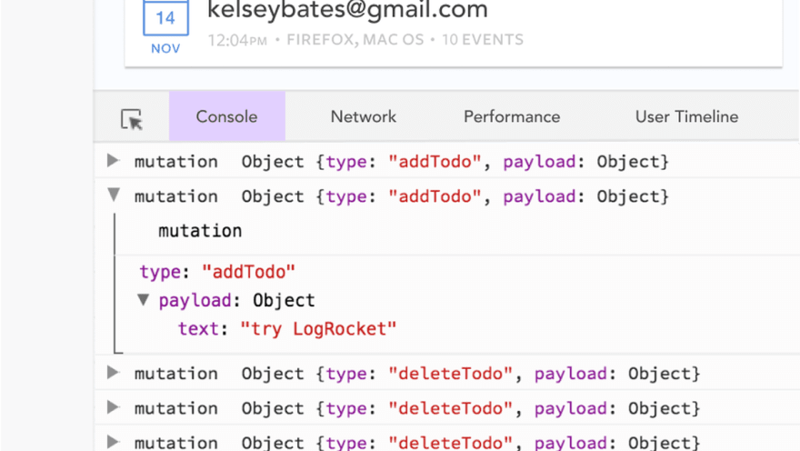
LogRocket is like a DVR for web apps, recording literally everything that happens in your Vue apps including network requests, JavaScript errors, performance problems, and much more. Instead of guessing why problems happen, you can aggregate and report on what state your application was in when an issue occurred.
The LogRocket Vuex plugin logs Vuex mutations to the LogRocket console, giving you context around what led to an error, and what state the application was in when an issue occurred.
Modernize how you debug your Vue apps - Start monitoring for free.
The post How to build reusable forms using vue-form-generator appeared first on LogRocket Blog.

Top comments (1)
How to align form input fields side by side. Like two input fields in an row