The Atomic Design System is a methodology for designing digital products based on a hierarchy of complex components organised into stages, where changes at any stage affect the subsequent ones.
In this article, I will introduce you the elements that make up the Atomic Design System.
Atoms
These are the basic components of the Atom design system and components of the entire design system. These include properties such as colours, fonts or shadows.
Molecules
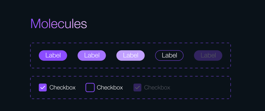
These are simple-to-use elements, such as buttons, checkboxes or badges, which are made up of connected atoms.
Organisms
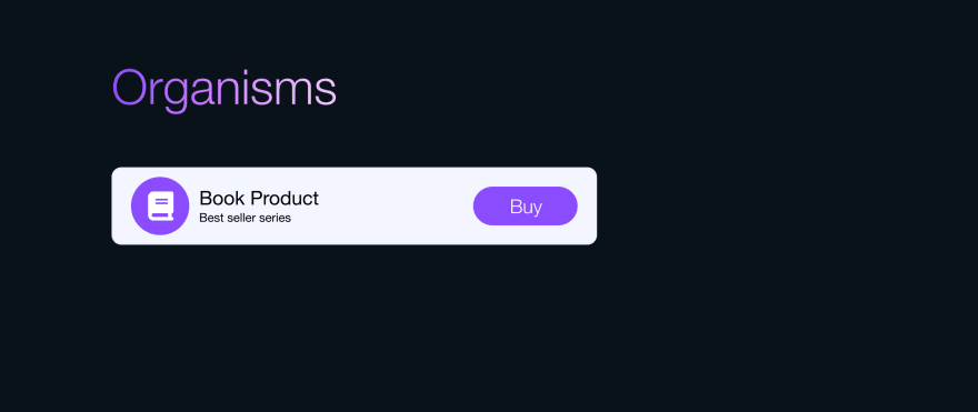
They are complete user interface components that form the basic backbone of the entire system design of a given product.
Templates
These are the equivalent of models in atomic design. We combine prepared organisms with grey-scale elements that are not yet ready, you can think of it as a kind of preview. We do this to create a tangible product that can be presented to the business teams.
Pages
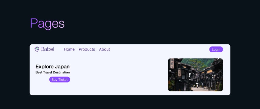
Pages are built from templates and populated with real content that we pass on to developers so that they become a functional product.
For Developers
You can also create and develop your user interface components and create your documentation through the storybook of the atomic designs created by your design team. You can even enable your test team to test these user interface components.
Installing Storybook with React and Typescript
You can create a Storybook + React + Typescript project in a simple way with the following command lines. For more information about developing user interface components with Storybook, please visit https://storybook.js.org/docs/react/get-started/introduction.
First, we’ll create a React + Typescript project.
npx create-react-app my-app --template typescript
Then we will set up the Storybook within this project.
npx sb init


Top comments (0)