The product designer’s toolbox
When every question has countless different answers, things get confusing. Fast.
Preface
Carpenters use their favorite hammers. Developers use their favorite IDEs. Doctors use their favorite… stethoscopes?
What do product designers use?
As a relatively new designer myself, I get overwhelmed when searching for the right tool for a specific task. When there’s multiple answers for every question, things get confusing. Fast. Until I ventured into the wonderful world of product design, my main tools were as followed:
Pen and paper
Box cutter
InDesign
Illustrator
Granted, I was using these tools primarily for my coursework in college, which was geared towards physical craft. I pulled my fair share of all-nighters measuring, cutting and re-cutting. Gluing, peeling apart, and re-gluing. It was a painful, repetitive process, but worthwhile. Don’t get me wrong, I love print design, and I love crafting a design from real, physical objects. I’m not trying to knock designers that work that way, but I‘ve fallen in love with product and *~digital~* design. Unfortunately, my school didn’t have a curriculum focused on web/mobile design apart from one course (User Interface Design…with Photoshop 😟).
So, to reach the title of Product Designer, I had to fully immerse myself and teach myself the basics. As I mentioned earlier, this is a daunting task, especially to a new designer* — *but also a fun one. Hopefully this article answers some of the questions new designers may have about product design and the tools that come with it.
Disclaimer: There won’t be any definitive choices in this article. Every designer works differently, and the tools I recommend may not be the best for you. This article is only meant to help you find the right tool for the right job in your workflow.
](https://res.cloudinary.com/practicaldev/image/fetch/s--_wfdVgR0--/c_limit%2Cf_auto%2Cfl_progressive%2Cq_auto%2Cw_880/https://cdn-images-1.medium.com/max/14720/1%2ALJj4hmOES-c0DYj4Kwg89A.jpeg) Photo: Štefan Štefančík
Photo: Štefan Štefančík
Brainstorming and Ideation
Pen and paper
When English author Edward Bulwer-Lytton cointed the phrase, “The pen is mightier than the sword,” in 1839, he wasn’t touting the advantages of pen and paper over wireframing software. But the argument still applies.
Pen and paper still reigns over the digital alternative in important ways:
Rapid prototyping: You’ll often be asked to deliver a proof of concept under a tight deadline. That may sound easy if you’re designing for one or two screens, but what happens if you’re designing for an entire sitemap, or enterprise software? Pen and paper are your best friends for quick sketches and accompanying annotation. Bonus: Check out What the hell is “Rapid Prototyping”? by Keaton Herzer.
**Easy handoff: **Notebook sketches can be passed around the conference table or scanned and emailed to your team in a matter of seconds. Collaborators can make comments, sketch their own ideas, or just trash it and tell you to start over. Now, aren’t you glad you didn’t spend three hours in Sketch?
Inspires creativity: There’s no worse feeling as a designer than staring at a blank canvas on your computer screen for hours on end, unable to come up with that next big idea. When you stare into the pixels, they also stare back at you. If that feeling does hit, crack open your notebook. When your hand is able to move freely across the page, and you can see the direct results of your creativity in the ink on the paper, you get motivated. You get inspired. You realize that you are a creative person, and that the pixels aren’t just staring — they’re cheering you on, waiting for you to transfer your awesome idea from the page to the screen.
For more advantages of pen and paper prototyping, check out Andrew Couldwell’s article.
](https://res.cloudinary.com/practicaldev/image/fetch/s--5C76GPqF--/c_limit%2Cf_auto%2Cfl_progressive%2Cq_auto%2Cw_880/https://cdn-images-1.medium.com/max/4000/1%2A91uRAi_in4jTW3WAn0l59Q.png) Photos: Andrew Couldwell
Photos: Andrew Couldwell
Milanote
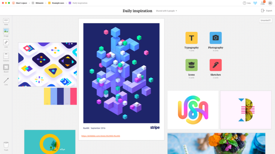
Milanote is a relatively new tool, but it’s quickly become a go-to for me. It’s an application and browser extension for creative project planning* — *essentially, a digital moodboard. Milanote can be used to create a customer journey map, and inspiration library, or even a website content plan. The deeper you dive into Milanote, the more useful it becomes. Milanote boards are infinite in size, accessible from anywhere, and stay right where you left them, even after the project is over.
](https://res.cloudinary.com/practicaldev/image/fetch/s--sra8Zw2A--/c_limit%2Cf_auto%2Cfl_progressive%2Cq_auto%2Cw_880/https://cdn-images-1.medium.com/max/4000/0%2AHugL2nPqKWYKcd7s.png) Photos: Milanote
Photos: Milanote
Pinterest gets a lot of flack, sometimes justifiably, but it still remains a powerful tool for design inspiration. A search for “UI design” returns thousands of linked results containing fonts, UI kits, color palettes, icons, and more. It’s an endless resource for discovering pretty much anything.
Honorable mentions: Dribbble, Designspiration, Medium, pttrns.com, Muzli
User Flows and Wireframing
Whimsical
Whimsical is a web application for flowcharts and wireframing. Whimsical allows you to build flows and collaborate on ideas quickly. If your project requires real-time collaboration for fast flowcharts and wireframes, Whimsical may be your best bet.
Overflow
Overflow hit the design scene in March 2018 and has since become a favorite tool for many product designers. Overflow, similar to Whimsical, is a cross-platform tool that integrates and syncs seamlessly with the most popular design tools to allow designers to create beautiful user flows. According to the creators, Overflow focuses on three main benefits: syncing designs, designing beautiful user flows, and presenting them the most efficient and engaging way possible.
Balsamiq
Balsamiq is a rapid wireframing tool that reproduces the experience of whiteboarding, but on the computer. It’s sketch-like aesthetics may be a turn off for some designers, but I think it encourages brainstorming and creativity (remember what I said earlier about pen and paper?). One of the advantages of Balsamiq is that it comes with preloaded with interface elements such as buttons, alert boxes, menus, and more to make rapid wireframing, well, rapid. Balsamiq also offers version control for easy iteration — their web app even has branching!
Disclaimer: You may want to read James Hatfield’s article here before committing to purchasing Balsamiq.
](https://res.cloudinary.com/practicaldev/image/fetch/s--gMhUwHtP--/c_limit%2Cf_auto%2Cfl_progressive%2Cq_auto%2Cw_880/https://cdn-images-1.medium.com/max/3188/0%2A4vMsi0-wIBVAxNML.png) Photo: Balsamiq
Photo: Balsamiq
Wireframe.cc
Wireframe.cc offers a simple, uncluttered interface for designing user flows quickly. There are features for team collaboration, such as editing and commenting, but these features are only included in the premium upgrade. Wireframe.cc also offers what they call *simple version control — *your work will be saved at the current state and you will be able to retrieve it or share it by sending a link to it.
](https://res.cloudinary.com/practicaldev/image/fetch/s--kTt7gg5o--/c_limit%2Cf_auto%2Cfl_progressive%2Cq_auto%2Cw_880/https://cdn-images-1.medium.com/max/2520/0%2ASDLD__TQsbYlH432.jpg) Photo: Fatbit Technologies
Photo: Fatbit Technologies
Honorable Mentions: Moqups
Low-fidelity Prototyping
Low-fidelity (lo-fi) prototyping is a quick and easy way to translate high-level design concepts into tangible and testable artifacts. The first and most important role of lo-fi prototypes is to check and test functionality rather than the visual appearance of the product.”
Sketch
Ah, Sketch. The reigning champ of user interface design tools for many designers. Look at any “best UI design tools list” and Sketch will usually be at the top, and for good reason.
Sketch is a design toolkit built to help you create your work* — *from your earliest ideas through your final work. When you launch Sketch for the first time, it will appear shockingly minimal. The first time I opened Sketch, I thought, “There’s no way I can design an entire app in this.” How naive I was.
Sketch has evolved into somewhat of a powerhouse design tool. Nowadays, there’s resources at our disposal for rapid prototyping, hundreds of plugins to increase functionality, and best of all, Sketch is compatible with some of the [other] best prototyping tools out there, like InVision, Figma, Framer, and more.
](https://res.cloudinary.com/practicaldev/image/fetch/s--7oJXmvCK--/c_limit%2Cf_auto%2Cfl_progressive%2Cq_auto%2Cw_880/https://cdn-images-1.medium.com/max/4000/0%2AU7lnCDzZ3GsLEoYb.jpeg) Photo: Newbird Design
Photo: Newbird Design
Figma
Figma, like Sketch, is a design toolkit, but is browser-based (PC users rejoice!). It supports real-time collaboration, detailed version history, team spaces, integration with Slack and Framer, and more. If you or your team is primarily PC-based, Figma may be a better alternative to Sketch.
High-fidelity Prototyping
High-fidelity (hi-fi) prototypes appear and function as similar as possible to the actual product that will ship. Teams usually create high-fidelity prototypes when they have a solid understanding of what they are going to build and they need to either test it with real users or get final-design approval from stakeholders.
Framer (X)
Framer is a powerhouse of a design tool, claiming to be the “only tool you need to build for iOS, Android, and the web.” Framer is similar to Sketch, Figma, and InVision Studio, in that it allows you to create high-fidelity interfaces with their powerful vector editor. Using their adaptive UI builder, CSS-ready elements, and app libraries, you can build any interface you can dream of in Framer.
Framer kicks it up a notch with their implemented code prototyping. Framer runs on CoffeeScript, a lightweight programming language that compiles into JavaScript. With CoffeeScript, you can prototype almost anything: animations, gestures, and even live data requests.
Framer X was recently announced and is currently in closed beta. It’s a whole new product, and more advanced than Framer, allowing you to use components to build entire interactive design systems, all based on React and ES6.
](https://res.cloudinary.com/practicaldev/image/fetch/s--aNejuodq--/c_limit%2Cf_auto%2Cfl_progressive%2Cq_auto%2Cw_880/https://cdn-images-1.medium.com/max/4000/0%2APDBBMsZhTfJD4sqP.jpg) Photo: MacUpdate
Photo: MacUpdate
Principle
Principle is a tool focused on making animating your designs with ease. Principle’s timeline makes it simple illustrate the perfect ease, pop, or bounce. It also gives you the freedom to create new custom interactions, even if you’re designing for multiple screens.
Principle offers Principle Mirror, which makes sharing your prototype with others effortless. You can also export a standalone Mac app for others to view for easy feedback and collaboration.
Sketch
We’ve already mentioned the benefits of Sketch for lo-fi prototyping, but what about hi-fi prototyping? Well, Sketch can do that too!
Sketch recently implemented prototyping, allowing you to create interactive workflows and preview your designs as your users will see them. Sketch’s prototyping allows you to create gestures and interactions without ever leaving the app, but it is somewhat limited compared to other hi-fi prototyping tools* — *no custom animations and only a handful of gestures.
](https://res.cloudinary.com/practicaldev/image/fetch/s--sv2PzD-x--/c_limit%2Cf_auto%2Cfl_progressive%2Cq_auto%2Cw_880/https://cdn-images-1.medium.com/max/2000/0%2AW3xnCGCNpLyHCWwJ.jpg) Photo: Sketch
Photo: Sketch
InVision Studio
InVision Studio is somewhat of a newcomer to the product design world, but InVision itself has existed for quite awhile, and was used by millions of designers and teams around the world to create easy, quick prototypes on the web.
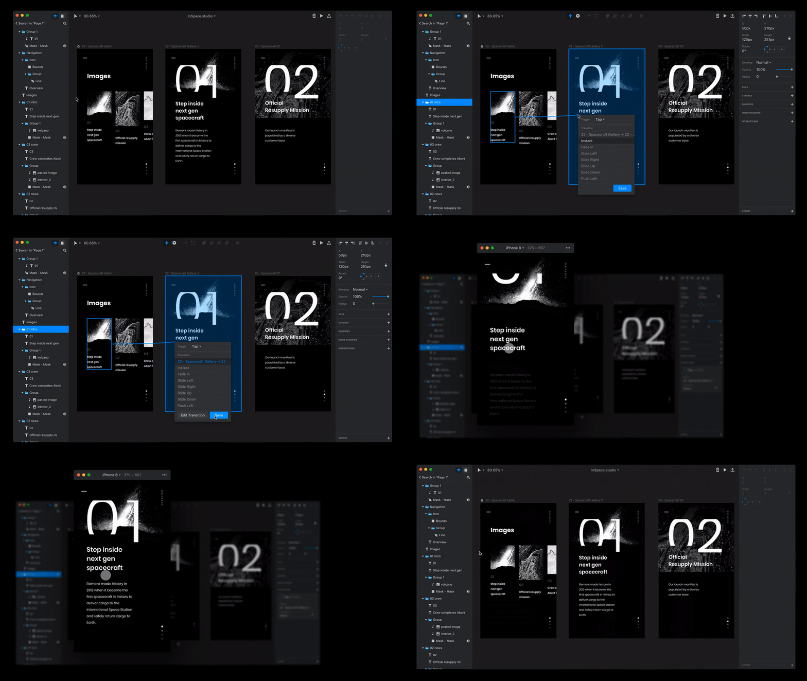
Studio allows you to design, prototype, and animate* — *all in one place. InVision has its roots in prototyping, and Studio takes that to the next level, with powerful vector editing, flexible layer styling, and pixel-perfect layouts. Rapid prototyping comes easy with comprehensive gestures and instant playback.
Studio took it a step further by incorporating animations. You’re able to use the built-in preset animations or customize them with timelines and easing editors.
Another advantage of Studio is InVision’s Design System Manager, which guarantees instant access to your team’s global shared component libraries, making it easier to remain consistent and manage your designs at scale.
From Prototype to Product
Zeplin
Zeplin is another one of those must-have apps for teams or designers who code.
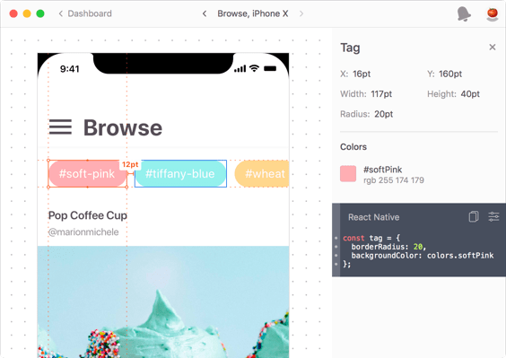
Zeplin is an app for UI designers and frontend developers, enabling them to collaborate efficiently and save time. Designers can quickly turn their designs into powerful specs and guidelines while developers can access all the resources they need in a single location and generate code snippets that are tailored to the platform they’re working on.
Zeplin seamlessly integrates with Sketch, Figma, Adobe XD, and Photoshop for effortless collaboration across your favorite design tool. Zeplin also features support for Slack and Trello to supercharge your workflow.
](https://res.cloudinary.com/practicaldev/image/fetch/s--cKaxfwkf--/c_limit%2Cf_auto%2Cfl_progressive%2Cq_auto%2Cw_880/https://cdn-images-1.medium.com/max/2000/0%2AdfZKU7g5SbZjTx4h.png) Photos: Zeplin
Photos: Zeplin
Avocode
Like Zeplin, Avocode is a platform-independent tool that helps you share, access and inspect design source files. Avocode allows you to get specs, assets, and code from Sketch, Figma, Adobe XD, and Photoshop, and allows your team to discuss changes and get feedback instantly.
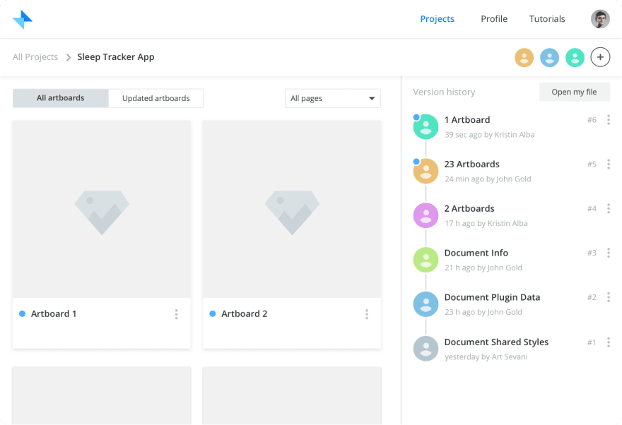
Avocode also offers a nifty version control system. It keeps an unlimited design version history for every file to avoid conflict. Coupled with Avocode’s file management system, it’s easy to keep track of changes and file placement.
](https://res.cloudinary.com/practicaldev/image/fetch/s--PpK8ngUg--/c_limit%2Cf_auto%2Cfl_progressive%2Cq_auto%2Cw_880/https://cdn-images-1.medium.com/max/4000/0%2AJHdF3HYagdmp92UQ)
Hotjar
What good are all of these design tools if they don’t help us create better experiences for the end user? Hotjar is an all-in-one analytics and feedback app that makes it easier to truly understand your web and mobile site visitors.
Hotjar features heatmaps, recordings, conversion funnels, form analysis, and more. Whether you’re working solo or on a team, Hotjar provides necessary information about your users so you can keep iterating and improving your product.
](https://res.cloudinary.com/practicaldev/image/fetch/s---BQcrGpj--/c_limit%2Cf_auto%2Cfl_progressive%2Cq_auto%2Cw_880/https://cdn-images-1.medium.com/max/2172/0%2AIfL_7vyxMzQ6MeaH)
Version Control and File Management
Dropbox/Google Drive
Never underestimate the classics. Cloud storage services serve as a great starting point for a version control system for your product. Nest folders, share with collaborators, get feedback, and keep iteratig.
Dropbox: Recover older versions of files
Google Drive: View activity and file versions
Abstract
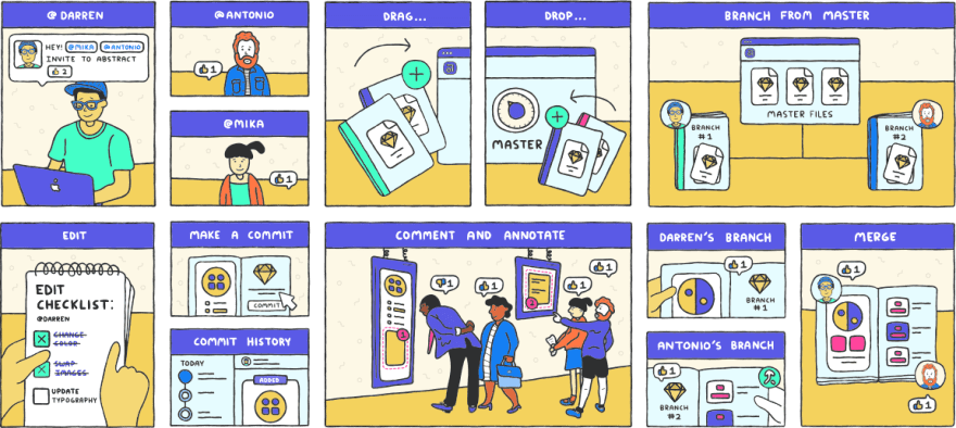
Abstract hit the scene last year and made waves across the design scene. Abstract is a platform for modern design teams to work together, offering a a secure, version-controlled hub for your design files. Abstract offers accessibility through your browser and also offers an app for macOS.
Abstract builds upon and extends the stable technology of Git to host and manage your work. Abstract’s comical how-to guide offers a look at how easy it is to create, maintain, collaborate on, and update projects.
Abstract currently only supports Sketch files, but more file formats are expected soon.
Plant
Plant is another alternative for design versioning. Plant keeps a detailed version history and offers selective artboard versioning. Unlike Abstract, Plant offers a direct plugin for Sketch *and *a standalone app. Plant is web accessible, making it easy to invite designers to a project, sync changes between each other, and see the project grow.
Trunk
The newest newcomer on the scene! It seems like design version control applications are becoming as ubiquitous as project management applications* — *but competition is a good thing.
Trunk is another alternative for a secure version control platform, made specifically with designers in mind. Trunk takes on the automated version control approach, telling you to forget the “branches, pull-requests, and merging” jargon. This may be a good starting point for those who are new to version control.
Trunk offers support for Sketch and Photoshop files.
Honorable mention: Kactus
Conclusion
Choosing the right tool for a specific job isn’t always easy, especially for new designers. Hopefully this article answers some of the questions you may have about the plethora of design tools at your fingertips. My advice: use each one extensively for different projects, and figure out which one suits your workflow. Scour the job boards and look at what companies are asking you to know before you jump in start applying, so that you can walk into your interview confident and ready to design. Last but not least, have fun!
I love feedback! If you have any comments, questions, or concerns, please feel free to drop a response below and let me know what you would’ve changed or added. Let me know what tools you use in your design workflow!
Special thanks to **Brandon Getty* for proofreading and editing this article.*
Update: Hansel Wongcreated a super useful resource that lists some of the apps here plus many others. Check it out at https://neede.co/
Note: This post was originally published by me on Medium.


](https://res.cloudinary.com/practicaldev/image/fetch/s--rpyyc5Bw--/c_limit%2Cf_auto%2Cfl_progressive%2Cq_66%2Cw_880/https://cdn-images-1.medium.com/max/2200/1%2Az8RqWpCDUj1Y7UQJK-7Mig.gif)




Top comments (0)