The article was initially published on Codica Blog.
Design in 2022 is about taking care of customers, their exclusiveness, and renouncing the “ideal visual”.
Let’s briefly consider new design trends in this article.
UI design trends
1. Vintage
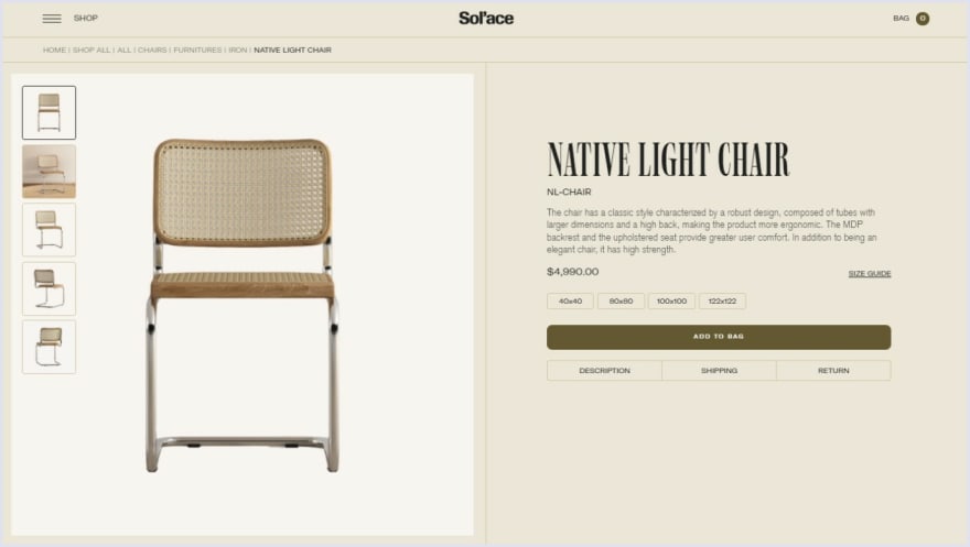
They say that everything new is well forgotten old. The features of the vintage style are organically integrated into website design in 2022.
The furniture brand Sol’ace is a very cool example of the implementation of the vintage style.
2. 3D
3D is used in many fields, such as e-commerce, the fashion industry, education, culture, and more. For instance, Apple uses 3D models of its products to show their best sides to future customers.
The Originals Museum Renault uses 3D animations to show the automobile from different angles.
3. Not-perfect illustrations
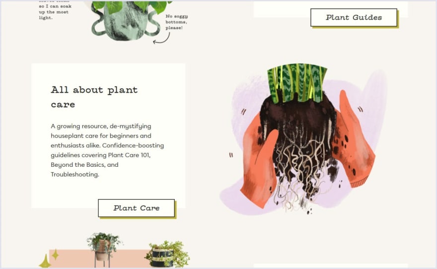
These can be hand-drawn pictures with natural textures and varying line widths.
The brand How many plants has successfully realized this trend.
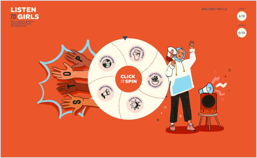
Another trend is depicting people of different nationalities with different skin colors and body types, to highlight that everyone has their own beauty.
The website Listen to Girls is a great example of the implementation of this trend.
4. Neo-brutalism
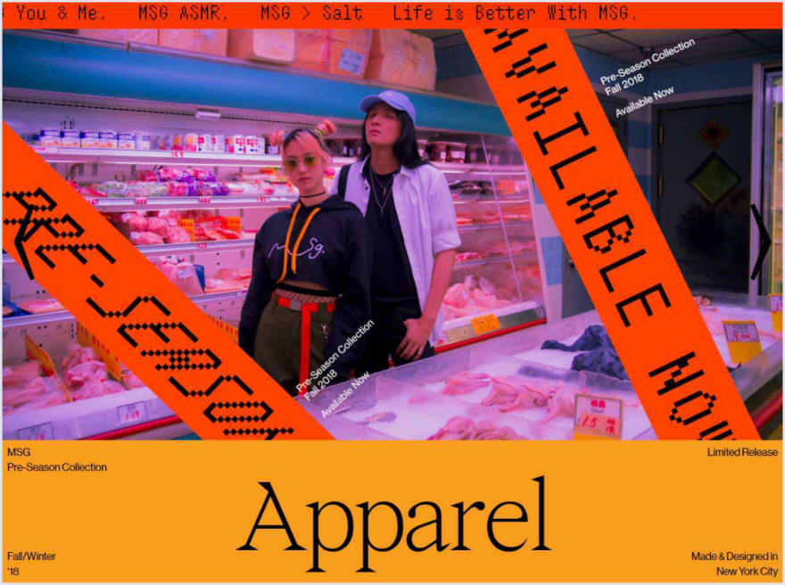
Brutalism is a style that breaks the rules, with hard fonts, big titles, and a combination of bright or neon colors. It does not seek to be convenient and comfortable.
Below you can see an example of this style implemented by the MSG brand.
5. Dissymmetry
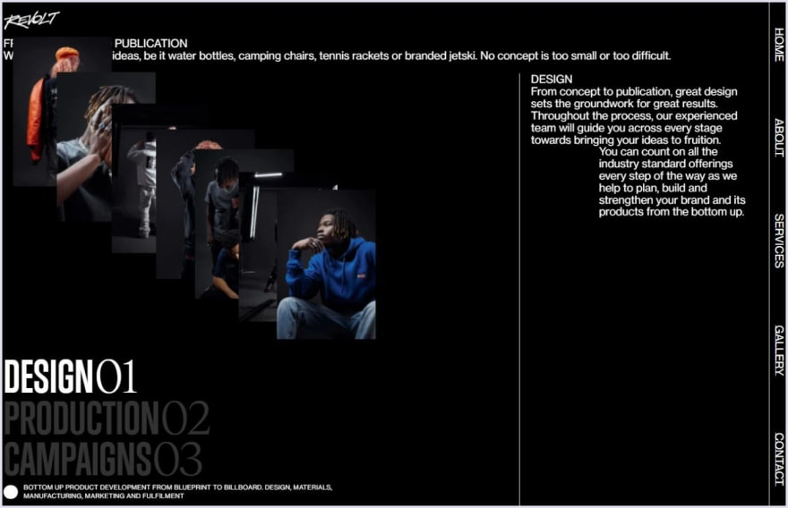
Asymmetry is not an emerging trend in graphic design and UI, but it still is up-to-date in 2022.
The Revolt website is an example of how the asymmetry style can look harmonious and clear as a whole.
6. Live photos
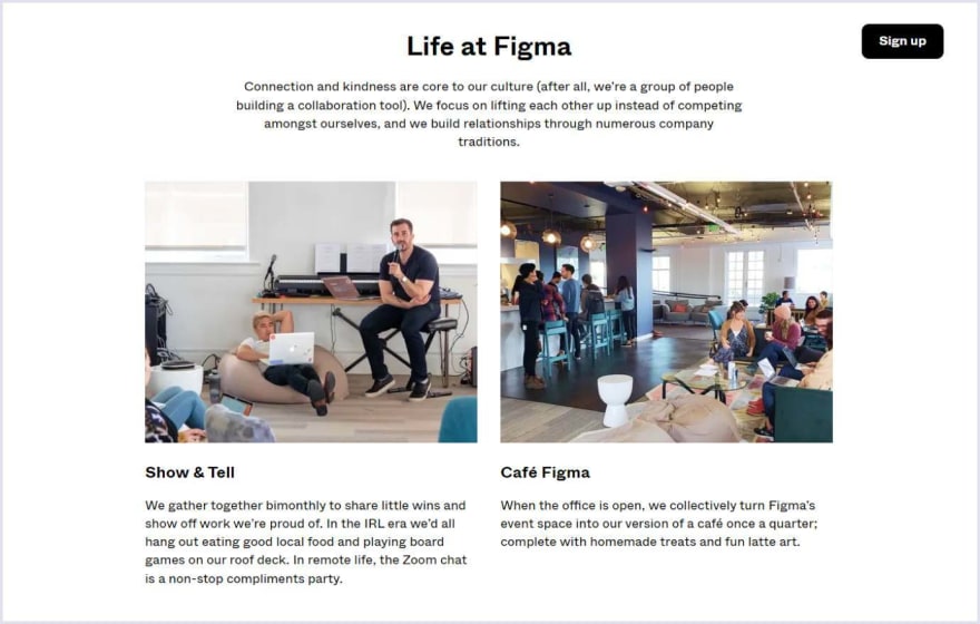
In 2022 real and live photos are one of the keys to attracting leads to your website and enhancing users' confidence. It's important for customers to be acquainted with the team that stays behind the product and to feel the atmosphere of their workspace.
Figma is a great example of how to use live photos in website design.
7. Minimalistic approach
The more simple and understandable the interface is, the more pleasing it is for the users.
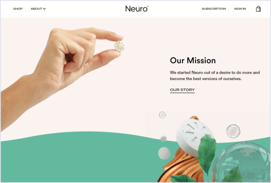
Minimalism in 2022 expands the boundaries and becomes bright. Now, it is not only about monochrome. However, this direction is still the overall concept of convenience and simplicity.
The Neuro website is a great example of striking minimalism.
8. Scrolling stories
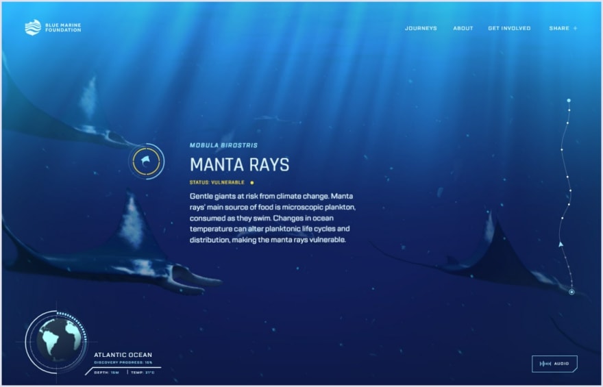
Now, you can tell about your product, or company using scrolling. You can create a website where the basic idea is explained stage-by-stage when the user scrolls the page.
The Blue Marine Foundation has effectively used scrollytelling to tell visitors about the ocean problem.
UX design trends
1. Inclusivity
Inclusivity is all about the individual characteristics of people. For instance, physical disabilities, different races, cultural backgrounds, age, gender, etc. So, all these issues must be considered when making a design.
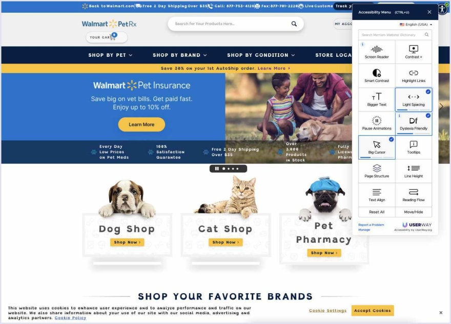
The WolmartPetRx website is a good example of an inclusiveness trend. It is plugged in a widget that makes the design inclusive. So, visitors have the opportunity to customize the website according to their preferences.
2. VR and AR
Augmented Reality (AR) and Virtual Reality (VR) connect reality with the digital world.
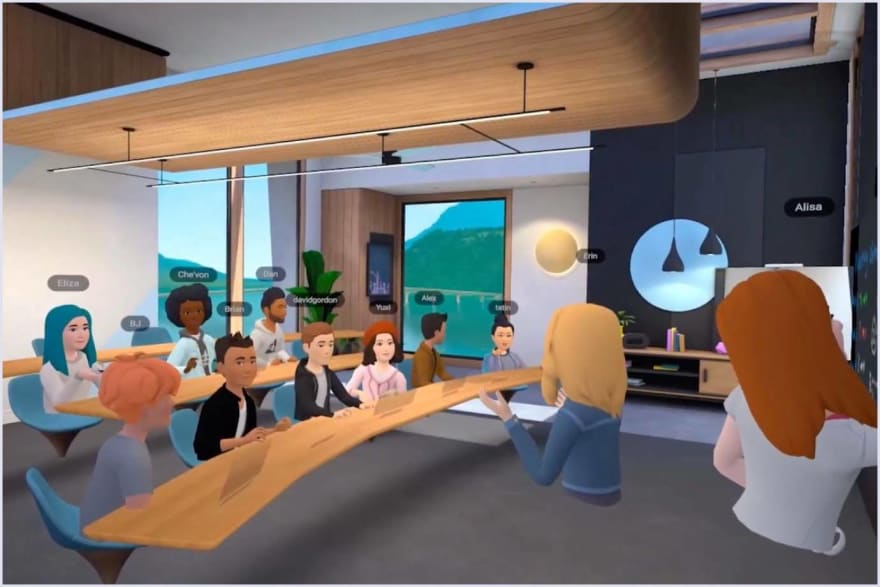
The popularity of virtual reality was nourished by the news of Metaverse, a new Facebook project. Metaverse is a three-dimensional world’s projection in which a user can make the 3D version of themselves and meet 3D models of other users online.
3. Super applications
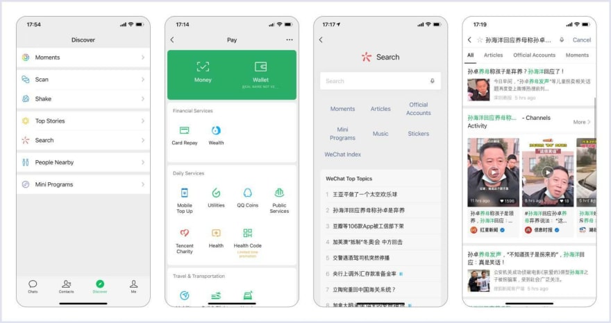
In simple words, a super application is an app in which many services are integrated. For instance, messenger, social network, electronic payments, delivery, and others.
Super applications are widespread in Asia. The most popular super apps are AliPay and WeChat.
4. Audio-first applications
Using audio-only apps is a good opportunity to listen to people on the topic you need, without logging in.
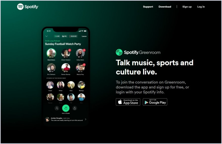
Many enterprises have adopted these apps. For instance, Spotify launches the live audio app Greenroom.
5. Design libraries and systems
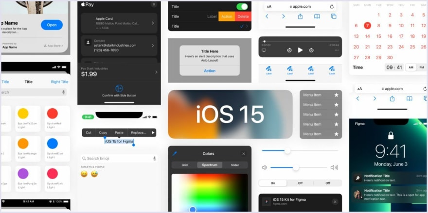
Such tools as Adobe XD, Figma, and Sketch allow designers to develop uniform components for all pages of an application or site. Moreover, they can collect these elements into a single library, which is accessible to all members of the team.
So, it is a great way for designers to work on the common project, even being far from each other.
6. Customizing
Customization enables users to select some design elements themselves.
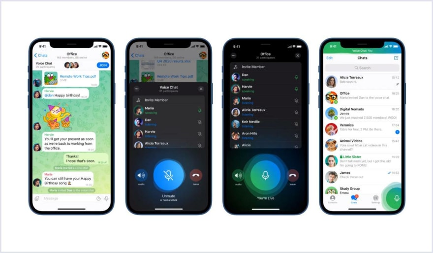
For example, the user settings of Telegram can be cited. Users can change the color theme, scale, wallpaper, language, and more.
7. Prioritization of page speed
One of the reasons why visitors leave the website is the slow page loading speed. Therefore, optimizing web pages to speed up their loading is essential.
A designer needs to develop an interface so as not to hinder the optimization. For example, it is better to use not many fonts and compress images without losing quality.
8. Mobile-first approach
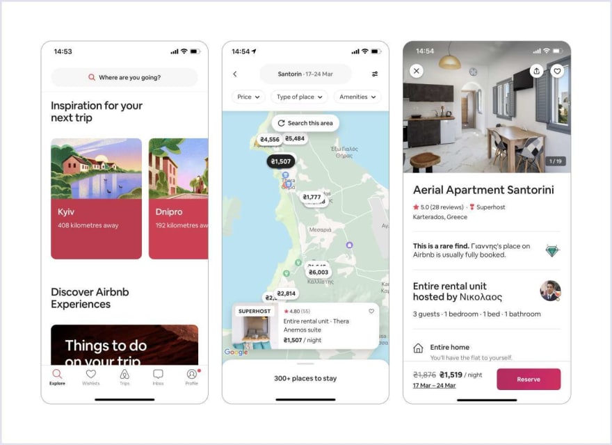
With the growing number of mobile device users, the mobile-first approach in design has become a necessity for developing websites and will remain at the top in the current year.
Here you can see an example of mobile-first design by Airbnb.




Top comments (1)
+1 for giving up the "ideal visual"