The article was originally published on Codica Blog.
Today Progressive Web Apps are getting more and more popular. In this regard, the PWA design became a hot topic for companies wanting to engage with their mobile users.
This post contains the most efficient PWA design practices. We believe that these tips will help you create the best user experience for your product.
What is a PWA and why should you care?
A PWA, or in other words, a Progressive Web Application is based on standard web technologies. At the same time, thanks to the addition of the newest JavaScript features, it is pretty similar to a native app.
In a nutshell, Progressive Web Applications work both like standard websites and mobile apps. Also, they offer offline mode, push notifications, and adding to the home screen. These functions previously were available in native applications only.
Companies investing in PWA technology get the following benefits:
- Higher conversion rate;
- Increased security;
- Improved engagement;
- Cost-effectiveness;
- Improved search ranking;
- Smooth performance within unstable networks.
There are many examples of successful creation of Progressive Web Apps. For example, Jumia got a 33% increase in conversion rate after turning its website into a fast and engaging PWA.
As you can see, Progressive Web Applications are more than a hot web app design trend. They are a powerful tool for interacting with mobile users and giving them a great native app’s experience.
Tip 1. Focus on PWA design for both desktop and mobile
Since Progressive Web Applications have cross-platform nature, great UI and UX for both mobile devices and desktop is a must. However, the version for smartphone users should remain your high priority.
Let’s compare two PWA design examples of Twitter Lite for desktop and mobile.
Desktop PWA
When designing a PWA version for desktop, think of extending the grid, adding some spacers (it is optional), and graphical elements such as illustrations or photos.
Progressive web app example of Twitter Lite for desktop is extended and has diverse features:
Mobile PWA
As for a mobile version, you need to choose the most popular features and content. Your website visitors hardly use all the available functionality. Usually, they choose several key features. For example, they may want to pay a bill and get a receipt, or search for a hotel room and book the most suitable option.
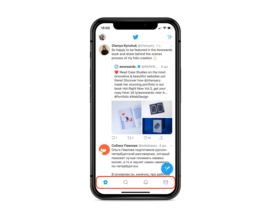
Given that, you should add the most required functionality to the navigation bar. This way users will have easy access to the commonly used functions.
Below you can see the Progressive Web design of Twitter Lite for mobile.
Tip 2. Get rid of footer
Footer is a typical place for copyright notice, terms and conditions of use, links to social media accounts, and newsletter signup. All this content remains the same on every web page.
Footers sometimes take too much space which can be a serious issue for mobile devices with small screens.
The lack of space serves as the main reason why native apps do not have footers. It means that you need to get rid of footer when designing a progressive web application.
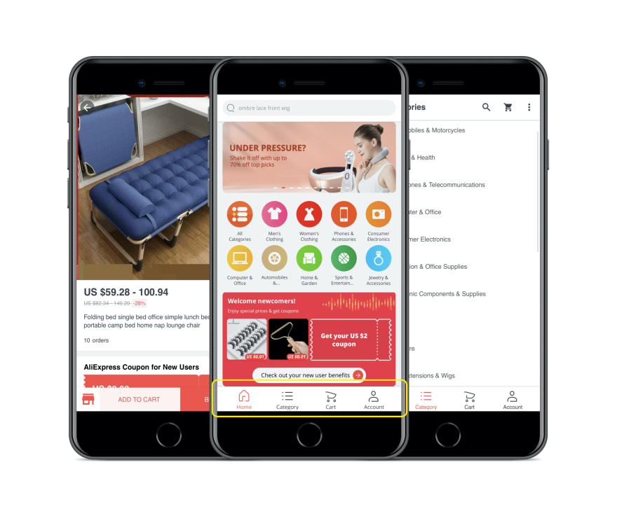
Instead, it would be much better to create a navigation bar for the most important information.
This tactic was successfully adopted by AliExpress.The buttons have the right size with a proper range of the thumb zone. As a result, users get immediate access to the most important pages or actions.
The additional information that could not be fit into the navigation bar, can be moved to the menu. The example below by the Weather Channel illustrates how to do this the right way:
Tip 3. Show interaction
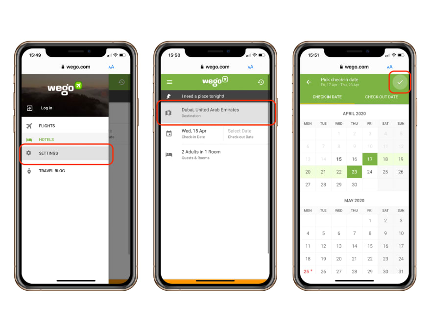
When users tap a button, link, or menu section, allow them to see that the tap was recognized. For example, highlight the selected area with a different color.
Wego is a good example of a PWA showing interaction properly:
At the same time, when implementing the touch feedback as a part of progressive web app UX design, make sure that it does not trigger by mistake when users are only touching an element to scroll the page.
Tip 4. Add custom splash screens
A splash screen (also called boot screen or launch screen) is displayed for 2-3 seconds before an application opens. To add it means to make your PWA website even more similar to a native app.
Businesses often use splash screens to display their logo, the company’s name or the motto. This way, they get a nice chance to increase their brand visibility and make user’s interaction even more engaging.
By following the tips below, you will strengthen your brand with a remarkable splash screen design.
Customize image size based on the screen size
The right image size is the key to creating the best launch screen. Make sure that your chosen visuals are customizable to fit different mobile devices, be it an Android gadget or an iPhone.
Keep users informed
If your PWA takes some time to load, keep users updated about the progress. Make sure they know that there are no errors. Thus, consumers will wait more patiently until they can interact with your application.
Think of a simple but not boring design
Create a launch screen with the idea of catching users’ attention in mind. Believe us, it can be done with the simplest design. You just need to choose the right color gradient and add some creative elements to the background.
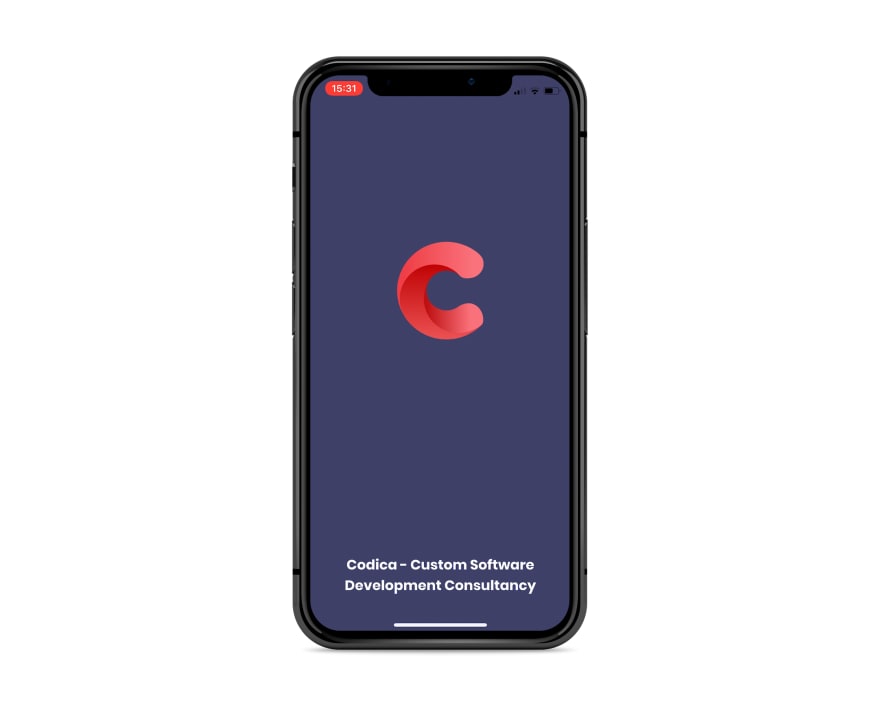
Here’s the splash screen of Codica’s PWA:
Tip 5. Create an attractive home screen icon
Users add progressive web applications to Home Screen where they live with other apps. It means that your PWA should have a unique and catching icon to be noticed.
Let’s discuss why the icon design is so important. Look at three PWAs from left to right that are Washington Post, Codica, The New Yorker. You will definitely agree that Codica and The New Yorker icons catch your eye.
At the same time, the Washington Post icon which is just a black square looks dull and boring.
Conclusion
To sum up, PWA design can be very close to a native app design. Still, it’s important to consider all the peculiarities of Progressive Web Apps, to bring great user experience, and create an app that people will love using.
We hope that our tips are useful and will help you in designing your own Progressive Web Apps.
For more tips, please read our original article Progressive Web App Design: 7 Tips for Great PWA UX and UI.


Top comments (0)