
Recently I took a second crack at CSS animations. The first time I looked into it, it simply looked like a cheap version of what you used to be able to do with flash. However I discovered that you can easily do simple animations that can captivate your audiance.
Table Of Contents
- Introduction
- Logo & Result
- HTML layout
- Building a flame
- Building the particle
- The flame animation
- The particle animation
- The glow animation
- Conclusion
Introduction
In this blog we will take a look at creating a simple animation to help dynammise a website. Movement attracts attention and thus CSS animations are perfect for captivating your audiance.
However remember to not do to many animations, the goal isn't to loose the audiance in this blog we will look at how to make an animated logo to captivate your audiance to look at it.
We will look at the animation I made on one of my temporary landing page. https://火.dev/
Logo & Result
Here is what the logo looks like:
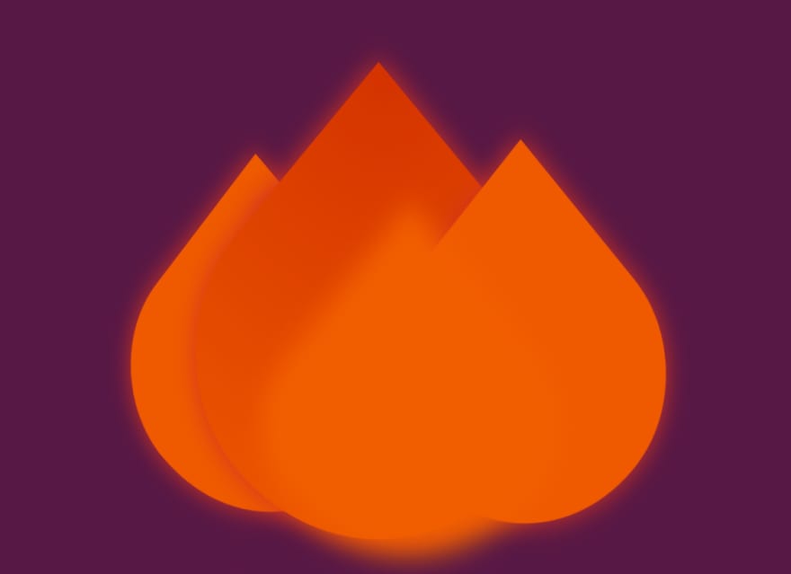
Here is what the logo will look like animated

HTML layout
<div class="fire">
    <div class="fire-left">
        <div class="main-fire"></div>
        <div class="particle-fire"></div>
    </div>
    <div class="fire-main">
        <div class="main-fire"></div>
        <div class="particle-fire"></div>
    </div>
    <div class="fire-right">
        <div class="main-fire"></div>
        <div class="particle-fire"></div>
    </div>
    <div class="fire-bottom">
        <div class="main-fire"></div>
    </div>
</div>
We can see here we have four fire components:
- The left flame
- The middle flame
- The right flame
- The bottom glow
Building a flame
We will take a look at the middle flame since the left and right are just a smaller version.
Here is the CSS code:
.fire-main {
    position: absolute;
    height: 100%;
    width: 100%;
    animation: scaleUpDown 3s ease-out;
    animation-iteration-count: infinite;
    animation-fill-mode: both;
}

.fire-main .main-fire {
    position: absolute;
    width: 100%;
    height: 100%;
    background-image: radial-gradient(farthest-corner at 10px 0, #d43300 0%, #ef5a00 95%);
    transform: scaleX(0.8) rotate(45deg);
    border-radius: 0 40% 60% 40%;
    filter: drop-shadow(0 0 10px #d43322);
}
fire-main being the parent div we make sure that it uses all the height and width of the parent div. It is also on this dive were we are casting the animation.
We say the animation should play for 3s and ease-out and that it should iterate for infinite.
main-fire is were we replicate the flame. This is quite simple. Using border-radius: 0 40% 60% 40%; we can create a nice tear drop we then finish the orientation and scaling with transform: scaleX(0.8) rotate(45deg);
Building the particle
To make the fire more realistic lets build some small particle that floats up.
.fire-main .particle-fire {
    position: absolute;
    top: 60%;
    left: 45%;
    width: 10px;
    height: 10px;
    background-color: #ef5a00;
    border-radius: 50%;
    filter: drop-shadow(0 0 10px #d43322);
    animation: particleUp 2s ease-out 0;
    animation-iteration-count: infinite;
    animation-fill-mode: both;
}
Since the width and height have the same value of 10px coupled with a border-radius: 50% it gives us a circle. adding a little drop-shadow to be able to really give a sense of depth.
The flame animation
The idea of the flam animation is pretty simple. We start off at the normal size we then make the flam grow taller then grow smaller while making it thinner.
@keyframes scaleUpDown {
    0%,
    100% {
        transform: scaleY(1) scaleX(1);
    }
    50%,
    90% {
        transform: scaleY(1.2);
    }
    75% {
        transform: scaleY(0.95);
    }
    80% {
        transform: scaleX(0.55);
    }
}
Let's take a look at this by time (percentage of animation completed):
-
0% the flame is scaled to
(1,1)(x,y) -
50% taller flame scaled to
(1, 1.2) -
75% smaller flame scaled to
(1, 0.95) -
80% thinner flame scaled to
(0.55, 0.95) -
90% taller flame scaled to
(0.55, 1.2) -
100% normal flame scaled to
(1,1)
The particle animation
The particle animation is pretty simple it is a simple going up animation mixed with some opacity changes.
@keyframes particleUp {
    0% {
        opacity: 0;
    }
    20% {
        opacity: 1;
    }
    80% {
        opacity: 1;
    }
    100% {
        opacity: 0;
        top: -100%;
        transform: scale(0.5);
    }
}
Let's take a look at this by time (percentage of animation completed):
-
0% the flame is invisible
opacity: 0; -
20% the flame is visible
opacity: 1; -
80% the flame is visible
opacity: 1; -
100% the flame moves to top
top: -100%;and is invisibleopacity: 0;and smallertransform: scale(0.5);
If you are not used to CSS animations you might be wondering why should we have the same line for 20% and 80%. WWell te way animations work are per the last change. Hence if I didnt have the 80% from 20% to 100% it would slowly change the opacity to 0. However if we want a faster opacity change and only at the end but saying at 80% that opacity: 1; then it will only become 0 between 80% and 100%
The glow animation
The last touch to this flame animation is the glow.
for this we have a very simple div with the following style:
.fire-bottom .main-fire {
    position: absolute;
    top: 30%;
    left: 20%;
    width: 75%;
    height: 75%;
    background-color: #ff7800;
    transform: scaleX(0.8) rotate(45deg);
    border-radius: 0 40% 100% 40%;
    filter: blur(10px);
    animation: glow 2s ease-out 0;
    animation-iteration-count: infinite;
    animation-fill-mode: both;
}
Most of this css is the same as the simple flame we saw above the main difference comes from filter: blur(10px); this will give a sligh blur to our flame shape.
Taking a look at the glow animation:
@keyframes glow {
    0%,
    100% {
        background-color: #ef5a00;
    }
    50% {
        background-color: #ff7800;
    }
}
we simply see that we change the color from a dark orange to light orange.
Conclusion
We can see that quite easily and using only HTML and CSS3 that we can really capture user attention to the logo. This can easily help with the branging. this can be used on a very simple login page for instance with either a two panel (logo left, login form right) or a simple logo above the login form.

Top comments (10)
How would you transition display: none and display: block property in CSS to animate in smooth. If not, what do you think the alternative solution for that?
In what sense ? many html items can be displayed in block could you give a simplified version of your html?
Thanks, man Your Code was helped on my blog I was Applied on Show and Hide Table of Content.
How to transition to show item 1,2,3 in nav in a smooth fashion. this pen.
Well the problem is CSS animations cant be applied to the display property.
However you can simply use opacity.
This pen
the importance is to make sure that show also adds
opacity:0;so that there is no flash of the div.We then use:
animation-iteration-countwill make sure it runs only once.animation-fill-modewill make sure that the last value in the animation is the last one keptopacity:1Transition and animation property in CSS works well with transform and opacity property in CSS. HTML page sees the content exist there and then apply the smooth animation.
But it does not show smooth animation when we change height: 0, to height: 50px, or display: none to block: none. What CSS property can cause this effect to make? this pen
As I said CSS animations don't apply to style.
There are too possibilities for your issue.
First one using
scaleY. You can simply transform the scaling of the Y axis in the animation like this:scaleY Pen
This however is still not smooth if you have text at the bottom.
The best I would recommend is using
flexYou can easily get a very fluid height movement for instance:
flex pen
Great..
Yes, yes, yes, YES. CSS animations are unsung heroes, and can do so much.
Yes totally agreed. But people should still be careful using them as they can still be heavy workload on the browser depending on the complexity of the animation