CustomTkinter is a powerful Python UI library that modernizes the traditional Tkinter framework with contemporary widgets, themes, and styling options.
This library allows developers to create visually appealing applications while maintaining the simplicity and cross-platform compatibility that made Tkinter popular.
This tutorial will guide you through CustomTkinter from basic concepts to advanced techniques, providing practical examples along the way.
Getting Started
Installation
Before diving into CustomTkinter, you need to install it. CustomTkinter is available on PyPI and can be installed using pip:
pip install customtkinter
First Application
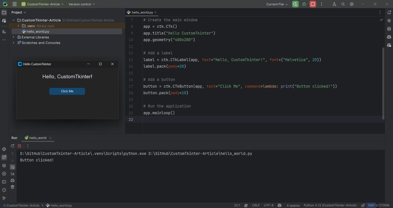
Let's create a simple "Hello World" application to get started:
import customtkinter as ctk

# Set appearance mode and default color theme
ctk.set_appearance_mode("dark")
ctk.set_default_color_theme("blue")

# Create the main window
app = ctk.CTk()
app.title("Hello CustomTkinter")
app.geometry("400x200")

# Add a label
label = ctk.CTkLabel(app, text="Hello, CustomTkinter!", font=("Helvetica", 20))
label.pack(pady=20)

# Add a button
button = ctk.CTkButton(app, text="Click Me", command=lambda: print("Button clicked!"))
button.pack(pady=10)

# Run the application
app.mainloop()
This simple code creates a window with a label and a button. When you click the button, "Button clicked!" will be printed to the console:
Core Concepts
Understanding the CTk Class
The CTk class is the CustomTkinter equivalent of Tkinter's Tk class. It creates the main window of your application. You can set the title, size, and other properties of your window using methods like title() and geometry().
app = ctk.CTk()
app.title("My Application")
app.geometry("800x600")  # Width x Height
app.resizable(width=True, height=True)  # Allow resizing
Event Loop
Just like in Tkinter, CustomTkinter applications run in an event loop. The event loop is started by calling the mainloop() method on your application window:
app.mainloop()
This method starts the event loop, which listens for user interactions (like button clicks) and updates the UI accordingly.
Widgets and Masters
In CustomTkinter, widgets (UI elements like buttons, labels, etc.) are created by specifying a "master" or parent widget.
The master is the container that will hold the widget. For top-level widgets, the master is usually the main window.
# The app is the master for this button
button = ctk.CTkButton(master=app, text="Click Me")
Basic Widgets
CTkLabel
Labels display text or images:
label = ctk.CTkLabel(
    master=app,
    text="This is a label",
    font=("Helvetica", 16),
    text_color="white",
    corner_radius=8
)
label.pack(pady=10)
CTkButton
Buttons perform actions when clicked:
def button_callback():
    print("Button clicked")

button = ctk.CTkButton(
    master=app,
    text="Click Me",
    command=button_callback,
    width=120,
    height=32,
    border_width=0,
    corner_radius=8,
    hover=True
)
button.pack(pady=10)
CTkEntry
Entry widgets allow users to input text:
entry = ctk.CTkEntry(
    master=app,
    placeholder_text="Type something...",
    width=200,
    height=30,
    border_width=2,
    corner_radius=10
)
entry.pack(pady=10)

# To get the text from the entry:
def get_text():
    text = entry.get()
    print(f"Entry contains: {text}")

get_button = ctk.CTkButton(master=app, text="Get Text", command=get_text)
get_button.pack(pady=5)
CTkCheckBox
Checkboxes allow users to make binary choices:
checkbox_var = ctk.StringVar(value="off")

def checkbox_event():
    print(f"Checkbox is {checkbox_var.get()}")

checkbox = ctk.CTkCheckBox(
    master=app,
    text="Check me",
    command=checkbox_event,
    variable=checkbox_var,
    onvalue="on",
    offvalue="off"
)
checkbox.pack(pady=10)
CTkRadioButton
Radio buttons allow users to select one option from a group:
radio_var = ctk.IntVar(value=0)

def radiobutton_event():
    print(f"Selected option: {radio_var.get()}")

radio1 = ctk.CTkRadioButton(
    master=app,
    text="Option 1",
    command=radiobutton_event,
    variable=radio_var,
    value=1
)
radio1.pack(pady=5)

radio2 = ctk.CTkRadioButton(
    master=app,
    text="Option 2",
    command=radiobutton_event,
    variable=radio_var,
    value=2
)
radio2.pack(pady=5)
CTkSwitch
Switches provide a modern alternative to checkboxes:
switch_var = ctk.StringVar(value="off")

def switch_event():
    print(f"Switch is {switch_var.get()}")

switch = ctk.CTkSwitch(
    master=app,
    text="Toggle me",
    command=switch_event,
    variable=switch_var,
    onvalue="on",
    offvalue="off"
)
switch.pack(pady=10)
CTkSlider
Sliders allow users to select a value from a range:
def slider_event(value):
    print(f"Slider value: {value}")

slider = ctk.CTkSlider(
    master=app,
    from_=0,
    to=100,
    command=slider_event,
    width=200
)
slider.pack(pady=10)
slider.set(50)  # Set initial value
CTkProgressBar
Progress bars visualize the completion status of a task:
progress_bar = ctk.CTkProgressBar(
    master=app,
    width=200,
    height=15,
    corner_radius=5
)
progress_bar.pack(pady=10)
progress_bar.set(0.5)  # Set to 50%
Layouts and Containers
CTkFrame
Frames are containers that group and organize other widgets:
frame = ctk.CTkFrame(
    master=app,
    width=200,
    height=200,
    corner_radius=10,
    border_width=2
)
frame.pack(pady=20, padx=20, fill="both", expand=True)

# Add widgets to the frame
label = ctk.CTkLabel(master=frame, text="Frame Content")
label.pack(pady=10)

button = ctk.CTkButton(master=frame, text="Frame Button")
button.pack(pady=10)
Layout Managers
CustomTkinter supports all standard Tkinter layout managers:
Pack: The pack geometry manager arranges widgets in blocks:
button1 = ctk.CTkButton(app, text="Top")
button1.pack(side="top", fill="x", padx=10, pady=5)

button2 = ctk.CTkButton(app, text="Bottom")
button2.pack(side="bottom", fill="x", padx=10, pady=5)
Grid: The grid geometry manager arranges widgets in a table-like structure:
for i in range(3):
    for j in range(3):
        button = ctk.CTkButton(app, text=f"Button {i},{j}")
        button.grid(row=i, column=j, padx=5, pady=5, sticky="nsew")

# Configure grid weights to make it responsive
for i in range(3):
    app.grid_columnconfigure(i, weight=1)
    app.grid_rowconfigure(i, weight=1)
Place: The place geometry manager places widgets at absolute positions:
button = ctk.CTkButton(app, text="Placed Button")
button.place(relx=0.5, rely=0.5, anchor="center")
CTkTabview
Tabview allows you to create tabbed interfaces:
tabview = ctk.CTkTabview(master=app, width=400, height=300)
tabview.pack(padx=20, pady=20, fill="both", expand=True)

# Create tabs
tab1 = tabview.add("Tab 1")
tab2 = tabview.add("Tab 2")
tab3 = tabview.add("Tab 3")

# Add widgets to tabs
ctk.CTkLabel(master=tab1, text="Content of Tab 1").pack(pady=20)
ctk.CTkLabel(master=tab2, text="Content of Tab 2").pack(pady=20)
ctk.CTkLabel(master=tab3, text="Content of Tab 3").pack(pady=20)
Theming and Appearance
Appearance Modes
CustomTkinter supports light and dark modes:
# Set to "light" or "dark"
ctk.set_appearance_mode("dark")

# Create a button to toggle between modes
def toggle_appearance_mode():
    if ctk.get_appearance_mode() == "dark":
        ctk.set_appearance_mode("light")
    else:
        ctk.set_appearance_mode("dark")

mode_button = ctk.CTkButton(
    master=app,
    text="Toggle Light/Dark Mode",
    command=toggle_appearance_mode
)
mode_button.pack(pady=10)
Color Themes
CustomTkinter comes with several color themes:
# Set the default color theme
ctk.set_default_color_theme("blue")  # Options: blue (default), green, dark-blue
Custom Widget Styling
Each widget can be styled individually:
button = ctk.CTkButton(
    master=app,
    text="Custom Button",
    fg_color="#FF5733",       # Button color
    hover_color="#CC4628",    # Color when hovered
    text_color="#FFFFFF",     # Text color
    border_color="#000000",   # Border color
    border_width=2,           # Border width
    corner_radius=10          # Corner roundness
)
button.pack(pady=10)
Advanced Widgets
CTkScrollableFrame
A frame with scroll capabilities:
scrollable_frame = ctk.CTkScrollableFrame(
    master=app,
    width=300,
    height=200,
    label_text="Scrollable Content"
)
scrollable_frame.pack(pady=20, padx=20, fill="both", expand=True)

# Add many widgets to demonstrate scrolling
for i in range(20):
    button = ctk.CTkButton(master=scrollable_frame, text=f"Button {i}")
    button.pack(pady=5, padx=10, fill="x")
CTkTextbox
A multi-line text entry widget:
textbox = ctk.CTkTextbox(
    master=app,
    width=400,
    height=200,
    corner_radius=10,
    border_width=2
)
textbox.pack(pady=20, padx=20, fill="both", expand=True)

# Insert some text
textbox.insert("1.0", "This is a multi-line textbox.\nYou can write multiple lines of text here.")

# To get the text
def get_textbox_content():
    content = textbox.get("1.0", "end-1c")
    print(f"Textbox contains:\n{content}")

get_text_button = ctk.CTkButton(master=app, text="Get Text", command=get_textbox_content)
get_text_button.pack(pady=10)
CTkComboBox
A dropdown selection widget:
def combobox_callback(choice):
    print(f"Selected: {choice}")

combobox = ctk.CTkComboBox(
    master=app,
    values=["Option 1", "Option 2", "Option 3"],
    command=combobox_callback,
    width=200
)
combobox.pack(pady=10)
combobox.set("Option 1")  # Set initial value
CTkOptionMenu
Another type of dropdown menu:
def optionmenu_callback(choice):
    print(f"Selected option: {choice}")

optionmenu = ctk.CTkOptionMenu(
    master=app,
    values=["Option A", "Option B", "Option C"],
    command=optionmenu_callback,
    width=200
)
optionmenu.pack(pady=10)
optionmenu.set("Option A")  # Set initial value
Responsive Design
Window Resizing
To make your application responsive, configure the layout to adjust when the window size changes:
app = ctk.CTk()
app.title("Responsive Layout")
app.geometry("600x400")

# Configure grid with weights
app.grid_columnconfigure(0, weight=1)
app.grid_columnconfigure(1, weight=3)
app.grid_rowconfigure(0, weight=1)

# Create a sidebar frame
sidebar = ctk.CTkFrame(master=app, width=200)
sidebar.grid(row=0, column=0, padx=10, pady=10, sticky="nsew")

# Create main content frame
content = ctk.CTkFrame(master=app)
content.grid(row=0, column=1, padx=10, pady=10, sticky="nsew")

# Configure sidebar layout
sidebar.grid_rowconfigure(0, weight=0)  # Don't expand title
sidebar.grid_rowconfigure(1, weight=1)  # Expand menu
sidebar.grid_columnconfigure(0, weight=1)

# Add some widgets to the sidebar
sidebar_title = ctk.CTkLabel(
    master=sidebar,
    text="Sidebar",
    font=("Helvetica", 20)
)
sidebar_title.grid(row=0, column=0, padx=10, pady=10)

menu_frame = ctk.CTkFrame(master=sidebar)
menu_frame.grid(row=1, column=0, padx=10, pady=10, sticky="nsew")

# Add some buttons to menu
for i in range(5):
    button = ctk.CTkButton(master=menu_frame, text=f"Menu Item {i+1}")
    button.pack(pady=5, padx=10, fill="x")

# Configure content layout
content.grid_columnconfigure(0, weight=1)
content.grid_rowconfigure(0, weight=0)  # Title doesn't expand
content.grid_rowconfigure(1, weight=1)  # Content area expands

# Add content
content_title = ctk.CTkLabel(
    master=content,
    text="Main Content",
    font=("Helvetica", 24)
)
content_title.grid(row=0, column=0, padx=20, pady=20)

content_text = ctk.CTkTextbox(master=content, width=400, height=200)
content_text.grid(row=1, column=0, padx=20, pady=20, sticky="nsew")
content_text.insert("1.0", "This is the main content area.\nIt will resize with the window.")
Dynamic UI Updates
You can update the UI based on window size changes by binding to the <Configure> event:
def on_resize(event):
    # Get current window width
    width = app.winfo_width()

    # Adjust UI based on width
    if width < 600:
        # Compact layout for small windows
        title_label.configure(font=("Helvetica", 16))
    else:
        # Normal layout for larger windows
        title_label.configure(font=("Helvetica", 24))

# Create a title label
title_label = ctk.CTkLabel(
    master=app,
    text="Responsive Title",
    font=("Helvetica", 24)
)
title_label.pack(pady=20)

# Bind the resize event
app.bind("<Configure>", on_resize)
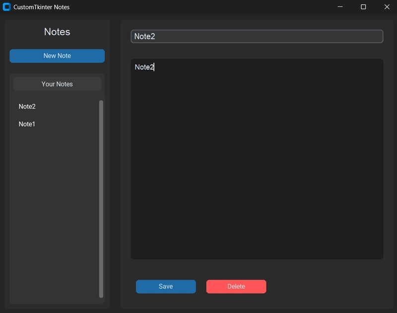
Building a Complete Application
Let's put everything together and build a simple note-taking application:
import customtkinter as ctk
import json
import os
from datetime import datetime

class NoteApp:
    def __init__(self, root):
        self.root = root
        self.root.title("CustomTkinter Notes")
        self.root.geometry("800x600")

        # Set appearance and theme
        ctk.set_appearance_mode("dark")
        ctk.set_default_color_theme("blue")

        # File to store notes
        self.notes_file = "notes.json"
        self.notes = self.load_notes()
        self.current_note = None

        # Create UI
        self.create_ui()

    def create_ui(self):
        # Configure grid layout
        self.root.grid_columnconfigure(0, weight=1)
        self.root.grid_columnconfigure(1, weight=3)
        self.root.grid_rowconfigure(0, weight=1)

        # Create sidebar for note list
        self.sidebar = ctk.CTkFrame(master=self.root)
        self.sidebar.grid(row=0, column=0, padx=10, pady=10, sticky="nsew")

        # Configure sidebar grid
        self.sidebar.grid_columnconfigure(0, weight=1)
        self.sidebar.grid_rowconfigure(0, weight=0)  # Title
        self.sidebar.grid_rowconfigure(1, weight=0)  # New note button
        self.sidebar.grid_rowconfigure(2, weight=1)  # Note list

        # Sidebar title
        sidebar_title = ctk.CTkLabel(
            master=self.sidebar,
            text="Notes",
            font=("Helvetica", 20)
        )
        sidebar_title.grid(row=0, column=0, padx=10, pady=10)

        # New note button
        new_note_button = ctk.CTkButton(
            master=self.sidebar,
            text="New Note",
            command=self.new_note
        )
        new_note_button.grid(row=1, column=0, padx=10, pady=10, sticky="ew")

        # Note list (scrollable)
        self.note_list_frame = ctk.CTkScrollableFrame(
            master=self.sidebar,
            label_text="Your Notes"
        )
        self.note_list_frame.grid(row=2, column=0, padx=10, pady=10, sticky="nsew")

        # Create main content area
        self.content = ctk.CTkFrame(master=self.root)
        self.content.grid(row=0, column=1, padx=10, pady=10, sticky="nsew")

        # Configure content grid
        self.content.grid_columnconfigure(0, weight=1)
        self.content.grid_rowconfigure(0, weight=0)  # Title input
        self.content.grid_rowconfigure(1, weight=1)  # Note content
        self.content.grid_rowconfigure(2, weight=0)  # Buttons

        # Note title input
        self.title_var = ctk.StringVar()
        self.title_entry = ctk.CTkEntry(
            master=self.content,
            placeholder_text="Note Title",
            textvariable=self.title_var,
            font=("Helvetica", 16),
            width=400
        )
        self.title_entry.grid(row=0, column=0, padx=20, pady=20, sticky="ew")

        # Note content textbox
        self.content_textbox = ctk.CTkTextbox(
            master=self.content,
            width=600,
            height=400,
            font=("Helvetica", 14)
        )
        self.content_textbox.grid(row=1, column=0, padx=20, pady=10, sticky="nsew")

        # Button frame
        button_frame = ctk.CTkFrame(master=self.content, fg_color="transparent")
        button_frame.grid(row=2, column=0, padx=20, pady=20, sticky="ew")

        # Save and delete buttons
        self.save_button = ctk.CTkButton(
            master=button_frame,
            text="Save",
            command=self.save_note,
            width=120
        )
        self.save_button.grid(row=0, column=0, padx=10, pady=10)

        self.delete_button = ctk.CTkButton(
            master=button_frame,
            text="Delete",
            command=self.delete_note,
            fg_color="#FF5555",
            hover_color="#AA3333",
            width=120
        )
        self.delete_button.grid(row=0, column=1, padx=10, pady=10)

        # Populate note list
        self.update_note_list()

        # Initially disable delete button if no note is selected
        self.delete_button.configure(state="disabled")

    def load_notes(self):
        if os.path.exists(self.notes_file):
            try:
                with open(self.notes_file, "r") as f:
                    return json.load(f)
            except:
                return {}
        return {}

    def save_notes_to_file(self):
        with open(self.notes_file, "w") as f:
            json.dump(self.notes, f, indent=4)

    def update_note_list(self):
        # Clear existing list
        for widget in self.note_list_frame.winfo_children():
            widget.destroy()

        # Add notes to list
        if not self.notes:
            no_notes_label = ctk.CTkLabel(
                master=self.note_list_frame,
                text="No notes yet",
                text_color="gray"
            )
            no_notes_label.pack(pady=10)
        else:
            for note_id, note in sorted(self.notes.items(), key=lambda x: x[1]["timestamp"], reverse=True):
                note_button = ctk.CTkButton(
                    master=self.note_list_frame,
                    text=note["title"] if note["title"] else "Untitled",
                    command=lambda id=note_id: self.load_note(id),
                    fg_color="transparent",
                    text_color=("black", "white"),
                    hover_color=("gray90", "gray20"),
                    anchor="w",
                    height=30
                )
                note_button.pack(pady=2, padx=5, fill="x")

    def new_note(self):
        # Clear inputs
        self.title_var.set("")
        self.content_textbox.delete("1.0", "end")

        # Create new note ID
        self.current_note = datetime.now().strftime("%Y%m%d%H%M%S")

        # Enable save button, disable delete button
        self.save_button.configure(state="normal")
        self.delete_button.configure(state="disabled")

    def load_note(self, note_id):
        if note_id in self.notes:
            self.current_note = note_id
            note = self.notes[note_id]

            # Set title and content
            self.title_var.set(note["title"])
            self.content_textbox.delete("1.0", "end")
            self.content_textbox.insert("1.0", note["content"])

            # Enable buttons
            self.save_button.configure(state="normal")
            self.delete_button.configure(state="normal")

    def save_note(self):
        if self.current_note:
            title = self.title_var.get()
            content = self.content_textbox.get("1.0", "end-1c")

            # Save to notes dictionary
            self.notes[self.current_note] = {
                "title": title,
                "content": content,
                "timestamp": datetime.now().strftime("%Y-%m-%d %H:%M:%S")
            }

            # Save to file
            self.save_notes_to_file()

            # Update note list
            self.update_note_list()

            # Enable delete button
            self.delete_button.configure(state="normal")

    def delete_note(self):
        if self.current_note and self.current_note in self.notes:
            # Remove from dictionary
            del self.notes[self.current_note]

            # Save to file
            self.save_notes_to_file()

            # Update note list
            self.update_note_list()

            # Clear inputs and disable buttons
            self.title_var.set("")
            self.content_textbox.delete("1.0", "end")
            self.current_note = None
            self.save_button.configure(state="disabled")
            self.delete_button.configure(state="disabled")

if __name__ == "__main__":
    app = ctk.CTk()
    note_app = NoteApp(app)
    app.mainloop()
Running the application:
Best Practices
Structure and Organization
- Use Classes: Organize your application using classes to keep code modular and maintainable.
- Separate Logic from UI: Keep your UI code separate from your business logic.
- Use Functions for Repeated UI Elements: Create functions for UI elements that you use repeatedly.
Performance
- Limit Widget Creation: Don't create widgets dynamically in loops if avoidable, as it can impact performance.
-
Use after() Method: For tasks that need to be executed periodically, use the
after()method instead of while loops. - Avoid Global Variables: Use class attributes or function parameters instead of global variables.
UI Design
-
Consistent Spacing: Use consistent padding and margins (e.g.,
padx=10, pady=10). - Group Related Elements: Use frames to group related elements.
- Responsive Design: Make your UI responsive using grid weights or dynamic reconfiguration.
- Provide Feedback: Give users feedback when operations are completed, such as showing a message or changing a UI element.
Troubleshooting
Common Issues
- Widget Not Showing: Ensure you've called a geometry manager (pack, grid, place).
- Inconsistent Appearance: Make sure you've set the appearance mode consistently.
- Widgets Overlap: Don't mix different geometry managers (pack, grid, place) in the same container.
- Performance Issues: Check if you're creating too many widgets or running heavy operations in the main thread.
Debugging Tips
- Print Statements: Add print statements to track the flow of your application.
-
Widget Information: Use
winfo_methods to get information about widgets. - Event Binding: Bind to events to track when they occur.
def debug_event(event):
    print(f"Event triggered: {event}")

button.bind("<Button-1>", debug_event)  # Left mouse button click
Conclusion
CustomTkinter brings modern UI capabilities to Python desktop applications while maintaining the simplicity and cross-platform compatibility of Tkinter.
With the widgets, styling options, and layout techniques covered in this tutorial, you can create attractive and functional applications that provide a great user experience.
Follow me on Twitter: https://twitter.com/DevAsService
Follow me on Instagram: https://www.instagram.com/devasservice/
Follow me on TikTok: https://www.tiktok.com/@devasservice
Follow me on YouTube: https://www.youtube.com/@DevAsService

Top comments (2)
thanks great help, need more tutorials for CustomTK
Thanks. I might do another one in the future. Exploring also different UI libraries, like Flet.