
To expose JavaScript variables to the UI I came up with a quick automated solution. With a combination of JavaScripts typeof operator, Svelte and the HTML Input tag I was able to auto generate a settings panel for primitive data types.
How?
Let's say we have a settings object like this:
const settings: {
  amount: number,
  lengthScale: number,
  lineWidth: number,
  randomColors: boolean
}
Which controls the settings for the following drawing:

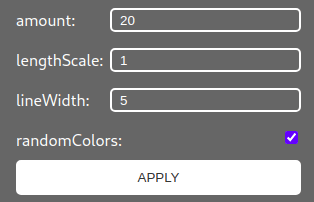
This drawing is displayed in the parent component. To edit and display the settings object we build a child component in Svelte named 'SettingsPanel' wich receives the settings as parameter. In the component we then use Sveltes '#each' operator to iterate over the settings keys.
<script lang="ts">
  export let settings;
</script>

<div class="panel-container">
  {#each Object.keys(settings) as key}
    <div class="panel-item">
      {key}: {settings[key]}
    </div>
  {/each}
</div>
This will only result in a list of the settings so let's map an input field to the settings type. To do this we use the typeof operator:
<div class="panel-item">
  <label for={key}>{key}:</label>
  {#if typeof settings[key] === 'boolean'}
    <input type="checkbox" bind:checked={settings[key]} id={key} />
  {:else if typeof settings[key] === 'number'}
    <input type="number" bind:value={settings[key]} id={key} />
  {:else}
    <input type="text" bind:value={settings[key]} id={key} />
  {/if}
</div>
If you want the parent component to react on the changed settings you can simply emit an event on the click of a button:
<script lang="ts">
  import { createEventDispatcher } from "svelte";
  const dispatch = createEventDispatcher();
  function apply() {
    dispatch("apply");
  }

  export let settings;
</script>
<!-- ... -->
<button on:click={apply}>apply</button>
Some styles could be added to the panel to make it look a bit better. Notice how the 'input[type="number"]' selector is used to style only the specified inputs:
.panel-container {
  justify-content: space-between;
  border-radius: 10px 0 0 10px;
}
.panel-item {
  display: flex;
  justify-content: space-between;
  margin: 0.5rem 0;
}
button {
  margin-bottom: 0.5rem;
  background-color: #fff;
  color: #333;
  border-color: #fff;
  border-style: solid;
  border-radius: 5px;
  padding: 0.5rem;
  text-transform: uppercase;
}
h3 {
  text-decoration: underline;
}
input[type="number"] {
  background: #666;
  color: #fff;
  border-color: #fff;
  border-style: solid;
  border-radius: 5px;
  padding-left: 0.5rem;
}
input[type="text"] {
  background: #666;
  color: #fff;
  border-color: #fff;
  border-style: solid;
  border-radius: 5px;
  padding-left: 0.5rem;
}
As a last step we import the SettingsPanel Component in the parent component, pass in the settings and react on an emitted event.
<script lang="ts">
  import SettingsPanel from "../components/SettingsPanel.svelte";
  const settings: {
    amount: number,
    lengthScale: number,
    lineWidth: number,
    randomColors: boolean
  };
  function apply() {
    // do something with new settings
    }
</script>
<SettingsPanel {settings} on:apply={apply} />
And there we have it. A simple automated settings panel for JS primitives with Svelte.
Creative Coding Workbench
This article is part of my progress for the Digital Ocean Hackathon Project 'Creative Coding Workbench':
Used features:
draw sketch on HTML canvasexpose sketch settings to UIexport sketch for print- toggle sketch animation
- save sketch to a library
- load sketch from a library
- edit sketch from a library
- ...
Used Technologies:
- Sapper
- Digitial Ocean App Platform
- ...
Stay tuned for updates on this project as there will be posts for each part of it.

Top comments (0)