
As the Covid-19 epidemic continues to rage throughout the United States, many Americans including myself have been sheltering in place for months. As the situation shows no sign of improvement in the forseeable future, I decided to use some of the ample available time to build my own version of a Covid-19 Dashboard.
I chose Laravel to build this project, as it contains tools for all of the tasks I needed to accomplish, including retrieving data from an API, crunching the numbers, storing everything in a database, and presenting the results using component based views.
My data source is the COVID Tracking Project, an organization described by its website as "made up of hundreds of volunteer data-gatherers, developers, scientists, reporters, designers, editors, and other dedicated contributors." Every day, data is collected from the states, territories, and District of Columbia, and posted on their website. Since the data is also made availabe through an API, my application can automatically update itself on a regular basis without any intervention on my part.
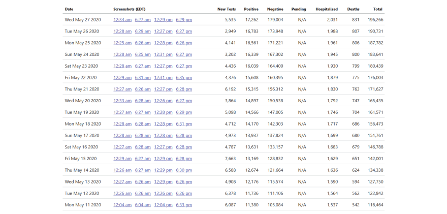
This image from their website shows the kind of state level data that is collected every day, including number of deaths, number of tests, and confirmed cases.
Overview
The home page of the application was created to provide a quick snapshot showing the state of the pandemic across the entire United States.
I realize that the USA is not the entire world, and so this app reflects only a small portion of the global pandemic. However, this is the country where I live, we currently have more cases than anywhere else, and so this is where I chose to focus my efforts.
The seven day average is my favorite measurement for trying to assess the current state of the coronavirus epidemic. It smooths out the highs and lows that result from lags in reporting, and allows you to see trends as they develop. Given the uncertain nature of data collection for this disease, the trends may offer more relevant information than any individual numbers.
By comparing the current seven day average to the seven day average from two weeks ago, you can get a pretty good idea as to how the number of covid-19 cases are improving or getting worse. I use this fourteen day percent change as the basis for building the application home page.
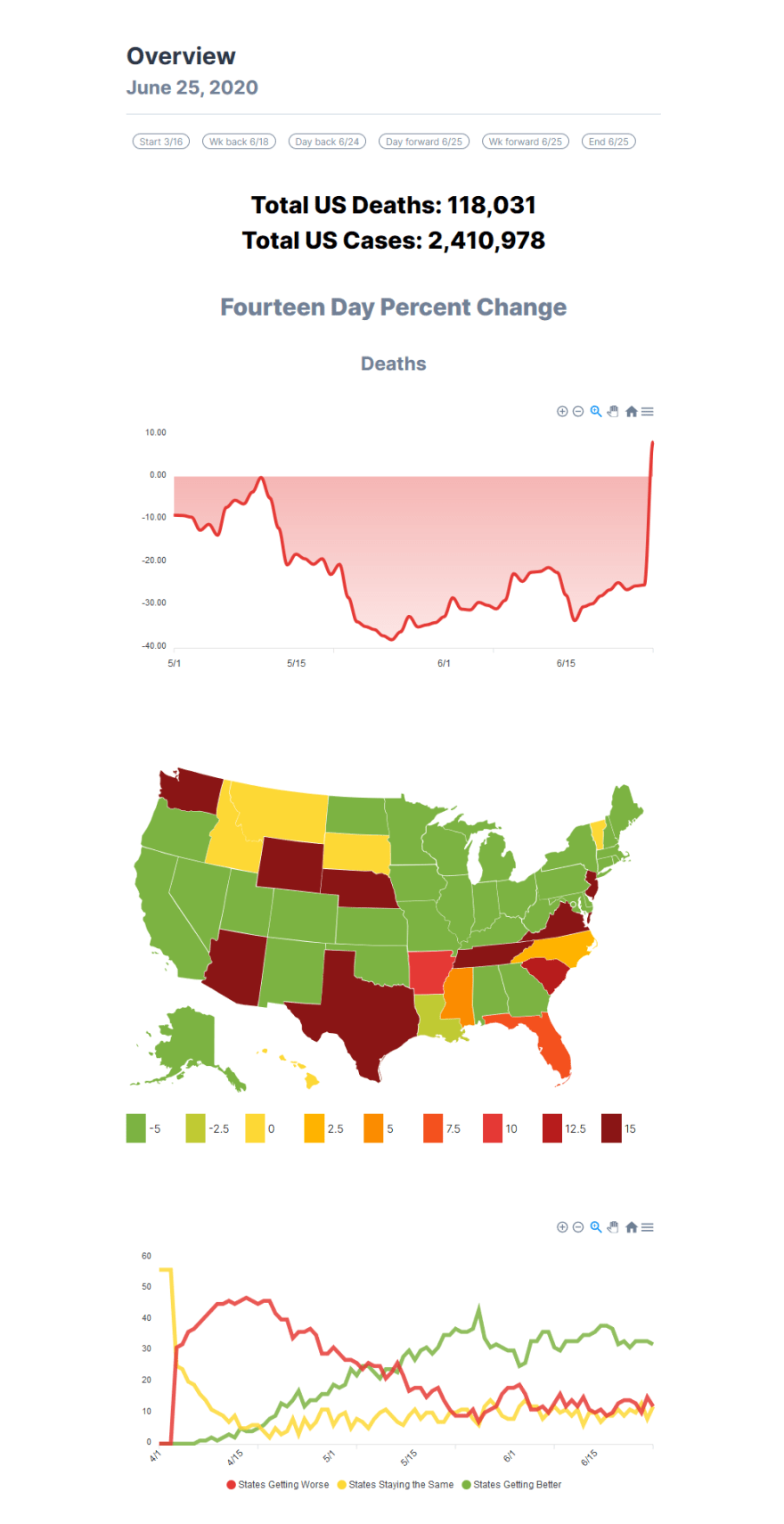
The page consists of the following graphs:
The first graph shows the fourteen day percent change for each day since May 1st, for the entire United States. An amount below zero indicates that the rate of deaths is declining. Ominously, on the day being reported here (June 25, 2020), the measure moved sharply into positive territory for the first time since the beginning of May, indicating a sudden rapid increase in the number of deaths.
The next chart is a color coded map showing the current day's percent change for each state, with bright green indicating improving numbers, and dark red indicating rapid deterioration. This map shows a definite pattern of worsening death rates across much of the southern USA.
Next, there is another graph showing the number of states where the death rate is currently improving, compared with the number of states where it is staying the same or getting worse.
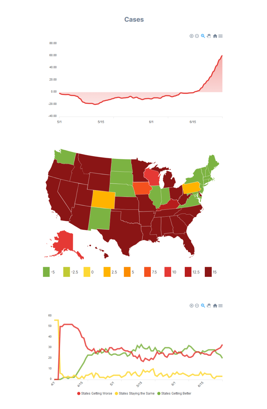
Finally, there are the same three charts, but this time showing the number of cases. You can see that there has been a rapid increase in the growth of new cases since the middle of May. At first this increase was confined to the southern states, then it started showing up in the western states, and it currently is beginning to trend negatively throughout the midwest.
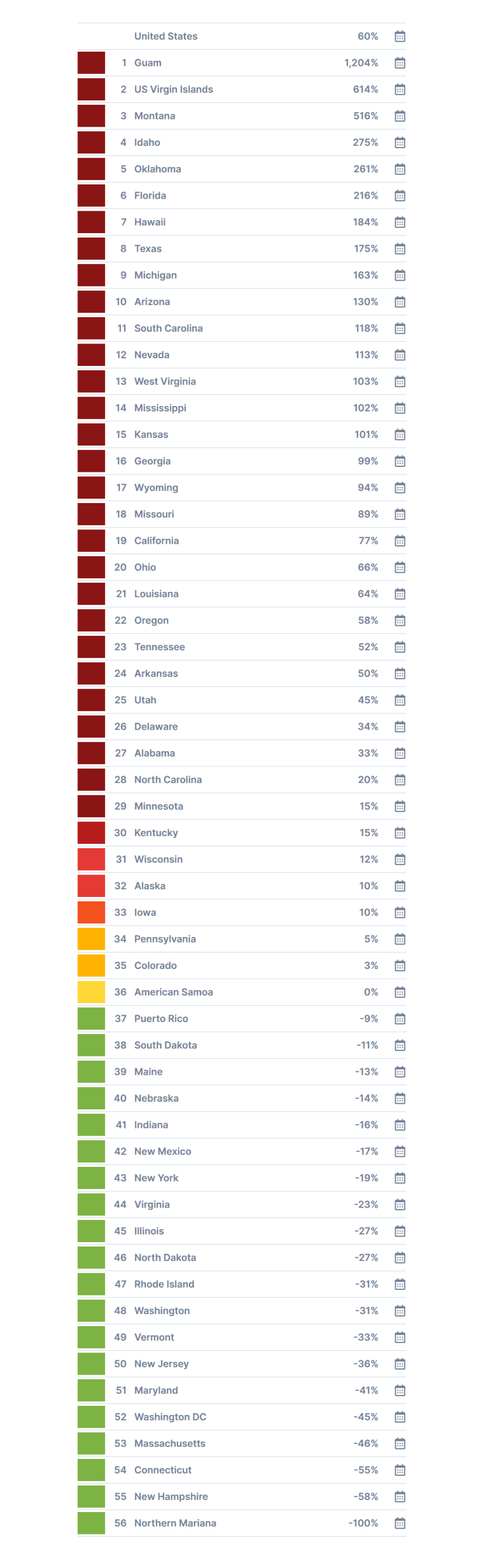
Below this is a table of each state (and territory) showing the current percent change in the number of new cases, again comparing the current day to the rate from two weeks previous.
Additional Information
There's a lot more information beyond this home page summary. Just about every item on every page is a link to further data, and it is easy to drill down and find more specifics for any particular state.
The following measurements are available for each state and territory, and for the country as a whole, for every day since the beginning of the epidemic.
How bad is the epidemic?
- total number of deaths
- total deaths per capita
- seven day total deaths
- seven day average deaths
- daily deaths
- total number of cases
- total cases per capita
- seven day total cases
- seven day average cases
- daily new cases
Is it getting better or worse?
- seven day deaths percent increase
- fourteen day trend (comparing the current seven day average number of deaths to the average from fourteen days ago)
- days for deaths to double (based on the seven day deaths increase, how many days until the entire number of deaths is twice as large as it is now)
- seven day cases percent increase
- fourteen day trend (comparing the current seven day average number of new cases to the average from fourteen days ago)
- days for cases to double (based on the seven day cases increase, how many days until the entire number of cases is twice as large as it is now)
Is there enough testing?
- number of tests
- number of tests per capita
- seven day tests
- seven day tests average
- daily tests
- percentage of positive tests (tests that find infected persons)
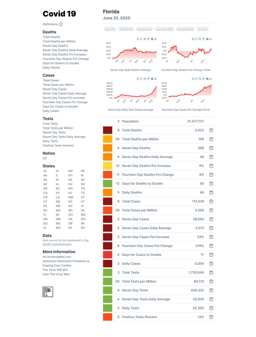
Here is what the State of Florida page looks like for May 25, 2020.
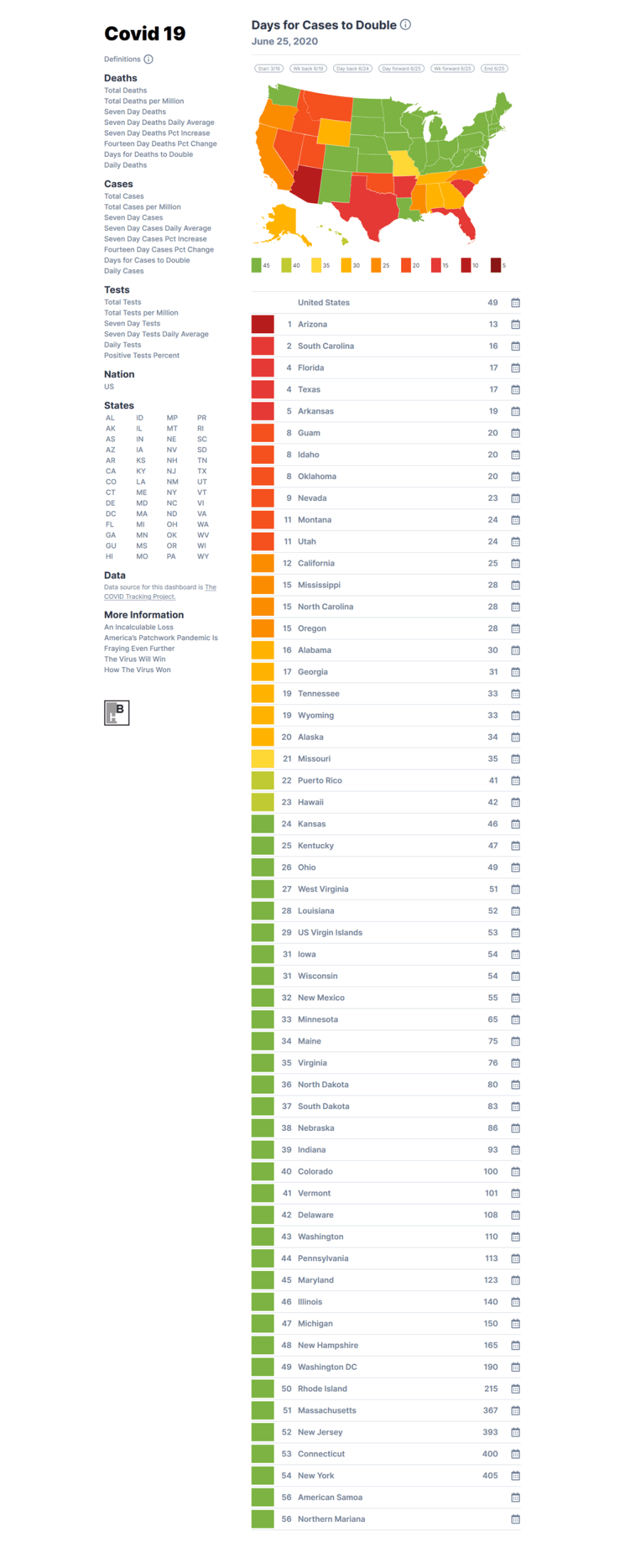
If you are on the Florida page and you click on Days for Cases to Double, you will be taken to the following screen, which shows the number of days it will take in each state for the number of cases to double from the current amount, based on the current rate of increase.
Back end
As I mentioned above, the entire project was built using Laravel.
Three times a day, Laravel automatically runs a job to query the COVID-Project API. The returned dataset is immediately loaded into a MySQL database.
Laravel then kicks off a series of jobs that transforms this basic data into the various measurements detailed above. The sequence of steps looks like this:
- The counts are compared to population size to arrive at per capita numbers.
- Seven day averages are computed.
- Seven day increase is computed.
- Seven day averages are compared to the seven day averages from 14 days earlier.
- Doubling rates are estimated, based on the previous seven day increase.
Finally, there are a number of steps that are executed to separate all of the statistics into categories and rankings. These make it easier to present the various data using color coded maps and sorted tables.
Front end components
The front end of the app was also built with Laravel, using the framework's easy to code and easy to maintain components. Here is how the components are structured for the Days for Cases to Double page shown above.
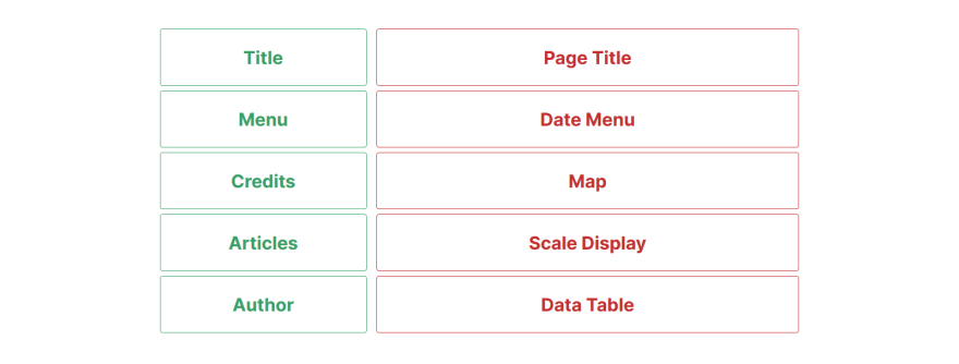
The components can then be arranged into a layout using Laravel Blade component tags.
<div class="grid grid-cols-3">
  <div class="col-span-1">
    <x-title />
    <x-menu />
    <x-credits />
    <x-articles />
    <x-author />
  </div>
  <div class="col-span-2">
    <x-pageTitle
      :pageTitle="$pageTitle"
      :date="$date"
      pageType="day"
      :path="$path"
    />
    <x-dateMenu :path="$path" />
    <x-map :stateData="$stateData" />
    <x-scaleDisplay :scale="$scale" />
    <x-dayDataTable
      :stateData="$stateData"
      :usData="$usData"
      :path="$path"
      :date="$date"
    />
  </div>
</div>
Some of the components used to build the project include:
- Maps - Using an open source SVG file availble on Wikipedia.
- Charts - Using Larapex Charts.
- Tables - Using plain HTML.
TailwindCSS was used for styling, and AlpineJs was used to add a little bit of JavaScript behavior, for things like hiding and displaying the menu on small screens.
Useful Techniques
This project demonstrates a number of useful techniques for using Laravel to create a data driven application. Some of these include:
- Creating jobs that automatically perform tasks, such as querying an api and updating a database, on a daily schedule
- Reading a CSV file and loading the information into a database
- Creating categories and assigning measurements to them
- Building components
- Making charts and graphs
- Creating a color coded map
- Using icons
- Adding a little bit of interactivity with Alpine js
Links to the app and code
If you are interested, the code for the app is available on Gitlab.
You can also check out a working version of the app here.
Thanks for your interest. Please stay safe, and wear a mask!

Top comments (0)