
Hello and welcome!! 🤩🤩
Today, we will get into what it is really about 🤣🤣 THE ALMIGHTY CSS
CSS is...

CSS is about to become the bane of your existence as a web developer.
CSS (Cascading Style Sheets) is the code that styles web content. Like HTML, CSS is not a programming language. It's not a markup language either. CSS is a style sheet language. CSS is what you use to selectively style HTML elements.
CSS, when added to HTML, is what gives all the color and style to a website. If you recall from our first HTML lesson, we had an example of what a website looks like with just pure HTML, that is, without any styling.
Let us get right into it!!! 🥳🥳🥳
Table of Contents
1. Different styles of writing CSS
2. CSS Syntax
3. CSS selectors
4. CSS Box Model
5. CSS Units
6. Some common CSS properties and their uses
7. CSS Layout
7.2. CSS Flex box
7.3. CSS Grid
8. Media Queries
9. Transitions and Animations
10. CSS Blend Modes
11. CSS Variables
11.4. Tailwind CSS
11.5. Bootstrap
11.6. Foundation CSS
11.7. Null JS
11.8. References
***NB: Remember, in our article, we discussed how to add a CSS file to our HTML document using the <link> element.
For those using a local IDE, for you to follow along with this lesson, you have to add the link to your Javascript file to your HTML document using the <link> element contained in our <head> element.***
What are the different styles of writing CSS?
There are three types of CSS, or three methods of including our CSS in the HTML document
Inline CSS
Internal or Embedded CSS
External CSS

Internal CSS
This features a <style> tag in the HTML document's <head> section. This CSS style is a good approach to styling individual pages.
We can use the internal CSS by embedding it in our HTML <head> element, like so
<head>
<!-- Insert boilerplate code -->
<style type="text/css">
body {
    background-color: black;
}
h1 {
    color: white;
    padding: 50px;
}
</style>
</head>
Inside here, we see that our CSS commands are written directly in our HTML. Don't worry about trying to understand the CSS for now. We will get into it shortly.
External CSS
In external CSS, we link the HTML to the external .css file, just as had learned in our Setting up the development environment article. This is a more efficient method for styling a website. By editing the .css file, we can change the whole site at once.
After creating the CSS file, we link it to the HTML document.
.xleftcol {
   float: right;
   width: 35%;
   background:#608800;
}
.xmiddlecol {
   float: right;
   width: 35%;
   background:#eff3df;
}
This is what a standard external CSS document looks like.
In-line CSS
Inline CSS is used to style a specific HTML element. Add a style attribute to each HTML tag without using the selectors. Managing a website may be difficult if we use only inline CSS. However, inline CSS in HTML is useful in some situations. In the following example, we have used the inline CSS in <p> and <h1> tag.
<!DOCTYPE html>
<html>
<!-- Insert boilerplate code -->
<body style="background-color:white;">
<h1 style="color:Red;padding:20px;">CSS Tutorials</h1>
<p style="color:blue;">It will be useful here.</p>
</body>
</html>
CSS Syntax: how to write your CSS code
CSS code, despite where it appears, whether as a stand-alone document or written in the HTML file, has a general syntax.
In CSS, we have the selector, the property being worked on, and the style value assigned to that selector.
Basically, selectors are representations of our HTML in our CSS code. CSS code is separated by semi-colons ; . In the image below, there are two CSS inputs separated by a semicolon. The color and font-size properties.
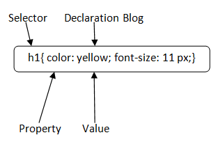
Is CSS code written in block letters?
CSS code is written with small letters, and compound words are hyphenated. Example: font-size.
What are CSS selectors?
CSS selectors are used to select the HTML element you want to style. Selectors are part of the CSS rule set. CSS selectors select HTML elements according to their id, class, type, attribute, etc.
Different types of selectors in CSS
CSS Element Selector
CSS Id Selector
CSS Class Selector
CSS Universal Selector
CSS Group Selector
CSS Element selector
The CSS element selector selects the HTML element by its name.
CSS Id selector
The CSS id selector selects a specific HTML element with its id attribute. An id is always unique within the page so it is chosen to select a single, unique element. It is written with the hash character (#), followed by the id attribute of the element.
CSS Class Selector
The CSS class selector selects HTML elements with a specific class attribute. It is used with a period character . (full stop symbol) followed by the class name.
There are other forms of selectors, that you can read up on Here.
What is the CSS Box Model
In CSS, the term "box model" is used when talking about design and layout. The CSS box model is essentially a box that wraps around every HTML element. It consists of: margins, borders, padding, and the actual content. The image below illustrates the box model:
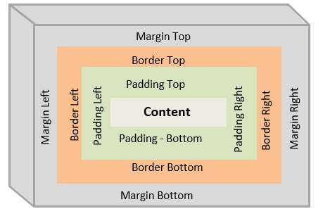
Different parts of the CSS box model
Content
The content of the box, where text and images appear
Padding in CSS
Clears an area around the content. The padding is transparent. The padding property can be modified using the, padding-left, padding-right, padding-top, and padding-bottom sub-properties.
Border in CSS
A border that goes around the padding and content. The border is transparent. The padding property can be modified using the, border-left, border-right, border-top, and border-bottom sub-properties.
Margin in CSS
Clears an area outside the border. The margin is transparent. The marginis transparent. The padding property can be modified using the, margin-left, margin-right, margin-top, and margin-bottom sub-properties.
What are the CSS Units?
CSS has several different units for expressing a length.
Many CSS properties take "length" values, such as width, margin, padding, font-size, etc. A length is a number followed by a length unit, such as 10px, 2em, etc.
Note: A whitespace cannot appear between the number and the unit. However, if the value is, 0, the unit can be omitted. For some CSS properties, negative lengths are allowed.
Read, and understand more about CSS units here.
Some common CSS properties and their uses
The CSS properties in the example above do not even begin to scratch the surface of all the CSS properties or sub-properties available for use.
CSS is all about styling, and with styling, there is so much you can do. This article does not cover all the possibilities available with CSS, but it will give you a great guide to figuring things out independently.
CSS Layout
What is Stacking context in CSS?
is a three-dimensional conceptualization of HTML elements along an imaginary z-axis relative to the user, who is assumed to be facing the viewport or the webpage. HTML elements occupy this space in priority order based on their attributes.*
CSS Position property
The CSS position property specifies the type of positioning method used for an element. There are five different position values: static, relative, fixed, absolute, and sticky.
Static position in CSS
HTML elements are positioned static by default. static position elements are not affected by the top, bottom, left, and right CSS properties. An element with position: static; is not positioned in any special way; it is always positioned according to the normal flow of the page.
Position Relative in CSS
An element with position: relative; is positioned relative to its normal position. Setting the top, right, bottom, and left properties of a relatively-positioned element will cause it to be adjusted away from its normal position.
Notice in the codepen above how we have been able to move the position of the green container.
Fixed position in CSS
An element with position: fixed; is positioned relative to the viewport, which means it always stays in the same place even if the page is scrolled. The top, right, bottom, and left properties are used to position the element. A fixed element does not leave a gap in the page where it would normally have been located.
In the example above, we notice that the h2 element is shown on our screen even when we scroll down past it.
Absolute position in CSS
An element with position: absolute; is positioned relative to the nearest positioned ancestor (instead of positioned relative to the viewport, like fixed). However, if an absolute positioned element has no positioned ancestors, it uses the document body, and moves along with page scrolling.
Note: absolute positioned elements are removed from the normal flow and can overlap elements.
In the example above, we see that the second container's position is being modified based on the position of the element preceding it.
Sticky position in CSS
An element with position: sticky; is positioned based on the user's scroll position. A sticky element toggles between relative and fixed, depending on the scroll position. It is positioned relative until a given offset position is met in the viewport - then it "sticks" in place (like position:fixed).
Note: Internet Explorer does not support sticky positioning. Safari requires a -webkit- prefix (see example below). You must also specify at least one of top, right, bottom or left for sticky positioning to work.
In the example above, we see that the green container has maintained a fixed position, regardless of our scrolling through the page.
What is the CSS Flex box
Flexbox is a powerful layout model that simplifies the creation of flexible and responsive layouts. It allows you to align and distribute elements within a container, making it easier to build complex designs. With properties like flex-direction, justify-content, and align-items, you can achieve versatile and dynamic layouts.
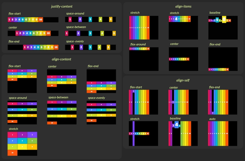
We can see how, in the example above, we were able to position our paragraphs next to each other, with ample space between them with just two lines of CSS. This is the power of the CSS flexbox. There is a lot more that can be done with the CSS flexbox.
What is the CSS Grid?
CSS Grid provides a two-dimensional layout system that enables precise control over rows and columns. It allows you to create complex grid structures and define the placement and sizing of elements. With features like grid templates, grid areas, and grid alignment, you can design sophisticated and visually appealing layouts.

Media Queries in CSS
Responsive web design is crucial in today's mobile-driven world. Media queries allow you to create responsive layouts that adapt to different screen sizes. By defining different CSS rules based on media query breakpoints, you can adjust the design, font sizes, and layouts to provide optimal user experiences across various devices. In my article about whether a developer should go with Mobile first or Desktop first website design, I talked a bit more about what responsive design is.
/* Example of a media query for responsive design */
@media screen and (max-width: 768px) {
  /* CSS rules for smaller screens */
  /* Adjust the layout, font sizes, etc. */
}
In the code block above, there is a sample syntax for writing a media query for a device whose maximum width is 768px. After defining your media breakpoint, you write your CSS code in between the curly braces as you would normal CSS. The properties you specify here will only take effect when the device width is at the specified value.
Transitions and Animations in CSS
With CSS, there are lots of cool and flashy stylings we can add to our website to make it more visually appealing. A cool way we can do this is by using CSS transitions and animations. You can go the extra mile by learning how to personally create these animations and transitions and even coming up with a few of your own. However, there are these packages called CSS transition libraries, which are other people's CSS transition or animation effects already written and ready for use. Here are a few:
There are a lot more transition and animation libraries available. You can even create your own! 😏😏
CSS Blend Modes
CSS blend modes offer creative possibilities by controlling how elements blend with the background or other elements. By applying blend modes to elements, you can create stunning overlays, image effects, and blending compositions. Some common blend mode values include multiply, screen, overlay, and soft-light.
In the codepen above, we can see the effect the different blend modes are having on the containers. Each container has a background color of red on a black body.
CSS Variables
CSS variables, also known as custom properties, introduce the concept of reusable values throughout your CSS codebase. By defining variables, you can easily change and update common values across your stylesheets, providing consistency and flexibility. CSS variables also allow you to create dynamic themes and styles by modifying variable values with JavaScript.
/* Example of defining and using a CSS variable */
:root {
  --primary-color: #007bff;
}

.my-element {
  color: var(--primary-color);
}
To round up this article, we will be looking at various CSS frameworks that are available for you to use to fasttrack your development experience.
In our Beginner CSS and Advanced CSS classes, we have learned the fundamentals of vanilla CSS and all that we need to style our website.
CSS frameworks to accelerate your development journey!
CSS frameworks are a bunch of relevant CSS code written by someone else or compiled by a team of people and made ready to use for the sole purpose of making styling a website faster, easier, and more straightforward.
There are many CSS frameworks available for web developers and designers to choose from, depending on need and convenience. I'd list a few. You can learn about a lot more that are relevant and in use in 2023 at CSS Frameworks 2023.
Bootstrap: is the most popular HTML, CSS, and JavaScript framework for developing responsive, mobile-first projects on the web.
Tailwind CSS: a utility-first CSS framework for rapid UI development.
Foundation CSS: is the most advanced responsive front-end framework in the world.
Null Js: is a free and open-source framework built only with HTML, CSS, and pure JavaScript, with no dependencies.
Material UI: this is a lightweight CSS framework that follows Google's Material Design guidelines.
98.css: CSS library for building interfaces that look like Windows 98.
TuiCss: Library to create MS-DOS interfaces.
For this tutorial, we will use Code Pen. To enable any of the CSS frameworks, go to the settings button on the CSS editor on your pen, search for the framework you want to use, and then enable it.
What is Tailwind CSS?
A utility-first CSS framework packed with classes like flex, pt-4, text-center and rotate-90 that can be composed to build any design, directly in your markup.
When installing Tailwind, you install, as said, a compilation of CSS code that has previously been written, to make the building of various style points easy.
Tailwind takes effect on your project by using certain class names that have already been pre-programmed into the compiled CSS code that you downloaded upon installation.
Information on Tailwind Css can be found on their website. When on a local IDE, tailwind is installed using the Node Package manager, npm.
See how fascinating this is! Without writing a single line of CSS, we have been able to style our website, although very poorly styled 🤣🤣🤣 This is the power and flexibility a CSS framework offers! To use Tailwind to style your website, you will need to have a good working knowledge of CSS, as most of the class names you will be modifying are vanilla CSS properties, although some have been shortened for readability. A full list of the things possible with Tailwind can be found on their documentation page. Of course, there are a lot more things you can do with Tailwind as regards styling your website. The above example was just to give a sneak peek into what is possible.
Note: Tailwind can be used in conjunction with normal vanilla CSS to achieve the exact styling you want.
What is Bootstrap CSS?
Bootstrap is a powerful, feature-packed front-end toolkit. Build anything—from prototype to production—in minutes. Bootstrap is unlike Tailwind in a lot of ways, one of the most prominent being that Bootstrap comes pre-styled. Much like Tailwind, Bootstrap also uses class names. However, with Bootstrap, you aren't just typing in vanilla CSS properties, you are copying their components directly.
Information on Bootstrap can be found on their website. In our local IDEs, we access Bootstrap using a CDN, Content Delivery Network.
<nav class="navbar navbar-expand-lg bg-body-tertiary">
  <div class="container-fluid">
    <a class="navbar-brand" href="#">Navbar</a>
    <button class="navbar-toggler" type="button" data-bs-toggle="collapse" data-bs-target="#navbarSupportedContent" aria-controls="navbarSupportedContent" aria-expanded="false" aria-label="Toggle navigation">
      <span class="navbar-toggler-icon"></span>
    </button>
    <div class="collapse navbar-collapse" id="navbarSupportedContent">
      <ul class="navbar-nav me-auto mb-2 mb-lg-0">
        <li class="nav-item">
          <a class="nav-link active" aria-current="page" href="#">Home</a>
        </li>
        <li class="nav-item">
          <a class="nav-link" href="#">Link</a>
        </li>
        <li class="nav-item dropdown">
          <a class="nav-link dropdown-toggle" href="#" role="button" data-bs-toggle="dropdown" aria-expanded="false">
            Dropdown
          </a>
          <ul class="dropdown-menu">
            <li><a class="dropdown-item" href="#">Action</a></li>
            <li><a class="dropdown-item" href="#">Another action</a></li>
            <li><hr class="dropdown-divider"></li>
            <li><a class="dropdown-item" href="#">Something else here</a></li>
          </ul>
        </li>
        <li class="nav-item">
          <a class="nav-link disabled">Disabled</a>
        </li>
      </ul>
      <form class="d-flex" role="search">
        <input class="form-control me-2" type="search" placeholder="Search" aria-label="Search">
        <button class="btn btn-outline-success" type="submit">Search</button>
      </form>
    </div>
  </div>
</nav>

We can see from the example above, how we were able to create a standard navigation bar skeleton. This was possible with Bootstrap's pre-styled navbar component. There are loads more components that you can use on Bootstrap (as seen on their website) to quickly build a responsive and styled website. Reading through the Bootstrap documentation, you can see how to further customize these components to suit your needs.
What is a Content Delivery Network (CDN)?
A content delivery network (CDN) is a geographically distributed group of servers that caches content close to end users. A CDN allows for the quick transfer of assets needed for loading Internet content, including HTML pages, JavaScript files, stylesheets, images, and videos.
Foundation CSS
However, very similar to Bootstrap, Foundation makes use of pre-styled components. Foundation for Sites was built to be the most advanced responsive front-end framework in the world.
Information on Foundation can be found on their website. Like Tailwind, Foundation is installed using the node package manager , npm.
In the codepen above, we see an example of a pre-styled progress bar. See how with just HTML, and the class names corresponding to the compiled CSS by Foundation, we have been able to build four different progress bars, with different colors. Of course, the filling of the progress bars will be moderated using Javascript. In our next class, we will be starting on Javascript!! 🥳🥳🥳
What is Null JS?
Information about Null Js can be found on their website.
Null JS is a free and open-source framework built only with HTML, CSS, and pure JavaScript, with no dependencies. It has a lot of pre-built components, and it allows developers to easily build small to medium websites. It is responsive, simple design, RTL-ready, easy to use, and well-documented.
    <form method="get" action="/">

        <div class="null-margin-bottom-20">
            <label class="null-color-main null-font-weight-bold null-display-block null-margin-bottom-10" for="firstName">
                First Name :
            </label>
            <input class="null-form-input" id="firstName" type="text"     name="firstName" required/>
            <span  class="null-form-error">First name is required</span>
        </div><!--End null-margin-bottom-20-->


        <div class="null-margin-bottom-20">
            <label class="null-color-main null-font-weight-bold null-display-block null-margin-bottom-10" for="lastName">
                Last Name :
            </label>
            <input class="null-form-input" id="lastName" type="text"     name="lastName" required/>
            <span  class="null-form-error">Last name is required</span>
        </div><!--End null-margin-bottom-20-->


        <div class="null-margin-bottom-20">
            <label class="null-color-main null-font-weight-bold null-display-block null-margin-bottom-10" for="email">
                Email :
            </label>
            <input class="null-form-input" id="email" type="text"     name="email" required/>
            <span  class="null-form-error">Email name is required</span>
        </div><!--End null-margin-bottom-20-->

        <div class="null-margin-bottom-20">
            <label class="null-color-main null-font-weight-bold null-display-block null-margin-bottom-10" for="number">
                Number :
            </label>
            <input class="null-form-input" id="number" type="number"    name="number" required/>
            <span  class="null-form-error">Number name is required</span>
        </div><!--End null-margin-bottom-20-->

        <div class="null-margin-bottom-20">
            <label class="null-color-main null-font-weight-bold null-display-block null-margin-bottom-10" for="password">
                Password :
            </label>
            <input class="null-form-input" id="password" type="password"     name="password" required/>
            <span  class="null-form-error">Password name is required</span>
        </div><!--End null-margin-bottom-20-->

    </form>

Above is a snippet of what we can do with Null Js. In the above snippet, we built a functional form page, using the pre-styled component from Null Js. As you read through the documentation, you will come across other components that you can use to efficiently and effectively style your website.
Hi, guys! We have come to the end of our lessons on CSS.

Top comments (2)
Woah, thank you so much for sharing this with us! This will definitely come in handy!
You're welcome. 😁