In the previous post, I mentioned that I used pen & paper to develop a system to stay productive and making sure all the daily tasks are aligned with a long term goal. Unfortunately, migrating a system from a paper to a digital version is not that straightforward.
I am not an expert in designing UI, but I did try my best and took inspiration from Dribbble. A few principles always kept in mind is that the design must be Clear & Simple. The designs are made with Figma for quick iterations.
Designing the “Goals” page
The main purpose of this page is to display long term goals. By my personal decision, a person should not have more than 2 long term goals at a time. But, maybe, in the future, I will be a productivity monster and I can take more than 2 goals. The page must accomplish the following things:
- indicate what page it is
- indicate how many goals a user can have in total
- display a list of all the goals
- display a due date for each goal
- have an action button to create a new goal
- have an action button to edit an existing goal
- have an action button to delete an existing goal

I decided for all the pages to simply have a big header with the title of the page and it helps to avoid an over-designing problem. Add Goal button is extremely prominent since it’s the main action of this page. Once the maximum number of goals is reached it will disappear.
Long terms goals shouldn’t be too long in terms of the number of words, however, it is still a great idea to have a goal box that is big enough to accommodate a long sentence. Available actions for a goal box are edit & delete. These are not the main features of the page, but they are available at a fingertip if required. And for reference, a due date of the goal is indicated at the top left corner. Any other goal information (if there will be any) I have determined not important and shouldn’t be displayed to avoid clutter.
Designing the “Weekly Planning” page
Once the user clicks on the goal, they will proceed to the current week’s planning. Once again, based on my own decision a person should not have more than 3 goals per week. This page is very similar to a Goal page with a few extra actions:
- indicate what page it is
- indicate a month and a week
- indicate how many tasks a user can have per week
- display a list of all the task for a week
- have an action button to create a new task
- have an action button to edit an existing task
- have an action button to delete an existing task
- navigation to past weeks
- navigation to the
Goalspage - navigation to the
Daily Planningpage

On a very important note, the sole purpose of this page is to plan, and that is why a task cannot be completed or rescheduled here. These actions will happen during a review step, which I will cover later.
From this page, a user should be able to quickly switch between a Weekly and Daily view more details of that particular week.
Designing the “Past Weekly Planning” page
Based on the scope, a completed project will act as a diary, so navigation “back in time” should still be present as well. While the page will still be called Weekly Planning the purpose is different:
- indicate the status of the task (completed, deleted, rescheduled)
- indicate the week is no longer editable
- no action button to create, update, delete a task

The only purpose of these pages is to view the past data, without an ability to edit to ensure that the history is preserved.
Designing the “Daily Planning” page
From the “Weeks Planning” the next step is to make plans for the day. The daily plan will have a limitation of 1 important task + 3 additional tasks per day. On top of that, a box to quickly write down notes during the day. A Daily Planning page will have the most information for display & must do:
- indicate what page it is
- indicate a day of the week
- indicate a date
- have an action button to add “the most important task” of the day
- have an action button to add “additional tasks”
- have an action button to edit tasks
- have an action button to delete tasks
- have an area to write down notes
- differentiate “the most important task” from “additional tasks”
- navigation to past days
- navigation to
Weekly Planning - have an action button to start a review process

This will be the most open page and the amount of information will be dense, so the interface must be clear & simple.
Designing the “Past Daily Planning” page
Navigation to the past days will be very similar to the navigation to the past weeks. The functionality on this page will be limited:
- indicate the status of the task (completed, deleted, rescheduled)
- indicate a day is no longer editable
- no action button to create, update, delete a task
- no action button to update notes

The same concept applies regarding the purpose of the page, to preserve history without the ability to alter it.
Designing the “Daily Review” page
When the day is finished, it is time to review what has been accomplished throughout the whole day. This can be achieved by clicking the End of Day button on the Daily Planning page. Few things require mentioning before proceeding any further.
This step is very crucial and it is a “must-do” step for every single working day. Without completing this step a user will not be allowed to proceed the next day.
The Daily Review page must accomplish the following things:
- indicate what page it is
- display a list of all the tasks planned for the day
- have an action button to complete a task
- have an action button to reschedule a task
- have an action button to delete a task
- have a text box to write down a quick summary or thought for the day
- have an action button to complete a review process
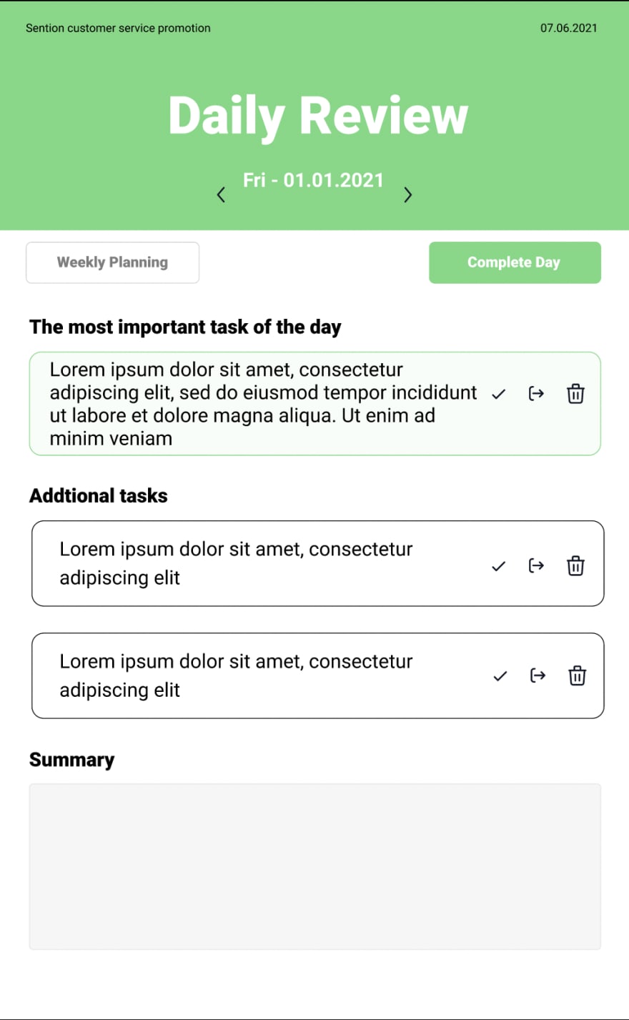
The page itself is simple, but the role it plays is very important. I can do ‘whatever I want, however, this step forces me to assert whether the tasks are aligned with a long term goal. It will also lock any further changes to the task and will become Past Daily Planning page.
Designing the “Weekly Review” page
At the end of the week, it will be a time to review the whole week and check the status of weekly tasks. Similar to the Daily Review page, the user won’t be able to proceed to the next week until the current week is reviewed.
The Weekly Review page must accomplish the following things:
- indicate what page it is
- display a list of all the tasks planned for the day
- have an action button to complete a task
- have an action button to reschedule a task
- have an action button to delete a task
- have a text box to write down a quick summary or thought for the day
- have an action button to complete a review process

There will be one small caveat, the Weekly Review page will only be accessible when the Friday day is reviewed.
Final thoughts
The design is still very rough and there is a high chance that I will change some things here and there along the way. On the good side, it should reduce the mental strain and speed up significantly the coding portion.
Overall, I am satisfied with how it looks like now, and all the improvements will come from actually trying to use it.
Like this? Buy me a coffee

Top comments (0)