Learn about stacking context
A stacking context is one of the topics that I find a bit difficult to get my head around; therefore, I think it makes a perfect topic to write about.
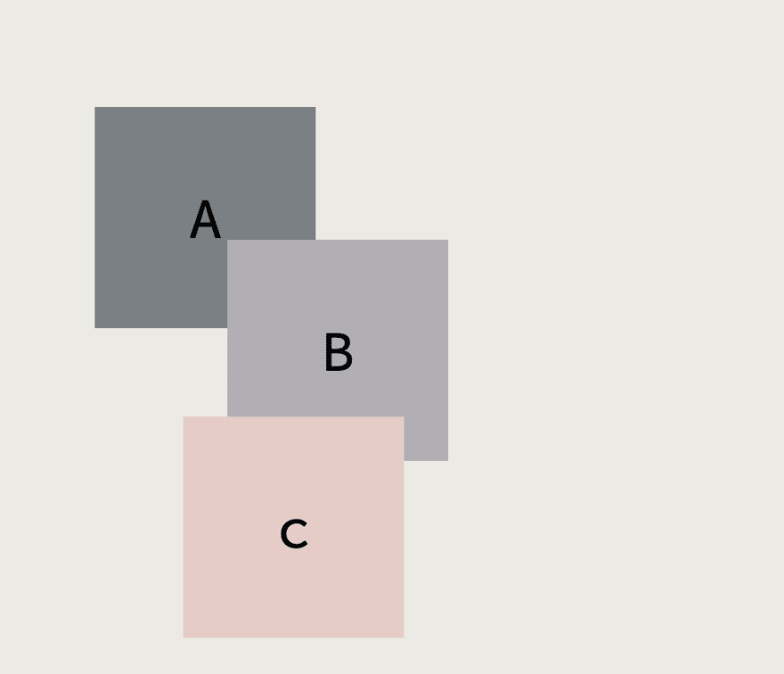
Considering this example, boxes A, B and C are all fixed positioned.
<body>
  <div class="box box-a">A</div>
  <div class="box box-b">B</div>
  <div class="box box-c">c</div>
</body>
.box {
  width: 250px;
  height: 250px;
  font-size: 4rem;
  display: flex;
  justify-content: center;
  align-items: center;
  position: fixed;
}

.box-a {
  background-color: var(--color-gray);
  top: 200px;
  left: 200px;
}

.box-b {
  background-color: var(--color-pewter);
  top: 350px;
  left: 350px;
}
.box-c {
  background-color: var(--color-seashell);
  top: 550px;
  left: 300px;
}
The result is not surprising, since all three elements are positioned fixed, the stacking order is determined by their DOM ordering, in this case, C comes after B, which comes after A, as a result, C is on top of B, which is on top of A.
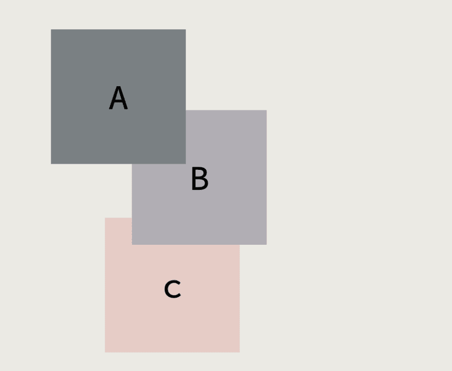
Now, suppose we somehow need to reverse their stacking over. One approach is simply to reverse their DOM ordering.
<body>
  <div class="box box-c">c</div>
  <div class="box box-b">B</div>
  <div class="box box-a">A</div>
</body>
This might not be the ideal approach, but it does get the job done.
A more suitable method is to use z-index to manually control the stacking order.
.box-a {
  ...
  z-index: 3;
}

.box-b {
  ...
  z-index: 2;
}

.box-c {
  ...
  z-index: 3;
}
Now consider another example, but this time rather than having all three elements in the layer(being siblings nodes), let's position box A within a blue container
<body>
  <div class="blue-container">
    <div class="box box-a">A</div>
  </div>
  <div class="box box-b">B</div>
  <div class="box box-c">c</div>
</body>
.blue-container {
  width: 60%;
  height: 300px;
  background-color: var(--color-blue-gray);
}
And then, a new requirement comes in, we are asked to make a decorative element on the top right of the blue container.
<body>
  <div class="blue-container">
    <div class="box box-a">A</div>
    <div class="circle"></div>
  </div>
  <div class="box box-b">B</div>
  <div class="box box-c">c</div>
</body>
.blue-container {
  width: 60%;
  height: 300px;
  background-color: var(--color-blue-gray);
  position: relative;
  overflow: hidden;
}

.circle {
  border-radius: 100%;
  background-color: var(--color-seashell);
  width: 250px;
  height: 250px;
  font-size: 4rem;
  display: flex;
  justify-content: center;
  align-items: center;
  position: absolute;
  top: -125px;
  right: -125px;
}
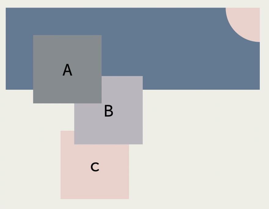
To make the circle appear on the top-right edge of the blue container, we have set the container to positive: relative.
After a while, we were asked to add another decorative element, a grey vertical bar.
<body>
  <div class="blue-container">
    <div class="box box-a">A</div>
    <div class="circle"></div>
  </div>
  <div class="box box-b">B</div>
  <div class="box box-c">c</div>
  <div class="verticalbar"></div>
</body>
.verticalbar {
  width: 35%;
  height: 100px;
  background-color: var(--color-dark-gray);
  position: fixed;
  left: 400px;
  transform: rotate(90deg);
}
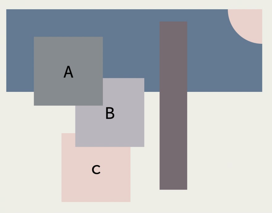
But then, we don't want our blue container to be below the vertical grey bar. How can we do that?
Here is what we know:
- Both the blue container and the vertical grey bar are positioned elements, and thus the stacking order depends on the DOM order.
- To manual set the DOM order, we can use the
z-indexproperty, and the defaultz-indexis 0. - We don't want box B, which has
z-index: 2, to be underneath the blue container. Given the above constraints, to place the blue container above the vertical grey bar and below box B, we can setz-indexto 1.
.blue-container {
  ...
  z-index: 1;
}
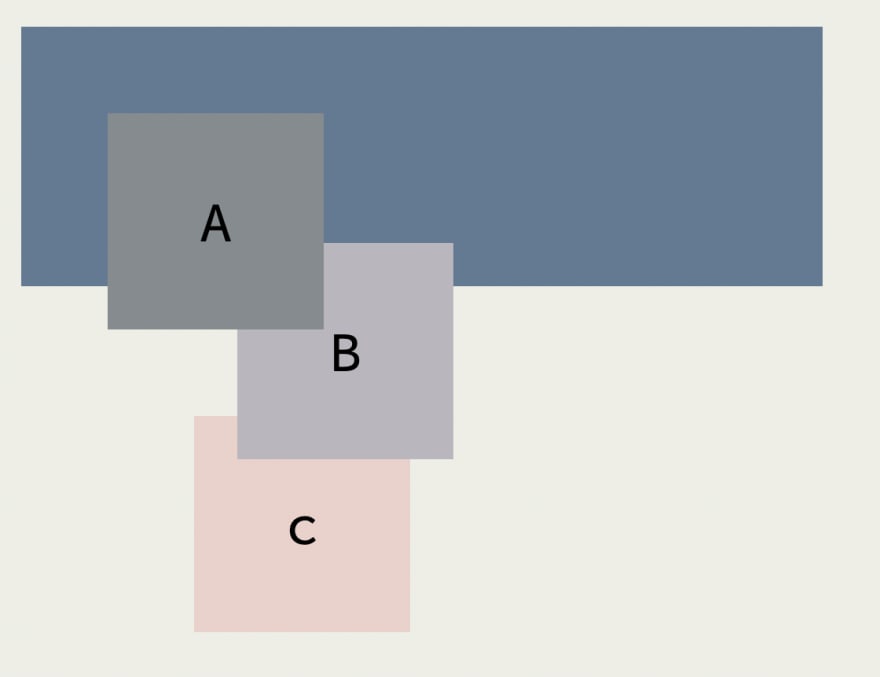
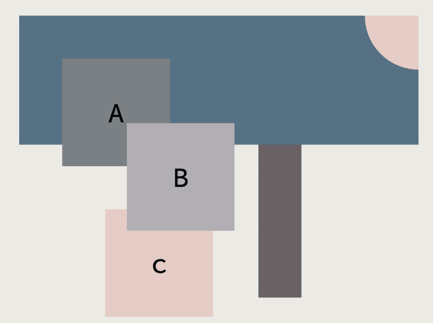
It works. The blue container is above the vertical grey bar and below box B, but something unexpected happened; box B appears to be on top of box A.
That's a bit surprising, isn't it? In the last few steps, we didn't even touch either box A or box B; we simply added a few CSS properties to a parent element of box A (i.e., the blue container) for some layout purposes. How is it possible we somehow altered the stacking order between box A and box B?
Stacking context
To understand why we first have to understand the stacking context.
Taken directly from the excellent book CSS-in-depth by Keith
A stacking context consists of an element or a group of elements that are painted together by the browser.
The critical point here is that elements are being painted together. It implies that no other elements from a different stacking context can be stacked between two elements within the same stacking context.
In other words, z-index only works for elements within the same stacking context.
There are many ways to create a stacking context.
Among those, two are more related to our example.
A stacking context is created on an element if :
- It is relatively positioned and has set
z-indexvalue. - It is fixed positioned.
In our case, the vertical grey bar and all three boxes, A, B and C, are fixed positioned, creating their own stacking context. Moreover, our blue container is relatively positioned and has a set z-index: 1; therefore, it also creates a stacking context.
Let's review our markup and denote stacking with the prefix "S" and the value for z-index.
<html lang="en">
  # S0
  <head>
    ...
  </head>
  <body>
    <div class="blue-container">
      # S1 z: 1
      <div class="box box-a">A</div>
      . # S2 z: 3
      <div class="circle"></div>
    </div>
    <div class="box box-b">B</div>
    # S3 z: 2
    <div class="box box-c">c</div>
    # S4 z: 1
    <div class="verticalbar"></div>
    # S5 z: 0
  </body>
</html>
Here we have four elements with stacking contexts S1, S3, S4 and S5 within the stacking context created by the root element S0. Thus, their stacking order will be determined by their z-index and DOM order.
S3 has a higher z-index than S1; therefore, box B appears on top of everything within the blue container. Remember, the blue container creates a stacking context and everything within that stacking context is painted together, in this case, box A and the top-right quarter circle.
This explains why box A is below box B even though it has a higher z-index. Its parent element creates a stacking context that has a lower stacking order than box B.
Conclusion
Our artificial example showed how tricky the stacking context can be, and the problem tends to happen very implicitly. In this case, we unintentionally created a stacking context by adding some decorative elements, which broke the original stacking order.
In the future post, I'll address a few common approaches and good practices about managing stacking context.
Bye for now.



Top comments (0)