In this article I will share some of the tools that help me improve the accessibility of my website. However, I'm just going to share tools that help us work on the color palette we have on our website in order to improve the contrast between text/illustrations and background.
I am fully aware that accessibility goes far beyond just contrasting foreground and background. And that we have to consider accessibility as a whole from the start and not just a single aspect of several.
Taking these points into account, I had the idea to focus on colors because it is one of the things that can be improved quickly and with the help of the tools that I will share in this publication, they will help us a lot to reach our goals.
1 - Color.review
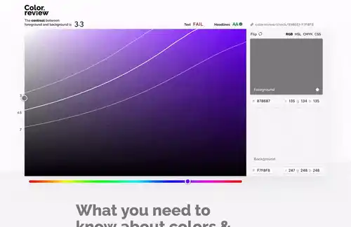
In this tool, check the contrast between colors in real time through the text example you have on the website. We can have access to RGB and CSS colors in an easy way.
One of the things that I find interesting is that we can copy the link colors from the current session and we can see if the text and header colors are following the standards.
Another interesting point is that when there is also an illustration as an example, we can choose a color that best fits the textual elements and the illustration. So that it doesn't give us the feeling that they are vying for the user's attention.
2 - Color Safe
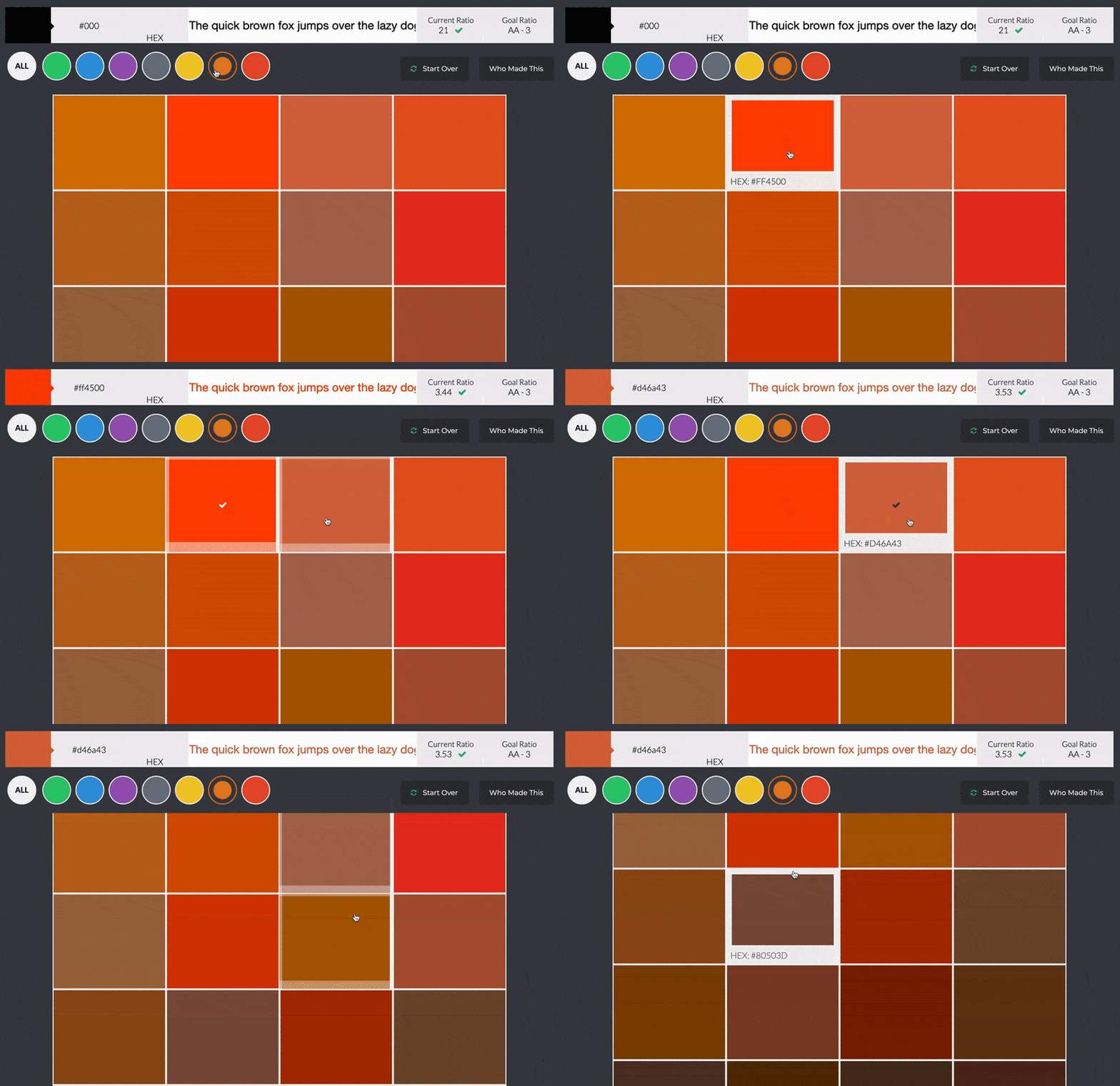
Some of the interesting aspects of this tool are that we can select a font that is similar to the one we are going to use, as well as its weight and then generate a color palette based on those points.
By selecting a background color then we can choose the color we can use in the text, for example in a button we can increase its readability taking into account these aspects.
3 - Contrast Ratio
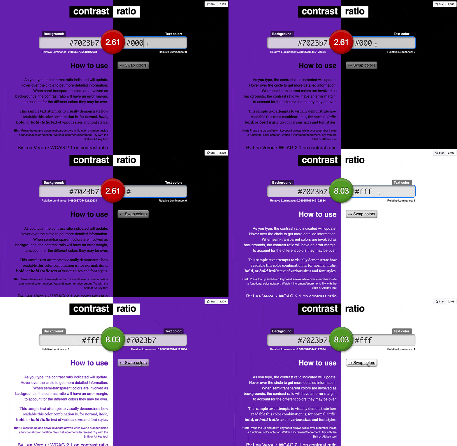
If you like to visually experiment quickly and simply with the combinations of the color palette you've chosen, this tool might be ideal for you.
Of all the tools that have been mentioned so far, this one is the most popular among my colleagues. The tool accepts any color format (Hex, RGBA, etc) and it has a good variety of typographies and weights to check the readability of the text as we play with colors.
4 - A11yEngineer
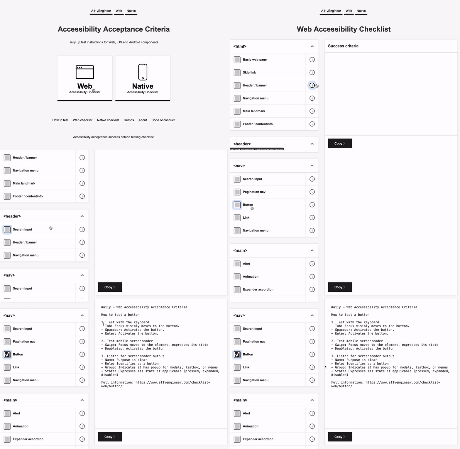
On this platform we have a checklist of things we should take into account before writing our application code, be it web or mobile.
The behavior of each element/component according to a context is explicitly listed. In the same way that we are given a link to show us some visual examples of what is ideal, as well as giving us some code examples.
Conclusion
I hope it was brief and that I shared with you tools that can help you create applications with much better color contrasts.
If you use a tool that was not mentioned here, write it down in the comments.
Have a nice day! 👋 😊


Top comments (2)
Thanks for the information. ☺️ I will read this article. 🧐