This is not meant to be a complete guide for mobile responsiveness. Rather, it's a quick guide for how to hack together a reasonable solution with minimal code change and high time constraints.
| Before | After |
|---|---|
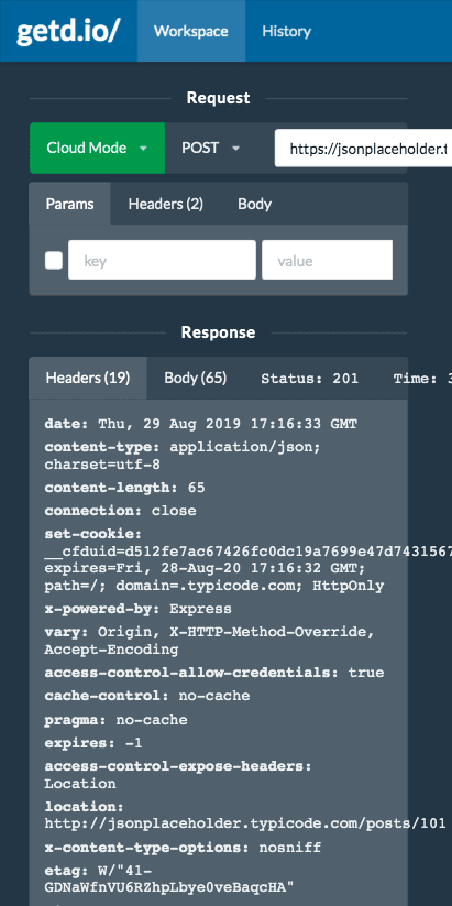 |
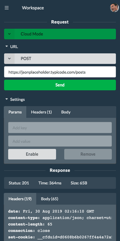 |
UI frameworks are your best friend 🤝
A good UI framework gives you high development velocity 🚀. getd.io uses Semantic UI React. It not only provides all basic components, but goes deep into specific use cases that are common for modern apps. E.g., it not only supports multi-select, but also multi-select with additions.
If you look at one of its sample sites it shows how to build a responsive page that converts a top menu bar to a sidebar when screen is mobile. Magic here is the Responsive component. The API is simple: you specify the min/max width at which the wrapping content will be displayed. E.g., code below will display desktop content when screen width is larger than 768px, and mobile content when less.
<Fragment>
  <Responsive minWidth={768}>
    {desktopContent}
  </Responsive>
  <Responsive maxWidth={767}>
    {mobileContent}
  </Responsive>
</Fragment>
But, it would be wasteful to have two separate UI implementations for desktop and mobile, when many UI components only need re-styling or moving-around. So what we really want to do here is to make our components 'device aware' so they can be reused for both desktop and mobile:
<Fragment>
  <Responsive minWidth={768}>
    <Content />
  </Responsive>
  <Responsive maxWidth={767}>
    <Content />
  </Responsive>
</Fragment>

const Content = () => {
  if device is 'DESKTOP':
    return (
      <TopMenu />
      <BodyContent />
    );
  else
    return (
      <Sidebar>
        <TopMenu />
      </Sidebar>
      <BodyContent />
    );
}

const TopMenu = () => {
  if device is 'DESKTOP', return a desktop layout
  else, return a mobile layout
}
Use React Context
Use React context, we can pass down the device info deep into the component stack.
// Data type
type ResponsiveContextData = {
  device: "MOBILE" | "DESKTOP";
};

// Create context
const ResponsiveContext = React.createContext<ResponsiveContextData>({
  device: "DESKTOP"
});

// Set different device context based on responsive UI
<Fragment>
  <Responsive minWidth={768}>
    <ResponsiveContext.Provider value={{ device: "DESKTOP" }}>
      <Content />
    </ResponsiveContext.Provider>
  </Responsive>
  <Responsive maxWidth={767}>
    <ResponsiveContext.Provider value={{ device: "MOBILE" }}>
      <Content />
    </ResponsiveContext.Provider>
</Fragment>
And in each responsive component:
const MyResponsiveComponent = () => {
  const responsiveContextData = React.useContext(ResponsiveContext);
  if (responsiveContextData.device === "DESKTOP") {
    return (desktop layout)
  else ...
}
Make them stack 🍔
The params editor in getd.io has a horizontal layout that doesn't work for mobile screen.

To convert it into a vertical / stack layout:
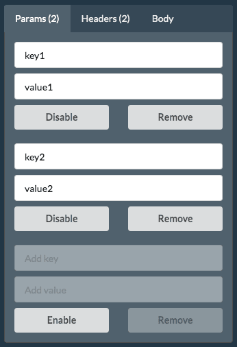
- One-component-per-line: this is almost always required for components that can have various width (e.g., input box). However, you can fit two or more components in the same line if they have close relationships and have fixed width (e.g., the disable and remove buttons below)
- Fat-finger problem: don't make users click tiny boxes. Make them large whenever possible. E.g., here I converted a checkbox on desktop to a disable/enable button on mobile.
Vertical space and scrolling
When dealing with vertical spacing on mobile, two quick guidelines here:
Try to avoid having one vertical scrolling inside another vertical scrolling. E.g., getd.io uses a JSON editor (thanks to the awesome React Ace Editor). When the JSON content is long, both the editor and the window show vertical scrolling, and it can lead to a confusing and bad UI. A quick hack here is to first calculate the total lines of the JSON, and then set the editor
minLinesto total lines so it never shows vertical scrolling.Allow users to collapse / hide some part of the UI to save vertical space. E.g., getd.io uses the
Accordioncomponent to hide request settings pane.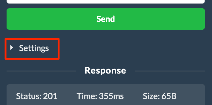
Handle white-space-wrap: It's generally good to disable wrapping, as wrapping content tends to make vertical space less predictable.
Handle overflows: Case-by-case. E.g., in getd.io I allow horizontal scrolling for showing response headers without wrapping. But in history tab, I hide overflows when URL is too long because horizontal scrolling in history search result doesn't make sense.


Think in mobile 📱
Sometimes you can't simply just convert a desktop UI into mobile ones, and it requires you to think out of the box to find the best UI that feels more mobile. E.g., the 'Create PermLink' button on desktop shows a popup that allows users to copy the link.

We could do the same thing on mobile, however it's not a good idea to show popups on mobile as it breaks the flat UI experience. In this case, I'd change the workflow into a floating 'Share' button on the bottom right corner that encourages users to share the current settings with others. Leave a comment below if you have a better idea ❤️ !

Top comments (0)