
Form elements are a common way to collect information that your website requires from users. They typically consist of elements, checkboxes, radio buttons, and a button for users to submit the information they entered. However, standard elements allow users to enter whatever they want, and if you're going to standardize the information that they entered, it's on the developers to implement that functionality.
That is where the InputMask comes in; Wijmo’s Angular InputMask control allows developers to implement masks and predefined formats for the input field quickly. This will enable you to restrict the number of characters that users can enter in the mask, the prompt characters displayed in the control, and whether the control allows users to enter numbers, letters, or both.
In this article, we’ll be outlining the following steps:
- Creating an Angular Form
- Implementing Wijmo’s Angular InputMask
- Defining the Mask and Prompt Characters
- Validating the User’s Information
If you’d like to download the project for yourself, you can find it here.
Creating an Angular Form
Before we go about implementing the InputMask control, we’re going to need to create the
element that will make use of the InputMasks. We’re going to be making use of Angular’s FormsModule and ReactiveFormsModule modules, so we’ll import them in the app.module.ts file: import { FormsModule, ReactiveFormsModule } from '@angular/forms';
...
imports: [
BrowserModule,
FormsModule,
ReactiveFormsModule
]
Now that we’ve imported the required modules, we’re going to jump over to the app.component.html file and add the markup for the form:
    <div class="form-control">
      <div class="form-header">
        <span>User Information</span>
      </div>
      <form class="form-body" [formGroup]="infoForm" (ngSubmit)="onSubmit()">
        <div class="form-footer">
          <button class="form-button" type="submit">Submit</button>
        </div>
      </form>
    </div>
We’re using Angular’s FormGroup to aggregate the data from the form and ngSubmit to handle when the form gets submitted.
Next, we’re going to open the app.component.ts file to create our FormGroup:
    import { FormBuilder } from '@angular/forms';
    ...
    export class AppComponent {
      importForm = this.formBuilder.group({
        name: '',
        email: '',
        phone: '',
        social: ''
      });

      constructor(private formBuilder: FormBuilder) {}

      onSubmit(): void {
        this.inputForm.reset();
      }
    }
Here, we’re using FormBuilder to create our importForm, which will manage the values for all of the different InputMasks in the form; in this case, we’ll ask the user for their name, email, phone number, and social security number.
The last thing we’ll do in this section is add styles for the form. Open up the app.component.css file and add the following CSS:
    .form-control {
      position: absolute;
      width: 400px;
      height: 300px;
      z-index: 15;
      top: 50%;
      left: 50%;
      margin: -150px 0 0 -200px;
      border-radius: 15px;
      box-shadow: 1px 0 5px -2px rgb(90, 90, 90);
      text-align: center;
    }

    .form-header {
      height: 50px;
      width: 100%;
      line-height: 50px;
      border-top-left-radius: 15px;
      border-top-right-radius: 15px;
      background: rgb(100, 100, 252);
      font-weight: bold;
      font-size: larger;
      color: white;
    }

    .form-body {
      height: 100%;
      position: relative;
    }

    .form-footer {
      position: absolute;
      bottom: 75px;
      right: 2px;
      height: 50px;
      width: 100%
    }

    .form-button {
      float: right;
      margin-top: 10px;
      margin-right: 10px;
      height: 40px;
      width: 100px;
      border-radius: 10px;
      border: 1px solid black;
      background: rgb(100, 100, 252);
      color: white;
      font-size: 16px;
    }

    .form-button:hover {
      cursor: pointer;
      background: rgb(140, 140, 255);
    }
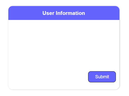
The CSS we’ve just written will center the form on the page and style our header, footer, and button elements. Now, if you run the application, you should see the following:
Implementing Wijmo’s Angular InputMask
Now that the form has been created, it's time to add our InputMasks. To use Wijmo, we will need to add the library to our project. Open up your command prompt, navigate to where your project is stored, and run the following:
npm i @grapecity/wijmo.angular2.all
Once NPM has installed all of the files, open up the app.module.ts file and import the following module:
    import { WjInputModule } from '@grapecity/wijmo.angular2.input';
    ...
    import: [
      BrowserModule,
      FormsModule,
      ReactiveFormsModule,
      WjInputModule
    ]
The last thing to do is add Wijmo’s CSS library to our application. Open up the styles.css file and add the following:
    @import '@grapecity/wijmo.styles/themes/wijmo.theme.material.css';
    body {
      box-sizing: boder-box;
      font-family: sans-serif;
    }
With all of that done, we can now make use of Wijmo’s Angular InputMask. Go back to the app.component.html and add the following markup inside of the
element: <div class="form-element">
<wj-input-mask #name id="name" [placeholder]="'Name'" formControlName="name"></wj-input-mask>
</div>
<div class="form-element">
<wj-input-mask #email id="email" [placeholder]="'Email'" formControlName="email"></wj-input-mask>
</div>
<div class="form-element">
<wj-input-mask #phone id="phone" [placeholder]="'Phone Number'" formControlName="phone"></wj-input-mask>
</div>
<div class="form-element">
<wj-input-mask #social id="social" [placeholder]="'Social Security Number'" formControlName="social"></wj-input-mask>
</div>
Here, we’re implementing 4 InputMasks; one for name, email, phone number, and social security number. We’re also setting a placeholder value for each of the masks, and we’re tying them to the inputForm object in the app.component.ts file using the formControlName property.
The last thing that we’ll need to do is add some CSS to style the InputMasks:
    .form-element {
      text-align: center;
      margin-top: 15px;
      width: 100%;
    }
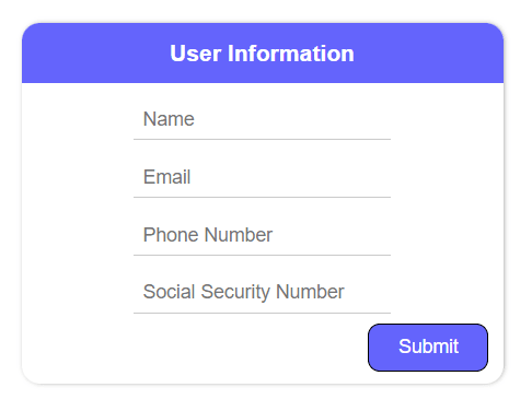
Now, if you run the application, you should see the following:
Defining the Mask and Prompt Characters
Now that we’ve implemented the InputMasks, we’re going to go over how to set the mask and prompt characters for the controls. In this sample, we want to define a mask and prompt characters for the phone number and social security number inputs. We’re going to modify the markup for both of these InputMasks:
    <wj-input-mask #phone id="phone" [mask]="'000-000-0000'" [placeholder]="'Phone Number'" [isRequired]="false" [promptChar]="'#'" [value]="''" formControlName="phone"></wj-input-mask>
    <wj-input-mask #social id="social" [mask]="'000-00-0000'" [placeholder]="'Social Security Number'" [isRequired]="false" [promptChar]="'*'" [value]="''" formControlName="social"></wj-input-mask>
By using number characters in the mask property, we’re telling the InputMask that we only want to accept numbers when typing in the control and how many characters we require the user to input. Setting the prompChar property tells the control what character we want to show for the values we still require input for. And finally, setting the isRequired and value properties will allow our placeholder to continue to display instead of defaulting to displaying the prompt characters. Now, if we run the application and begin typing in either the phone or social InputMask, we should see the following:

As you can see, when we type in either of those InputMasks, it will display the prompt character for the remaining characters that the control expects.
Validating the User’s Information
The last thing we’ll discuss in this article is how we can validate the user’s information. In the case of this form, we want them to enter information in the “Name” and “Email” InputMasks, and we want to make sure that the “Phone Number” and “Social Security Number” InputMasks have been completely filled out.
The first thing that we’ll do is make sure that users know that the last 2 InputMasks need to be completely filled out. To do that, we’ll be using Wijmo’s Angular InputMask valueChanged event. Inside of the markup, add the event to the control:
    <wj-input-mask #phone id="phone" [mask]="'000-000-0000'" [placeholder]="'Phone Number'" [isRequired]="false" [promptChar]="'#'" [value]="''" (valueChanged)="validateInput(phone)" formControlName="phone"></wj-input-mask>
    <wj-input-mask #social id="social" [mask]="'000-00-0000'" [placeholder]="'Social Security Number'" [isRequired]="false" [promptChar]="'*'" [value]="''" (valueChanged)="validateInput(social)" formControlName="social"></wj-input-mask>
Now, inside of the app.component.ts file, we’ll implement the following method:
    import * as wjCore from '@grapecity/wijmo';
    import * as wjInput from '@grapecity/wijmo.input';
    import * as wjcInput from '@grapecity/wijmo.angular2.input';

    validateInput(control: wjInput.InputMask) {
      wjCore.toggleClass(control.hostElement, 'state-invalid', !control.maskFull);
    }
This method checks if the maskFull property of the InputMask returns true; maskFull is a boolean value that returns true if the user has entered the required number of characters by the mask and false if not. If it does not return true, then we add a CSS class named state-invalid to the control.
We’ll add that CSS class to the app.component.css file:
    .state-invalid {
      color: red;
    }
Now, as we type in the “Phone Number” or “Social Security Number” InputMasks, we’ll see the following:

As you can see, if the mask has not been filled out completely, the text will display as red.
Next, we’ll add a method to check and see if the user has filled out all of the InputMasks, as well as update the onSubmit() method to determine whether or not to submit the form:
    @ViewChild('name') name: wjcInput.WjInputMask;
    @ViewChild('email') email: wjcInput.WjInputMask;
    @ViewChild('phone') phone: wjcInput.WjInputMask;
    @ViewChild('social') social: wjcInput.WjInputMask;

    isFormComplete() {
      if(this.name.value != '' && this.email.value != '' && this.phone.maskFull && this.social.maskFull) {
        return true
      }
      return false;
    }

    onSubmit(): void {
      if(this.isFormComplete()) {
        // Display user info on form submission
        alert('User Information:\nName: ' + this.inputForm.value.name +
          '\nEmail: ' + this.inputForm.value.email + '\nPhone Number: ' + this.inputForm.value.phone +
          '\nSSN: ' + this.inputForm.value.phone);
        this.inputForm.reset();
      }
    }
Now, if we run the app and correctly fill out all of the InputMasks, we’ll see the following alert:

Conclusion
As you can see, you can easily build forms using Angular Forms and Wijmo’s Angular InputMask control. If you'd like more information, we have demos, documentation, and API references for developers. If you'd like to download the finished application, you can find it here.
Happy coding!

Top comments (0)