
In the design world, dark mode is the new black. Also known as the light-on-dark-color scheme, night mode, or black mode, dark mode displays everything on a dark background with light text and icons.
Dark mode isn’t a new concept, but it’s gained a lot of popularity in recent years — so much so that most operating systems, browsers, smartphones, and apps now support dark mode.
A Brief History of Dark Mode
Dark mode became famous in 2018 when Sylvian Boyer extended dark mode to smartphones with OLED screens. Developers, gamers, and hackers quickly adopted the dark theme, and they remain the most significant users.
According to a 2020 survey, 70 percent of developers prefer dark mode IDE while coding or programming.
Still, dark mode has gained popularity even with general device users. Now, most operating systems, browsers, games, and apps have dark mode. For example, some applications, like Discord, have entirely shifted to dark mode for the user interface (UI).
So why is dark mode so popular? Research shows that an app with a dark palette uses almost 90 percent less energy than a light palette. The dark mode also helps color stand out better without being too bright. Dark mode reduces the screen’s overall brightness, making it more comfortable, even with low ambient light.
According to Sameer Samat, the VP of Google’s product management for Android and Play, “Everyone can relate to being in a room where the lights are turned down, and you’ve got this white screen blinding you.” A screen or website in dark mode is usually more visually appealing than one in light mode.
Also, while it’s not conclusive, a popular theory suggests that dark mode reduces the emission of blue light from screens. According to a study conducted by Harvard Medical School in 2018, blue light exposure interferes with our ability to produce melatonin, thereby impacting our sleep if we’re using devices close to bedtime.
All these factors contribute to the popularity of dark mode. But how do we go about designing in dark mode? Is it just a simple color inversion? Let’s delve into dark mode designs in more detail.
The Pitfalls of Dark Mode
Creating a dark theme is not as simple as just inverting the colors and adjusting shades. There are multiple considerations when designing a dark mode theme for a website or application. Before we discuss how to develop a dark mode in an application, let’s review what not to do.
The biggest pitfall of the dark mode is the fuzzing effect of halation. If we read bright text on a dark background, our irises dilate to receive more light. Due to this, the pressure on our eyes increases, and we get fuzzy vision.
Dark mode isn’t beneficial for applications or websites used only during daytime or in well-lit conditions. Using dark mode in well-lit conditions can reduce usability and make text hard to read.
Also, if the colors and contrast are not correctly balanced, color shades can behave very differently. We also know that colors affect our mood, so it can put off users if the colors are not well balanced.
When space is white, it automatically gives the impression of more space. A design with many components that looks good on a light or white background can feel cluttered on a dark theme.
For these reasons, getting the correct balance of colors in your dark theme is essential.
Designing Dark Mode
As we’ve seen, designing a dark-themed UI is a game of balance. It’s not straightforward. Let’s discuss some things you’ll want to consider when designing a dark-themed UI.
Consider Your Brand
Your brand’s story and the message you want to convey to the public should be an essential consideration in deciding whether your web application should have a dark theme or not. For example, a movie streaming platform is a good choice for a dark theme, whereas a banking application may not be a good candidate.
Avoid Pure Black
A pure black screen with pure white text and icons often leads to a jarring and unappealing visual interface. A dark grey is a better option. According to Material Design’s design document, color #121212 is the best background color.
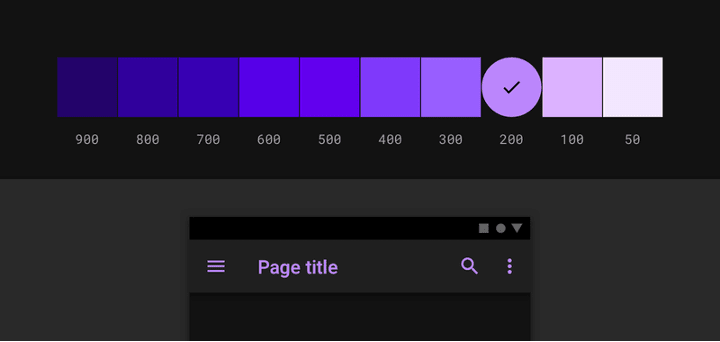
Avoid Saturated Colors
Saturated colors don’t work well with dark backgrounds. Overly saturated colors make it hard to read, and they vibrate against a dark background. Material Design recommends colors in the range of 200 to 50 for dark themes.
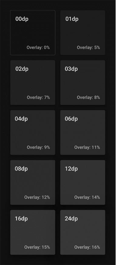
Build Elevation with a Semi-Transparent Overlay
According to Material Design’s documentation, “The higher a surface’s elevation (raising it closer to an implied light source), the lighter that surface becomes.”
In a dark theme, assume that the light source is from above. The farther back the layer, the darker its shade. Material Design suggests building elevation using a semi-transparent overlay on a component surface.
We should also preserve the darkness of shadows to give a more natural look. Below are the different overlay values:
Use a Legible Contrast Level
You should have enough contrast between the text and the background to ensure that the text is legible and readable. According to Material Design, the contrast level should be 15.8:1. If you don’t maintain good contrast in your design, the screen can tire out the eyes.
Use Darker Whites for Focus Colors
Focus colors show that a user has selected text or clicked a button to turn something on. Using pure white to do this would lead to the vibration problem or being excessively bright, which reduces readability. The better way is to use “darker whites.” Shifting opacity values helps achieve darker whites.
A typically accepted scheme is:
- On or emphasized text with an opacity of 87 percent
- Medium emphasis text at 60 percent opacity
- Disabled text is 38 percent opacity
The following comparison helps us understand how they appear:

Use Accent Colors Sparingly
Accent colors are the colors that help elements stand out. You should use them sparingly, and, just as with the primary colors, they shouldn’t be the same vibrant shade on a dark theme. Making accent colors too bright makes the design harsh and jarring on the eyes.
Use a Consistent Color Scheme for Icons
The color palette of icons, scalable vector graphics, or otherwise, should follow the same principles as the other color scheme in the design. They should be pure white or overly saturated.

Think About the Brightness and Contrast of Images
A critical consideration in dark mode is images. A bright image on a dark background can be unappealing. So, before adding images to a dark design, it’s better to decrease its brightness and contrast. As an example, look at the following picture:

Consider the Emotional Impact of the Design
Depending on the background color, the colors in your design can appear different. Color schemes that look pleasant and pleasing to the eye on a light surface can look menacing and jarring on a dark background.
Too little or too much color, hue, brightness, and so on can completely change the message you’re trying to convey.
Consider this example from Material Design:
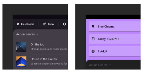
The design with blocks of color would probably look fine on a white or light background, but it’s less appealing in dark mode. The image on the right shows a much better way to implement the same components on a dark design.
Before you switch over to a dark-theme design, you’ll need to understand the emotional impact and the message that the design conveys.
Let the Users Choose
The choice between dark mode and light mode should always be the user’s. Some users may prefer the light mode over the dark mode and vice versa. Additionally, you’ll want to make sure your design is accessible: some people with visual impairments may have a better experience in dark mode, for example.
Plus, it’s a terrible UI practice to take away control from the user. So, your design might offer a toggle or button to switch between the dark and light modes so that users can choose which they prefer. We will see some working examples in the next section.
The Dark or Light Mode Option
There are a couple of ways we can show or give users the choice of selecting the dark mode or light mode. We can apply operating system defaults or provide a toggle button for users to choose the mode. We can also offer a way to store user preferences.
Some operating systems like the Mac OS ask for dark or light theme preferences in the system settings. So, we can set the theme on our webpage using the system’s settings. There are two ways of doing so: using pure CSS or JavaScript.
The pure CSS way is the prefers-color-scheme media query. With the prefers-color-scheme media query, we specify the theme’s behavior.
For example, similar to the example on CSS-Tricks, say we have a webpage with text and a link. When the operating system setting is “light,” the page displays as follows:

The CSS stylesheet we use to achieve this is:
@media (prefers-color-scheme: light) {
   body {
    color: #000000;
    background: white;
  }

  body a {
    color: #809fff;
  }
}
However, if we assume that the user has set their system preferences to dark, this activates the media query:
@media (prefers-color-scheme: dark) {
  body {
    color: #eee;
    background: #121212;
  }

  body a {
    color: #809fff;
  }
}
And displays the page:

Instead of the pure CSS method, we can use the JavaScript window.matchedMedia() method as this demo illustrates.
Of course, as mentioned earlier, we can provide a toggle button on the webpage itself to provide more control. Below is a small snippet showing how we can switch between the modes using a button. We handle the button listener event as follows:
const btn = document.querySelector(".btn-toggle");
const prefersDarkScheme = window.matchMedia("(prefers-color-scheme: dark)");

btn.addEventListener("click", function () {
  if (prefersDarkScheme.matches) {
    document.body.classList.toggle("light-theme");
  } else {
    document.body.classList.toggle("dark-theme");
  }
});
When the user presses the button to switch to dark mode, the code applies the dark-theme CSS as:
body.dark-theme {
  --text-color: #eee;
  --bkg-color: #121212;
}
The webpage that supports both the dark and light mode looks as follows:

The whole code is available on CodePen.
Support in Common Frameworks for Dark Mode
Due to its ever-increasing popularity, many of the commonly used frameworks support building with dark mode. The following are a few examples:
Material UI
Material UI
Material UI provides a developer-friendly, extensible, and simple theming utility. Theming allows you to customize all design aspects of your project to make them dark mode ready and compliant with your business needs.
Vuetify
Vuetify is a trendy UI framework that uses Vue.js. It supports toggling between the light and dark modes of Material Design’s design specification. Vuetify selects the light mode by default, but you can easily toggle it to dark mode. Customization is easy in Vuetify.
Nebular
Based on the EVA Design System, the Nebular library is one of the best UI libraries for Angular. Nebular provides inbuilt, customizable themes like the default theme, cosmic theme, dark theme, etc. The mobile version of Nebular, called UI Kitten, also supports the dark theme.
Smelte
Smelte sits on top of Tailwind CSS and follows Material Design’s guidelines. It supports dark mode and lets you toggle and customize it. You can switch dark mode on by simply setting the dark mode property to true for components.
Blueprint
The Blueprint UI library lets you toggle between the dark and light modes easily. Shifting to dark mode in Blueprint is as easy as applying the bp3-dark property to the container element.
Rebass
The Rebass catchphrase is “our components were all built with themeability in mind.” They provide extensive support for theming and have a straightforward implementation of their Theming API.
React Native Paper
The React Native Paper UI library, or simply Paper, supports the dark theme in its third version.
Paper is essentially a library of customizable and production-ready React native components that follow Google’s Material Design’s design principles.
These are just some of the libraries that support dark mode. There are thousands of UI libraries that provide the same or similar support for dark mode. Besides these libraries, there are UI toolkits that come packaged with dark mode or a dark theme.
One such notable example is the Wijmo UI toolkit. Wijmo is a UI toolkit with over 40 customizable widgets ranging from interactive menus and data grids to charts and graphs and comes bundled with dark mode support.
Conclusion
Most people (or at least avid Android users) have used dark mode, and it’s likely to stay this way for some time.
But, as we saw, designing a dark theme for your website or application isn’t straightforward. You must consider many things before you can implement an attractive dark theme.
We also saw that many UI libraries also provide support for building applications in dark mode. Using a library to build your application may be a good idea instead of designing a dark mode from scratch.
Although there are challenges when designing and planning, it’s worth exploring how your application can support a dark mode.

Top comments (0)