
The Xamarin Community Toolkit's first stable release is finally out to the public after a very long wait. It marks a special day to me because it is my First contribution to an open source project (but certainly won't be the last) this big. So this series of posts will explain what is the Xamarin Community Toolkit and will show case some of the features in it with code Walkthroughs.
What is the Xamarin Community Toolkit ?
For those who don't know about the Xamarin Community toolkit (XCT for short) is the home for some marvelous creations by many talent Xamarin developers, it also houses some of the features that were supposed to be included in Xamarin.Forms 5.0 but the are exploding with potential such as the MediaElement,the CameraView, the C# Extensions and many more so there are now housed in the XCT to further evolve and shine.
How Can the Xamarin Community Toolkit Up My Game ?
The XCT has a very diverse collection of reusable elements that are needed in approximately any app. Such as animations, behaviors, converters, effects, and helpers. It also gathers many of the libraries and packages that are mostly used in every app so it simplifies and demonstrates common developer tasks when building iOS, Android, and Universal Windows Platform (UWP) apps using Xamarin.Forms.
Where can one find the Xamarin Community Toolkit ?
As the name implies the XCT is completely open source and it is hosed on Github, You can find it here in the Xamarin Community Toolkit Repo.
As for the documentation you can find it here in this MicrosoftDocs Repo;
So Enough with the intro lets dig into it.
so for the first touch point I chose the ExpanderView as it has been a little bit of a hassle to create before.
The first step would be to create a new Xamarin forms project in out Visual Studio 19 by heading to File>>New>>Project and selecting the Mobile Application (Xamarin.Forms) project.
Side Note: We would be using Xamarin.Forms 5 and it only works on VS2019 edition. Learn more here.
Starting with the Blank template we make sure both Android and iOS are selected.
The first thing we have to do is to update the Xamarin.Forms version to 5.0 and to install the XCT package from the Nuget Package Manager by right clicking the solution and choosing "Manage Nuget Packages for this solution". Search for the "Xamarin Community Toolkit" package and install it. after that update your existing package.

Now we are ready for the code.
We are going to be Building an expandable collection of name tags that expand showing the age and height of people that looks like this.

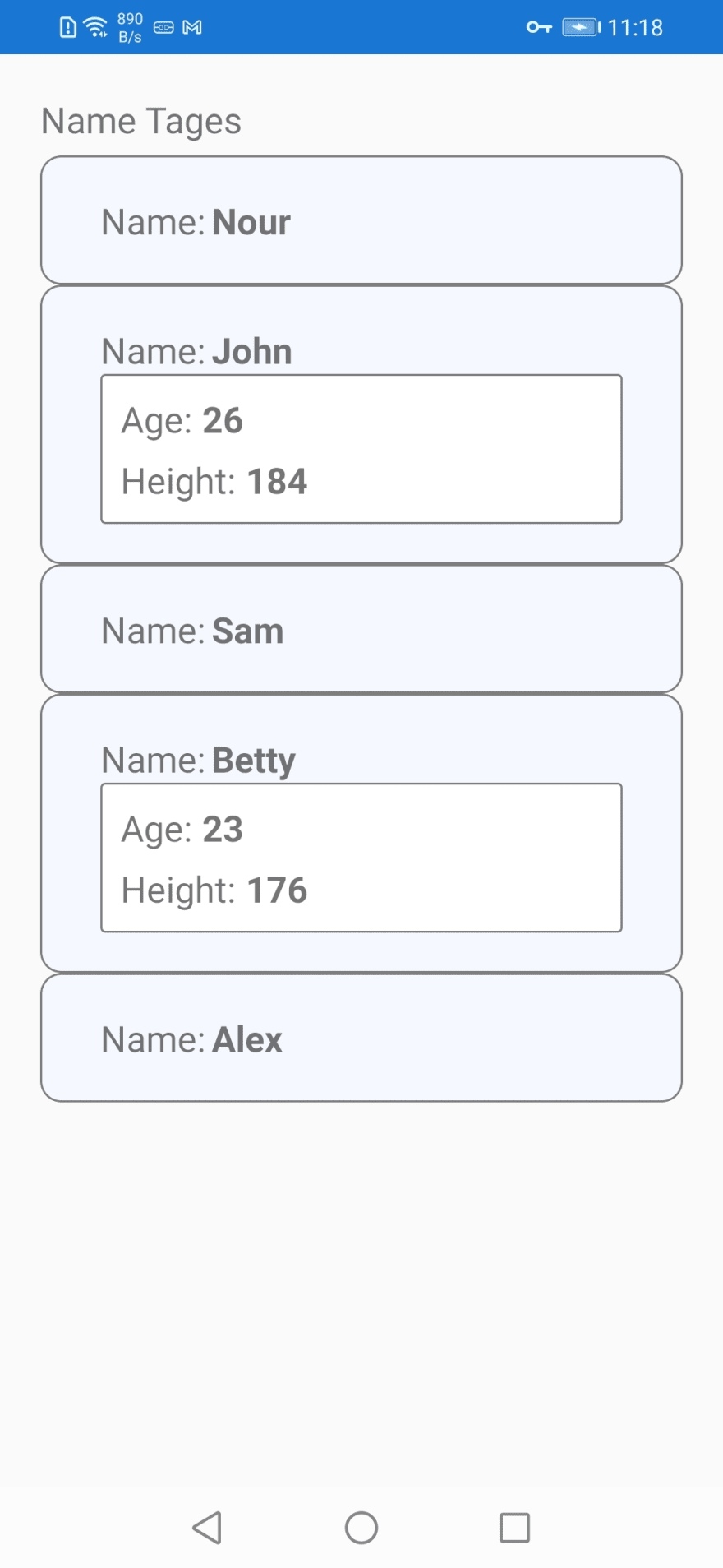
to get the basics aside i have created a model called NameTagModel inside my models folder that looks like this
    public class NameTagModel
    {
        public string Name { get; set; }
        public int Age { get; set; }
        public int Height { get; set; }
    }
and another class in my ViewModels folder by the name of NameTagsViewModel which is only used to provide the view with some dummy data so it looks like this
    public class NameTagsViewModel
    {
        public ObservableCollection<NameTagModel> NameTags { get; set; }
        public NameTagsViewModel()
        {
            NameTags = new ObservableCollection<NameTagModel>
            {
                new NameTagModel (){Name="Nour",Age=22,Height=189},
                new NameTagModel (){Name="John",Age=26,Height=184},
                new NameTagModel (){Name="Sam",Age=25,Height=180},
                new NameTagModel (){Name="Betty",Age=23,Height=176},
                new NameTagModel (){Name="Alex",Age=29,Height=175},
            };
        }
    }
now for the last configuration step we should set the binding context of the view from the code behind of the page in the Views folder (I know this is not the best Practice it is just for the sake of simplicity for this demo). it should look something like this
    [XamlCompilation(XamlCompilationOptions.Compile)]
    public partial class NameTagsPage : ContentPage
    {
        NameTagsViewModel NameTagsVM;
        public NameTagsPage()
        {
            InitializeComponent();
            NameTagsVM = new NameTagsViewModel();
            this.BindingContext = NameTagsVM;
        }
    }
With that out of the way we can focus on the interesting part.
we are going to create a collection view and bind its ItemsSource to the NameTags Collection we created earlier
    <ContentPage.Content>
        <StackLayout>
            <CollectionView ItemsSource="{Binding NameTags}">

            </CollectionView>
        </StackLayout>
    </ContentPage.Content>
then we are going to define its ItemTemplate the Expander is made up of 2 parts the header and the body (to be shown when expanded) the both can host Views so for the data template we are going to have a Frame which houses the Expander and then a StackLayout with 2 Labels for the header design.
                    <DataTemplate>
                        <Frame
                            BackgroundColor="#f5f8fe"
                            BorderColor="#7e7e7e"
                            CornerRadius="10"
                            HasShadow="False">
                            <xct:Expander
                                Margin="10,0"
                                CollapseAnimationEasing="{x:Static Easing.CubicOut}"
                                ExpandAnimationEasing="{x:Static Easing.CubicIn}">
                                <xct:Expander.Header>
                                    <StackLayout Orientation="Horizontal" Spacing="3">
                                        <Label
                                            FontSize="Medium"
                                            Text="Name:"
                                            VerticalOptions="CenterAndExpand" />
                                        <Label
                                            FontAttributes="Bold"
                                            FontSize="Medium"
                                            HorizontalOptions="FillAndExpand"
                                            Text="{Binding Name}" />
                                    </StackLayout>
                                </xct:Expander.Header>
                                <Frame
                                    Padding="10"
                                    BackgroundColor="White"
                                    BorderColor="#7e7e7e"
                                    HasShadow="False">
                                    <StackLayout>
                                        <StackLayout Orientation="Horizontal" Spacing="5">
                                            <Label
                                                FontSize="Medium"
                                                Text="Age:"
                                                VerticalOptions="CenterAndExpand" />
                                            <Label
                                                FontAttributes="Bold"
                                                FontSize="Medium"
                                                HorizontalOptions="FillAndExpand"
                                                Text="{Binding Age}" />
                                        </StackLayout>
                                        <StackLayout Orientation="Horizontal" Spacing="5">
                                            <Label
                                                FontSize="Medium"
                                                Text="Height:"
                                                VerticalOptions="CenterAndExpand" />
                                            <Label
                                                FontAttributes="Bold"
                                                FontSize="Medium"
                                                HorizontalOptions="FillAndExpand"
                                                Text="{Binding Height}" />
                                        </StackLayout>
                                    </StackLayout>
                                </Frame>
                            </xct:Expander>
                        </Frame>
                    </DataTemplate>
And Here you Go! you have just created an Expanding Card.
This is just a representation for the simplest use of the Expander.There are some more things you have to know in order to make more advanced scenarios.
There is a bindable property Called
IsExpandedto tell if theExpanderis Expanded.There is a bindable Command that takes a bindable command parameter if you want to execute some special logic on Expansion or Shrinking.
You can stop an Expander from expanding by setting the
IsEnabledproperty totrue.Expanders Can be nested into each other.
You can find the source code here.
To learn more about the Expander View click here to visit the documentation
Thanks for your Time and i hope you enjoyed.
Special Thanks to Beshoy Mansour for the amazing cover.
See you in part 2 ;)

Top comments (0)