
Introduction
In this tutorial, you'll learn how to build a simple shopping cart application with the following Jamstack technologies; NextJS, Xata, and Cloudinary. Here, you'll see how easy it is to use Xata to create APIs (Application Programming Interfaces), NextJS to fetch and display data, implement basic shopping cart logic, and Cloudinary to optimize images.
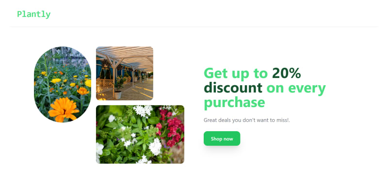
Below is a screenshot of the shopping cart home page:
Prerequisites
The following is required to follow along smoothly with the tutorial:
- Basic understanding of React
- Understanding of how Typescript works
- A Xata account
- A Cloudinary account
- Recent version of Node & npm or yarn package manager installed on your PC
Technologies
Nextjs is a front-end development framework created by the Vercel team. It builds on React to offer extra functionalities like handling client-side and server-side rendering, automatic page routing, static site generation, etc.
Xata is a serverless database platform good for developing Jamstack applications. With Xata, you can transform your database into an API that can be queried and updated. It offers a ton of functionality, including support for branching, schema migrations, edge caching, etc.
Cloudinary is a SaaS platform that efficiently uploads, optimizes, and delivers media files across all devices and mediums, such as images and videos.
Other technologies used in this tutorial include;
Typescript - A JavaScript superset that ensures type safety, making it easier to spot errors during development.
Tailwind - A CSS framework used for styling the user interface of an application.
Step 1: Set up Next
In your preferred terminal, install a new Next application with the --typescript template flag:
yarn create next-app shopping-cart --typescript
To launch the development server, run yarn dev command. This serves the application on localhost:3000.
Step 2: Install and Configure Tailwind
Install Tailwind at the root of your project directory:
yarn add -D tailwindcss postcss autoprefixer
Create tailwind.config.js and postcss.config.js configuration files by running:
yarn tailwindcss init -p
Configure your template path in the tailwind.config.js file as shown below:
/** @type {import('tailwindcss').Config} */
module.exports = {
  content: [
    "./pages/**/*.{js,ts,jsx,tsx}",
    "./components/**/*.{js,ts,jsx,tsx}",
  ],
  theme: {
    extend: {},
  },
  plugins: [],
}
Add the following Tailwind directives to your styles/global.css file:
@tailwind base;
@tailwind components;
@tailwind utilities;
Step 3: Upload Images to Cloudinary
To properly optimize the product images you wish to use for the shopping cart, log in to Cloudinary. Then click the Media Library tab to upload the images manually.

You can hover over an image to copy its URL. We will add the URLs for each image to the Xata database later.
Additionally, for the uploaded images to work well in your Nextjs project, the next.config.js file needs to be configured as follows:
/** @type {import('next').NextConfig} */
const nextConfig = {
  reactStrictMode: true,
  swcMinify: true,
  images: {
    domains:['res.cloudinary.com']
  }
}
module.exports = nextConfig
Step 4: Create a Xata Database
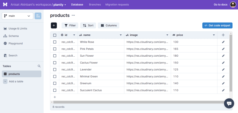
After creating a Xata account, log in to your workspace. Then, create a database by clicking the add symbol and entering a name and location.

Click on the created database and add a table titled products. Next, add a name and image column of type String and a price column of type Float to the table.
Your database should look like this:
Step 5: Set up Xata SDK
To set up Xata, you'll need to install the CLI globally:
yarn add @xata.io/cli -g
Then, authorize Xata to log you in:
xata auth login
Next, select Create a new API key in browser from the prompts in your terminal. This opens your browser, where you can type in any name you choose. Once successful, you will get a display page indicating you are all set.
Now cd into the Nextjs project created earlier and run xata
``init to initialize Xata in your project:
cd shopping-cart
xata init
The command above initializes the project with some questions in the terminal. This is where you select the database name created earlier, select Generate Typescript code and choose your output source as lib/xata.ts, where the Xata codegen will be generated.
Step 6: Create UI Components
You'll need to create a folder named components in your Nextjs project, including the Navbar, WelcomePage, and CartItems components.
But before then, create a _document.tsx file in the pages folder of your project and add the following:
import { Html, Head, Main, NextScript } from "next/document";

export default function Document() {
  return (
    <Html>
      <Head>
        <link
          rel="stylesheet"
          href="https://cdnjs.cloudflare.com/ajax/libs/font-awesome/6.1.1/css/all.min.css"
        />
      </Head>
      <body>
        <Main />
        <NextScript />
      </body>
    </Html>
  );
}
The code above will allow you to use Font Awesome icons in your project.
Now, create the Navbar component:
// components/Navbar.tsx

import Link from "next/link";
const Navbar = () => {
  return (
    <>
      <nav className="flex items-center justify-between flex-wrap bg-white p-6 border-b-2 border-gray-100">
        <div className="flex items-center flex-shrink-0 text-white mr-6">
          <Link href="/" passHref>
            <h1 className="font-bold text-3xl tracking-tight font-mono text-green-400">
              Plantly
            </h1>
          </Link>
        </div>
      </nav>
    </>
  );
};

export default Navbar;
In the code above, we imported the Link component from next to navigate the welcome page whenever the logo is clicked. Also, the Tailwind classes are contained within each tag.
You may decide to follow along strictly with the styling or tweak it to your preference.
Next, create the WelcomePage
.tsx
// components/WelcomePage.tsx
import Link from "next/link";
import Image from "next/image";
const WelcomePage = () => {
return (
<>
<div className="py-16 bg-white">
<div className="container m-auto px-6 space-y-8 text-gray-500 md:px-12 lg:px-20">
<div className="justify-center text-center gap-6 md:text-left md:flex lg:items-center lg:gap-16">
<div className="order-last mb-6 space-y-6 md:mb-0 md:w-6/12 lg:w-6/12">
<h1 className="text-4xl text-green-400 font-bold md:text-5xl">
Get up to <span className="text-green-900">20% discount</span>{" "}
on every purchase
</h1>
<p className="text-lg">Great deals you don't want to miss!.</p>
<div className="flex flex-row-reverse flex-wrap justify-center gap-4 md:gap-6 md:justify-end">
<Link href="/products">
<button
type="button"
className="w-full py-3 px-6 text-center rounded-xl transition bg-green-500 shadow-xl hover:bg-gray-600 active:bg-gray-700 focus:bg-gray-600 sm:w-max"
>
<span className="block text-white font-semibold">
Shop now
</span>
</button>
</Link>
</div>
</div>
<div className="grid grid-cols-5 grid-rows-4 gap-4 md:w-5/12 lg:w-6/12">
<div className="col-span-2 row-span-4">
<Image
className="rounded-full"
width={640}
height={960}
src="https://res.cloudinary.com/annysah/image/upload/v1667494587/photo-1644979938680-a3794d2a7bbf_fn2kl0.jpg"
alt="plant"
/>
</div>
<div className="col-span-2 row-span-2">
<Image
className="w-full h-full object-cover object-top rounded-xl"
width={640}
height={640}
src="https://res.cloudinary.com/annysah/image/upload/v1667494556/summer-terrace-with-separate-gazebos-on-the-beach-picture-id1373008572_h3pcy3.jpg"
alt="plant"
/>
</div>
<div className="col-span-3 row-span-3">
<Image
className="w-full h-full object-cover object-top rounded-xl"
width={640}
height={427}
src="https://res.cloudinary.com/annysah/image/upload/v1667494529/photo-1632446087106-eea3332a7bb4_teccp2.jpg"
alt="plant"
/>
</div>
</div>
</div>
</div>
</div>
</>
);
};
export default WelcomePage;
Now, create a skeleton CartItems component. More of the component logic will be added later on in the tutorial:
// components/CartItems.tsx
const CartItems = () => {
  return (
    <>
      <main className="flex items-center justify-center p-10 w-full h-full bg-white">
        <div className="border-t border-b pt-0 grid grid-cols-2 gap-14">
          <div className="flex flex-col justify-start">
            <div
              className="flex flex-col w-full mt-3 h-44 justify-items-start rounded-l-lg overflow-hidden"
              style={{ height: "250px" }}
            >
              <img src="#" />
            </div>
          </div>
          <div className="flex flex-col">
            <div className="flex flex-col gap-4 mt-3">
              <h1 className="capitalize text-2xl font-bold">Product name</h1>
              <h2 className="text-xl">Product price</h2>
              <div className="w-1/6">
                <p className="mb-1 text-sm text-gray-700 font-thin">Quantity</p>
                <div className="flex border bg-gray-100">
                  <div className="ml-2 text-green-900 border-r">
                    <button>-</button>
                  </div>
                  <div className="ml-2 mr-2 text-lg text-gray-700">
                    <p>quantity</p>
                  </div>
                  <div className="ml-2 text-green-900 border-l">
                    <button>+</button>
                  </div>
                </div>
              </div>
              <div className="flex items-center gap-4 my-6 cursor-pointer">
                <div className="bg-transparent rounded border px-2 py-3 text-gray w-1/6 text-center">
                  Each cart item total price
                </div>

                <div className="text-red-500 border py-3 px-4 rounded">
                  <button>
                    <i className="fa fa-trash"></i>
                  </button>
                </div>
              </div>
            </div>
          </div>
        </div>
      </main>
    </>
  );
};

export default CartItems;
Step 7: Define Context
Context allows sharing data and props across components without going through what is generally known as prop drilling.
Create a context folder in the root of your project directory and add an appContext.tsx file. Then, define the context types and interfaces as shown below:
// context/appContext.tsx

import { Products } from "../lib/xata";

export interface CartItemProp {
  product: Products;
  quantity: number;
}

//types for our context
type ProductsContextType = {
  cartItems: CartItemProp[];
  onAddToCart: (product: Products) => void;
  onRemoveFromCart: (product: Products) => void;
  onClearCart: () => void;
};
From the code above, we imported the type Products from the Xata codegen file and the cart items interface and defined the needed context types.
Next, define context default values as shown below:
// context/appContext.tsx

const ProductsContextDefValues: ProductsContextType = {
  cartItems: [],
  onAddToCart: () => {},
  onRemoveFromCart: () => {},
  onClearCart: () => {},
};
Create context using the createContext() and set the useContext. This will allow you to define a custom hook that you will use later in the application:
// context/appContext.tsx

import { createContext, useContext } from "react";

const ProductsContext = createContext<ProductsContextType>(
  ProductsContextDefValues
);

export const useProducts = () => useContext(ProductsContext);
Create a provider function:
// context/appContext.tsx

type Prop = {
  children: React.ReactNode;
};

export const ProductsProvider = ({ children }: Prop) => {

  const value = {
    cartItems,
    onAddToCart,
    onRemoveFromCart,
    onClearCart,
  };
  return (
    <>
      <ProductsContext.Provider value={value}>
        {children}
      </ProductsContext.Provider>
    </>
  );
};
Once we do this, define logic for the context values within the provider function;
// context/appContext.tsx

import { useState } from "react";

export const ProductsProvider = ({ children }: Prop) => {
  const [cartItems, setCartItems] = useState<CartItemProp[]>([]);

    const onAddToCart = (product: Products) => {
      const findProductItem = cartItems.find(
        (item) => item.product.id === product.id
      );

      if (findProductItem) {
        const newItems = cartItems.map((item) => {
          if (item.product.id === product.id) {
            return {
              product: findProductItem.product,
              quantity: item.quantity + 1,
            };
          }
          return item;
        });
        setCartItems(newItems);
      } else {
        const newItem = {
          product: product,
          quantity: 1,
        };
        setCartItems([...cartItems, newItem]);
      }
    };

    const onRemoveFromCart = (product: Products) => {
      const findProductItem = cartItems.find(
        (item) => item.product.id === product.id
      );

      if (findProductItem?.quantity === 1) {
        const deleteItem = cartItems.filter(
          (item) => item.product.id !== product.id
        );
        setCartItems(deleteItem);
      } else {
        if (findProductItem) {
          const newItem = cartItems.map((item) => {
            if (item.product.id === product.id) {
              return {
                product: findProductItem.product,
                quantity: item.quantity - 1,
              };
            }
            return item;
          });
          setCartItems(newItem);
        }
      }
    };

  const onClearCart = () => setCartItems([]);

  return (
      ...
We defined the state of cart items in the code above, and the logic would handle adding items to the cart, removing items from the cart, and emptying the cart.
Go ahead to enable the ProductsProvider function by wrapping it around the Components in the pages/_app.tsx file:
// pages/_app.tsx
import '../styles/globals.css'
import type { AppProps } from 'next/app'
import { ProductsProvider } from '../context/appContext'

export default function App({ Component, pageProps }: AppProps) {
  return (
    <ProductsProvider>
      <Component {...pageProps} />
    </ProductsProvider>
  )
}
Now that the context has been created, you can use it throughout the pages and components as needed.
Step 8: Create Routes
In Nextjs, the pages folder is where automatic routing can be executed. To create the first route for the application, display the Navbar and WelcomePage components in the pages/index.tsx file:
import Head from "next/head";
import styles from "../styles/Home.module.css";

import Navbar from "../components/Navbar";
import WelcomePage from "../components/WelcomePage";

export default function Home() {
  return (
    <div className={styles.main}>
      <Head>
        <title>Shopping cart app</title>
        <meta
          name="description"
          content="This is a shopping cart application built with Nextjs, Typescript, Xata & Cloudinary."
        />
        <link rel="icon" href="/favicon.ico" />
      </Head>
      <div className={styles.container}>
        <Navbar />
        <WelcomePage />
      </div>
    </div>
  );
}
We will create two additional pages route for this application; one will display the products that have been fetched, and the other will show the items that are added to the shopping cart.
Create the products page route and insert the following code:
// pages/products.tsx
import Head from "next/head";
import Link from "next/link";

import { type FC } from "react";

import Navbar from "../components/Navbar";
import { useProducts } from "../context/appContext";

import { Products, XataClient } from "../lib/xata";

type Props = NonNullable<
  Awaited<ReturnType<typeof getServerSideProps>>["props"]
>;

export interface CartItem {
  product: Products;
  quantity: number;
}

const Products: FC<Props> = ({ products }) => {
  const {onAddToCart} = useProducts()
  return (
    <>
      <Head>
        <title>Products</title>
        <link rel="icon" href="/favicon.ico" />
      </Head>

      <Navbar />

      <main className="my-8">
        <div className="container mx-auto px-6">
          <h3 className="text-gray-700 text-2xl font-medium">
            Featured Plants
          </h3>
          <span className="mt-3 text-sm text-gray-500">200+ Plants</span>
          <div className="grid gap-6 grid-cols-1 sm:grid-cols-2 lg:grid-cols-3 xl:grid-cols-4 mt-6">
            {products.map((product) => (
              <div
                className="w-full max-w-sm mx-auto rounded-md shadow-md overflow-hidden"
                key={product.id}
              >
                <div
                  className="flex items-end justify-end h-56 w-full bg-cover"
                  style={{
                    backgroundImage: `url(${product.image})`,
                  }}
                >
                  <Link href="/cart" passHref>
                    <button
                      className="bg-green-400 d hover:shadow-lg border border-gray-200 text-gray-700 font-semibold -mb-16  py-2 px-4 rounded shadow"
                      onClick={() => onAddToCart(product)}
                    >
                      <i className="fa fa-shopping-cart text-white"></i>
                    </button>
                  </Link>
                </div>
                <div className="px-5 py-3">
                  <h3 className="text-gray-700 uppercase">{product.name}</h3>
                  <span className="text-gray-500 mt-2">${product.price}</span>
                </div>
              </div>
            ))}
          </div>
        </div>
      </main>
    </>
  );
};

export default Products;

export const getServerSideProps = async () => {
  const xata = new XataClient();
  const products = await xata.db.products.getMany();
  return {
    props: {
      products,
    },
  };
};
In the code above, the products from the database were rendered to the UI using the getServerSideProps method. Also, we added the onAddToCart prop from the context to the button to implement the logic of adding things to the cart when clicked.
The products page should look like this:

Now, create a shopping cart page as cart.tsx and add the following:
import Head from "next/head";
import Link from "next/link";
import CartItem from "../components/CartItems";
import { CartItemProp, useProducts } from "../context/appContext";

const Cart = () => {
  const { cartItems, onAddToCart, onRemoveFromCart } = useProducts();

  const getTotal = (products: CartItemProp[]) =>
    products.reduce(
      (accumulator, product) =>
        accumulator + product.quantity * Number(product.product.price),
      0
    );

  const getCartTotal = (cartItems: CartItemProp[]) =>
    cartItems.reduce(
      (accumulator, cartItem) => accumulator + cartItem.quantity,
      0
    );

  return (
    <>
      <Head>
        <title>Cart</title>
        <link rel="icon" href="/favicon.ico" />
      </Head>

      <div>
        <div className="font-thin mt-8 cursor-pointer">
          <Link href="/products">
            <i
              className="fa fa-long-arrow-left ml-6 mr-2 text-green-300"
              aria-hidden="true"
            ></i>
            Back
          </Link>
        </div>
        <h1 className="-mt-6 text-center text-lg font-bold">Cart Summary</h1>
        <div className="text-2xl text-green-400 absolute top-8 right-6">
          <Link href="/cart">
            <i className="fa fa-shopping-cart">
              <sup style={{ fontFamily: "monospace" }}>
                {getCartTotal(cartItems)}
              </sup>
            </i>
          </Link>
        </div>
      </div>

      {cartItems.length === 0 ? (
        <h1 className="text-center">Your Cart is Empty!</h1>
      ) : null}

      <div className="flex-grow">
        <div className="m-4 grid grid-cols-1 gap-6 mt-8">
          {cartItems.map((item) => (
            <CartItem
              key={item.product.id}
              cartItem={item}
              onAddToCart={onAddToCart}
              onRemoveFromCart={onRemoveFromCart}
            />
          ))}
        </div>
      </div>
      <div>
        {cartItems.length === 0 ? null : (
          <div>
            <h2
              className="text-lg text-gray-700 font-semibold"
              style={{ position: "absolute", right: "450px" }}
            >
              Total
            </h2>
            <h2
              className="text-lg text-gray-700 font-semibold"
              style={{ position: "absolute", right: "170px" }}
            >
              ${getTotal(cartItems)}
            </h2>
          </div>
        )}
        <br />

        <span className="float-right">
          <div className="flex border border-gray-200 d hover:shadow-lg border-2 item-center px-8 py-3 font-semibold w-4/6 mb-4 mr-48 bg-green-400 text-white">
            <p className="ml-16">Checkout</p>
            <i
              className="fa fa-long-arrow-right font-semibold ml-20 mt-2 text-white float-right"
              aria-hidden="true"
            ></i>
          </div>
        </span>
      </div>
    </>
  );
};

export default Cart;
From the code above;
We defined the getTotal function to determine the total price of items added to the cart.
We defined the getCartTotal function to show the total number of cart items added.
We created conditional rendering logic to display each added cart item as a
CartItemcomponent.
Step 9: Update the CartItem Component
Recall that we created the skeleton for this component in Step 6. You'll need to update the component like so;
// components/CartItems.tsx

import { CartItemProp, useProducts } from "../context/appContext";

import { Products } from "../lib/xata";

import { type FC } from "react";

import Image from "next/image";

type CartItemsProp = {
  cartItem: CartItemProp;
  onAddToCart: (product: Products) => void;
  onRemoveFromCart: (product: Products) => void;
}

const CartItems: FC<CartItemsProp> = ({ cartItem }) => {
  const { onAddToCart, onRemoveFromCart } = useProducts();

  const getCartItemPrice = Number(cartItem.product.price) * (cartItem.quantity)

  return (
    <>
      <main className="flex items-center justify-center p-10 w-full h-full bg-white">
        <div className="border-t border-b pt-0 grid grid-cols-2 gap-14">
          <div className="flex flex-col justify-start">
            <div
              className="flex flex-col w-full mt-3 h-44 justify-items-start rounded-l-lg overflow-hidden"
              style={{ height: "250px" }}
            >
              <Image
                width={400}
                height= {250}
                src={`${cartItem.product.image}`}
                alt={`${cartItem.product.id}`}
              />
            </div>
          </div>
          <div className="flex flex-col">
            <div className="flex flex-col gap-4 mt-3">
              <h1 className="capitalize text-2xl font-bold">{cartItem.product.name}</h1>
              <h2 className="text-xl">${cartItem.product.price}</h2>
              <div className="w-1/6">
                <p className="mb-1 text-sm text-gray-700 font-thin">Quantity</p>
                <div className="flex border bg-gray-100">
                  <div className="ml-2 text-green-900 border-r">
                    <button onClick={() => onRemoveFromCart(cartItem.product)}>-</button>
                  </div>
                  <div className="ml-2 mr-2 text-lg text-gray-700">
                    <p>{cartItem.quantity}</p>
                  </div>
                  <div className="ml-2 text-green-900 border-l">
                    <button onClick={() => onAddToCart(cartItem.product)}>+</button>
                  </div>
                </div>
              </div>
              <div className="flex items-center gap-4 my-6 cursor-pointer">
                <div className="bg-transparent rounded border px-2 py-3 text-gray w-1/6 text-center">
                  ${getCartItemPrice}
                </div>

                <div className="text-red-500 border py-3 px-4 rounded">
                  <button onClick={() => onRemoveFromCart(cartItem.product)}>
                    <i className="fa fa-trash"></i>
                  </button>
                </div>
              </div>
            </div>
          </div>
        </div>
      </main>
    </>
  );
};

export default CartItems;
In the code above;
CartItemsPropwas defined to store the needed types for theCartItemcomponent to function correctly.We created the getCartItemPrice function to track an item's total price whenever the quantity is either increased or decreased.
We added the onAddToCart prop to the
+button to implement the logic of increasing the quantity of each added item when clicked.We added the onRemoveFromCart prop to the
-button to implement the logic of decreasing the quantity of each added item when clicked and thedelete iconbutton to delete the cart item entirely from the cart.
Upon updating the CartItem component, each added item component should look like this;

Using Jamstack technologies, you have successfully built a shopping cart application. You can view the project demo here and access the source code in this GitHub repo.
Conclusion
In this tutorial, you learned how to create a shopping cart application with NextJS that queried data from Xata. By incorporating the power of Xata, you could generate a fully typed API for your application from the database schema. You also learned how to upload images to Cloudinary to ensure optimization.
Furthermore, you can extend the functionalities of this application by integrating a payment gateway like Stripe or Paypal.

Top comments (0)