In this article, I'll share my experience of how I built a productivity timer web application from start to finish, without entirely losing my motivation in the middle of it. I'll share some strategies and tips that have worked for me. Maybe they'll work for you, too.
This is part of a series on how I built a new Pomodoro web application, AnotherPomodoro, from start to finish. This article focuses on the development side of the process, but I plan to do a detailed write-up on the release part (buying a domain, managing branching, creating graphics, launching etc.) as well.
💡 Motivation
Probably the most critical question when building an app is why you are doing it. At some point, I realized that I couldn't structure my time well and ended up not being too productive. I thought that a small tool would perhaps help me: something that tells me to keep working for a little longer, possibly keeping track of my tasks as well.
I ended up searching for Pomodoro timers: the technique is about working 25 minutes and then taking a 5-minute-long break and repeating the cycle, turning every few pauses into longer ones. I tried a lot of these browser-based timers but none could make me keep using them. Among the main reasons were bloated designs (eg. small timer, lots of links and unnecessary stuff on the screen), simple customization features locked behind paywalls or the app just very clearly asking me to pay for it. Such things not only frustrate people but also distract them from the app's main purpose (to stay productive), in my opinion.
I also thought that making such an app should not be so difficult, maybe I could create something even better. I just had to decide on the platform and tooling, but since I was already looking at web apps and I already had some experience with Nuxt and Vue.js, I believed that I could leverage them to build my very own take on a great timer application. Time to start building it!
🏗️ Building an application little by little
So I started making the app and while coding it, I made a few observations of myself: how I worked, what helped and what didn't help. If there are two essential takeaways from the following paragraphs, they are to start small and work little by little. As cliché as they sound, they allow you to reach the end of the tunnel without giving up or sinking into "feature creep" mode.
Start with a working prototype
This is an advice that strongly applies to game development and many other fields, too. When starting a product, you should always try to make a minimal, working prototype first (like how on StackOverflow it is advisable to provide an MWE or minimal working example). In the case of AnotherPomodoro, that working prototype was the timer page with the following items:
- A timer/countdown in the middle
- A button that starts and pauses the timer
And that's it. No less, no more. See, the above list does not contain features that any viable productivity timer should, but that was not the goal, either! This was something that I, as a beginner, could implement in a short time, too, and once that timer page was there and I could start and stop the countdown, I knew that I was on the right track. I just created a timer, now I only had to extend it, and if that small prototype is not flexible enough anymore, I'll rewrite it, but I won't have to start from scratch again.
Go for the most critical parts first
Having built a working foundation for the app, it was time to put the word "productivity" into the productivity timer. For me, I had to move on to the following features:
- Create sessions of three different lengths: 25 minutes for working, then 5 minutes for a short pause, and eventually 15 minutes for a longer pause. The app had to be able to switch between these in a particular order (work -> pause -> work -> ... -> long pause -> work).
- An advance button to skip to the next session
- A display showing the type of session that is currently running (just a string initially, like "work")
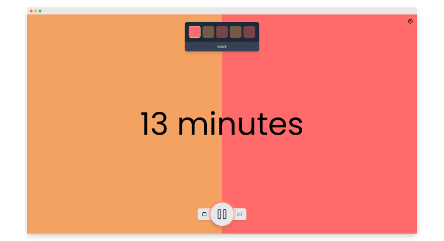
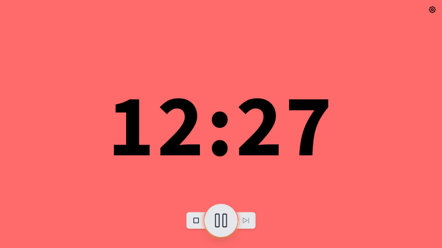
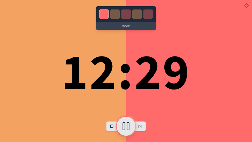
... and then I could start doing all kinds of fancy stuff: a progress bar in the background, coloured boxes for the different session types, a settings panel, fancy animations, whatever I liked. And once the timer page was done and had a minimally viable set of features, I could have a go at the home page and other stuff. I did the timer page first because that is what users would spend most of their time on, anyway.
It would've been pointless to start with the home page, because, logical it may sound, it's nothing more but a funnel to the timer page. Alternatively, I could have made the timer page the home page, too, as is the case with some apps. But then I would have had to introduce the app there, bloating a page that was meant to help you focus with its cleanness.
Managing priorities
It was also important to realize what is critical and what is not. There's no point building the fancy glowing ring animation for the play/pause button if the app still cannot switch between sessions reliably. Usually, it's a good idea to leave refining the visuals (eg. adding animations or making colours consistent) to the end, unless they are a key part of the application.
This won't be new if you've worked on a project before. If you're keeping your application in a hosted Git repository like GitHub, GitLab or Bitbucket (you better be!), then you should start making use of issues (with labels) and milestones as soon as you can. They help you categorize the features you want to have and avoid feature creeping, where you keep adding new stuff and thus growing an endless wish list instead of finishing the thing.
Here's something that maybe I could have done, too: assign 0.1, 0.2 and such milestones to my issues. It would have helped me "feature freeze" releases so that I don't keep adding all kinds of new wishes to the 1.0 milestone and release 0.x versions ad-hoc. It will be borderline impossible to create a fixed set of features for 1.0, because as you develop the app and time passes, your expectations will change, too. Still, it's a good idea to only add something to the 1.0 milestone (or any milestone) if you are sure you need it. You can also ask your friends or the people of the internet if they would want a feature or not.
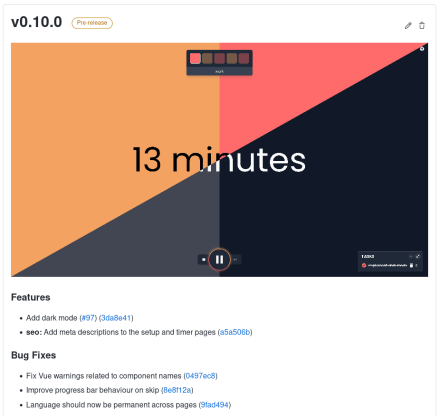
As a bonus point, the issues you create in your repository can also serve as part of the documentation. You can outline new features there and you will even be able to generate changelogs from the merged pull requests (like I do using conventional-changelog/standard-version).
Face it: it will never be perfect
As with all forms of art, at some point, you'll have to draw the final stroke. In software development, it's not the final one, though, but it's a very important one: the 1.0 milestone. If you keep refining your app for years without ever releasing 1.0, it will remain unfinished and possibly hidden forever. AnotherPomodoro has been in development for more than a year now, which is probably a bit too long compared to that
- I won't be making a lot of money with it (people don't support free projects that much) and
- it likely won't have tens of thousands of monthly users.
Speaking of feature creep, in my case, I still think that it would be cool to add motivational quotes, a reward system, personal statistics and more to the app, but if I started working on these before releasing 1.0, it would probably take another year to finish. Also, new ideas and wishes would arise anyway, so maybe I wouldn't be much ahead on this journey. These things are not critical to make the app usable and enjoyable, so they go to the backlog, and I'll finish them if I have enough time and motivation.
Now I only need to fix the remaining bugs 🐞
I'd love to hear your opinion about this post, how you stay productive or what you think of my app! Don't forget to check out the app's GitHub repository!
See you around.


Top comments (0)