Follow me as I briefly describe my coding journey to build the NFT Preview component from Frontend Mentors. I’m a firm believer in learning in public, sacrificing perfection while learning, and each day improving by 1%. I welcome feedback from anyone and will update the final project as time allows. Frontend Mentors is a online platform that provide front-end challenges that include professional web designs.
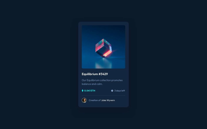
The goal is to build this:
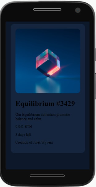
Step 1: Build an empty layout that focuses on a mobile first design
Started with a simple layout that focused on a mobile layout first, then a desktop layout. I’m loving the CSS variables to use colors with a descriptive name.
Step 2: Focused on one section at a time
Focused on the top section's styling and structure of the primary image. I still haven't worked on the desktop version.
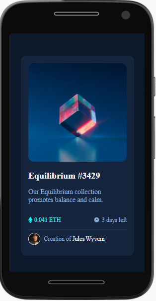
Step 3: Focus on styling the final section and adding content
Next step was to update content in the lower section with styling and adding the images based on the design given. Now I worked on the desktop version with a few simple media queries.
Step 4: Biggest problem was the active state in the project for me
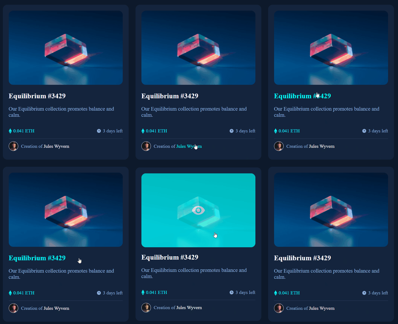
A final step is to add the active state to the project. This included cursor pointers and color changes, but the big one was an image over the primary image. The trick was to have one image with position: absolute, while the other was position: relative, and have a system of hiding one or the other based on the cursor location.
Here is code that I am proud of. It works with the hover CSS styling to display the eye image when you hover. I’m pretty sure there is a better way to do this but I didn’t want to use a background image.
You can play with the final product here and read the code here.
What I learned
- The hardest part of this project was doing multiple actions at once to the image section. I needed the active state to change when hovering, the images to be visible stacked on top of each other, and a light blue background color that allows all images to show. A super fun challenge.
- There is this resource I saw but haven't appreciated til now and it's Google fonts at https://fonts.google.com/. One of my goals in doing these frontend projects is to get better at design and styling. This was a valuable gem to find.
Thank you for reading
Thank you for reading my learning journey and if you have tips, please DM me on Twitter or LinkedIn.


Top comments (0)