I love building side-projects. Seeing your own ideas come to life is amazing.
Side-projects provide a creative outlet and are a great way to learn and experiment with new things.
If your side-project takes off, it might even turn into a startup. Many well-known companies started off as side-projects: Twitter, Slack, GitHub, and Instagram to name a few.
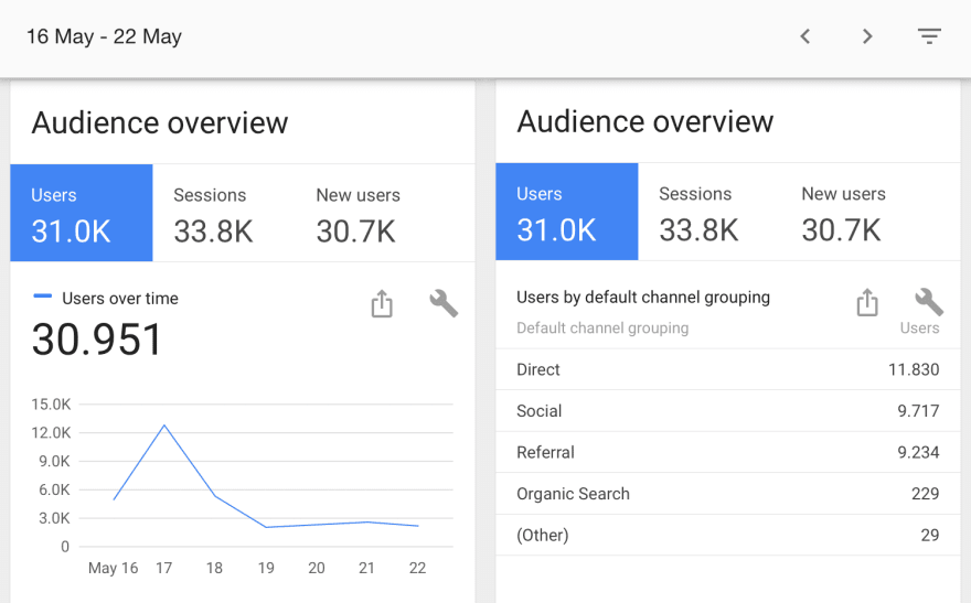
Recently, I launched a new side-project and was able to get 31,000 users in the first 7 days after launching.
The website I built is called Screely. It allows you to instantly turn a screenshot into a beautiful design mockup, without the hassle of using Photoshop or Sketch templates.
In this article, I'll tell you how I got the idea, how I built it, and how I managed to get 31,000 users in the first 7 days.
Finding an Idea
The idea for Screely came from a group chat of designers and developers that share and discuss their projects. Often they share screenshots to ask for feedback or to show finished work.
But there was one person whose screenshots stood out. He shared beautiful images instead of plain screenshots like everyone else.
They looked more like the designs you see on Dribbble or Behance.
It turned out he had made a custom template in Sketch to add these effects.
I wanted to make my screenshots look similar. But I did not want to design my own templates and have to load every new screenshot into Sketch.
I knew about Carbon, a tool that instantly generates a nice image of your code, but I wanted something similar for my screenshots.
I couldn't find a website that did this, so I decided to build it myself.
Define your Minimum Viable Product(MVP)
The first thing I do when I start working on a new product is to define an MVP.
There are a few different definitions of what an MVP is. Usually, it's described as a product with the smallest number of features that still solves the problem.
Limiting yourself to building only an MVP is very important for two reasons.
First, you prevent yourself from spending lots of time building a product without validating the idea and knowing if it's something others want to use.
Second, you prevent yourself from endlessly adding more features and tweaking your product.
These aren't bad things, of course. But this is a dangerous trap that can lead to working on your product for months or years before ever releasing it.
"In product development, the minimum viable product (MVP) is a product with just enough features to satisfy early customers, and to provide feedback for future development" - Wikipedia
The faster you ship your MVP, the faster you can validate your idea and improve your MVP with feedback from users.
For Screely, I defined the MVP as:
- A user should be able to pick a local image file (jpg, png)
- The system should generate an image with a mockup window, box shadow, and a background color
- A user should be able to change the background color
- A user should be able to download the generated image
Of course there were plenty of other features that I would've liked to add: drag-and-drop an image, gradient backgrounds, or being able to tweet the generated image.
But none of these are part of the core functionality. And as I said before, it's important to limit yourself for the MVP, or you start getting into this endless feature sprawl.
Preparation
Before firing up my text editor, I explored potential technical solutions and their pros and cons.
After doing some research, I considered 3 different options:
- Use an HTML canvas element and JavaScript
- Use regular DOM elements and use pure HTML and CSS
- Generate the image server-side and return the end result
Each option had its pros and cons.
For example, rendering the image server-side would avoid cross-browser compatibility issues. But as a user, I would not want my screenshots being sent to a server since I don't know if they are saved or used in any way.
It would also require running a server, whereas I could host a pure front-end solution for free on Netlify. So option three was out.
With the first two options left. I finally decided on using the HTML <canvas> element and painting on the canvas with plain JavaScript. Additionally, because I hadn't used the HTML canvas element before, and side-projects are a great way to learn new things, I was inclined to go down that path. 😉
Let's Start Building
The most exciting part of any project.
I immediately started with the basic functionality. I did not spend any time on a name/domain, design, logo, or setting up social media. You can do these later.
1 hour into the project I had the very basics working.
- A placeholder name - sexy screenshots (it's what we called these images in the group chat)
- A file input
- A generated
<canvas>element with the image I select with a colored background and with the added fake window
I hardcoded everything, and it only worked with one (specific) screenshot. You could not change the background color, or use a screenshot with different image dimensions.
I improved the product from there, starting with the ability to handle different size screenshots.
I also started adding the other features I had defined for the MVP, like adding a color picker to change the background color and a download button for the generated image.
Now that all the MVP requirements I set in the beginning were met, it was time to launch (yes, already)!
Preparing for Launch
At this point my MVP was nothing more than a placeholder title, an HTML button, and a small list of things I wanted to add after launching the MVP.
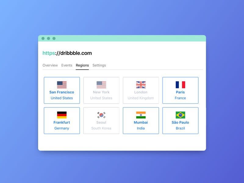
After picking a name (Screely), buying the .com domain, and making a landing page, this was the result:
I also added an e-mail opt-in and a link to a Twitter account to make sure I could stay in touch with users after the launch.
Another thing I added was a chat button on the right bottom so users could easily talk to me. I received valuable feedback on the product, bug reports, and feature suggestions there.
There are many options you can use to embed a chat on your product. I used Drift but you can also use alternatives such as Intercom or Olark.
Build in the open
A quick side-note about launching your project: launching should not be a one day event where you share your project and hope for the best.
Your "launch" starts the day you start working on your idea. You should start promoting your project from day one.
When I started working on Screely, I tweeted about my progress just one hour after starting. I also tweeted regular updates as I built the MVP.
Working on a little web app that turns your screenshots into those fancy Dribbble shots (with background, fake window, shadows, etc.)
— Jurn @ 🇳🇱 (@jurn_w ) 31 maart 2018
Quickly share a new design or feature you are working on Twitter/Slack/Telegram/Jira/Whatever and make it look good!🤩 pic.twitter.com/nE3xSHXjju
This helps spread awareness about your new product, gets people curious, and helps you get feedback.
Don't be embarrassed about showing an unfinished product. People love seeing others build cool things and understand that it takes time to build cool projects.
Launch
I posted Screely to Product Hunt, Hacker News, Reddit, Designer News and a few other websites.
I won't go very in-depth in where to post your product and best practices for each platform, as that's a blog post on it's own.
The most important thing is that you reach your target audience. For Screely, that was mainly designers, developers, and technical writers.
Product Hunt
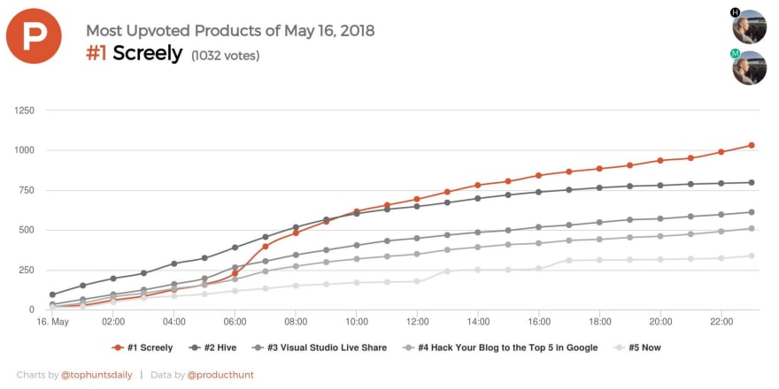
The Product Hunt launch went extremely well and exceeded all my expectations. Screely ended up becoming the #1 product of the day with 1032 upvotes.
Screely was #1 product of the day, #1 product of the week and #4 product of the month. This meant it would also appear in Product Hunt's daily and weekly newsletter.
In total, Product Hunt brought in close to 11k visitors in the first week!
Hacker News
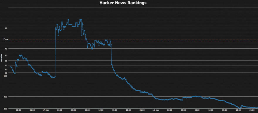
Screely started quite slow but after a few hours it suddenly jumped to the front page of Hacker News. Even though Screely's highest position was 'only' #15, it still resulted in a lot of traffic.
I estimate that 5 -10k users came from Hacker News.
It's unclear exactly how many users came from HN as it does not add a ?ref= parameter to the URL. I have included a more detailed look at traffic sources later in this article.
Designer News
The third most successful platform (in terms of traffic numbers) was designernews.com.
Screely got to #2 on the front page and this resulted in just under 3k new users.
Going Viral
I had posted Screely on many other places, like Reddit and Indie Hackers, but the previous three were by far the most successful.
A cool side-effect of doing well on places like Hacker News and Product Hunt is that your product shows up on many other places. Tweets, newsletters, smaller blogs, aggregators and more.
For example, Screely was mentioned by CSS tricks to their 360k followers.
Sick of your screenshots just being screenshots, not put within fake browser windows with a drop shadow?https://t.co/k6PwIzPX7x pic.twitter.com/qDgJBC3Odq
— CSS-Tricks (@Real_CSS_Tricks) 17 mei 2018
Screely was also included in Codrops Collective #416, a popular newsletter among designers.
In total, Screely had just under 31,000 users in the very first week.
Improve with User Feedback
Given the success of the launch, I can confidently say that the idea has been validated. Now I know it's worth it to dedicate more time to this project.
Remember the chat feature I implemented to prepare for the launch of Screely? It was filled with feature requests and feedback by users of Screely.
Now that you know exactly what your users want, it's easy to know what features to work on and what to prioritise.
For example, many users wanted to be able to drag-and-drop their image into Screely so I added that feature first.
Another often requested feature was to automatically match the background color with the image. So you immediately have a background that suits your screenshot.
I added a script that analyzes the image, generates a color palette and picks the most dominant color for the background.
🚨 New feature
— Screely (@getScreely) 28 juni 2018
Screely now finds the dominant color of your screenshot and sets that as background color. pic.twitter.com/JIfFBsJg2O
Apart from adding new features and fixing bugs, I also spend time polishing up the design.
Working on some major improvements to the homepage, here's a little sneak peek of the before and after👀 pic.twitter.com/ObTcAvkJgh
— Screely (@getScreely) 23 juli 2018
If you want to get updates on Screely. Follow @getScreely on Twitter, or sign up for the monthly product update by email on screely.com.
Advice for Shipping Your Side-projects (faster)
- Keep it simple: Keep your MVP as limited as possible. Use programming languages you are familiar with instead of whatever framework is trendy. The more complex your project becomes, the longer it takes to ship and get your first users.
- Ship everyday: Keeping the momentum going in your side-projects is super important. Try to work on your project every single day. Refactor a single function or fix a tiny CSS issue. It doesn't matter how small the task you complete is, keep shipping! If you skip a day (it happens), make it a top priority to get something, no matter how small, done the next day.
- Take shortcuts: Whenever possible, try to find shortcuts to ship your product faster. If you can find a good open-source solution for a problem, use that instead of writing your own from scratch. Use tools like Netlify to host and deploy instead of setting up your own server.
- Launch before you think you are ready: Don't get caught up in perfecting your product. You can get away with a lot more than you think.
- Programming is a tool to get your idea into the world: Don't over-engineer your side-project. Your users don't care about your tech stack, what matters to them is the benefit they get from using your product. They don't care if you are using Docker or React, they focus on what problem your product can solve for them.
- You know enough: Many people that are learning to code postpone working on their own projects. They often think they need to follow more tutorials, buy more courses, and read more books. Don't keep learning forever, start building! Even seasoned developers still look up 'simple' things like how to remove an element from an array.
Good luck and have fun!
This post was first published on freeCodeCamp's medium publication and edited by one of their volunteer editors.


Top comments (3)
This is awesome, congratulations! 31k users in a week is great and I hope monetization works out for you! I was wondering as I read this, have you thought of doing different kinds of windows? So not just web browser windows, but maybe also on mobile devices?
Thank you!
I have added a few window variations after launching but these are all desktop window variations. Mobile devices will be added in the future!
Brilliant article Jurn, thank you for the walkthrough!
It's easy to think products need to be perfect or technologies must be the "best" available and end up losing track of what's important: the product itself.