If you are a frontend developer and create some tables/grids, keep in mind the following 3 simple tips so the outcome is more readable for your users:
Tip 1 - format and use monospaced fonts for numbers
Imagine that you have a table like this:

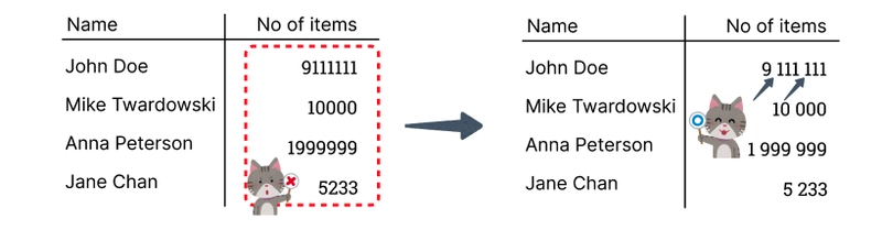
The column No of items is hard to read - can you tell what is the number 9111111 at first glance? Let’s format it:
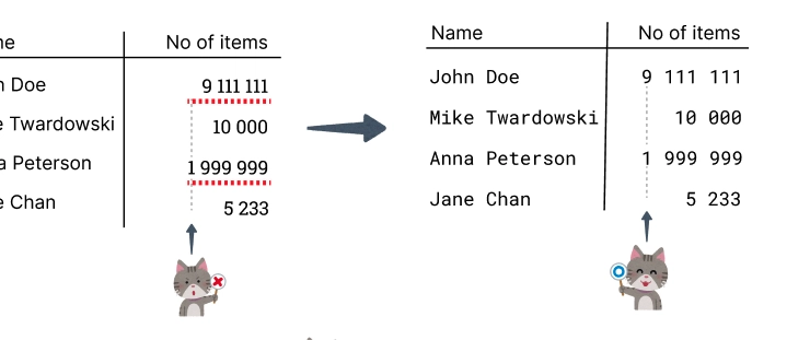
Much better, but if you look at 9 111 111 and 1 999 999 in the table, the length of the 1 999 999 is much bigger and makes an illusion that 1 999 999 is greater than 9 111 111. It’s because the width of 1 and 9 in the chosen font is different. Let’s fix it with a monospaced font (all characters in such a font have the same width):
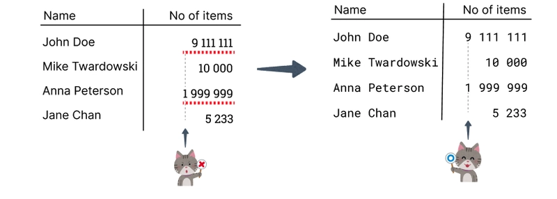
The numbers are now easy to compare but the text became also monospaced. Unlike in the case of numbers, text is more readable without a monospaced font. There are fonts that are monospaced for numbers but not for other characters - let’s see the result:
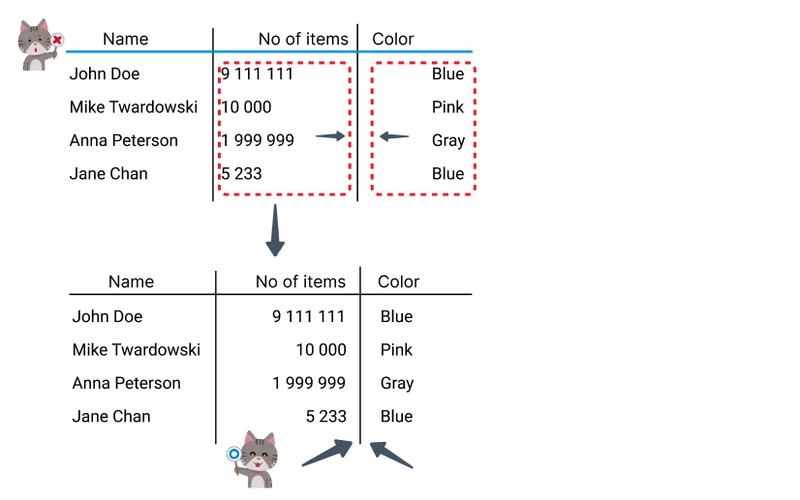
Tip 2 - proper alignment in header and columns
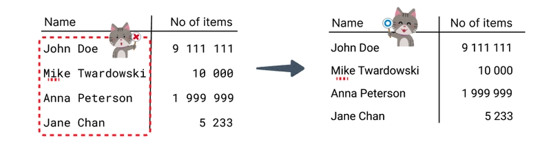
Let’s consider such an example:

As you can see, the alignment is a bit strange.
Alignment in columns
Let’s start with correcting the alignment in columns:
- align to left: text
- align to right: numbers - because it’s easier to compare the numbers this way
What about centering in columns?

It’s ok for columns with values of the same length (like “Sent”) but not recommended for other cases (like numbers and text with various length) because it’s much less readable.
Alignment in headers
General rule for alignment in headers is to fit the alignment in its column:

It’s clear what the header is corresponding to.
Tip 3 - don’t overuse colors and lines
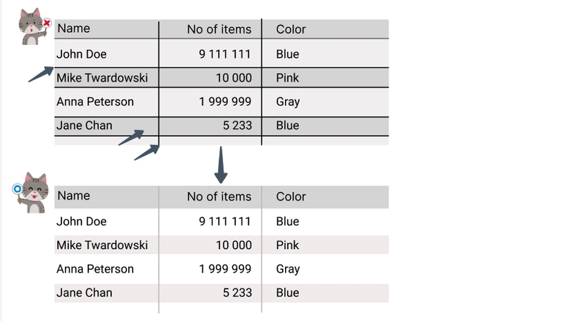
It’s good to use delicate colors to make it easier to follow data in a row but too many lines make the look less readable and a bit old-fashioned.
Summary
From my experience, a neat and readable table should follow at least the following tips (of course there are many exceptions, I’m generalizing 🙂 ):
- for numbers - use monospaced font, for text - use not monospaced font,
- numbers should be aligned to right, text to left,
- colors shouldn’t bring users attention but the data should be easy to track in rows and columns.
Thanks for reading!

Top comments (0)