
In this tutorial, we’ll be creating a reusable React accordion component from scratch, and share it with Bit so it can be used in other apps and people.
When done, you will have this component available to use, share and develop for any application you’re working on! Let's get started.
Getting started
Accordions allow you to break down the large section of any content, such as FAQs, into smaller chunks. A user can view the sections one by one, improving user-experience and helping users focus on the right info at the right time.
Here’s the output of this component.
I grabbed the short stories from 100wordstory.org. The title always appears, and content can be shown/hidden with a click on the story title.

Inception
The two basic ways to handle components are JavaScript and CSS.
This component is css-heavy. With Accordions, there’s always this trade-off even when it works perfectly as expected.
https://medium.com/media/6a391c8c9aff886614a84b4d5fb7f52c/href
While CSS is very efficient, JavaScript uses CPU.
The content in the story doesn’t have a fixed height. JavaScript grabs the content calculated height, keeps track of it and then shows/hides it.
CSS can’t do this but CSS animations don’t have CPU usage. So, CSS animations will have to use some arbitrary height.
In a react way, the hidden content should not be on the DOM. But, when building an accordion, I assume things should be a bit different. I’d only like to arrange the information on the screen and won’t mind search engines and other bots having access to all FAQs or stories.I’m just looking to improve user experience, not block access to the content which isn’t shown right now.
With all that in mind, I went with the CSS-based approach. The max-height for the content is 100rem (that’s 1600px for default browser setting). I animated this height in 0.5s in a bezier curve while the content gets its opacity from 0 to 1 in 0.2 seconds. It looks as if the content is loading while the container is expanding.
The arrow on the right is a base64 encoded image as a background, which rotates 180 degrees when the content opens (through CSS).
That is what CSS does beyond setting margins and padding. All the CSS code is in the index.css file.
Stories
Define stories in here as an array of objects, each object should have title and story. It is of the format below.
const stories = [
  {
    title: 'The Title',
    story: 'Story Here'
  },
  {
    title: 'Another Title',
    story: 'Another Story '
  },
  {
    title: 'Next Title',
    story: 'Next Story Here'
  }
]
export default stories;
App
The app is the parent component. Import the stories into App.
import React from 'react';
import './App.css';
import AccordionItem from './AccordionItem';
import stories from './stories';

const App = () => {
  return (
    <div className="wrapper">
      <ul className="accordion-list">
        {stories.map((story) => {
          return (
            <li className="accordion-list\_\_item">
              <AccordionItem {...story} />
            </li>
          );
        })}
      </ul>
    </div>
  );
};

export default App;
It has a wrapper div and then creates a list of stories. Each is a story is in its own list item. The single item is rendered using AccordionItem. The AccordionItem gets the story as a prop.
A story is an array of objects.
Each object is a story is an object with title and content as keys. The object story is passed to the AccordionItem . Got it? :)
Accordion Item
The accordion has the state opened which is true if the accordion is expanded. It also has onClick method that toggles the state.
If the accordion is opened it gets an extra class of accordion-item--opened. This makes the content visible with all the animations I discussed.
class AccordionItem extends Component {
  state = {
    opened: false
  };

  render() {
    const {
      props: { title, content },
      state: { opened }
    } = this;
    const onClick = () => {
      this.setState({ opened: !opened });
    };
    const className = `accordion-item ${opened && 'accordion-item--opened'}`;
    return (
      <div className={className} onClick={onClick}>

      </div>
    );
  }
}

export default AccordionItem;
We need to return the JSX with title and content. The variables are destructured before using the props and states in the render method.
This is the returned JSX.
return (
      <div className={className} onClick={onClick}>
        <div className="accordion-item\_\_line">
          <h3 className="accordion-item\_\_title">{title}</h3>
          <span className="accordion-item\_\_icon" />
        </div>
        <div className="accordion-item\_\_inner">
          <div className="accordion-item\_\_content">
            <p className="accordion-item\_\_paragraph">{content}</p>
          </div>
        </div>
      </div>
    );
It returns a wrapper div with onClick, you can show/hide the accordion by clicking anywhere on the div. There’s a heading with the passed title, along with the icon. The icon itself is a png image set as a background.
The content of the story is in another div, it is only visible if the parent has the class accordion-item--opened This is why className variable was used. It also holds all the animations.
Each accordion-list__item has a border top (except the first one).
So we get the desired output…
Output

Make the component reusable with Bit

Bit (open source) is a fast and visual hub for sharing reusable components.
It helps your team organize and share components, which can be used to build new applications and shared between team members.
Components can be shared with Bit from different projects and libraries, and become available to discover, play-with, and install in your apps.
Simply put, you can think of Bit as your component “Lego box” to which you can share components from any project, and then find and use them to build new things. Useful, right? there’s much more, but we won’t get into it now.
First, log in to Bit and create your component collection.
Now our collection is ready; let’s use Bit to quickly share the component from the repository it’s in (Bit does the “magic”; it automatically isolates the component and shares it to the cloud, without a single code or file change!).
Let’s share the tab component.
Install Bit
If you don’t have Bit already, install it globally using
npm install -g bit-bin
Initialize Bit for the project
Initialize Bit workspace with:
bit init

This command adds bit.json and .bitmap files so Bit can start tracking and isolating components in the repository when told to do so.
following bit document we need an entry point for component
create index.js and move all code from App.js
import React from 'react';
import './App.css';
import AccordionItem from './AccordionItem';
import stories from './stories';

const App = () => {
  return (
    <div className="wrapper">
      <ul className="accordion-list">
        {stories.map((story) => {
          return (
            <li className="accordion-list\_\_item">
              <AccordionItem {...story} />
            </li>
          );
        })}
      </ul>
    </div>
  );
};

export default App;
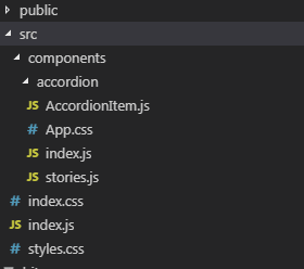
Now, ask Bit to track all the components you put in src/components directory.
bit add src/components/\*

Login to Bit account prepare to push code to Bit repo
bit login

Set a Bit compiler for the workspace (I’ll use react) :
bit import bit.envs/compilers/react --compiler

and you can build your own components.
bit build

Now, declare this as the 1.0.0 version.
bit tag --all 1.0.0

Run bit status again to confirm this version is attached:
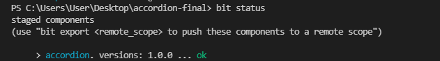
Push them to the Bit remote scope:
bit export kriss.reactcomponent
That’s it! The component you just exported will now show in your collection.
Any comment-block above the component definition is used as the component description, and if I were to add tests- Bit would run them too. You can now install components using Bit and NPM, and even import them into other projects and continues to develop them. Take a look.
accordion - reactcomponent · Bit
Conclusion
You’ve created a good Accordion component for yourself and shared it with Bit. Now, you and your team can use it in any app you like, to build faster. Hope you enjoyed, and please feel free to comment and ask anything! Cheers 😃
- 5 Tools for Faster Vue.js App Development
- 5 Tools for Faster Development in React
- 11 JavaScript Animation Libraries For 2019

Top comments (0)