Font
There are 7 fonts with 124(!) variations.
Sohne-var is the primary font. This was probably a ">= 5" figure decision for them to license this font. Here is some more detail about the font and similar types.
Colors
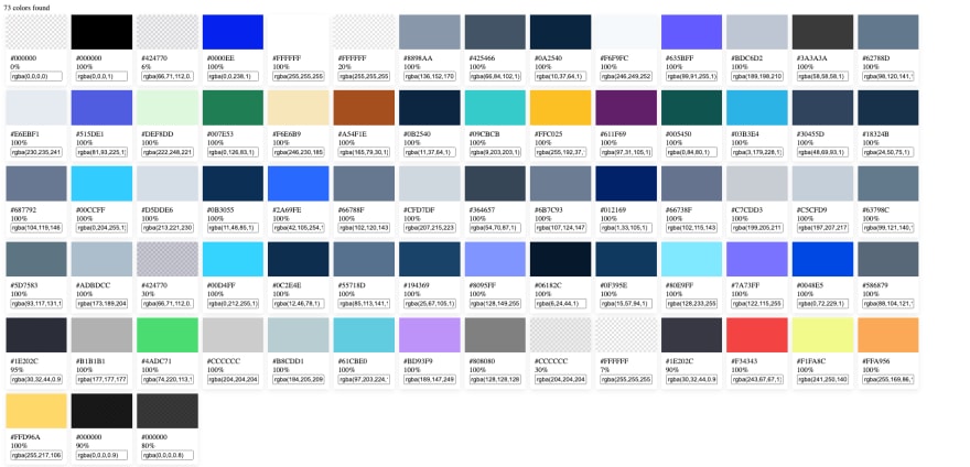
73 colors were used on that page. This is probably high because they make almost everything on the page an html element. This is highlighted by the fact that there are only 26 assets on the whole page.
Layout
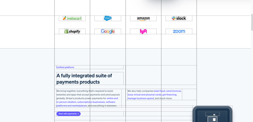
Their previous design was 2 columns with a balance on the center line of the screen. This new design is 4 columns with a left aligned balance.
Notable
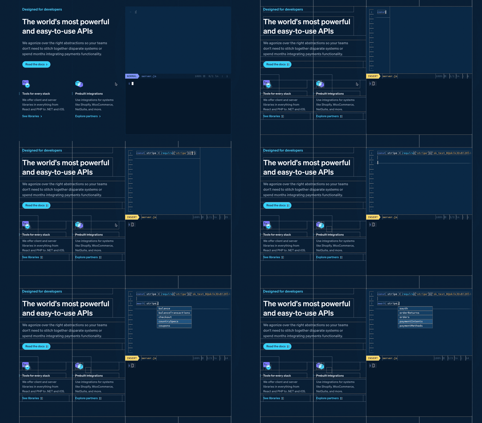
The animations are smooth and intricate as they were with the previous site. The animated text editor is pretty amazing.
The outlines I added to illustrate that it's not a gif but actual html elements. Looking at the source code it supports multiple languages, autocompletions, line numbers, a terminal area and more. I can only imagine this feature took considerable amount of time to make. Hopefully they open source it at some point.
Conclusion
There is a depth of knowledge with each new design that stripe uses. My previous post talked about the animation of the drop down from their previous version:


Top comments (4)
Great post, color is very important in home page design. Here's another cool post on creating home pages that explores the dynamism and emotionality of your homepage design, navigation, heading design and more - gapsystudio.com/blog/how-to-design....
Thank you for a thorough analysis. What tools can we use to re-engineer the design?
Visual Inspect for aggregates and single element inspection.
WhatFont for font inspection
User CSS I use this with custom css rules to outline things and a few other tricks.
Browser Devtools
Thanks for the reply