You probably have seen a lot of "covidtracker" or cryptocurrency charts applications for some time now, some of them offer really awesome charts which you can hardly make with commons libraries of "ready to make" charts.
I must admit... I love play with data and seeing these kinds of beautiful UIs with all those numbers so well presented makes me jealous, I was like : oh, I really need to be able to build that !
So I recently started to put my head into the famous d3.js library.
Don't expect I come up with something impressive here, no but I hope a good basic to introduce you to data visualization with d3.js.
What we are going to build is is a bar chart of the top 10 population by country :
What is d3.js ?
In fact d3.js is not a chart library, It is a kind of big API to manipulate the DOM and offers a lot of utilities functions. You can manipulate svg, canvas, html and so construct charts, graphs, maps, everything you want for data visualization.
The biggest advantage of using d3 is that every cool data visualization you've ever seen on the web are probably feasible using d3.js.
The major drawback is d3.js may be overwhelming at first and is quite hard to learn in my opinion.
Build the application
Prepare the project :
We won't use any framework or particular config here just for the sake of simplicity some pure javascript.
Create a index.html file and include this :
<!DOCTYPE html>
<html lang="en">
<head>
    <meta charset="UTF-8">
    <meta http-equiv="X-UA-Compatible" content="IE=edge">
    <meta name="viewport" content="width=device-width, initial-scale=1.0">
    <link rel="stylesheet" href="style.css">
    <title>d3.js Demo</title>
</head>
<body>
    <h1>Top 10 population by country</h1>
    <div id="chart"></div>
    <div id="tooltip">
        <h3 id="country_name"></h3>
        <p id="country_population"></p>
    </div>

    <script src="https://d3js.org/d3.v6.js"></script>
    <script src="index.js"></script>
</body>
</html>
We are importing the d3.js library and the index.js file which is going to contain our code.
Create a style.css file with thoses styles :
* {
    margin: 0;
    box-sizing: border-box;
}

body {
    box-sizing: border-box;
    min-height: 100vh;
    display: flex;
    flex-direction: column;
    justify-content: center;
    align-items: center;
    font-family: Avenir, Helvetica, Arial, sans-serif;
}

svg {
    background-color: #2a2a2e;
    color: white;
    border-radius: 5px;
}

h1 {
    padding-bottom: 2rem;
}

#tooltip {
    position: absolute;
    visibility: hidden;
    background-color: white;
    font-size: .7rem;
    border-radius: 5px;
    padding: .3rem;
    display: flex;
    flex-direction: column;
    justify-content: center;
    text-align: center;
}

#country_name {
    padding: .3rem;
}

#country_population {
    padding: .3rem;
}

.bar {
    transition: .2s all;
}
Finally, add an index.js file. We are now ready to start coding.
Prepare the data
We are going to use restcountries API.
What we want to display on the chart is a list of the top 10 countries in term of population so we only need the name and population for x/y axis of each country.
Let's start by gathering these data and format them in the desired shape :
const API_URL = 'https://restcountries.eu/rest/v2/all';

const getData = async () => {
  const reponse = await fetch(API_URL);
  const result = await reponse.json();
  // Sort by population
  const dataSort = result.sort((a, b) => b.population - a.population);
  // only keep the top 10 population
  dataSort.length = 10;
  // We only need name + population
  const dataReady = dataSort.map((country) => ({
    name: country.name,
    population: Math.floor(country.population / 1000000),
  }));
  return dataReady;
};
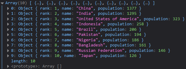
Now we have exactly what we need :
https://i.gyazo.com/384c61698aae5dc6f39c86d8b5447150.png
Build the chart :
Create the main element
Create a new function which will be in charge of generating the bar chart with the help of d3 :
const generateChart = (popData) => {
  const margin = {
    top: 20,
    right: 40,
    bottom: 60,
    left: 80,
  };
  const width = 1000 - margin.left - margin.right;
  const height = 500 - margin.top - margin.bottom;

  // Create svg
  const svgElement = d3
    .select('#chart')
    .append('svg')
    .attr('width', width + margin.left + margin.right)
    .attr('height', height + margin.top + margin.bottom)
    .append('g')
    .attr('transform', `translate(${margin.left},${margin.top})`);
}
Notice how we use "d3.select" to select a dom element and chains other methods such as "append" and "attr" to construct our elements. Thoses are really the basic of d3.
The margin, width and height variables are there to set up the position of our svg element and will be use to position our axis as well.
Create axis
Next let's create our axis with d3-scale methods :
    // Add X axis
    const xScale = d3.scaleBand()
    .range([0, width])
    .domain(popData.map((s) => s.name))
    .padding(0.2)
    svgElement.append('g')
        .attr('transform', `translate(0, ${height})`)
        .call(d3.axisBottom(xScale));

    // Add Y axis
    const yScale = d3.scaleLinear()
        .domain([popData[0].population, popData[9].population])
        .range([0, height]);
    svgElement.append('g')
        .call(d3.axisLeft(yScale));

   // Add grid
   svgElement
    .append('g')
.call(d3.axisLeft(yScale).ticks().tickSize(-width).tickFormat(''));
We have used several utilities methods from d3 part of the scale module to correctly map our axis with the datas (scaleLinear, scaleBand).
If you open your navigator you see now an svg element with two axis but no data yet.
Represent the data with bars
To represent our data with bar we simply create rectangles and add them to our main svg element with the correct width and proportion again thanks to certains d3-scale methods (bandwidth, xScale, yScale) :
  // Draw the bars
  svgElement
    .append('g')
    .selectAll('.bar')
    .data(popData)
    .enter()
    .append('rect')
    .attr('class', 'bar')
    .attr('x', (d) => xScale(d.name))
    .attr('width', xScale.bandwidth())
    .attr('y', (d) => yScale(d.population))
    .attr('height', 0)
    .style('fill', '#00FA9A')
    .transition()
    .duration(750)
    .attr('height', (d) => height - yScale(d.population));
Our chart is working right now but let's make it a bit more "alive".
Add Tooltip and hover effect :
We want to show the exact population when we hover one bar so we need to create a tooltip and add mouse events on each bar.
Remember: there is a div element in our index.html page with a tooltip id, and some styles in the css. In fact everything was ready, the tooltip is there but hidden, we simply need now to add mouse event :
 // create a tooltip
  const tooltip = d3.select('#tooltip');
  const tooltip_name = d3.select('#country_name');
  const tooltip_pop = d3.select('#country_population');

  // Add mouse event to show the tooltip when hovering bars
  d3.selectAll('.bar')
    .on('mouseover', function () {
      d3.select(this).style('fill', '#59ffb2');
      tooltip.style('visibility', 'visible');
    })
    .on('mousemove', function (e, d) {
      tooltip
        .style('top', event.pageY - 10 + 'px')
        .style('left', event.pageX + 10 + 'px');
      tooltip_name.text(d.name);
      tooltip_pop.text(`Population: ${d.population} Millions`);
    })
    .on('mouseout', function () {
      d3.select(this).style('fill', '#00FA9A');
      tooltip.style('visibility', 'hidden');
    });
Add text label for the axis :
  // text label for the y axis
  svgElement
    .append('text')
    .attr('transform', 'rotate(-90)')
    .attr('y', 0 - margin.left)
    .attr('x', 0 - height / 2)
    .attr('dy', '1em')
    .style('text-anchor', 'middle')
    .style('fill', 'white')
    .text('Population (in millions)');

  // text label for the y axis
  svgElement
    .append('text')
    .attr('y', height + 30)
    .attr('x', 0 + width / 2)
    .attr('dy', '1em')
    .style('text-anchor', 'middle')
    .style('fill', 'white')
    .text('Country name');
Execute the code :
In the main scope simply execute our functions
getData().then(generateChart);
And there you go, now you should have this result .
If you want to check the entire code : here
There are really so much possibilities and things to build in the data visualization domain, just be curious and explore !
I hope I have been clear enough and that it has help you to apprehend chart construction for creating better UI.
Have a good day!

Top comments (0)