
I completed the first of Daily UI's 100 day design challenge. Here's what I did, how I did it, my thoughts from the first day, and I already strongly recommend doing it!
The challenge:
Design A Sign Up Page.
I began by doing a little research on the internet to gain inspiration. After a few minutes of doing so, I had a couple ideas. For this first day I decided to do two different 'takes' on a sign up page. The first being a modern, minimalistic sign up page for a mobile app. The second also being a modern and minimalistic sign up form but for a website.
Take 1:
 Daily UI ::001 - Sign Up Page; Take 1 - Bēhance
Daily UI ::001 - Sign Up Page; Take 1 - Dribble
For this first take I wanted to give designing a sign up form for a mobile app a shot. I'm pretty satisfied with it currently, though there is room for improvement so I'll definitely return to this first take and update it a bit later on.
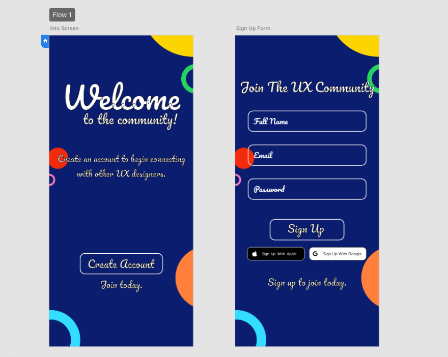
The first of the two pages, the "Intro Screen" is the welcome/introduction to the app. The page is very basic in the sense that besides the welcome text, it only features a "Create Account" button.
Moving to the "Sign Up Form" page, the page viewed after pushing the Create Account button, it features the actual form where users can choose to create an account with the app, or create one using their Apple or Google account. Once they've filled out their information using any of the sign up options, pushing the sign up button will transport the user straight into the app.
Take 2:
 Daily UI ::001 - Sign Up Page; Take 1 - Bēhance
Daily UI ::001 - Sign Up Page; Take 1 - Dribble
For the second take I decided to go with a sign up page for a desktop website. I began with a simple split screen design I've seen countless times on various, popular websites. This sign up form doesn't feature a sign up with apple or google button because I thought it would be more fitting just to have the user create an account directly. It's followed by two check boxes for auto sign up to newsletter, and a select box for accepting terms and conditions.
As for the color and concept of developers who love salads, it's very random and wasn't my original intention but I thought why not add a bit of humor to liven up the project!
As always, thanks for reading, and consider following me on Dribbble and or Bēhance to stay up to date on each project I complete!

Top comments (0)