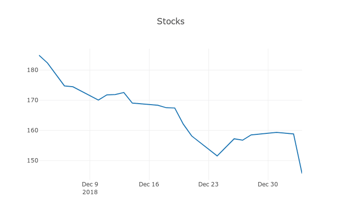
Understanding stocks can be hard but In this post, we will be visualizing stocks with the help of Plotly(a visualization Library). As we all know Python is really powerful when it comes to handling data. Therefore we will be using modules such as Pandas to handle our CSV files and Plotly to visualize our data.
In order to begin we need to install a few libraries
- Install
AnacondaDistribution. (This contains all data science related packages/modules) Installion Link. - Install
Plotly(This is not included in Anaconda)pip install plotly.
If you don't want to install Anaconda. You can install the packages you need by following these instructions.
- Install Pandas
pip install pandas. - Install Jupyter Notebook
python3 -m pip install jupyter. - Install
Plotlypip install plotly.
Lets Begin
- First, let start jupyter notebook by running the following command
jupyter-notebook. - Now we have the
jupyter-notebookrunning. We will be importing libraries.
import pandas as pd
# importing Plotly
import plotly.plotly
import plotly.graph_objs as go
- Turning on offline mode for
Plotly
plotly.offline.init_notebook_mode(connected=True)
- Lets download stocks data (It can be found on Yahoo Finance Search for your favourite stock). I will be using AAPL.
- Now we will be reading stocks csv using pandas.
# read_csv allows us to read csv files
data = pd.read_csv('AAPL.csv')
# few pandas operations.

#This will display first few cells of the CSV files we can always specify how many cells we need by passing a number within those parenthesis data.head(10)
data.head()

# This will tell how many rows and columns are there in our CSV file.
data.shape

# This will describe our data by giving us information like mean, max, min, std and etc
data.describe()
- Selecting specific columns using
pandasto plot them
# Selecting a specific column from csv file. Note brackets should contain exact name from the csv file.
dates = data['Date']
high = data['High']
- Plotting the data using
Plotly
plotly.offline.iplot({
    "data": [go.Scatter(x=dates ,y=high)],
    "layout": go.Layout(title="AAPL Stocks")
})
Output
And now you have the stocks data represented using Line Graph.
I hope you enjoyed this post if you think I missed anything feel free to comment below.
Feel to share it among your friends and colleagues.
Note
This article was posted on MyBlog


Top comments (0)