
🧠 Day 14 of 200 Days of Code: Leveling Up My CSS Skills
As part of my 200-day full-stack development journey, Day 14 was all about diving deeper into CSS — the language that gives life and layout to web pages. Today, I focused on three key concepts that are essential for building responsive and structured layouts:
- CSS Sizing Units:
px,em,rem,%,vh,vw -
floatandclearproperties - Flexbox: The modern way to build flexible layouts
Whether you're just starting out or need a refresher, here's what I learned — with clear explanations and examples to help you get up to speed.
📏 CSS Sizing Units Explained
CSS units define how elements are sized — everything from fonts to containers. Here are the most common ones:
1. px – Pixels (Absolute Unit)
Pixels are the most straightforward unit. They’re fixed and don’t scale with the user’s browser settings or screen size.
p {
  font-size: 16px;
}
2. em – Relative to Parent Element
1em equals the font size of the parent. So if the parent has font-size: 16px, then 1em = 16px.
div {
  font-size: 16px;
}

p {
  font-size: 1.5em; /* 24px */
}
3. rem – Relative to Root Element (html)
rem is more predictable than em because it always refers to the root element (usually html).
html {
  font-size: 16px;
}

p {
  font-size: 2rem; /* 32px */
}
4. % – Percentage
Used to size elements relative to their parent’s dimensions.
div {
  width: 50%; /* Half the width of the parent */
}
5. vw and vh – Viewport Width and Height
-
1vw= 1% of the viewport width -
1vh= 1% of the viewport height
div {
  width: 100vw; /* Full width of the browser window */
  height: 100vh; /* Full height of the browser window */
}
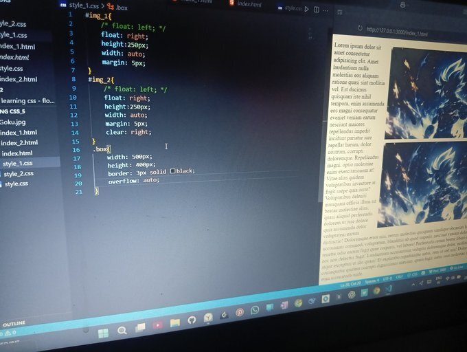
🧱 CSS float and clear
Before Flexbox and Grid, float was one of the few ways to create layouts.
✅ What is float?
It allows elements to float left or right, letting text and other inline content wrap around them.
<img src="image.jpg" style="float: left; margin-right: 10px;" />
<p>This text will wrap around the image.</p>
🧼 What is clear?
The clear property prevents elements from flowing around floated elements.
.clearfix {
  clear: both;
}
You might see this pattern:
<div style="float: left; width: 50%;">Left</div>
<div style="float: right; width: 50%;">Right</div>
<div style="clear: both;"></div>
📝 Pro Tip: Float is mostly outdated for layout purposes. It’s better used for wrapping text around images. For layout, use Flexbox or CSS Grid.
🎯 Intro to Flexbox – Modern CSS Layout Made Easy
Flexbox is one of the most powerful features in modern CSS. It simplifies layout design and handles spacing, alignment, and reordering — all without hacks.
✅ Flexbox Basics
To use Flexbox, set a container’s display property to flex.
.container {
  display: flex;
}
All child elements (flex items) will be laid out in a row by default.
🧰 Common Flexbox Properties
-
justify-content: Aligns items along the main axis -
align-items: Aligns items along the cross axis -
flex-direction: Changes the direction (row or column) -
flex-wrap: Allows items to wrap to a new line
💡 Example: Simple Flex Layout
<div class="container">
  <div class="box">1</div>
  <div class="box">2</div>
  <div class="box">3</div>
</div>
.container {
  display: flex;
  justify-content: space-around;
  align-items: center;
  height: 100px;
}

.box {
  background-color: #4caf50;
  padding: 20px;
  color: white;
  font-weight: bold;
}
This will display three boxes spaced evenly across the container, vertically centered.

If you're on your own learning path, don’t rush. Play around with these concepts. Try small projects. The more you experiment, the more everything will start to click.
📚 Resources to Learn More
- CSS Tricks – A Complete Guide to Flexbox
- MDN Web Docs – CSS Units
- Flexbox Froggy – Interactive Flexbox Game
💬 What About You?
Have you used Flexbox or em/rem in your projects? Still struggling with floats? Let’s talk about it in the comments.

Top comments (0)