
📖 Table Of Content
- 🌍 1. HelloWorld with simple CustomElements
- 🚴 2. Try the life cycle (other than Adapted Callback)
- 🎣 3. Adapted Callback
- 🔧 4. Extends HtmlXXXElement
- 🛤️ 5. Three main ways to generate CustomElements
- 🌓 6. CustomElements with shadow DOM and without
- 🚪 7. Open and Close mode of ShadowRoot
- 🐾 8. Template
- 🎰 9. Slot
- 🌸 10. Adopted Stylesheets
- 🍺 11. (Extra) Todo List Example
💻 Source Code
🛠️ Preparation before starting for my codes
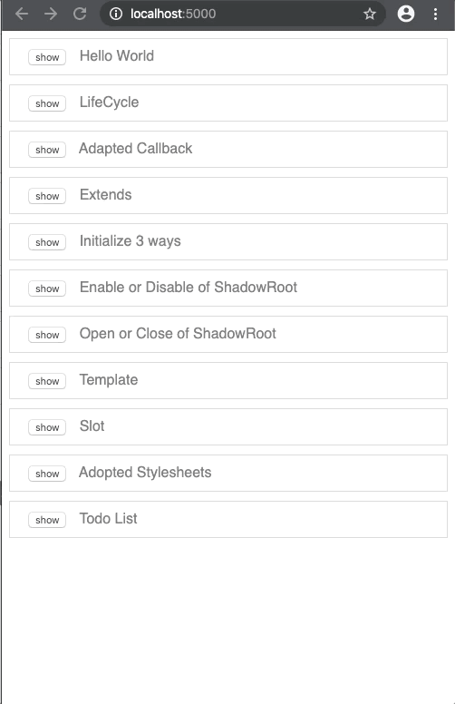
feature-of-web-components/src/index.html
<!DOCTYPE html>
<html>
  <head>
    <meta charset="utf-8" />
    <meta name="viewport" content="width=device-width,initial-scale=1" />
    <link rel="stylesheet" href="./index.css" />
    <script type="module" src="./index.js"></script>
  </head>
  <body>
    <div class="box">
      <button data-tag-name="x-helloworld">show</button>
      <span>Hello World</span>
    </div>
    <div class="box">
      <button data-tag-name="x-lifecycle">show</button>
      <span>LifeCycle</span>
    </div>
    <div class="box">
      <button data-tag-name="x-adapted-callback">show</button>
      <span>Adapted Callback</span>
    </div>
    <div class="box">
      <button data-tag-name="x-extends">show</button>
      <span>Extends</span>
    </div>
    <div class="box">
      <button data-tag-name="x-3ways">show</button>
      <span>Initialize 3 ways</span>
    </div>
    <div class="box">
      <button data-tag-name="x-shadow-noshadow">show</button>
      <span>Enable or Disable of ShadowRoot</span>
    </div>
    <div class="box">
      <button data-tag-name="x-open-close">show</button>
      <span>Open or Close of ShadowRoot</span>
    </div>
    <div class="box">
      <button data-tag-name="x-template">show</button>
      <span>Template</span>
    </div>
    <div class="box">
      <button data-tag-name="x-slot">show</button>
      <span>Slot</span>
    </div>
    <div class="box">
      <button data-tag-name="x-adopted-stylesheets">show</button>
      <span>Adopted Stylesheets</span>
    </div>
    <div class="box">
      <button data-tag-name="x-todo-list">show</button>
      <span>Todo List</span>
    </div>
    <main>
      <!-- Attach component -->
    </main>
  </body>
</html>
feature-of-web-components/src/index.css
* {
  box-sizing: border-box;
}

body {
  color: dimgray;
  font-family: Helvetica, Arial, sans-serif;
}

main {
  display: flex;
  align-items: flex-start;
  justify-content: center;
  padding: 30px;
}

x-shadow-noshadow {
  width: 700px;
}

x-todo-list {
  width: 500px;
}

.box {
  border: 1px solid lightgray;
  padding: 10px 20px;
}

.box + .box {
  margin-top: 10px;
}

button {
  margin-right: 10px;
}

h1 {
  font-weight: bold;
  font-size: 50px;
  text-align: center;
}
feature-of-web-components/src/index.js
import './adoptedStyleSheets/index.js';
import './adaptedCallback/index.js';
import './extends/index.js';
import './helloworld/index.js';
import './lifecycle/index.js';
import './openClose/index.js';
import './shadowdom/index.js';
import './slot/index.js';
import './todoList/index.js';
import './template/index.js';
import './3ways/index.js';

// Get DOM
const _mainElm = document.querySelector('main');
const _buttonElms = document.querySelectorAll('button');

/**
 * Remove DOM
 * @private
 */
const _clearMain = () => {
  while (_mainElm.firstChild) {
    _mainElm.removeChild(_mainElm.firstChild);
  }
};

/**
 * Click each item
 * @private
 * @param {CustomEvent} e
 */
const handleItemClick = e => {
  // Initialize
  _clearMain();
  // Attach the tag to main
  _mainElm.appendChild(document.createElement(e.currentTarget.dataset.tagName));
};

// Set an event for each item
[..._buttonElms].forEach(item => item.addEventListener('click', handleItemClick));
🌍 1. HelloWorld with simple CustomElements

Just put this.innerHTML in your connectedCallback.
feature-of-web-components/src/helloworld/index.js
/**
 * Hello Wold class
 */
export default class HelloWorld extends HTMLElement {
  /**
   * Constructor
   */
  constructor() {
    super();
  }
  /**
   * Attach
   */
  connectedCallback () {
    this.innerHTML = '<h1>Hello World</h1>';
  }
}

// Register custom element
window.customElements.define('x-helloworld', HelloWorld);
NOTE: Don't put this.innerHTML in your constructor. Because you can't add children or manipulate attributes in the constructor yet. If do that, you'll get error like this.
Uncaught DOMException: Failed to construct 'CustomElement': The result must not have children
🚴 2. Try the life cycle (other than Adapted Callback) in CustomElements
(1) observedAttributes
When a custom element is registered in window.customElements.define, observedAttributes is called and returns an array to listen for attribute changes. The reason for choosing an attribute to listen on here is that if you listen to all properties, there is overhead.
(2) constructor
Next, constructor is called and initialization processing is performed.
The responsibilities of the constructor are to set up event listeners and to create a shadowRoot. When you try to use it as a constructor, note that it is a pattern that receives arguments from outside and sets it to attribute. At this point, it is still an error to set a value for attribute, so be careful. Also, an operation that attempts to add a child element such as this.innerHTML in the constructor will result in an error. The solution is to manipulate attributes and render with connectedCallback.
(3) attributeChangedCallback
After the constructor is called, it can receive attribute changes, and attributeChangedCallback is called.
(4) connectedCallback
connectedCallback is called when the tag is attached. The responsibility of connectedCallback is fetching resources and rendering.
(5) disconnectedCallback
When the tag is detached, disconnectedCallback is called. The responsibility of disconnectedCallback is to clean up memory, such as remove event listeners.
feature-of-web-components/src/lifecycle/index.js
import LifecycleItem from './item.js';

/**
 * Lifecycle testing class
 */
export default class Lifecycle extends HTMLElement {
  /**
   * Attach
   */
  connectedCallback() {
    this.innerHTML = '<x-lifecycle-item label="LifeCycle"></x-lifecycle-item>';

    // Register `LifecycleItem` from the component on this side
    // If you define it in `LifecycleItem`, `window.customElements.define` is called
    // Then `observedAttributes` is also called
    // So it is not suitable for life cycle testing
    !window.customElements.get('x-lifecycle-item') && window.customElements.define('x-lifecycle-item', LifecycleItem);
  }
}

// Register custom element
window.customElements.define('x-lifecycle', Lifecycle);
feature-of-web-components/src/lifecycle/item.js
/**
 * Lifecycle implementation class
 */
export default class LifecycleItem extends HTMLElement {
  /**
   * Create a whitelist to subscribe to attribute changes
   */
  static get observedAttributes() {
    alert('①: observedAttributes');
    return ['label'];
  }

  /**
   * Subscribe to attribute changes
   * @param {string} name
   * @param {string} oldValue
   * @param {string} newValue
   */
  attributeChangedCallback(name, oldValue, newValue) {
    alert('③: attributeChangedCallback');
    switch(name){
      case 'label':
        this._label = newValue;
        break;
      default:
        break;
    }
  }

  /**
   * Constructor
   */
  constructor() {
    super();
    alert('②: constructor');
  }

  /**
   * Render
   */
  _render() {
    this.innerHTML = '<h1 class="label"></h1>';
    this.querySelector('.label').textContent = this._label;
  }

  /**
   * Attach
   */
  connectedCallback() {
    alert('④: connectedCallback');
    this._render();
  }

  /**
    * Detach
    */
  disconnectedCallback() {
    alert('⑤: disconnectedCallback');
  }

  /**
   * When the owner document moves
   */
  adoptedCallback() {
    // This is difficult to call, so just cut out and explain
  }
}
🎣 3. Adapted Callback

It is not usually called, but it is one of the life cycles. A callback that fires when the parent document moves. In the example, the custom element is moved to another html in the iframe and fired.
feature-of-web-components/src/adaptedCallback/index.js
import './item.js';

/**
 * AdaptedCallback testing class
 */
export default class AdaptedCallback extends HTMLElement {
  /**
   * Attach
   */
  connectedCallback() {
    this.innerHTML = `
      <style>
        .container {
          width: 500px;
          margin: 0 auto;
        }
        iframe {
          width:100%;
          height: 200px;
        }
        .button {
          display: block;
          width: 100%;
        }
      </style>
      <x-adapted-item></x-adapted-item>
      <div class="container">
        <div>Outer html</div>
        <button class="button">move</button>
        <iframe src="./adaptedCallback/inner.html">
      </div>
    `;
    this.clickLisnner = this.handleClick.bind(this);
    const buttonElm = this.querySelector('.button');
    buttonElm.addEventListener('click', this.clickLisnner);
  }

  /**
    * Detach
    */
  disconnectedCallback() {
    const buttonElm = this.querySelector('.button');
    buttonElm.removeEventListener('click', this.clickLisnner);
  }

  /**
   * Click button
   */
  handleClick() {
    const item = this.querySelector('x-adapted-item');
    const iframElm = this.querySelector('iframe');
    iframElm.contentDocument.body.appendChild(item);
  }
}

// Register custom element
window.customElements.define('x-adapted-callback', AdaptedCallback);
feature-of-web-components/src/adaptedCallback/item.js
/**
 * AdaptedCallback implementation class
 */
export default class AdaptedItem extends HTMLElement {
  /**
   * Attach
   */
  connectedCallback() {
    this.innerHTML = '<h1>Adapted Callback</h1>';
  }

  /**
   * When the owner document moves
   * In other words, fire when the parent html is changed to another html
   */
  adoptedCallback() {
    alert('adoptedCallback');
  }
}

// Register custom element
window.customElements.define('x-adapted-item', AdaptedItem);
feature-of-web-components/src/adaptedCallback/inner.html
<!DOCTYPE html>
<html>
  <head>
    <style>
      body {
        color: dimgray;
        font-family: Helvetica, Arial, sans-serif;
      }
      h1 {
        font-weight: bold;
        font-size: 50px;
        text-align: center;
      }
    </style>
  </head>
  <body>
    <div>Inner html</div>
    <!-- Put components from outside here -->
  </body>
</html>
🔧 4. Extends HtmlXXXElement

Extend existing HTMLAnchorElement and create link tags that require approval for transition.
feature-of-web-components/src/extends/index.js
import './anchor.js';

/**
 * Extends testing class
 */
export default class XExtends extends HTMLElement {
  /**
   * Attach
   */
  connectedCallback() {
    this.innerHTML = `
      <style>
        a {
          display: block;
          text-align: center;
        }
      </style>
      <h1>Extend existing UI parts</h1>
      <!--
        Apply custom elements using the 'is' attribute
        Alternatively, it can also be created with the new operator, DOM API
      -->
      <a href="https://www.google.com/" is="x-confirm-anchor">https://www.google.com/</a>
    `;
  }
}

// Register custom element
window.customElements.define('x-extends', XExtends);
feature-of-web-components/src/extends/anchor.js
/**
 * ConfirmAnchor class that extends Anchor
 */
export default class ConfirmAnchor extends HTMLAnchorElement {
  /**
   * Attach
   */
  connectedCallback() {
    this.clickLisnner = e => {
      const result = confirm(`Jump to link? : '${this.href}'`);
      if (!result) {
        // Disable Anchor action
        e.preventDefault();
      }
    }
    this.addEventListener('click', this.clickLisnner);
  }

  /**
   * Detach
   */
  disconnectedCallback() {
    this.removeEventListener('click', this.clickLisnner);
  }
}

// Register custom element
// Add third argument when extends existing browser element
customElements.define('x-confirm-anchor', ConfirmAnchor, { extends: 'a' });
🛤️ 5. Three main ways to generate CustomElements
(1) Tag writing
<body>
  <x-foo label="hello"><x-foo>
</body>
(2) DOM API
const elm = document.createElement('x-foo');
elm.label = 'hello';
document.body.appendChild(elm);
(3) new operator
const Foo = window.customElements.get('x-foo');
document.body.appendChild(new Foo('hello'));
feature-of-web-components/src/3ways/index.js
import './label.js'

/**
 * Testing custom element generation patterns
 */
export default class X3ways extends HTMLElement {
  /**
   * Attach
   */
  connectedCallback() {
    this._render();
  }

  /**
   * Render
   * @private
   */
  _render() {
    this.innerHTML = `
      <h1>Three ways to generate CustomElements</h1>
      <!-- ① Declarative tag writing pattern -->
      <x-label label="① hello"></x-label>
    `;

    // ② Generated by new operator
    const Label = window.customElements.get('x-label');
    const labelElmA = new Label('② hello');
    this.appendChild(labelElmA);
    // ③ Generated by DOM API
    const labelElmB = document.createElement('x-label');
    labelElmB.label = '③ hello';
    this.appendChild(labelElmB);
  }
}

// Register custom element
window.customElements.define('x-3ways', X3ways);
feature-of-web-components/src/3ways/label.js
/**
 * Label class
 */
export default class Label extends HTMLElement {
  /**
   * Create a whitelist to subscribe to attribute changes
   */
  static get observedAttributes() {
    return ['label'];
  }

  /**
   * Subscribe to attribute changes
   * @param {string} name
   * @param {string} oldValue
   * @param {string} newValue
   */
  attributeChangedCallback(name, oldValue, newValue) {
    switch(name){
      case 'label':
        this._label = newValue;
        this._render();
        break;
      default:
        break;
    }
  }

  /**
   * Constructor
   */
  constructor(label) {
    super();
    this._label = label || '';
  }

  /**
   * Attach
   */
  connectedCallback() {
    // If initialized by the new operator, an error will occur if the attribute is not manipulated after the constructor
    this.label = this._label;
  }

  /**
   * Render
   * @private
   */
  _render() {
    this.innerHTML = `<h1>${this._label}</h1>`;
  }

  set label(val) {
    if (val) {
      this.setAttribute('label', val);
    } else {
      this.removeAttribute('label');
    }
  }
}

// Register custom element
window.customElements.define('x-label', Label);
🌓 6. Customelements with shadow DOM and without

Here, let's compare the normal custom element and the custom element with ShadowDOM. For non-ShadowDOM custom elements, the style wins, and the parent h1 element becomes the style of the child h1 element, it is smaller in size, and the color is blue. In the case of ShadowDOM, there is no influence of the style from the parent, and the child does not affect the parent.
feature-of-web-components/src/shadowdom/index.js
import './noshadow.js';
import './shadow.js';

/**
 * ShadowRoot testing class
 */
export default class ShadowNoShadow extends HTMLElement {
  /**
   * Attach
   */
  connectedCallback() {
    this.innerHTML = `
      <style>
        .container {
          display: flex;
          flex-direction: column;
          align-items: center;
          justify-content: center;
          padding: 50px 0;
        }
        x-noshadow,
        x-shadow {
          width: 600px;
        }
      </style>
      <h1>Enable or Disable of ShadowRoot</h1>
      <div class="container">
        <x-noshadow></x-noshadow>
        <x-shadow><x-shadow>
      </div>
    `
  }
}

// Register custom element
window.customElements.define('x-shadow-noshadow', ShadowNoShadow);
feature-of-web-components/src/shadowdom/noshadow.js
/**
 * ShadowRoot disabled class
 */
class NOShadow extends HTMLElement {
  /**
   * Attach
   */
  connectedCallback() {
    this.innerHTML = `
      <style>
        h1 {
          font-size: 30px;
          color: #3F51B5;
        }
        .box-noshadow {
          border: 1px solid lightgray;
          padding: 20px;
        }
      </style>
      <div class="box-noshadow">
        <h1>Disable shadowRoot</h1>
      <div>
    `;
  }
}

// Register custom element
window.customElements.define('x-noshadow', NOShadow);
feature-of-web-components/src/shadowdom/shadow.js
/**
 * ShadowRoot enabled class
 */
export default class Shadow extends HTMLElement {
  /**
   * Constructor
   */
  constructor() {
    super();
    // Constructor is recommended for forming shadowRoot
    this.attachShadow({mode: 'open'});
  }

  /**
   * Attach
   */
  connectedCallback() {
    this.shadowRoot.innerHTML = `
      <style>
        :host {
          display: block;
        }
        h1 {
          font-size: 30px;
          color: #d51b5a;
          text-align: center;
        }
        .box-shadow {
          border: 1px solid lightgray;
          padding: 20px;
        }
      </style>
      <div class="box-shadow">
        <h1>Enable shadowRoot</h1>
      <div>
    `;
  }
}

// Register custom element
window.customElements.define('x-shadow', Shadow);
🚪 7. Open mode and Close mode of ShadowRoot

ShadowRoot can be set to open or closed mode open can take shadowRoot but closed returns null when accessing shadowRoot.
According to goole, closed is "should avoid", but it is interesting chromium uses closed👀
feature-of-web-components/src/openClose/index.js
import './close.js';
import './open.js';

/**
 * Open and Close testing class
 */
export default class OpenClose extends HTMLElement {
  /**
   * Attach
   */
  connectedCallback() {
    this.innerHTML = `
      <style>
        .button {
          width: 100px;
          height: 20px;
          display: block;
          margin: 0 auto;
        }
      </style>
      <h1>Mode of ShadowRoot</h1>
      <button class="button">click</button>
      <x-open></x-open>
      <x-close></x-close>
    `;
    this.clickLisnner = this.handleClick.bind(this);
    const buttonElm = this.querySelector('button');
    buttonElm.addEventListener('click', this.clickLisnner);
  }

  /**
    * Detach
    */
  disconnectedCallback() {
    const buttonElm = this.querySelector('button');
    buttonElm.removeEventListener('click', this.clickLisnner);
  }

  /**
   * Ckick button
   */
  handleClick() {
    const openElm = this.querySelector('x-open');
    const closeElm = this.querySelector('x-close');
    if (openElm.shadowRoot) {
      // Come here
      alert('Get Open ShadowDOM', openElm.shadowRoot);
    }
    if (closeElm.shadowRoot) {
      // Don't come here
      alert('Get Closed ShadowDOM', openElm.shadowRoot);
    }
    console.log(openElm.shadowRoot);
    // shadowRoot returns null
    console.log(closeElm.shadowRoot);
  }
}

// Register custom element
window.customElements.define('x-open-close', OpenClose);
feature-of-web-components/src/openClose/open.js
/**
 * Open implementation class
 */
class Open extends HTMLElement {
  /**
   * Constructor
   */
  constructor() {
    super();
    this.attachShadow({mode: 'open'});
    this.shadowRoot.innerHTML = `
      <style>
        :host {
          display: block;
        }
        h1 {
          font-weigh: bold;
          font-size: 50px;
          text-align: center;
        }
      </style>
      <h1>Open</h1>
    `;
  }
}

// Register custom element
window.customElements.define('x-open', Open);
feature-of-web-components/src/openClose/close.js
/**
 * Close implementation class
 */
class Close extends HTMLElement {
  /**
   * Constructor
   */
  constructor() {
    super();
    const root = this.attachShadow({mode: 'closed'});
    root.innerHTML = `
      <style>
        h1 {
          font-weigh: bold;
          font-size: 50px;
          text-align: center;
        }
      </style>
      <h1>Close</h1>
    `;
  }
}

// Register custom element
window.customElements.define('x-close', Close);
🐾 8. Template

Even if template tag is rendered on the screen, it does not exist on the screen. Until activated, the content inside will not be rendered, and Do not load resources inside.
feature-of-web-components/src/template/index.js
// Create template tag
const template = document.createElement('template');
template.innerHTML = `
  <h1>Template</h1>
`;

/**
 * Template implementation class
 */
export default class Template extends HTMLElement {
  /**
   * Attach
   */
  connectedCallback() {
    // Activate template with cloneNode
    this.appendChild(template.content.cloneNode(true));
  }
}

// Register custom element
window.customElements.define('x-template', Template);
🎰 9. Slot

Creating a modal that can insert content from outside using slot tag.
NOTE: Slot does not work without shadowRoot.
feature-of-web-components/src/slot/index.js
import './modal.js';

// Create template tag
const template = document.createElement('template');
template.innerHTML = `
  <style>
    :host {
      display: block;
    }
    h1 {
      font-weigh: bold;
      font-size: 50px;
      text-align: center;
    }
    .container {
      margin-top: 20px;
    }
  </style>
  <h1>Slot</h1>
  <button class="signin-button">signin</button>
  <button class="signup-button">signup</button>
  <div class="container"></div>
`;

/**
 * Slot testing class
 */
export default class XSlot extends HTMLElement {
  /**
   * Constructor
   */
  constructor() {
    super();
    this.attachShadow({mode: 'open'});
    this.shadowRoot.appendChild(template.content.cloneNode(true));
    this._signinBtnElm =  this.shadowRoot.querySelector(".signin-button");
    this._signupBtnElm =  this.shadowRoot.querySelector(".signup-button");
    this._onSigninClickLisnner = this.handleSigninClick.bind(this);
    this._onSignupClickLisnner = this.handleSginupClick.bind(this);
  }

  /**
   * Attach
   */
  connectedCallback() {
    this._signinBtnElm.addEventListener('click', this._onSigninClickLisnner);
    this._signupBtnElm.addEventListener('click', this._onSignupClickLisnner);
  }

  /**
   * Detach
   */
  disconnectedCallback() {
    this._signinBtnElm.removeEventListener('click', this._onSigninClickLisnner);
    this._signupBtnElm.removeEventListener('click', this._onSignupClickLisnner);
  }

  /**
   * Click signin
   */
  handleSigninClick() {
    const containerElm = this.shadowRoot.querySelector('.container');
    containerElm.innerHTML = `
      <x-modal>
        <div slot="content">
          <h1>Signin</h1>
        </div>
      </x-modal>
    `;
  }

  /**
   * Click signup
   */
  handleSginupClick() {
    const containerElm = this.shadowRoot.querySelector('.container');
    containerElm.innerHTML = `
      <x-modal>
        <div slot="content">
          <h1>Signup</h1>
        </div>
      </x-modal>
    `;
  }
}

// Register custom element
window.customElements.define('x-slot', XSlot);
feature-of-web-components/src/slot/modal.js
// Create template tag
const template = document.createElement('template');
template.innerHTML = `
  <style>
    :host {
      display: block;
    }
  </style>
  <dialog open>
    <button class="close">✗</button>
    <slot name="content"></slot>
  </dialog>
`;

/**
 * Slot implementation class
 */
export default class XSlot extends HTMLElement {
  /**
   * Constructor
   */
  constructor() {
    super();
    this.attachShadow({mode: 'open'});
    this.shadowRoot.appendChild(template.content.cloneNode(true));
    this._closeElm =  this.shadowRoot.querySelector(".close");
    this._onCloseLisner = () => this.handleCloseClick();
  }

  /**
   * Attach
   */
  connectedCallback() {
    this._closeElm.addEventListener('click', this._onCloseLisner);
  }

  /**
   * Detach
   */
  disconnectedCallback() {
    this._closeElm.removeEventListener('click', this._onCloseLisner);
  }

  /**
   * Click close
   */
  handleCloseClick() {
    const dialogElm = this.shadowRoot.querySelector("dialog");
    dialogElm.close();
  }
}

// Register custom element
window.customElements.define('x-modal', XSlot);
🌸 10. Adopted Stylesheets

Import css from external file using adoptedStyleSheets. @imports is asynchronous, so we need handling with promise.
feature-of-web-components/src/adoptedStyleSheets/index.js
// Create template tag
const template = document.createElement('template');
template.innerHTML = `
  <h1 class="box">Adopted Stylesheets</h1>
`;

/**
 * AdoptedStyleSheets implementation class
 */
export default class AdoptedStyleSheets extends HTMLElement {
  /**
   * Constructor
   */
  constructor() {
    super();
    this._initializeDOM();
  }

  /**
   * Initialize
   */
  _initializeDOM = async () => {
    const commonStylePath = '../index.css';
    const componentStylePath = './index.css';
    const tasks = [
      this._createStyleSheet(commonStylePath),
      this._createStyleSheet(componentStylePath)
    ];
    try {
      this.attachShadow({mode: 'open'});
      // Combine existing sheets with our new one
      // e.g. this.shadowRoot.adoptedStyleSheets = [...document.adoptedStyleSheets, sheet];
      this.shadowRoot.adoptedStyleSheets = await Promise.all(tasks);
      this.shadowRoot.appendChild(template.content.cloneNode(true));
    } catch(err) {
      console.error(err);
    }
  }

  /**
   * Create stylesheet
   * @param {string}
   * @returns {Promise}
   */
  _createStyleSheet = async path => {
    const url = new URL(path, import.meta.url);
    const style = await new CSSStyleSheet().replace(`@import url(${url})`);
    return style;
  }
}

// Register custom element
window.customElements.define('x-adopted-stylesheets', AdoptedStyleSheets);
feature-of-web-components/src/adoptedStyleSheets/index.css
:host {
  display: block;
}

h1 {
  font-style: italic;
}
🍺 11.(Extra) Todo List Example
feature-of-web-components/src/todoList/index.js
import './item.js';

// Create template tag
const template = document.createElement('template');
template.innerHTML = `
  <style>
    :host {
      display: block;
    }
    h1 {
      text-align: center;
      font-weight: bold;
      font-size: 50px;
    }
    .container {
      padding: 20px 0;
    }
    form {
      display: flex;
      align-items: center;
      justify-content: center;
      border: 1px solid lightgray;
      padding: 10px; 0;
      background-color: whitesmoke;
    }
    input {
      flex-grow: 1;
      margin: 0 10px;
      height: 20px;
    }
    x-todo-item + x-todo-item {
      margin-top: 20px;
    }
  </style>
  <h1>Todo List</h1>
  <form>
    <input type="text"></input>
    <button type="submit">add</button>
  </form>
  <div class="container"></div>
`;

/**
 * TodoList class
 */
export default class TodoList extends HTMLElement {
  /**
   * Constructor
   */
  constructor() {
    super();
    this.attachShadow({mode: 'open'});
    this.shadowRoot.appendChild(template.content.cloneNode(true));
    this._containerElm = this.shadowRoot.querySelector('.container');
    this._submitElm = this.shadowRoot.querySelector('form');
    this._inputElm = this.shadowRoot.querySelector('input');
    this._clickSubmitListener =  this._tryAddItem.bind(this);
  }

  /**
   * Attach
   */
  connectedCallback() {
    this._submitElm.addEventListener('submit', this._clickSubmitListener);
    this._render();
  }

  /**
   * Detach
   */
  disconnectedCallback() {
    this._submitElm.removeEventListener('submit', this._clickSubmitListener)
    const todoElms = this.shadowRoot.querySelectorAll('x-todo-item');
    [...todoElms].forEach(item => item.clearListeners())
  }

  /**
   * Render
   * @private
   */
  _render() {
    // Insert test data
    this._addItem('TaskC', false);
    this._addItem('TaskB', true);
    this._addItem('TaskA', false);
  }

  /**
   * Find Todo item from ID
   * @private
   * @param {string} id
   * @returns {Element | undefined}
   */
  _findItemById(id) {
    const todoElms = this.shadowRoot.querySelectorAll('x-todo-item');
    const target = [...todoElms].find(item => item.id === id);
    return target;
  }

  /**
   * Try add todoItem
   * @private
   * @param {CustomEvent} e
   */
  _tryAddItem(e) {
    e.preventDefault();
    const val = this._inputElm.value;
    if (!val) {
      return;
    }
    // Initialize input
    this._inputElm.value = '';
    this._addItem(val, false);
  }

  /**
   * Add todo item
   * @private
   * @param {label} label
   * @param {boolean} checked
   */
  _addItem(label, checked) {
    const todoElm = document.createElement('x-todo-item');
    todoElm.label = label;
    todoElm.checked = checked;
    const onToggleListener = this._toggleItem.bind(this);
    const onRemoveListener = this._removeItem.bind(this);
    todoElm.addEventListener('onToggle', onToggleListener);
    todoElm.addEventListener('onRemove', onRemoveListener);
    todoElm.clearListeners = () => {
      todoElm.removeEventListener('onToggle', onToggleListener);
      todoElm.removeEventListener('onRemove', onRemoveListener);
    };
    // Add Todo items to the top of the container
    this._containerElm.insertBefore(todoElm, this._containerElm.firstChild);
  }

  /**
   * Toggle todo item for check mark
   * @private
   * @param {CustomEvent} e
   */
  _toggleItem(e) {
    const item = this._findItemById(e.detail.id);
    if (!item) {
      return;
    }
    // Toggle check mark
    item.checked = !item.checked;
  }

  /**
   * Remove todo item form todolist
   * @private
   * @param {CustomEvent} e
   */
  _removeItem(e) {
    const item = this._findItemById(e.detail.id);
    if (!item) {
      return;
    }
    // Remove target todo item
    this._containerElm.removeChild(item);
  }
}

// Register custom element
window.customElements.define('x-todo-list', TodoList);
feature-of-web-components/src/todoList/item.js
// Create template tag
const template = document.createElement('template');
template.innerHTML = `
  <style>
    :host {
      display: block;
    }
    .container {
      display: flex;
      align-items: center;
      justify-content: center;
      border: 1px solid lightgray;
      padding: 10px; 0;
    }
    .label {
      flex-grow: 1;
      margin: 0 10px;
    }
    :host .label {
      text-decoration: none;
    }
    :host([checked]) .label {
      text-decoration: line-through;
      opacity: 0.5;
    }
  </style>
  <div class="container">
    <input class="checkbox" type="checkbox">
    <label class="label"></label>
    <button class="remove" type="button">remove</button>
  </div>
`;

/**
 * TodoItem class
 */
export default class Todo extends HTMLElement {
  /**
   * Create a whitelist to subscribe to attribute changes
   */
  static get observedAttributes() {
    return ['label', 'checked'];
  }

  /**
   * Subscribe to attribute changes
   * @param {string} name
   * @param {string} oldValue
   * @param {string} newValue
   */
  attributeChangedCallback(name, oldValue, newValue) {
    switch(name){
      case 'label':
        this._label = newValue;
        break;
      case 'checked':
        this._checked = this.hasAttribute('checked');
        break;
      default:
        break;
    }
    this._render();
  }

  /**
   * Constructor
   */
  constructor() {
    super();
    this.attachShadow({ 'mode': 'open' });
    this.shadowRoot.appendChild(template.content.cloneNode(true));
    this._id = this._createRandomId();
    this._label =  '';
    this._checked =  false;
    this._checkBoxElm = this.shadowRoot.querySelector('.checkbox');
    this._removeElm = this.shadowRoot.querySelector('.remove');
    this._labelElm = this.shadowRoot.querySelector('.label');
    this._toggleListener = this._dispatchToggle.bind(this);
    this._removeListener = this._dispatchRemove.bind(this);
  }

  /**
   * Attach
   */
  connectedCallback() {
    this._checkBoxElm.addEventListener('click', this._toggleListener);
    this._removeElm.addEventListener('click', this._removeListener);
    this._render();
  }

  /**
   * Detach
   */
  disconnectedCallback() {
    this._checkBoxElm.removeEventListener('click', this._toggleListener)
    this._removeElm.removeEventListener('click', this._removeListener);
  }

  /**
   * Render
   * @private
   */
  _render() {
    this._labelElm.textContent = this._label;
    this._checkBoxElm.checked = this._checked;
    this._checked ? this._labelElm.classList.add('label--selected') : this._labelElm.classList.remove('label--selected');
  }

  /**
   * Create Random ID
   * If you try to create a UUID, the code will be long, so I will omit it here
   * @private
   * @returns {string}
   */
  _createRandomId() {
    return Math.random().toString(32).substring(2);
  }

  /**
   * Dispatch that item check has been toggled
   * @private
   */
  _dispatchToggle() {
    this.dispatchEvent(new CustomEvent('onToggle',
      {
        detail: { id: this._id },
        bubbles: true,
        composed: true
      }
    ));
  }

  /**
   * Dispatch that item has been removed
   * @private
   */
  _dispatchRemove() {
    this.dispatchEvent(new CustomEvent('onRemove',
      {
        detail: { id: this._id },
        bubbles: true,
        composed: true
      }
    ));
  }

  /**
   * Get id
   * @returns {string} id
   */
  get id() {
    return this._id;
  }

  /**
   * Set label
   * @param {string} val
   */
  set label(val) {
    if (val) {
      this.setAttribute('label', val);
    } else {
      this.removeAttribute('label');
    }
  }

  /**
   * Checked or not
   * @returns {boolean}
   */
  get checked() {
    return this.getAttribute('checked') === '';
  }

  /**
   * Checked or not
   * @param {boolean} val
   */
  set checked(val) {
    if (val) {
      this.setAttribute('checked', '');
    } else {
      this.removeAttribute('checked');
    }
  }
}

// Register custom element
window.customElements.define('x-todo-item', Todo);

Oldest comments (0)