
Welcome to part-5 of the series.
We will first learn about the auto-fill and auto-fit property in this tutorial. We will be using this codepen for the tutorial.
Auto-fill property is used with repeat function and it is used by grid to fit as many item as possible in the row, before items been moved to next row. It is great for responsive design, where items reorganise themselves.
Consider the below CSS.
<div class="container">
    <div class="item item1">Item 01</div>
    <div class="item item2">Item 02</div>
    <div class="item item3">Item 03</div>
    <div class="item item4">Item 04</div>
    <div class="item item5">Item 05</div>
    <div class="item item6">Item 06</div>
    <div class="item item7">Item 07</div>
    <div class="item item8">Item 08</div>
    <div class="item item9">Item 09</div>
    <div class="item item10">Item 10</div>
    <div class="item item11">Item 11</div>
    <div class="item item12">Item 12</div>
  </div>

<style>
    .container {
      display: grid;
      grid-gap: 20px;
      border: 10px solid black;
      grid-template-columns: repeat(auto-fill, 150px);
    }

</style>
Here every column is to be 150px. So, the grid is able to fill only till item 07 and then the item 08 is moved to next row.
 the auto-fill
Now, let create a tablet view. Here you can see the grid auto-arrange itself.
 The auto-fill tablet view
Auto-fit is almost similar to auto-fill. But there is a difference and to understand the same, we will use reduce the number of items to 4.
<div class="container">
    <div class="item item1">Item 01</div>
    <div class="item item2">Item 02</div>
    <div class="item item3">Item 03</div>
    <div class="item item4">Item 04</div>
<!--     <div class="item item5">Item 05</div>
    <div class="item item6">Item 06</div>
    <div class="item item7">Item 07</div>
    <div class="item item8">Item 08</div>
    <div class="item item9">Item 09</div>
    <div class="item item10">Item 10</div>
    <div class="item item11">Item 11</div>
    <div class="item item12">Item 12</div> -->
  </div>

<style>
    .container {
      display: grid;
      grid-gap: 20px;
      border: 10px solid black;
      grid-template-columns: repeat(auto-fill, 150px);
    }

</style>
Now open up the codepen with Dev tool opened and grid selected. The dark lines shows where the grid start and end. You can see the grid ending at track 8. We can fit additional items here.
 the auto-fill
Let’s change it to auto-fit now.
.container {
      display: grid;
      grid-gap: 20px;
      border: 10px solid black;
      grid-template-columns: repeat(auto-fit, 150px);
    }
You can see that the grid ends where the items end and we cannot fit additional items here.
 The auto-fit
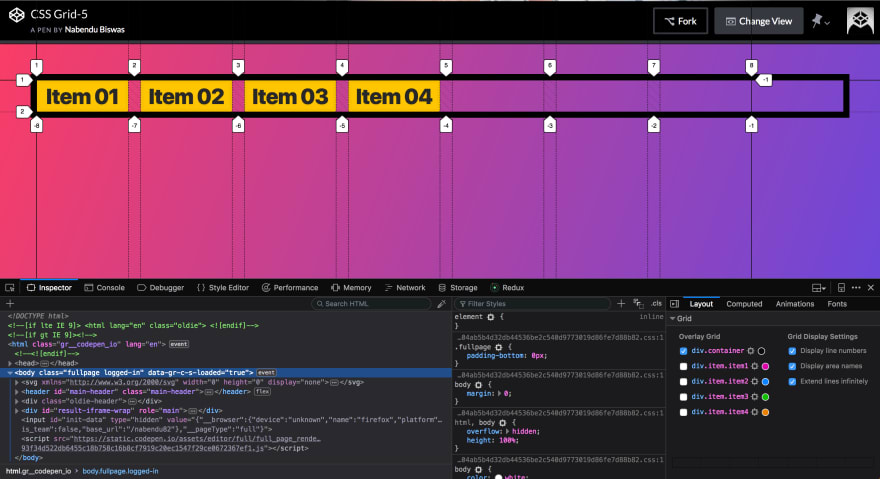
Now let add a property to item4.
.container {
      display: grid;
      grid-gap: 20px;
      border: 10px solid black;
      grid-template-columns: repeat(auto-fit, 150px);
    }

.item4 {
   grid-column-end: -1;
}
It will have now effect and the grid ends at track-8 , which is the end.
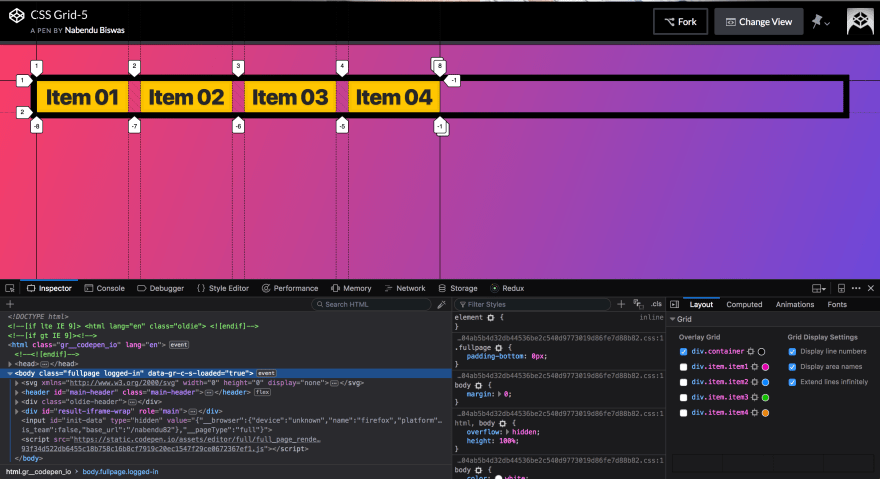
Now, let’s change it to auto-fill.
.container {
      display: grid;
      grid-gap: 20px;
      border: 10px solid black;
      grid-template-columns: repeat(auto-fill, 150px);
    }

    .item4 {
      grid-column-end: -1;
    }
As you can see, the item4 is shifted to the end of the grid. This is a very common pattern, when you have menu items. You might have 3 items together and one item to the other end.
 auto-fill benefit
Minmax along with auto-fill is a very powerful concept, which makes your site responsive without much use of media-queries.
Let have another grid container to display minmax. We will first look into the problem with below CSS.
<div class="minmaxContainer">
    <div class="item item5">Item 05</div>
    <div class="item item6">GoodBye</div>
    <div class="item item7">Item 07</div>
    <div class="item item8">Item 08</div>
</div>
  <style>
    .minmaxContainer{
      display: grid;
      grid-gap: 20px;
      border: 10px solid mediumblue;
      grid-template-columns: repeat(auto-fill, 100px );
    }
</style>
Which will result in below. As in the below screenshot, the problem is with the Goodbye going out of it’s item.
 The problem
Here the minmax can be used. the property minmax takes two parameters and is written as minmax(150px, 1fr), which means the item is minimum 150px or 1fr which every is applicable. Let’s apply to our case.
.minmaxContainer{
      display: grid;
      grid-gap: 20px;
      border: 10px solid mediumblue;
      grid-template-columns: repeat(auto-fill, minmax(150px, 1fr));
    }
Which will result in the perfect display.
 The perfect thing
And also it is responsive. Below is the tab view.
 The tab view
And the mobile view.
 The Mobile view
You might have noticed that in the desktop view, the items are sort of at one side and there is a lot of empty space in our grid.
We can fix this problem with the auto-fit property. Let’s change our code to use auto-fit.
.minmaxContainer{
      display: grid;
      grid-gap: 20px;
      border: 10px solid mediumblue;
      grid-template-columns: repeat(auto-fit, minmax(150px, 1fr));
    }
And now the desktop view is completely fixed. We now have our fully responsive grid ready.
 The final result
This concludes part-5.

Top comments (0)