
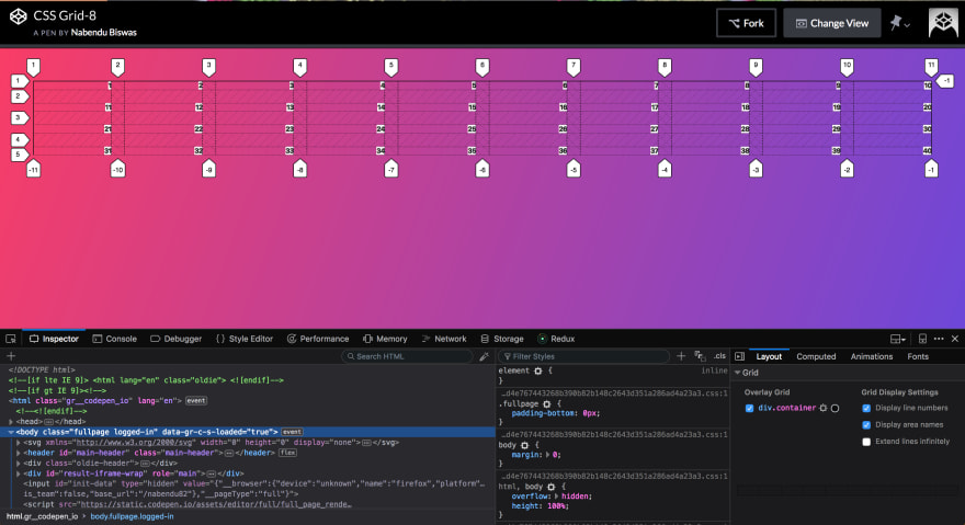
Welcome to part-7 of the series.
We will learn the important concept of CSS Grid alignment and centring in this tutorial.
We will use this codepen in the tutorial. We will learn about the below four properties in this tutorial. You should also bookmark this awesome quick reference from CSS trick to quickly check these.
justify-items:
align-items:

justify-content:
align-content:

justify-self:
align-self:
CSS grid doesn’t have a flex-direction property like flexbox. So, justify-* is row axis and align-* is column axis
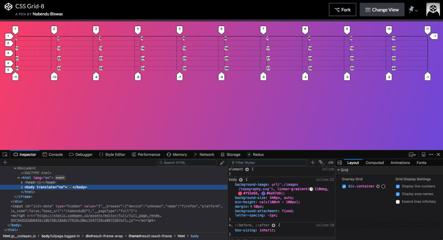
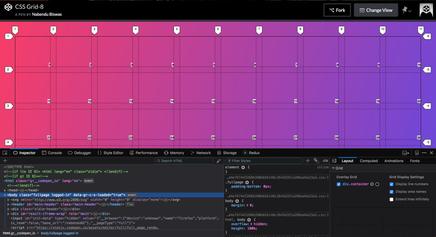
Our basic CSS is as below, in which we have a grid with 40 items, 10 columns of 1fr each.
<body>
  <div class="container">
    <div class="itm itm1">1</div>
    <div class="itm itm2">2</div>
    <div class="itm itm3">3</div>
    <div class="itm itm4">4</div>
    <div class="itm itm5">5</div>
    <div class="itm itm6">6</div>
    <div class="itm itm7">7</div>
    <div class="itm itm8">8</div>
    <div class="itm itm9">9</div>
    <div class="itm itm10">10</div>
    <div class="itm itm11">11</div>
    <div class="itm itm12">12</div>
    <div class="itm itm13">13</div>
    <div class="itm itm14">14</div>
    <div class="itm itm15">15</div>
    <div class="itm itm16">16</div>
    <div class="itm itm17">17</div>
    <div class="itm itm18">18</div>
    <div class="itm itm19">19</div>
    <div class="itm itm20">20</div>
    <div class="itm itm21">21</div>
    <div class="itm itm22">22</div>
    <div class="itm itm23">23</div>
    <div class="itm itm24">24</div>
    <div class="itm itm25">25</div>
    <div class="itm itm26">26</div>
    <div class="itm itm27">27</div>
    <div class="itm itm28">28</div>
    <div class="itm itm29">29</div>
    <div class="itm itm30">30</div>
    <div class="itm itm31">31</div>
    <div class="itm itm32">32</div>
    <div class="itm itm33">33</div>
    <div class="itm itm34">34</div>
    <div class="itm itm35">35</div>
    <div class="itm itm36">36</div>
    <div class="itm itm37">37</div>
    <div class="itm itm38">38</div>
    <div class="itm itm39">39</div>
    <div class="itm itm40">40</div>
  </div>

<style>
    /*
      justify-items:
      align-items:

justify-content:
      align-content:

align-self:
      justify-self:

justify-* is row axis
      align-* is column axis
    */

.container {
      display: grid;
      grid-gap: 20px;
      grid-template-columns: repeat(10, 1fr);
    }
  </style>
</body>
 Result
justify-items
First we will look into justify-items, which align items along row axis. It can have any of the 4 values.
justify-items: start | end | center | stretch;
Let’s see start first. We will give all item a background of white and also, show our grid through Firefox developer edition.
.container {
      display: grid;
      grid-gap: 20px;
      grid-template-columns: repeat(10, 1fr);
      justify-items: start;
    }

    .itm{
      background: white;
    }
As, you can see it aligns items to the start edge of cell.
 justify-items: start;
Now, end is opposite of start.
.container {
      display: grid;
      grid-gap: 20px;
      grid-template-columns: repeat(10, 1fr);
      justify-items: end;
    }

    .itm{
      background: white;
    }
It aligns items to the end edge of cell.
 justify-items: end;
The center value will align items to center of cell.
.container {
      display: grid;
      grid-gap: 20px;
      grid-template-columns: repeat(10, 1fr);
      justify-items: center;
    }

    .itm{
      background: white;
    }
 justify-items: center;
The final value stretch, which is the default also. It will fill the whole width of the cell.
.container {
      display: grid;
      grid-gap: 20px;
      grid-template-columns: repeat(10, 1fr);
      justify-items: stretch;
    }

    .itm{
      background: white;
    }
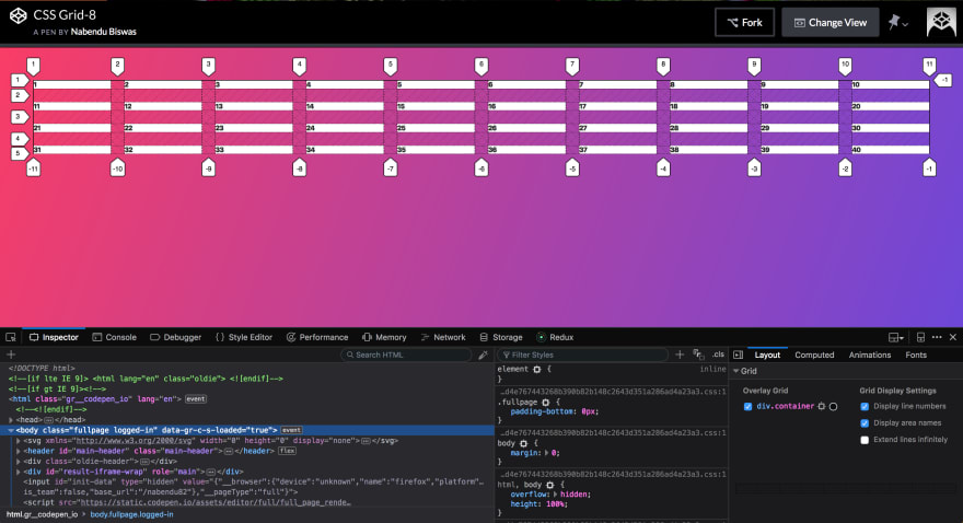 justify-items: stretch;
align-items
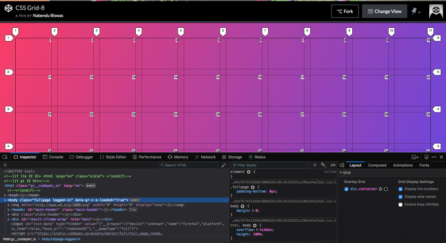
Now, we will look into align-items property. It align the grid items along the column axis. It can have any of the 4 values.
align-items: start | end | center | stretch;
We will add some rows in our grid and use the below basic code to see how align-items work.
.container {
      display: grid;
      grid-gap: 20px;
      grid-template-columns: repeat(10, 1fr);
      grid-template-rows: repeat(5, 100px);
      justify-items: end;
    }

    .itm{
      background: white;
    }
First we will check the align-items: start
.container {
      display: grid;
      grid-gap: 20px;
      grid-template-columns: repeat(10, 1fr);
      grid-template-rows: repeat(5, 100px);
      justify-items: end;
      align-items: start;
    }

    .itm{
      background: white;
    }
Which will result in, the grid items to be at the start of the column.
 align-items: start;
Now, let’s check align-items: end;
.container {
      display: grid;
      grid-gap: 20px;
      grid-template-columns: repeat(10, 1fr);
      grid-template-rows: repeat(5, 100px);
      justify-items: end;
      align-items: end;
    }

    .itm{
      background: white;
    }
Which will result in, the grid items to be at the end of the column.
 align-items: end;
Now, align-items: center;
.container {
      display: grid;
      grid-gap: 20px;
      grid-template-columns: repeat(10, 1fr);
      grid-template-rows: repeat(5, 100px);
      justify-items: end;
      align-items: center;
    }

    .itm{
      background: white;
    }
Which will result in, the grid items to be at the center of the column.
 align-items: center;
Now, we will look into align-items: stretch;
.container {
      display: grid;
      grid-gap: 20px;
      grid-template-columns: repeat(10, 1fr);
      grid-template-rows: repeat(5, 100px);
      justify-items: end;
      align-items: stretch;
    }

    .itm{
      background: white;
    }
Which will result in, the grid items filling the whole height of the cell.
 align-items: stretch;
One trick to center the items is to have the justify-items and align-items as center.
.container {
      display: grid;
      grid-gap: 20px;
      grid-template-columns: repeat(10, 1fr);
      grid-template-rows: repeat(5, 100px);
      justify-items: center;
      align-items: center;
    }

    .itm{
      background: white;
    }
Which will center the item.
 The center trick
Now we will look into justify-content and align-content.
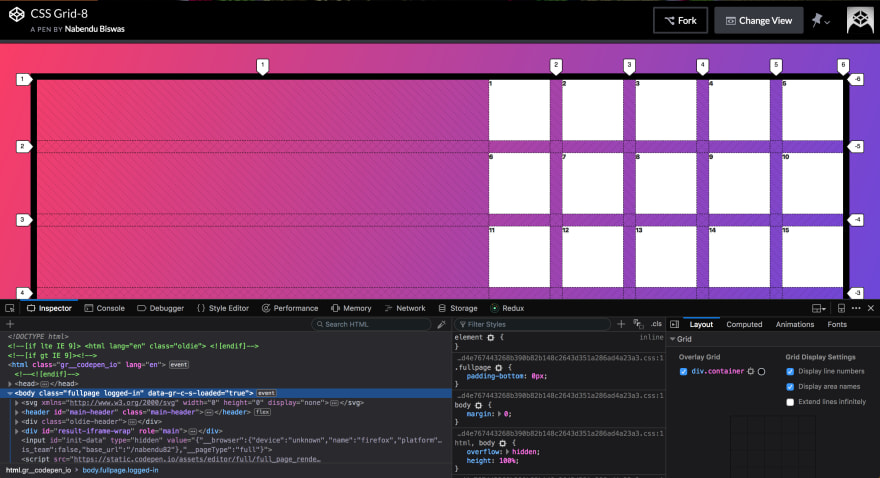
They are generally used when your total size of the grid is less then the size of grid container.
We will do justify-content first and to make the grid size less, we will use grid-template-columns: repeat(5, 100px); The complete code is below.
.container {
      display: grid;
      grid-gap: 20px;
      border: 10px solid black;
      grid-template-columns: repeat(5, 100px);
      grid-template-rows: repeat(5, 100px);
      justify-items: stretch;
      align-items: stretch;
    }

    .itm{
      background: white;
    }
Which will result in the below.
 Result
justify-content
The property justify-content have 7 values as below.
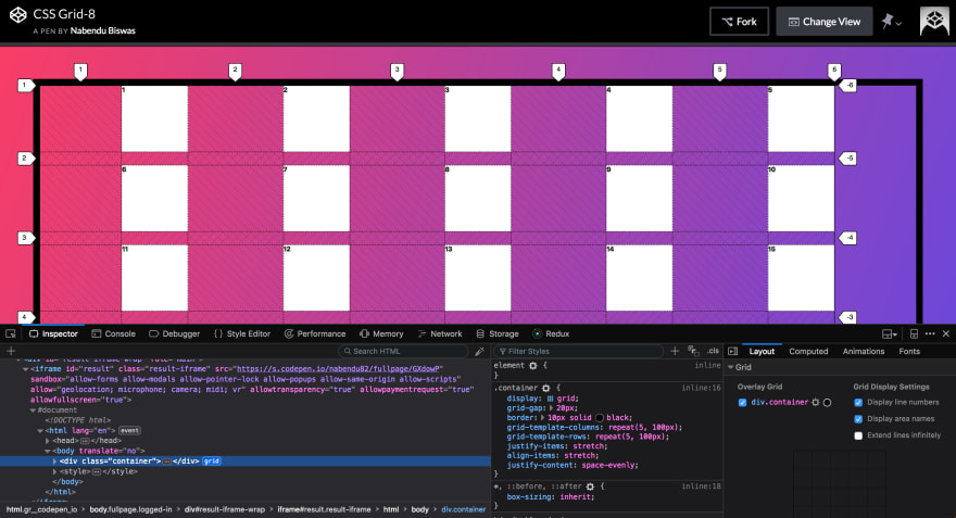
justify-content: start | end | center | stretch | space-around | space-between | space-evenly;
We will check start first.
.container {
      display: grid;
      grid-gap: 20px;
      border: 10px solid black;
      grid-template-columns: repeat(5, 100px);
      grid-template-rows: repeat(5, 100px);
      justify-items: stretch;
      align-items: stretch;
      justify-content: start
    }

    .itm{
      background: white;
    }
It aligns the grid to the start edge of grid container.
 justify-content: start
Now, we will check end.
.container {
      display: grid;
      grid-gap: 20px;
      border: 10px solid black;
      grid-template-columns: repeat(5, 100px);
      grid-template-rows: repeat(5, 100px);
      justify-items: stretch;
      align-items: stretch;
      justify-content: end;
    }

    .itm{
      background: white;
    }
It aligns the grid to the end edge of grid container.
 justify-content: end;
Now, we will check center.
.container {
      display: grid;
      grid-gap: 20px;
      border: 10px solid black;
      grid-template-columns: repeat(5, 100px);
      grid-template-rows: repeat(5, 100px);
      justify-items: stretch;
      align-items: stretch;
      justify-content: center;
    }

    .itm{
      background: white;
    }
It aligns the grid in the center of grid container.
 justify-content: center;
Now, we will look into space-around, which is quite similar to what we have in flexbox.
.container {
      display: grid;
      grid-gap: 20px;
      border: 10px solid black;
      grid-template-columns: repeat(5, 100px);
      grid-template-rows: repeat(5, 100px);
      justify-items: stretch;
      align-items: stretch;
      justify-content: space-around;
    }

    .itm{
      background: white;
    }
It places an even amount of space between each grid item, with half-sized spaces on the far ends.
 justify-content: space-around;
Now, we will look into space-between.
.container {
      display: grid;
      grid-gap: 20px;
      border: 10px solid black;
      grid-template-columns: repeat(5, 100px);
      grid-template-rows: repeat(5, 100px);
      justify-items: stretch;
      align-items: stretch;
      justify-content: space-between;
    }

    .itm{
      background: white;
    }
It places an even amount of space between each grid item, with no space at the far ends.
 justify-content: space-between;
Now, we will look into space-evenly.
.container {
      display: grid;
      grid-gap: 20px;
      border: 10px solid black;
      grid-template-columns: repeat(5, 100px);
      grid-template-rows: repeat(5, 100px);
      justify-items: stretch;
      align-items: stretch;
      justify-content: space-evenly;
    }

    .itm{
      background: white;
    }
It places an even amount of space between each grid item, including the far ends.
 justify-content: space-evenly;
align-content
We will now look into align-content. This property aligns the grid along the column axis. The property align-content have 7 values as below.
align-content: start | end | center | stretch | space-around | space-between | space-evenly
We will use this basic CSS for **align-content. **We have reduced the number of items and added a height.
<body>
  <div class="container">
    <div class="itm itm1">1</div>
    <div class="itm itm2">2</div>
    <div class="itm itm3">3</div>
    <div class="itm itm4">4</div>
    <div class="itm itm5">5</div>
    <div class="itm itm6">6</div>
    <div class="itm itm7">7</div>
    <div class="itm itm8">8</div>
    <div class="itm itm9">9</div>
    <div class="itm itm10">10</div>
  </div>

<style>


.container {
      display: grid;
      grid-gap: 20px;
      height: 500px;
      border: 10px solid black;
      grid-template-columns: repeat(5, 100px);
      justify-items: stretch;
      align-items: stretch;
      justify-content: space-between;
    }

    .itm{
      background: white;
    }
  </style>
</body>
We will first look at start.
.container {
      display: grid;
      grid-gap: 20px;
      height: 500px;
      border: 10px solid black;
      grid-template-columns: repeat(5, 100px);
      justify-items: stretch;
      align-items: stretch;
      justify-content: space-between;
      align-content: start;
    }

    .itm{
      background: white;
    }
It aligns the grid to the start edge of grid container on column axis.
 align-content: start;
Now, we will look at end.
.container {
      display: grid;
      grid-gap: 20px;
      height: 500px;
      border: 10px solid black;
      grid-template-columns: repeat(5, 100px);
      justify-items: stretch;
      align-items: stretch;
      justify-content: space-between;
      align-content: end;
    }

    .itm{
      background: white;
    }
It aligns the grid to the end edge of grid container on column axis.
 align-content: end;
Now, we will look into center.
.container {
      display: grid;
      grid-gap: 20px;
      height: 500px;
      border: 10px solid black;
      grid-template-columns: repeat(5, 100px);
      justify-items: stretch;
      align-items: stretch;
      justify-content: space-between;
      align-content: center;
    }

    .itm{
      background: white;
    }
It aligns the grid in the center of grid container on column axis.
 align-content: center;
Now, we will look into stretch.
.container {
      display: grid;
      grid-gap: 20px;
      height: 500px;
      border: 10px solid black;
      grid-template-columns: repeat(5, 100px);
      justify-items: stretch;
      align-items: stretch;
      justify-content: space-between;
      align-content: stretch;
    }

    .itm{
      background: white;
    }
It resizes the grid items to allow the grid to fill the full height of the grid container.
 align-content: stretch;
For the next three values of align-content, we will have 20 items in CSS. Let’s start with space-around.
<body>
  <div class="container">
    <div class="itm itm1">1</div>
    <div class="itm itm2">2</div>
    <div class="itm itm3">3</div>
    <div class="itm itm4">4</div>
    <div class="itm itm5">5</div>
    <div class="itm itm6">6</div>
    <div class="itm itm7">7</div>
    <div class="itm itm8">8</div>
    <div class="itm itm9">9</div>
    <div class="itm itm10">10</div>
    <div class="itm itm11">11</div>
    <div class="itm itm12">12</div>
    <div class="itm itm13">13</div>
    <div class="itm itm14">14</div>
    <div class="itm itm15">15</div>
    <div class="itm itm16">16</div>
    <div class="itm itm17">17</div>
    <div class="itm itm18">18</div>
    <div class="itm itm19">19</div>
    <div class="itm itm20">20</div>

  </div>

<style>


.container {
      display: grid;
      grid-gap: 20px;
      height: 500px;
      border: 10px solid black;
      grid-template-columns: repeat(5, 100px);
      justify-items: stretch;
      align-items: stretch;
      justify-content: space-between;
      align-content: space-around;
    }

    .itm{
      background: white;
    }
  </style>
</body>
It places an even amount of space between each grid item, with half-sized spaces on the far ends on column axis.
 align-content: space-around;
Now, let’s look into space-between.
.container {
      display: grid;
      grid-gap: 20px;
      height: 500px;
      border: 10px solid black;
      grid-template-columns: repeat(5, 100px);
      justify-items: stretch;
      align-items: stretch;
      justify-content: space-between;
      align-content: space-between;
    }

    .itm{
      background: white;
    }
It places an even amount of space between each grid item, with no space at the far ends on column axis.
 align-content: space-between;
Now, let’s look into space-evenly.
.container {
      display: grid;
      grid-gap: 20px;
      height: 500px;
      border: 10px solid black;
      grid-template-columns: repeat(5, 100px);
      justify-items: stretch;
      align-items: stretch;
      justify-content: space-between;
      align-content: space-evenly;
    }

    .itm{
      background: white;
    }
It places an even amount of space between each grid item, including the far ends.
 align-content: space-evenly;
We can also update the individual item properties. There are two properties for this and they are justify-self and align-self.
justify-self
Let’s look into justify-self first. It is similar to justify-content and overrides the value of justify-content, but is meant for a single item. It have got four values.
justify-self: start | end | center | stretch;
Let’s look at start first. Below is our basic CSS also, which we will use for all justify-self examples.
.container {
      display: grid;
      grid-gap: 20px;
      height: 500px;
      border: 10px solid black;
      grid-template-columns: repeat(5, 100px);
      justify-items: stretch;
      align-items: stretch;
      justify-content: space-between;
      align-content: space-between;
    }

    .itm{
      background: white;
    }

    .itm8 {
      background: yellow;
      justify-self: start;
    }
Notice the itm8, which is aligned to the start of the cell.
 justify-self: start;
Now, we will look into end.
.itm8 {
      background: yellow;
      justify-self: end;
    }
It aligns the itm8, to the end of the cell.
 justify-self: end;
Now, let’s look into center.
.itm8 {
      background: yellow;
      justify-self: center;
    }
It aligns the itm8, to the center of the cell.
 justify-self: center;
Now, let’s look into stretch.
.itm8 {
      background: yellow;
      justify-self: stretch;
    }
It fills the whole width of the cell.
 justify-self: stretch;
align-self
Let’s look into align-self now. It is similar to align-content and overrides the value of align-content, but is meant for a single item. It have got four values.
align-self: start | end | center | stretch;
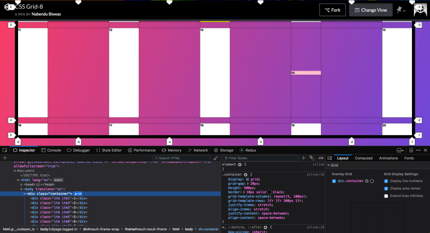
Let’s look at start first. Below is our basic CSS also, which we will use for all align-self examples. Note that we have made the third row of 300px height, because it contains the itm14 which we are using in example.
<body>
  <div class="container">
    <div class="itm itm1">1</div>
    <div class="itm itm2">2</div>
    <div class="itm itm3">3</div>
    <div class="itm itm4">4</div>
    <div class="itm itm5">5</div>
    <div class="itm itm6">6</div>
    <div class="itm itm7">7</div>
    <div class="itm itm8">8</div>
    <div class="itm itm9">9</div>
    <div class="itm itm10">10</div>
    <div class="itm itm11">11</div>
    <div class="itm itm12">12</div>
    <div class="itm itm13">13</div>
    <div class="itm itm14">14</div>
    <div class="itm itm15">15</div>
    <div class="itm itm16">16</div>
    <div class="itm itm17">17</div>
    <div class="itm itm18">18</div>
    <div class="itm itm19">19</div>
    <div class="itm itm20">20</div>

  </div>

<style>


.container {
      display: grid;
      grid-gap: 20px;
      height: 500px;
      border: 10px solid black;
      grid-template-columns: repeat(5, 100px);
      grid-template-rows: 1fr 1fr 300px 1fr;
      justify-items: stretch;
      align-items: stretch;
      justify-content: space-between;
      align-content: space-between;
    }

    .itm{
      background: white;
    }

    .itm8 {
      background: yellow;
      justify-self: stretch;
    }

     .itm14 {
      background: pink;
      align-self: start;
    }

</style>
</body>
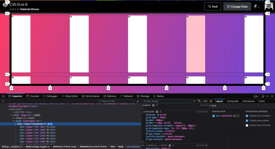
Notice the itm14, is aligned to the start of the cell on column axis.
 align-self: start;
Now, we will look into end.
.itm14 {
      background: pink;
      align-self: end;
    }
It aligns the itm14, to the end of the cell on column axis.
 align-self: end;
Now, we will look into center.
.itm14 {
      background: pink;
      align-self: center;
    }
It aligns the itm14, to the center of the cell on column axis.
 align-self: center;
Now, we will look into stretch.
.itm14 {
      background: pink;
      align-self: stretch;
    }
It fills the whole height of the cell.
 align-self: stretch;
This concludes part-7 of the tutorial.

Top comments (0)