
Welcome to a brand new series on CSS animation. While creating my earlier series CSS3 in 10 days, i did some animations and got hooked with them. So, decided to create a CSS animation tutorial.
This series is inspired by this awesome youtube series by The Net Ninja.
We will start with learning a bit about CSS animation and then creating some cool animations.
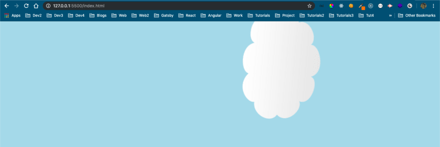
So, go ahead and create an index.html file and put the below code. It is just showing a cloud image.
 CSS Animation
We will then have a style.css file, which will contain the basic styles.
 Basic styles
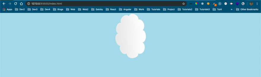
It will show this nice centered cloud in our webpage, with light blue background.
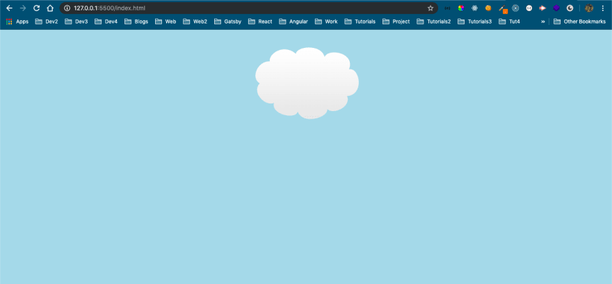 Cloud image
We will first learn about transform. A 2-dimentional transformation is applied to the element, through the transform property.
It have got many other properties. We will first learn about translate properties. The translateX moves the element on the x-axis.
Add the below in our style.css.
 translateX
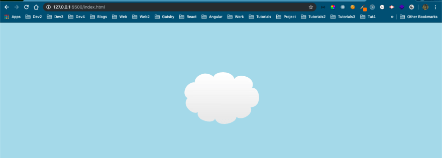
And it will move our cloud by 120px on x-axis i.e. to the right.
 Moving along x-axis
Similarly, a negative unit will move to the left on the x-axis.
 negative translateX
Will show as below.
 Moving along x-axis
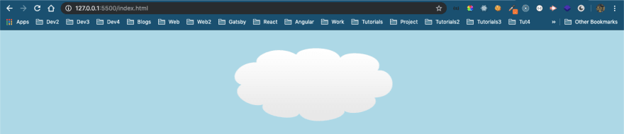
Now, as you might have guessed — The translateY moves the element on the y-axis.
Below is a positive translateY.
 positive translateY
And it will move the element down.
 Moving along y-axis
Similarly, a negative translateY.
 negative translateY
Will move the element up, which can also result in image getting cut.
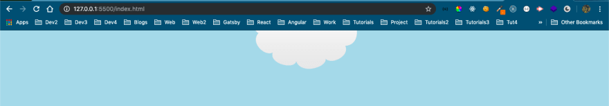 Moving along y-axis
We can move the element in, both x-axis and y-axis by passing two values in translate.
 translate
Will result in below.
 Moving along x-axis and y-axis
Next, we will look into scale. It basically stretches or shrinks an element.
First, we will look into scaleX which stretches or shrinks an element, along x-axis.
 scaleX
It will stretch 1.5 times along x-axis.
 x-axis
Now, scaleY stretches or shrinks an element, along y-axis.
 scaleY
It will shrink the element 0.5 times along y-axis.
 y-axis
We can also use to scale on both axis by using scale.
 scale
scale
It will scale on both axis.
 On both axis
Next, we will look into the transform property of rotate. It rotates the 2-D element, along x, y or z-axis.
We will see rotateX first, which rotates the element along x-axis.
 rotateX
It is sort of difficult to visualize, as the image got smaller. But it actually is rotating along x-axis so, it became smaller to human eyes.
 Along x-axis
Similarly, rotateY will rotates the element along y-axis.
 rotateY
Will show below.
 Along y-axis
Now, rotateZ will rotates the element along z-axis.
 rotateZ
It is more easy to visualize as it rotate along z-axis.
 Along z-axis
We can also chain all three transform properties, which we learnt together like below.
 All together
It will apply the result of one property on the other. First will rotate, the translate and then scale.
 transform together
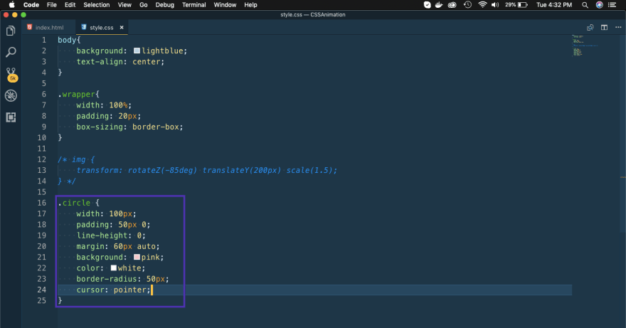
Next, we will learn transition property. Add a new circle to index.html
 New element
Also, add some styles for this circle in style.css
 New style
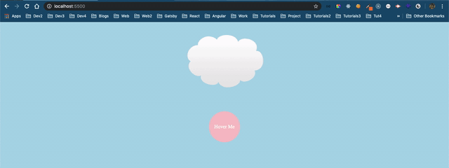
It will show as below in browser.
 New element
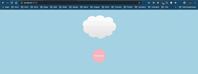
Now, let add a hover state on the circle.
 Hover state
As we can see from below, only the background changes and the transform doesn’t shows. This happens because the state change happens instantaneously.
 only background
Now, if we put a transition of 1 sec in the parent element it will apply all hover state transition, smoothly in 1 sec.
 transition
Now, it will change both background color and rotate 360 degrees.
 Both hover states applied
We can also have background and transform, transitions to take different time. We have to add code like below.
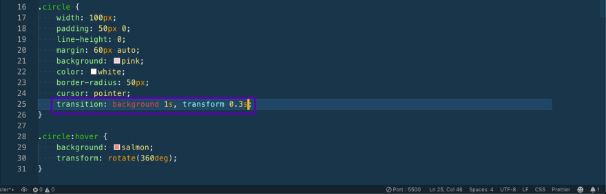 transition differently
Now, the background changes in 1 second but the rotate happens more quickly.
 Quick rotation
We also have two other properties in transition. They are transition-timing-function and transition-delay.
Now, the transition-timing-function specifies the speed at which the transition happens.
And the transition-delayspecifies the delay after which the transition should start.
Now, in the below example transition: 1s ease-in 0.8s; means apply the transition for 1 sec, with function ease-in and after a delay of 0.8 sec.
 All properties
It will show the transition as below.
 The complete transition
Now, there are some other transition-timing-function like below-
ease — specifies an effect with a slow start, then fast, then end slowly (this is default)
linear — specifies an effect with the same speed from start to end
ease-in — specifies an effect with a slow start
ease-out — specifies an effect with a slow end
ease-in-out — specifies an effect with a slow start and end
You can try them all, but the most used one are linear and ease-in.
This completes the part 1 of the series. You can find the code for the same here.

Top comments (0)