
I. Preface: “The Sweet Heart of a Game: The Story of One Phrase”
The idea for this article came to me long ago from a phrase that, at first glance, seemed ordinary. I heard it at a conference a few years back from a mobile game developer — someone who clearly knew his craft. He was talking about how to create new projects. During the Q&A session, someone in the audience asked:
“How do you come up with an idea for a mobile game?”
The answer was so simple that I didn’t immediately grasp its depth:
“Take a AAA project, remove all the unnecessary stuff, and leave only the sweetest part — the bit that makes people play again and again.”
Those words stuck with me. They felt both brilliant and scary. Brilliant, because there’s a logic you can’t deny: successful mobile games often revolve around simplified versions of mechanics from big projects, which is how half the mobile market works. Scary, because it revealed a dark side of the industry — one where creativity loses some of its importance and dissolves in the act of deconstruction. Instead of inventing something new and unique, we engage in a sort of “cannibalism,” carving out the tastiest pieces from existing games and serving them under the sauce of mobile “accessibility.”
I kept coming back to that phrase, dissecting it in my mind, and the more I thought about it, the more examples I saw around me. It turned out that the act of “extracting” key elements from complex games had already become a sort of standard. But what kind of standard is that?
Let’s be honest: the success — yes, actual success — of Diablo Immortal is hardly a coincidence or just a case of “carving out” mechanics for a “wide” mobile audience. Despite the well-known “Do you guys not have phones?” line from BlizzCon 2018, which became a meme and a symbol of disappointment for many fans, the game managed impressive results. At release, it racked up over 15 million downloads in its first week alone, and years later, its monthly audience still runs high. Why? I’d venture to say the developers truly understood how to pull out the most critical parts of the Diablo experience and adapt them for a new platform — mobile. They held onto those “sweet” bits: the grind, the loot (and loot boxes), the enemy-clicking (slash-killing) mechanic, plus the rewards, and removed everything that might intimidate newcomers or cause performance issues on mobile devices.
And PUBG Mobile is a special case. When the Korean studio PUBG Corp decided to bring its multiplayer shooter to mobile platforms, many were skeptical. How could you adapt a tactical shooter with long matches and complex controls to phones? (Especially considering that, pre-2019 and pre-COVID, the average mobile play session ranged from 6 to 20 minutes, tops.) But the developers did exactly what my conference colleague said: they took the essence — arcade shooting, the thrill of winning, the fast-paced competition — and simplified everything else to the extreme. Matches got shorter, controls became intuitive (complete with things like auto-loot), and the interface was made as touch-friendly as possible. It worked. PUBG Mobile didn’t merely replicate its PC sibling’s success — it eclipsed it. According to various analytic companies, the mobile version brings in about four times more revenue than the original and has a far bigger player base. The heart of the game didn’t just keep beating; it got stronger when it was transplanted into a new body.
Sure, you might say that’s just adapting to mobile, that we shouldn’t compare apples to oranges. But the mechanics are right there, out in the open — simplified, trimmed down, but still recognizable. Let’s begin at square one.
To understand this concept, we need to see it not as some abstract idea but as a practical method. In writing this article, I wanted to dissect specific examples, pinpoint key patterns, and give readers a tool they could use to analyze mechanics — for both simplification and expansion. This approach will allow us not only to watch certain games “devour” others but, hopefully, to discover why that happens and to try applying it in reverse.
It does seem like a strange asymmetry. On one side, we have enormous AAA projects with thousands of details to pull from and adapt into mobile. On the other, we have simple games that stay that way forever. Why?
So, we’ll attempt to figure out two major phenomena:
- How mobile games “devour” AAA projects, extracting only the crucial pieces and adapting them for new formats.
- Whether you can go the other way — take simple mechanics and build large, multi-layered game systems around them.
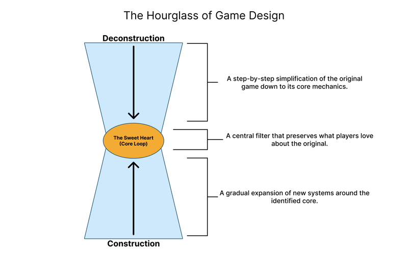
To make it clearer and easier to follow my reasoning, I created a custom diagram called “The Game Design Hourglass.” It tries very hard to reflect not only the essence of the process I’m describing but also to visually represent how deconstruction of mechanics and then reconstruction can occur. At its core is that “sweet heart” — the key mechanic that remains appealing, motivating players to return again and again. We’ll revisit the diagram as we go along, adding to it so we can more clearly see how adaptation and transformation unfold.
And in the end, each game is a story, and a story can be told in many different ways. I’ll try one of them here.
II. Part 1: “How to Eat an Elephant? (One Bite at a Time)”
To start, let’s establish something for everyone: creating mobile games isn’t as simple as it might look. And creating successful mobile games is even harder. I’ve often stumbled on the notion (and occasionally the advice) that succeeding in this industry is all about making your game as simple, quick, and “viral” as those short videos we see on TikTok, Reels, Shorts, etc. But that’s a misconception, although it springs from an accurate, if superficial, observation because indeed about 70% of the games on mobile marketplaces fit the “viral” mold. Yet what matters is that most of them have an extremely short lifespan — sometimes under a week. Then they vanish.
We need not “pity” those developers because their strategy revolves around quick returns, not long-term survival. Such games aim to grab maximum profit in minimal time, surfing a spike of interest from viral content or aggressive ads. They’re “one-and-done” titles. But if you look at the remaining 30%, you’ll see that these are just the tip of the iceberg. Below the surface sits a deeper, more complex world of mobile games, in which success is measured not in days or weeks, but years.
Only a small portion of these can achieve lasting success, a fact that often goes unremarked. That’s why many long-term hits in mobile build on a key principle: they look at the longer horizon. And that’s where we find the interesting connection between mobile games and AAA projects.
It turns out that “long-lived” mobile hits generally share an important characteristic: they create a kind of depth that can keep players engaged for months or even years. That depth might not be obvious, the way it is in AAA, but it’s definitely there. Often, it’s revealed in carefully designed, addictive systems that operate on a subconscious level, prompting players to come back time and again.
To understand this phenomenon, it’s vital to define what I mean by a “good” mobile game. Yes, it’s subjective, and each game designer (or player) might define it differently. But for this article, I’ll propose an axiom: A good mobile game successfully combines three key elements: addictiveness, accessibility, and long-term value.
- Addictiveness — the game’s ability to be habit-forming, leveraging repeated interactions and positive reinforcement. Players need to want to return, even if their total session is just a few minutes. This happens thanks to reward loops, progression, and the constant sense of forward motion.
- Accessibility — the game’s ease of onboarding. Mobile players usually don’t want to spend hours learning complex systems or wade through lengthy tutorials. The game should be intuitive right away, with a minimal barrier to entry, but still able to go deeper if the player desires.
- Long-term Value — the aspect that separates truly successful mobile titles from one-hit wonders. It’s not just the option to keep playing longer, but the presence of content, mechanics, and systems that sustain interest over an extended period. It might be seasonal events, deep leveling systems, social components, or even emotional ties to the game world.
Moving on with this thought, we need to note one key idea: game design itself doesn’t change based on the platform. The core principles that make a game fun — whether on PC, console, or mobile — remain universal. The thrill of victory, the satisfaction of progression, the emotional attachment to a fictional world — those are timeless. The differences lie not in the mechanics but in how we tailor them to each platform’s constraints and opportunities.
Simply porting a AAA game to mobile rarely leads to success. Look at Grand Theft Auto: San Andreas, Death Stranding, or Resident Evil. They all shone brightly on their original platforms, but their attempts at going mobile weren’t nearly as well-received. I can’t think of anyone who’d say, “Hey, I completed Death Stranding on iPhone and loved it!” But why not? It’s not just the technical limitations (although those matter). The bigger problem is that these titles carry over their complex systems and lengthy sessions, which just don’t fit the mobile audience.
Mobile players come in expecting quick access to fun, short sessions, and simple controls. Therefore, success in mobile requires more than just porting the mechanics; you need a rethink. And that’s where we start “eating the elephant” by taking pieces of big, heavy systems and extracting the aspects that fit a mobile format.
How Deconstruction Happens
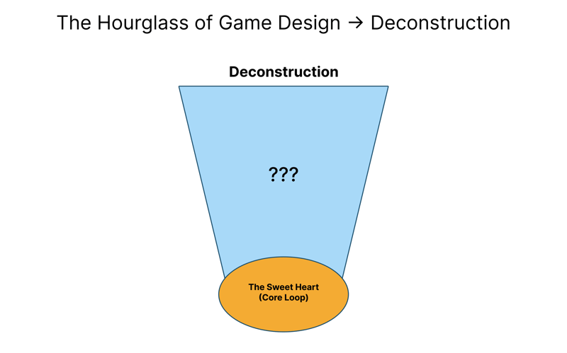
Before going further, let’s jump back to our hourglass diagram and “zoom in” on its upper portion, focusing on the deconstruction stage. For clarity, we’ll look at it in a simplified form for now: an overview of that downward journey toward the core. This is the path we’ll take to see exactly how you reduce AAA-level complexity into something more streamlined for a new platform.
To make sense of this, let’s see game design as cooking a dish. Imagine a AAA game as a layered meal — like a fancy restaurant lasagna. It has loads of ingredients: sauce, cheese, pasta, ground meat, spices. Each is crucial, and there’s also specialized equipment and chefs, creating a unique taste. Now imagine needing a similar dish for a different audience — say, folks who love quick snacks or street food. You can’t just serve the same heavy lasagna: it’s too filling, time-consuming, expensive, and complicated for that setup. Instead, you take the key ingredients — like cheese and sauce — and craft something new, perhaps mini-pizzas or cheesy breadsticks.
The base ingredients haven’t changed (cheese and sauce), and you still get the same final outcome (tasty food that fills you up).
That’s exactly what happens with mobile games. Devs take the complex systems of AAA projects and distill them to their “main ingredients” — mechanics that deliver the real fun and addictive potential. Then they transform those mechanics to suit the new environment. It’s more than “just simplifying”; it’s reimagining, which only works if you have real expertise.
Okay, so now you have this knowledge too! Let’s dig in. With an idea of the “kitchen” tools used in this side of game design, we can move on to the juicy part: seeing deconstruction in practice. Because, as people like to say, “Better to see once than to hear a hundred times.” Let’s analyze a concrete example that, in my opinion, would be silly to skip — Genshin Impact.
One of the world’s highest-grossing mobile games, Genshin Impact, started with a simple but challenging question:
“How do we bring a full-scale RPG experience to mobile?”
The devs at miHoYo didn’t reinvent the wheel. They looked at the average mobile hardware on the market, noticed that the Nintendo Switch’s hardware was roughly comparable to mid-range phones (around 2020), and that the most successful example of an open-world action game with stellar visuals was The Legend of Zelda: Breath of the Wild. Two plus two equals bingo!
That game, presumably, became their primary model for research. miHoYo meticulously studied Zelda: BOTW, investigating its mechanics, art style, and open-world approach. But simply cloning it wouldn’t have worked — mobile devices impose different limits, and mobile players have their own tastes. That meant a thorough deconstruction of key elements was needed.
Let’s pause here for a second. Try putting yourself in the shoes of Genshin Impact’s designers. Ask yourself:
“How would I bring the Breath of the Wild experience to mobile?”
Think of the key components of the game, the constraints of the mobile platform, and which mechanics you might keep, simplify, or scrap. When you’re ready, read on!
Example #1: Open World and Exploration
In BOTW, you have a huge, seamless open world where you’re free to go almost anywhere from the start. This creates a dizzying sense of freedom, where if you see a mountain on the horizon, you can climb it. Exploration is always rewarded: shrines, Koroks, new gear — all scattered around, encouraging constant movement.
Problem for Mobile Devices:
A giant, seamless open world needs tons of resources — both technical and in terms of player time. Mobile sessions tend to be short, and loading such a big environment drains the battery, heats the device, and can be tiresome.
Our Game Design Fix:
We don’t attempt to recreate the seamless world. Instead, we split it into separate regions that load on demand. This eases the device’s load but keeps the sense of scale. Each region is big enough for players to explore freely but not so big it overwhelms the system.
Next question: how do we preserve the motivation to explore? Our solution comes from a basic psychological principle: if something looks out of place, checking it out should be rewarded. We fill each region with visual clues — strange structures, unique enemies, weird natural phenomena, sparkling objects — and each clue reliably leads to some kind of prize.
Rewards might be tiny (common consumables) or more substantial (chests with Primogems or unique items), but the principle is the same: curiosity is always rewarded. The player quickly grasps: “Something unusual? Let’s go look.”
We’ll also have an exploration metric for each region. A percentage gauge on your map shows how many secrets you’ve discovered so far. It doesn’t spell out exactly what’s missing, preserving the feel of exploration, but it satisfies the completionists.
Why It Works from a Game Design Perspective:
We form a closed reward loop: Curiosity → Exploration → Reward → More Curiosity.
This is perfect for short mobile sessions: you see something interesting, spend a few minutes investigating, and get instant gratification, plus you secure your progress. At the same time, you get that big-world freedom from BOTW, minus the need for hours-long sessions to see any progress.
Example #2: The Combat System
BOTW (in some ways, a distant ancestor of the “souls-like” trend, though that’s a whole other topic) has a fairly involved combat system. Success depends on a range of factors; it’s not just about quick reflexes but also about solving a bite-sized tactical puzzle. You watch your weapon’s durability, choose gear to counter enemies, gather materials for upgrades, and keep adapting. The main draw is that feeling of “tactical puzzle” in combat.
Problem for Mobile Devices:
Deep combat with many moving parts doesn’t translate well on mobile for two big reasons: tricky touchscreen controls and the short session focus. Plus, a steep learning curve might scare away newbies, who comprise a big share of the mobile audience.
Our Game Design Fix:
We want to preserve BOTW’s core essence — the “tactical puzzle” in each fight — but make it simpler so it’s instantly intuitive and easy to control. Our solution:
Rock-Paper-Scissors Elemental System:
Instead of elaborate weapon systems, we build a clear elemental mechanic: each element has definite strengths and weaknesses (Cryo vs. Hydro, Pyro vs. Cryo, Electro vs. Hydro, etc.). It provides tactical depth minus a huge learning curve.Visual Clarity for Elemental Reactions (Feedback):
Every elemental interaction is instantly visible through bright effects and bold damage numbers. Correctly pairing elements yields a “puzzle solved” high, and the visual payoff is immediate.Simplified Controls Without Losing Strategy:
Base attacks are done with simple taps. The true depth lies in mixing elements. Mashing taps can yield basic results, but mastering elemental combos massively boosts your success rate, giving the all-important sense of skill progression.Staggered Complexity:
The fundamental combat loop is available from the get-go (also reflected in the starting hero the player controls), but deeper systems (artifacts, constellations, synergy bonuses) unlock over time. That hooks casuals with easy accessibility while also letting hardcore players chew on a deeper endgame.
Why It Works from a Game Design Perspective:
We kept BOTW’s spirit — a tactical puzzle in each fight — but changed its outward form. Instead of a giant system with endless variables, we introduced a straightforward and visually striking elemental mechanic with enough room for tactical mastery. That setup appeals to both newbies (who love the explosions and big digits) and experienced players (who optimize combos for maximum effect).
Example #3: Progression and Rewards
Progression is often the toughest piece for me. In BOTW, you boost health and stamina, find better weapons and outfits, and unlock new abilities. Rewards are scattered across the world, and you can collect them in any order. There’s no daily reward structure or progression limit.
Problem for Mobile Devices:
Free-to-play mobile games demand a lengthier lifecycle and reasons for the player to return consistently. A model with zero limits, like BOTW, risks letting players blow through content too quickly. Also, you need some free/paid balance — devs have to eat too!
Our Game Design Fix:
Multi-layered Progression:
We split progression across multiple parallel systems: Adventure Rank (overall “level”), character levels, weapon levels, artifacts, and constellations. That leaves the player with multiple mini-goals, which fit well into short play sessions.“Resin” (Energy) System:
Introduce a resource that restricts how many top-tier rewards you can snag in a day. It regenerates over time, nudging the player to come back day after day. Important: basic exploration and main quests aren’t limited here, so it still feels like BOTW’s open freedom.Structured Events:
Set up a regular cycle of in-game events, from daily tasks to seasonal adventures, each with its own rewards, ensuring a constant flow of fresh content.
Why It Works from a Game Design Perspective:
Multi-layered progression makes you feel like you’re always moving forward, even in short sessions. You’ve got a reward that’s always just around the corner, which keeps engagement high. The “Resin” system can feel restrictive, but really it prevents burnout (psychologically) and opens a natural window for monetization. Meanwhile, regular events ensure the world feels alive and evolving, which is essential for keeping players around long-term.
Finishing Our Feast!
Phew! That elephant sure was big. But if we’re honest, even a breakdown of Genshin Impact is just scratching the surface. If we tried to dive into every case of AAA deconstruction for mobile (and there are plenty of fun ones), we’d be going through a whole herd of elephants. My appetite’s not that enormous yet, so I’ll leave other cases (like how PUBG Mobile retooled PUBG: Battlegrounds, or how Mobile Legends simplified League of Legends) for the comments or another day!
So let’s outline the rules of deconstruction: how can you justify the notion of “taking a mechanic from Games X and Y and popping it into ours”?
Key Core Extraction:
Focus on the mechanics that form the core appeal — the features that deliver the most fun and can be simplified without losing their essence. You need to see how they fit the overall loop and figure out which are “anchors” and what you can discard or simplify for mobile/casual play.Platform Alignment:
Technical constraints, touch controls, and short sessions are the deciding factors. When porting mechanics, think about how players interact (swipes, taps, not buttons) and plan for a 5–10 minute window (if you can hook them in that short time, you can open the door to longer 30+ minute sessions). If a mechanic can’t fit that time window, either optimize it or split it into smaller sub-tasks.Multi-Layer Progression:
Shape your progression so that the player sees both short-term rewards and a reason to keep playing in the long run. The system should work in two modes: immediate gratification (after just one short session) and a bigger payoff if you come back tomorrow. Then the player sees how valuable each session is and doesn’t abandon the game, thinking about it even when not playing.
Now that we’ve drilled down into how to devour an elephant, turn lasagna into cheese sticks, and basically deconstruct a game, why not look at it the other way around? Let’s say we want to do the opposite: build something more complex out of something smaller. Suppose we take the running mechanic from Subway Surfers and layer it with roguelike elements, procedural generation, and a story that makes people come back not just for a quick snack but for a full-course meal.
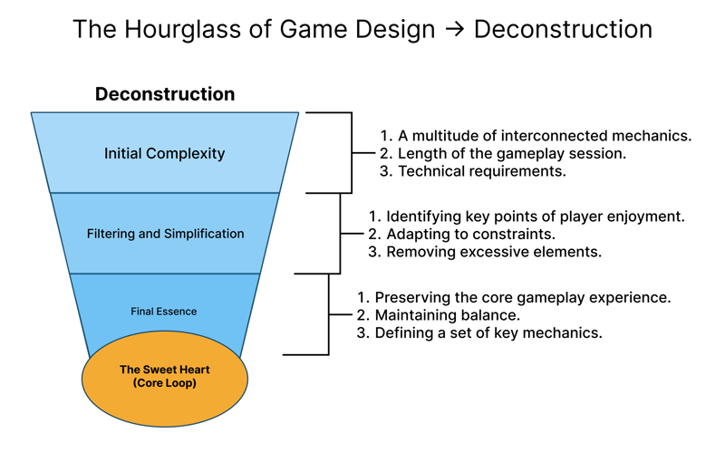
Stage 1: “Initial Complexity.” At this point, the game is huge and multifaceted, brimming with mechanics, long sessions, and high system requirements. The goal is to meticulously record everything that makes the original experience what it is. Essentially, it’s a phase of deep analysis and understanding before we remove or simplify anything.
Stage 2: “Filtering and Simplification.” This is the heart of deconstruction. Here you discard the stuff that doesn’t fit the new format or constraints. You discover the “key fun points,” adapt the mechanics to the platform (simplify controls, shorten sessions), and eliminate anything that might overwhelm the player or device. Revisiting our examples, this is where Zelda: BOTW’s seamless world or detailed combat tactics get reworked and replaced with the pure emotional highs of exploration and combat — now reconfigured for mobile.
Stage 3: “Final Essence.” By the end of this stage, you have a significantly simpler — but still recognizable — structure. It’s where you assess whether you’ve preserved the core loop, struck a balance between accessibility and engagement, and are ready for the next step.
Notice how our three earlier rules align with these stages. For example, Key Core Extraction neatly represents the shift from “Initial Complexity” to “Filtering & Simplifying”. Platform Alignment is the key driver of the “Filtering & Simplifying” stage, dictating how you adapt mechanics for the new platform. Meanwhile, Multi-Layer Progression emerges toward the “Final Distillation,” where you shape progression systems that keep players invested.
So that’s how you eat an elephant, turn lasagna into cheese sticks, and dissect a game. But what if we try going the other way around? What if we take a simple snack and build it into a full meal? For instance, imagine taking the running mechanic from Subway Surfers and adding roguelike elements, procedural generation, and a story that keeps players coming back not for a “quick bite” but for a full-course experience.
Because that’s what we started pondering in the first place: not just how to simplify but how to build up something from a smaller base. On we go to the next part!
III. Part 2: “How to Build a House? (Brick by Brick)”
This part of the article is quite personal to me. Let me be straightforward: if it weren’t for my “game designer’s” professional bias and a weird, almost masochistic habit of diving into every beta test or closed preview, I probably never would have written this. The idea, the “bold analysis,” came about because of my habit of poking my curious nose into any intriguing new project.
It’s not even that I have a special passion for buggy, half-done titles (though, honestly, I do enjoy them). It’s that you get a unique chance to watch a game grow, morph, and transform, sometimes dying off in infancy, sometimes becoming something else entirely. That’s precisely how these reflections on deconstructing and constructing game mechanics took shape.
Betas usually serve as little experiments and thought exercises for me, but for some time now, HASTE: Broken World had been on my radar. I was quite eager to “poke around” the game, not just because it looked cool, but also because I’ve always liked LandFall and their approach (big hello to those folks!). So, when the chance for closed beta came along, I jumped at it. While I was playing around with its procedurally generated levels, my brain kept churning: “What exactly am I feeling right now? Why is something so simple so addictive? Which detail is hooking me?” And that’s when I saw not only how simple systems could evolve into something more but the other side of the coin: not just deconstruction of large mechanics, but also construction. There it was, the missing puzzle piece, the flip side of the medal, the reason for this article!
(By the way, if you haven’t tried the new HASTE: Broken World demo on Steam yet, hop to it!)
HASTE is perfect for our little investigation, precisely because I got to see how it ended up at its current form. I know how the devs got there. This example is especially valuable to me: not only did I watch the process, but I know the devs hadn’t set out with my “construction–deconstruction” framework. Their idea came from internal prototypes, not from picking apart someone else’s game. And yet, ironically, HASTE practically “intuitively” implements the constructive approach we’re about to discuss, as though the team subconsciously followed the same reasoning we’re describing, creating a robust system out of a single, simple mechanic that resembles a mobile runner.
Now that I’ve laid out the personal aspect and walked you to the spot where the puzzle pieces fit together, let’s move forward. We’ll see exactly how you can build a substantial, deep gaming experience around the simplest possible mechanic — “running forward.”
How Construction Happens
Let’s go back to our “Game Design Hourglass,” but now let’s focus on the lower half. The top half showed the transition from complexity down to a simple core, while the bottom half is the reverse: we start with that basic core and expand upward, adding layers and systems. Think of it like “zooming in” on the lower portion, still without too many details.
It’s usually easier to simplify something that exists than to expand it. Breaking is simpler than building, right? Pulling cheesy sticks out of a lasagna that’s already there is no big deal. But making a lasagna out of cheesy sticks is the real challenge. The key is that even in this “building” approach, minimalism doesn’t vanish. Construction is not about cramming everything in but rather a minimalistic expansion. We’re not piling up a giant fortress; we’re trying to build a comfy, fully functioning house out of single bricks.
Broadly speaking, a mobile (or casual) game can sometimes be 100% sugar cubes: brimming with positive reinforcement, quick rewards, and super-simple rules. You have a “box” that’s mostly immediate gratification. But if you want to turn that “box” into a bigger, more varied experience, you’ve got to lay bricks of deeper, more deliberate mechanics. And that, in turn, requires a structured approach — a mirror to our method of deconstruction. The difference is that, in deconstruction, we had all the “fancy bits” to strip away. In construction, we’re facing the emptiness beyond the core. We need a framework that can sustain a bigger experience while still keeping that “sweetness” of short sessions, accessible fun, and so on.
Hence, construction isn’t just “adding more stuff.” It’s about carefully, gradually integrating new systems so you don’t crush the original simplicity and fun. And crucially, the basic rules of game design remain universal. In principle, the “constructive” path can be no harder than the “deconstructive” path — it’s the same balancing act, turned upside down.
If you watch gameplay of Subway Surfers on the left and HASTE: Broken World on the right, you’ll spot a direct resemblance, much like Genshin Impact and Zelda: BOTW. This doesn’t mean anyone’s “stealing ideas” (we know LandFall got here through a different, three-year route from an unrelated prototype). But imagine you’ve got the brainwave:
“What if we take Subway Surfers and expand it to a grand-scale project?”
What bumps in the road would you face? What would that thought process be like?
You’d soon run into a not-so-obvious but rather massive stumbling block: imagination. Unlike deconstruction — where you see a finished product and remove parts — here, you don’t have a perfect blueprint or reference. You not only have to pose the question but also envision how to grow a game from “run forward.”
It’s easy to get stuck. The first pitfall is referencing existing games: “Well, Sonic runs too, so let’s be like Sonic!” But you didn’t want to just clone Sonic or “make a Sonic out of Subway Surfers,” right?
Hence, at this stage, the game designer has to be very clear on which rules and principles they’ll use to build something big around a core that’s small. That’s where we jump back to the analytical vantage point: imagine we’re the game designers who got this assignment:
“Here’s the mobile runner Subway Surfers. Your job is to expand its simple mechanics into a full, rich game without losing its basic appeal — but also without turning it into Sonic.”
Forget for a moment that LandFall already made something kind of similar (albeit via a different route) or that HASTE: Broken World exists. Let’s just see how we’d do it from scratch, using fundamental game design logic and the concepts we’ve discussed so far.
Time to get our hands dirty “building a house.”
Example #1: From “Three Lanes” to Meaningful Landings
In classic Subway Surfers, you swipe left and right to dodge, jump to clear obstacles, and pick up coins across three lanes. For our expanded version, we’d like more variety and a sense of skillful control. The base runner doesn’t have much nuance — you either jump or crash. So what if we introduce an extra “landing quality” factor that shapes your run’s results?
Problem We’re Solving:
In typical endless runners (Subway Surfers, Temple Run, Minion Rush), after a bit, the experience can feel repetitive: the player only has quick-swipe reflexes and memorizing obstacle patterns. We want each jump or slide to have at least a pinch of strategy.
Our Game Design Fix:
Add a “landing” system — a mini-skill check whenever you come back down after a jump or drop. Picture a “timing bar” or “precision gauge.” Depending on whether you land spot-on or flub it, you gain certain bonuses or penalties.
Instant Reward:
A proper landing might ramp up your speed or grant a special “energy” (Boost or Energy) you can spend on extras like short-term turbo, a super jump, or temporary invulnerability.Pacing Shifts:
By highlighting landing control, you introduce mini-lulls where the player thinks, “I need to time this jump perfectly to stay efficient for the next five seconds.” No longer is it just about memorizing patterns but also about when and how you land.Synergy with Other Systems:
Perhaps good landings trigger more valuable pickups (coins, crystals, etc.). That encourages players to keep getting better at these mini-skill checks, rather than merely swiping mechanically.
Why It Works from a Game Design Perspective:
First, we preserve the usual “three-lane” environment, but it’s no longer just a fixed corridor. The player has more agency, and the space feels “deeper.” Second, the same frantic reflex-based tension remains, but now there’s a skill element: nailing “perfect landings” to gain advantage. Third, because we’re awarding bonuses or penalties, players are incentivized to hone their skills over time, ramping up their resources and enabling riskier maneuvers.
Extra Note: “Surfboards” and Similar Boosters
Subway Surfers has a “hoverboard” system that acts like a temporary safety net and bonus engine. In HASTE: Broken World, there’s a similar “Surfboard,” but it’s not just a passive bonus. It’s an ability you activate with an “energy” resource you accumulate through skillful landings. That adds a layer of tactical choice: you can’t just pop an ability whenever; you need to decide when and how to trigger it, depending on your current state and energy reserves.
Hence, by one decision, we elevate two simple mechanics — movement and temporary power-ups — into a meaningful system, while retaining the original accessibility.
Example #2: From Tedious Repetition to Adaptive Difficulty Scaling
Any endless runner typically increases difficulty in one way: the longer you run, the faster it goes, and the more complicated the obstacles. But eventually, players see the repeating patterns and the novelty evaporates. We want each new attempt to feel fresh and exciting.
Problem We’re Solving:
Classic mobile runners might hit a “difficulty ceiling.” Sure, speed keeps rising, but the level geometry or obstacles remain pretty much the same patterns in different sequences. Once the player memorizes them, the only factor left is “speed.” They either eventually crash from sheer velocity or get bored.
Our Game Design Fix:
Use procedural (or hybrid-procedural) generation with a “dynamic difficulty budget.” In other words, every track segment draws from a certain “budget” of points that the game can spend on obstacles and environment features. The further you go, the higher that budget, so you see more varied and challenging obstacles. Key elements:
Vertical and Horizontal Variation:
We can drop the static, three-lane flat approach. Our expanded runner might include slopes, multi-layer platforms, branching paths, or overlapping traps. That stops the game from feeling monotonous.Smooth Difficulty Curve:
Rather than just flipping on “turbo mode” at X minutes, let the procedural generation ramp up complexity based on the difficulty budget. If the budget is high, the system can spawn nastier obstacles, cunning traps, special events, or even mini-bosses. This helps maintain the sense of “flow” — hard but still doable.Progress and Reward System:
Each segment can rate you on how quickly you passed it, how many items you grabbed, or some bonus criteria (like precision landings). High scores encourage skillful play. You might get buffs that carry into the next segment.
Why It Works from a Game Design Perspective:
Procedural generation with a difficulty budget keeps things from becoming stale. Patterns appear in new combos, forcing you to adapt. The difficulty curve adjusts continuously, hopefully matching your developing skills and giving that satisfying sense of “I can do this if I stay sharp.” Rewarding skillful players with bigger prizes completes the motivational loop.
Example #3: Quick-Fire Solutions
To finish our little “construction” tour, let’s do a few more expansions we can add when evolving a simple mobile mechanic into something deeper. This time, we’ll keep it short and sweet: “Problem → Solution.”
Roguelike Flavor and Procedural Goodness
Problem: Endless runners can still feel repetitive; after you’ve seen enough patterns, you might get bored.
Solution: Add meta-progression, like a roguelike (randomized items, between-run growth, branching paths a la Slay the Spire) and keep using robust procedural generation. For a Subway Surfers example, you might let players choose a branch after each run, with each new track featuring unique obstacles and random gear that buffs your character. Think “Subway Surfers meets deckbuilding.” Sounds wild, but balanced right, it’s addictive. (Hello from HASTE!)Story and a Real Ending
Problem: Many mobile runners have no narrative or finale; it’s all endless, so the motivation fades when you realize “it never ends.”
Solution: Give it a storyline split into chapters (or biomes). Each ends with a boss or final test. Still keep an endless mode for those wanting high scores. But now you also have a reason to keep pushing for story progress.Escaping the F2P Chains
Problem: Mobile games (especially runners) often rely on microtransactions.
Solution: Either skip F2P altogether or at least tone it down, so you aren’t pushing microtransactions at every turn. That freedom lets you build deeper systems for long-term enjoyment, not just micro-purchases. (Thanks, Captain Obvious!)
Why It Works from a Game Design Perspective:
These three tweaks — roguelike systems, a storyline, and friendlier monetization — let you keep fast, casual sessions while expanding the concept into a bigger project. Procedural generation and roguelike elements combat repetition. A storyline adds a sense of progress and closure. Minimizing harsh monetization sets you free to include more thoughtful, long-lasting mechanics rather than quick hits of gratification. You can mix and match these ideas however you like. The key is seeing beyond that immediate “sugar” and realizing that “run forward” can be the foundation for much bigger things.
A House the Game Designer Built
I’ve practically gotten calluses on my fingers writing all this… Let’s take a tiny break. If you’re still here, that means we’ve done a pretty solid job, and our “house” now stands with a proper frame and shape. All that’s left is to look around and see how well we transformed a lightweight, casual concept into a truly deep and compelling game.
As we discovered, the fundamental principles of game design remain the same, whether we’re deconstructing something huge or constructing something large out of something small. The main challenge is striking that balance: not drowning in details, keeping the “heart,” and ensuring the result remains fun and user-friendly.
So, what big lessons can we extract about construction?
Core-Driven Expansion
Don’t throw a hundred mechanics at the player. Let each new system grow directly from the fundamental gameplay. If “running” is your cornerstone, make all expansions revolve around it: landing mechanics, energy usage, interesting obstacles. Steer clear of random add-ons that feel disconnected.Modular Layering
Expand in layers, not everything at once. Start the player off with the basic mechanic in pure form, then gradually add new capabilities, challenges, or progress loops. The game feels like it’s constantly evolving without overwhelming newcomers.Meaningful Complexity
When adding challenge or intricacy, ensure every piece has a point. Complexity for its own sake isn’t good design unless it reinforces a reward system or has synergy with existing mechanics.Motivation Loop
As you expand features, anchor them in a reward structure that feeds back into the game’s main loop. If you add “landings” and “energy,” let them integrate with progression, bonuses, or advanced content. That way, your new system is more than just a gimmick — it’s central to the overall experience.
Now that we understand how construction works, let’s revisit the bottom half of our hourglass in more detail. The top showed how we simplify complexity; the bottom shows how we build from a kernel. Just like deconstruction, we can break it down into three steps:
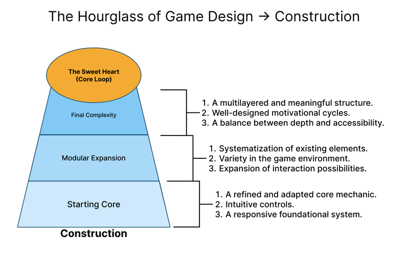
First Stage — “The Starting Core.” Here, we have the simplest, platform-friendly mechanic that must be intuitive and fun by itself. This is your “box,” your foundation. It’s crucial that this core really is engaging. If it isn’t fun, no amount of bells and whistles will save the game.
Second Stage — “Modular Expansion.” This is where we systematically add new layers. Each mechanic blossoms out of the core, developing more robust surroundings, deeper gameplay, new progression routes. The player already feels comfortable with the basics, so each addition expands an established framework.
Third Stage — “Full Complexity.” In the end, we have a multi-layered, coherent design. Every new system has its place, and your motivation loops become more elaborate. This is the time to confirm you haven’t overloaded the game with features and that it’s still approachable. If we did it right, the game can keep players long-term without scaring them off or boring them.
Once again, the rules we detailed for construction map neatly onto these three steps. For instance, Core-Driven Expansion lines up with “The Starting Core.” Modular Layering is all about “Modular Expansion,” while Meaningful Complexity and Motivation Loop shape “Full Complexity,” where the game remains welcoming and players return over and over.
So there you have it — your “builder’s handbook.” It’s a kind of compass to keep you from getting lost in the vast realm of “let’s expand a simple idea.” We’ve built our house and hung a few curtains. Now, it’s just a matter of deciding who’s hosting the housewarming party!
But, as always in game design, there is no end to improvement. You can always add more features, systems, or a basement with quirky secrets. I encourage you not to stop here: feel free to continue the conversation in the comments or future articles. I’m certain some of you can “build a house” that’s even bolder and more elegant.
For now, let’s pop the champagne and watch the fireworks as we bring this to a close!
IV. Conclusion: “The Sweet Heart of Game Design”
Kicking off with a simple question — “Can we adapt and rework mechanics between AAA and mobile games?” — we arrived at the understanding that construction and deconstruction are not just possible, but incredibly helpful. Through concrete examples, we saw that the formula for success lies in skillfully identifying and adapting the core elements that drive gameplay, always looking for that sweet spot between accessibility and depth.
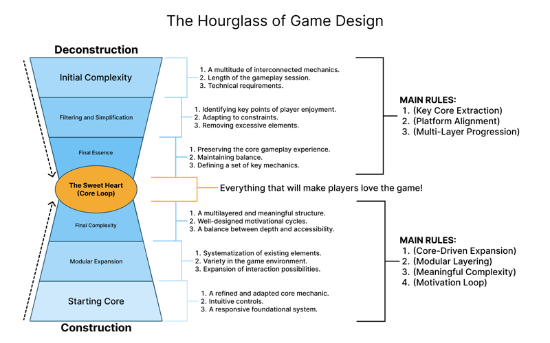
Now that we have both halves of our “Game Design Hourglass,” it serves as a universal lens: flip it around to watch deconstruction, or keep it upright to see simple cores expand outward. It’s not some one-size-fits-all approach and will need tweaks per project, but I think it illustrates a few of the big constants in game design. We can apply it either when analyzing large, complex titles for simplification or when turning small casual concepts into deeper games.
Above all, remember that at the center of any lens is the heart of game design itself, which you can’t build purely out of analysis or “right tools.” That heart needs a creative spark — a clear vision of the project’s meaning and a team that cares enough to bring it to life. That creative spark is what lets us see adaptation not as “cannibalizing” the original but as transferring its essence into a fresh form. A game designer in that sense becomes a donor or an inspirer — not just piecing together borrowed parts, but retaining what made them special while adding a new layer of meaning, so the end product finds its own identity.
I believe this method isn’t just about borrowing other titles’ mechanics; it’s also about genuinely understanding their core, so you can adapt or expand them consciously and craft new experiences. Both construction and deconstruction help us isolate the most important bits, discard the clutter, or gradually build complexity around a simple foundation without losing that delicate balance of depth and approachability.
If you’ve ever wondered how to make your game deep yet easy to learn, I urge you to experiment with both approaches. Take a mechanic from your favorite game, pare it down to its bare essence, and then try “growing” it again by adding layers of meaningful systems. At least now you have a way to try it on paper! So, get those Game Design Documents open and dive in!
P.S:
Yes, this is my first hefty article, and I’ll admit it turned out veeery… big, and somewhat personal. I hope that if you’ve made it here, you’ve found something useful, gotten some inspiration, or at least got a bit of food for thought. For me, writing out my thoughts like this is labor-intensive but super helpful in clarifying and organizing my own experiences.
I’d be genuinely happy if you shared your thoughts, comments, and especially your critiques. Remember: the sweetest heart of game design is the ability to see possibility where others only see constraints.
See you in the land of bigger secrets → t.me/slepokNTe
Or if you looking for more... linktr.ee/nickkeepkind

Top comments (0)