Building forms from scratch is hectic than we may imagine. tcomb-form-native is one powerful library, that helps building complex input forms having validation, maintain state on input or submit, or initializing the form with default values, styling the input fields etc. Here is the official link as well:
In this tutorial, we will explore the library while writing example codes to see how it practically works.
Let’s get started with obvious steps:
Initializing new RN project:
react-native init tcombFormNativeTutorial
Installing tcomb library:
npm i --save tcomb-form-native
Building first form:
Lets build a new component in Tcomb.js which renders our form. tcomb automatically generates a form based on provided domain model, ‘PersonModel’ in our case, as follows:
import React, { Component } from 'react';
import { View } from 'react-native';
import t from 'tcomb-form-native'

let Form = t.form.Form
class Tcomb extends Component {
  constructor(props){
    super(props)
  }
  render() {
    let PersonModel = t.struct({
      name: t.String, // a required string
      surname: t.maybe(t.String), // an optional string
      age: t.Number, // a required number
      rememberMe: t.Boolean, // a boolean
    });
    return (
      <View>
       <Form
         ref='form'
         type={PersonModel}
         // options={{}}
         // value={{}}
         // onChange={{}}
       />
      </View>
    )
  }
}
export default Tcomb;
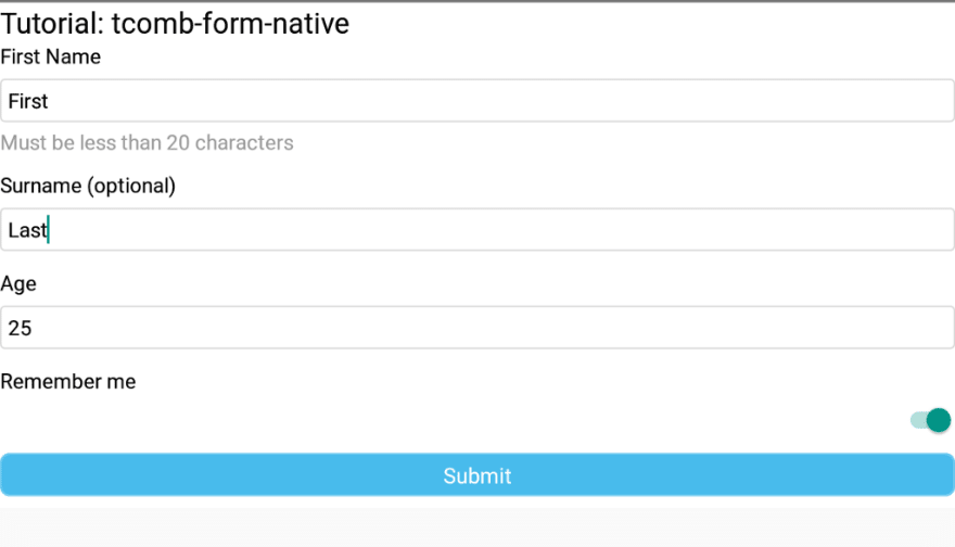
The above form adds Text Input, Numeric and Boolean input fields. And notice, it adds labels on its own, and it adds mandatory validation by default and you need to use t.maybe() for optional fields (i.e. ‘surname’ in the above form).
Validating input:
To verify the fields we call getValue() function on form using ref. We will add a submit button and its handler which ultimately triggers the validation of the fields:
submitForm() {
  var value = this.refs.personForm.getValue();
  if (value) {
    // if validation fails, value will be null
    ToastAndroid.show('Validation successful', ToastAndroid.SHORT);
  } else {
    ToastAndroid.show('Please fix errors', ToastAndroid.SHORT);
  }
}
and in render
<TouchableOpacity style={styles.button} onPress={this.submitForm}>
  <Text style={styles.buttonText}>Submit</Text>
</TouchableOpacity>
here is the result
Adding default values:
Let’s add default values to our form. We add this.state.value in our constructor
this.state = {
  value: {
    name: 'First',
    surname: 'Last',
    age: 25,
    rememberMe: true,
  },
};
and update form as follows
<Form
  ref='personForm'
  type={PersonModel}
  // options={{}}
  value={this.state.value}
  // onChange={{}}
/>
Changing labels
To change the label from ‘Name’ to ‘First Name’, we add options inside render:
let options = {
  fields: {
    name: {
      label: 'First Name',
    },
  },
};
and update our form
<Form
  ref='personForm'
  type={PersonModel}
  options={options}
  value={this.state.value}
  // onChange={{}}
/>
Hint/Help Text:
let options = {
  fields: {
    name: {
      label: 'First Name',
      help: 'Must be less than 20 characters',
    },
  },
};
Dropdown field:
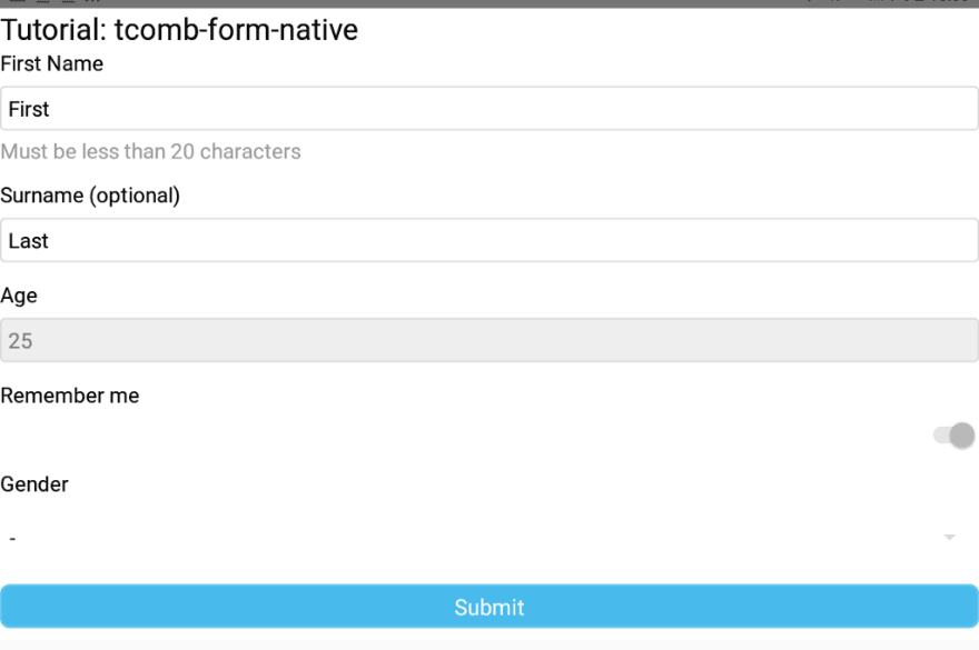
Let us add a dropdown field of gender:
let PersonModel = t.struct({
  name: t.String, // a required string
  surname: t.maybe(t.String), // an optional string
  age: t.Number, // a required number
  rememberMe: t.Boolean, // a boolean
  gender: t.enums({M: 'Male', F: 'Female'}, 'gender'),
});
Disabling fields:
Here we disable the fields ‘age’, ‘rememberMe’ and ‘gender’. Notice, we sometimes use ‘editabale’ and sometimes ‘disabled’ configuration variables
let options = {
  fields: {
    name: {
      label: 'First Name',
    },
    age: {
      editable: false,
    },
    rememberMe: {
      editable: false,
    },
  },
};
Conclusion:
We built a simple form using tcomb-form-native library. We used textinput, dropdown, toggle switch, we also added mandatory validation and added a form submission handler. There will be another tutorial in the continuation where I will show how can you add custom advanced validation to the fields. This project is also uploaded on Github for reference:


Top comments (1)
I am using tcomb form but I am using function based components. Could you please explain how I can get the value of a form into a variable. Every time I try I get the error undefined is not an object (evaluating 'form.getValue')