
In honor of Women’s History Month, I wanted to create a public workspace that highlights women who have paved the way for the work women in tech are doing now, and that also highlights some of the issues women across many industries still face in the workplace.
For the resulting Women’s History Month public workspace, I pulled data from several sources and created a few different collections focusing on different areas of interest, and created Postman Visualizers to make the data more accessible. To access visualizers within a request, first send the request, then navigate to the visualize view in the response pane. To see the code used to make a visualizer, click over to the Tests tab on a request.
Inspired by Postman Technical Enablement Architect Ruby Sattar’s recent blog post about her search for Black History Month APIs, I set out to find APIs particularly relevant during Women’s History Month. I didn’t find a ton of APIs per se, but did find quite a few datasets, most available in CSV or TSV formats via URL.
Though we’re big API fans here, I took the opportunity to showcase one of my favorite uses for Postman Visualizer: helping to make sense of large datasets. By using a CSV parsing library, I was able to convert CSV data to JSON objects to make them easier to work with. After plugging in some visualizer code, the once-unwieldy wall of data can now be easily read and understood. The following is an overview of the four collections in the workspace. To run and tinker with the visualizations yourself, use the Run in Postman button in each section below to fork the collection into your own workspace.
1. Industry trailblazers
Many women have played a huge role in advancing the fields of science and technology. In this collection, I use the Pantheon Wikipedia explorer API to create table visualizations exploring prominent women in different fields. Pantheon calculates biography popularity using many measures, but the one I chose to highlight was the Historical Popularity Index (read about it here)). Use the visualizations like the one below to explore well-known female figures in math, computer science, social activism, or your field of choice.

GIF showing a sortable table visualization of famous women in computer science, sortable by popularity index, name, occupation, description, or birth year
2. Gender pay gap in employment
A coworker pointed me to the Gender Indicators dataset by the OECD (Organization for Economic Co-operation and Development), which has a wealth of data about various gender issues spanning multiple countries. For this collection, I pulled a couple of indicators into their own graphs: the share of women on prominent board seats by country, and median pay gap data.
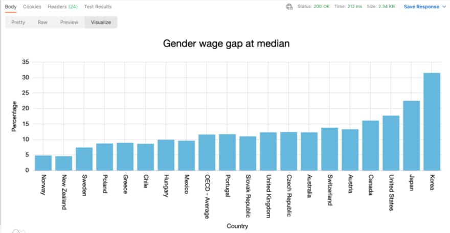
Postman Visualizer bar graph showing median wage gap data by country
3. Parental leave policies
Paid parental leave is a big factor in helping women in the workforce, and the OECD data source mentioned above has a dataset around parental leave that I used for this collection as well. One other data source I found interesting was an analysis of parental leave policies at US universities. Check out the original full analysis here, or the two requests with visualizations in the collection.

Postman Visualizer bar graph showing length of maternity leave (in weeks) by country
4. Film dialogue by gender
This collection strays a bit from the overarching theme of women in the workplace, but women’s representation in popular culture is also a critical piece of the equality puzzle. You may have heard of informal measures like the Bechdel Test to measure women’s representation in films, but two researchers took it a step further by putting together this visual essay analyzing data from over 2,000 screenplays to look at the ratio of words spoken by different characters, broken down by gender and age. Among the findings, they discovered that:
- Men speak more often than women in Disney’s princess films
- Only 22% of films had a female lead when measured by words of dialogue spoken
- Film scripts seem to be biased toward younger women where the opposite is true for men
The visualization in this collection generates a new movie analysis each time the request is sent:

Postman Visualizer showing a pie chart of character dialogue broken down by gender, and a table showing detailed character dialogue data
Check out more—and contribute
Finally, we have included a couple of other datasets that aren’t great fits for creating a Postman Collection, but that are great resources to look into. Check out the workspace documentation for those links, or fork the collection with the Run in Postman button below to add your own contributions to the workspace.
The post A Public Workspace for Visualizing Women’s History Month appeared first on Postman Blog by Carson Hunter.

Top comments (0)