Secret of good design
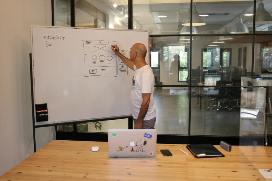
The difference between developer and designer is that we not only see, but also take notice of the small things around us. We also pay attention to the colors and layout, the way of visual look, and a variety of other things that might otherwise go unnoticed.
3 Secret of good design:
Think Broader: Stand back and consider everything. This is one of the three keys of successful design.
Take a closer look: Consider the details; are they important ? or is this how things have always been done ?
Think like a child: View the world through the eyes of a novice. Have young folks or those with fresh perspectives on your team.
Layout is King
Your website can benefit greatly from Layout and designs. These may consists of:
Structure: A large number of visitors to your website will browse it in search of the information they need.
The majority of the time, this will include scanning your material for headings, buttons, links, or pictures that could appear pertinent.
This may be made simpler for your users by using a layout on a structured, organized website, which will improve the user experience.
Flexible: The design allows you to arrange the grid in whatever way you choose as long as your content fits inside the boxes.
There are many other design possibilities to choose from, such as a straightforward layout with two boxes across and two down, a mismatched set of three, or an unaligned set of four. This implies that you may select the choice that is best for your business.
For instance, unique businesses could use an asymmetrical grid design to reflect their brand identity. While not being appropriate for a more serious business.
Balance: Because a layout employs several boxes to cover the available space, it may be simpler to strike a balance between your text-based and visual material.
And doing so will aid in preventing your website from website from being overly heavy or overpowering. Additionally, it will maintain your user's attention
How to use Typography Beautifully
Initial Impressions have a lasting effect. Whether or not you are aware of it, your typography contributes to the user experience even before they have read a word or clicked a button.
Typography has the power to convey more than just a story; it can also reveal to the user who is responsible for the website and what it stands for.
Asking yourself these questions can help you determine what to say and how to express it. What do you want the user to feel and experience when the page loads, which in turn determines the website's personality.
How people react to your website will depend on the typeface you use.
Art of Color
Color has been essential to the expression of ideas since humans first started blending paint. Certain hues have the power to stir up strong feelings or recollections.
Color can transform a piece's ambiance and vibe from drab and life less to vibrant and captivating. Color must ne utilized to engage customers and advocate for computer users as the role of the internet in business and education grows.
Color theory is critical for a strong identity and user friendliness when designing a web page, whether it be for a service, a product like IT software, or personal usage. An overview of color theory and its best applications is given on this page.
Machines, such as printers and computer screens, employ a finite number of colors, but the human eye is able to distinguish a dizzying array of hues.
Design benefits greatly from a fundamental knowledge of human psychology. This article lists several excellent web design examples and explains what makes them smart choices.
Interaction: Breathing Life into your website
Designing a website involves more than just aesthetics. Interaction is key in web design. Animations may direct attention, change behaviour, and improve the overall user experience on your website.
They are designed to increase usability and draw attention to the crucial call to action on the website.
Enjoy the Wait
The wait for a page to load may be entertaining. If there is no way to reduce the wait time, we must come up with techniques to make loading more enjoyable.
Animation can be utilized to divert users and minimise the perceived wait time. User will be more engaged with your brand if they have something entertaining to watch while your content loads.
Explain Interactions
The feeling of web navigation can be improved by animation. By altering its wording or colors, a symbol, for instance, can seamlessly go from one duty to another.
Users are made aware of the connection between the two operations when a play symbol is changed into a pause button.
Full Screen Entertainment
Additionally, large scale animations may be a huge asset. They have the ability to draw visitors into the design if created in an engaging manner.
Large-Scale animations can take up a major amount of the screen, frequently in the form of a movie. These types of animations serve as a focal point in the overall design as long as you do not mix too many different moving elements together.
Responsive design from desktop to mobile
These days, nearly every new client want a mobile version of their website. Afterall, it is literally necessary to have separate designs for the Blackberry, iphone, ipad, netbook, and kindle, as well as ensuring that all screen resolution are compatible.
We'll probably need to plan for a lot of more inventions over the next five years. When will the madness stop? of course it won't.
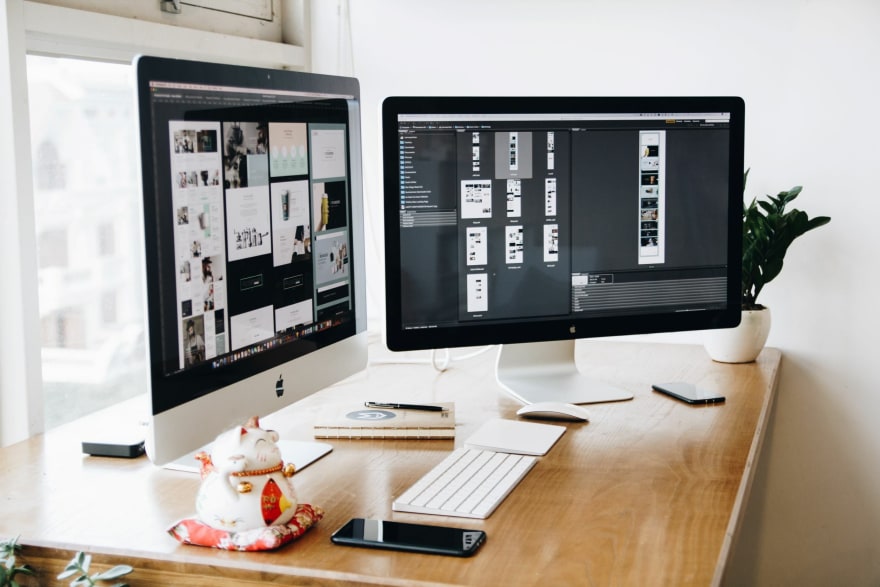
Responsive Web design is the approach that suggests that design and development should respond to the user's behaviour and environment based on screen size, platform and orientation.
When a user transition from a laptop to an ipad, the website should adjust to accommodate resolution, image size, and scripting capabilities.
In other words, the website should have the technology to respond to the user's preference automatically. This would eliminate the need for each new item on the market to go through a separate design and development phase.



Top comments (0)