
Deprecation Notice
Yeah, yeah, I know. I hate it too when people abandon tutorial series mid-way. But, due to (exciting!) circumstances, I'm calling it quits for now.
I'm thinking of just dropping a link to the full repo here - it's a mess, but it's something you guys can chew on instead of my empty promises.
If you'd like me to drop it here - let me know at hey@redcaptom.com.
And, just sayin', I had a BLAST doing this. If you know something - anything - about technology, take the time to write it down as a tutorial series. You will get SO, SO much value out of it, you can't even believe it.
Until we meet again - RCT :)
The Video (Scroll down for the article)
Coming soon!
More User Interface
Alright, so we are currently here:
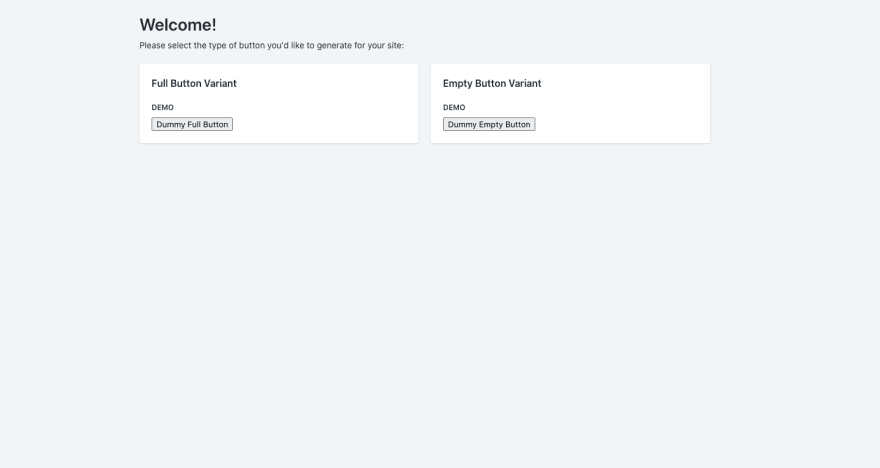
This is nice, but it doesn't actually lets the user choose between the two buttons, now, does it? We'd need to add some sort of input element to allow the user to pick a button variant.
Since this is an OR relation, i.e. you have to pick one - and exactly one - variant of button, a radio button is a great fit. Shopify actually provides us with a Radio Button component that has all sorts of niceties to it:
<RadioButton
  label="The text that appears right next to the button"
  helpText="Greyed-out subtext"
  checked={"A boolean value to indicate whether the button is checked or not"}
  id="An HTML element id, used for selection (must be unique)"
  name="An HTML element name used for identification (can be repeated)"
  onChange={
    "A callback function, that is triggered once the radio button is changed (i.e. marked / unmarked)"
  }
/>
Let's talk a little bit about this, since this is the first time we're observing an element that is not very simple. Look at all the props we're providing the componenet (label, helpText, checked etc.) - I've added a small sentence explaing what each of them does. There are two props - checked and onChange - that get {} as inputs and not just text. Inside those {} we can input whatever JavaScript we want, but they expect to get a boolean and a callback function, respectively. But, hold back one moment. Why do we need a React component for a radio button? We already have <input type="radio">, right? Let's explore this for a second.
A normal radio button (i.e. <input type="radio">) already has a checked attribute and a change event, that can replace the checked and onChange props. We can totally use those without having to wrap the button in a component. But, the Polaris design system would like to standardize the way radio buttons are used in Shopify Apps. Therefore, the RadioButton component encapsulates all the styles Shopify would like you to use with the button (padding, color of the bullet in the button, color of the surroundinc circle etc.). It also allows for a somewhat more convienent wrapper around features that are often used together (like label that removes the need for a <label> tag and helpText that expands the normal label with optional subtext).
The reason why onChange is also a RadioButton property has to do with the way React sees the world. In React, everything is interactive - an action in one element is expected to trigger something in another element, or maybe even in the backend of the application. The change event (in the original <input type="radio">) was created for just this purpose - to be the main source of interactivity for your radio button (when its value changes, do something - i.e. trigger a callback function). But, in practice, getting this functionality of events to work across browsers has been historically hard. React created a new type of event, that "wraps around" the original event, and that is why we have a special onChange property inside the component. This is not the only reason, of course, but to me is the most.... comfortable one. If Dan Abramov ever reads this, and I happen to be wrong (which I sometimes am, it appears) - please accept my sincere apologies and make a comment for me to fix this. :P
Back to business - what do we want to happen when the button changes? Well, we want to first know that it did. Which means we need to store that infomration somewhere. Luckily, we can use state in our App component to keep track of what's going on inside the page!
A Note on Redux
You will note that I, much like the offical Shopify Tutorial, chose to forego the use of a (very) popular JavaScript library called Redux. Redux allows you to have a central, instead of a distributed, location for your state. A state of a component is some information being kept in it about.... whatever, and is notriously difficult to manage as your apps get more and more complicated.
I can honestly say that the app I'm building here is just not complicated enough to justify the use of Redux, or any other central state management library. Therefore, I "bear" the complexity, and choose to manage the state myself. This might seem like I'm doing a lot of hacks to get the information around, but for the sake of simplicity I think it's the way to go.
So before we add the radio button, let's make sure to add state properties that account for which button was selected. For this, I am going to correct an oversight that any experience React developer will tell you I made (albeit intentionally) in the beginning: I omitted the constructor.
A constructor (as I mentioned in the React Sidestep 3) is a special function in a JavaScript class (and specifically inside React class components) that gets called when an object representing the class is initiated. So let's add it first:
class App extends React.Component {
  constructor(props) {
    super(props);
  }
  render() {
    return (
      <AppProvider>
      ...
      </AppProvider>
    );
  }
}

export default App;
VSCode might throw a "useless constructor" error at you (well, probably a warning - i.e. yellow squiggly lines, and not an error). This is OK - this constructor indeed doesn't do anything. All it does is call the constructor of the class above it with the props that were provided to it (since every React class component extends React.Component, its constructor is being called with the pops provided for the current constructor). This is an implementation detail that you shouldn't really care about - it's the way React is built.
The interesting bit comes when we want to provide state to the component. This can happen simply by defining the state attribute for the current class in the following way:
class App extends React.Component {
  constructor(props) {
    this.state = {}
    super(props);
  }
  render() {
    return (
      <AppProvider>
        ...
      </AppProvider>
    );
  }
}

export default App;
We now have a place in our component where we can manage our state. Let's add a property inside our state, one that shows which variant of the button has been selected:
class App extends React.Component {
  constructor(props) {
    this.state = {
      buttonType: "full"
    };
    super(props);
  }
  render() {
    return (
      <AppProvider>
        ...
      </AppProvider>
    );
  }
}

export default App;
We define buttonType to be "full" upon initialization to provide some sort of default to the user. This means that at first initizliation, the selection box will be the one one with the full button in it. In the future, we will have this value stored in a database, and brought into the application to "remember" the prefence of the user. More about this later.
We also need to create some function that - when the button's status is changed - chages the value in the state of the component. This is a function that is called when onChange is called on RadioButton - i.e. a callback fucntion. Let's call this function handleButtonTypeSelection, since it handles which type of button is used.
This function can go in one of one of 4 places, which can cause a bit of confusion. I'm choosing to add them as arrow functions inside the render function, like so:
class App extends React.Component {
  constructor(props) {
    this.state = {
      buttonType: "full"
    };
    super(props);
  }
  render() {
      const handleButtonTypeSelection = (changedButtonType) => {
    ...
  }
    return (
      <AppProvider>
        ...
      </AppProvider>
    );
  }
}

export default App;
I like this option because it feels, to me, like it's simpler once you figure out how arrow functions work like. For most intents and purposes, an arrow function is just another way to write a function - instead of funcName(){}, we're writing const funcName = () => {}. But, there are some places where the arrow function behaves a bit differently than your run-of-the-mill function - and I will warn you about them as they come up. In this case - use the arrow! :)
Our full function needs to accept the type of button that was selected, and change the state of the component's buttonType accordingly. As you will see in a moment, this will also check the correct button by changing the checked prop on each RadioButton component. Let's put our full function in then:
class App extends React.Component {
  constructor(props) {
    this.state = {
      buttonType: "full"
    };
    super(props);
  }
  render() {
      const handleButtonTypeSelection = (changedButtonType) => {
        this.setState({ buttonType: changedButtonType });
  }
    return (
      <AppProvider>
        ...
      </AppProvider>
    );
  }
}

export default App;
This part:
this.setState({ buttonType: changedButtonType });
Changes the value of buttonType in the state of the component. Specifically, what it's doing is passing a destructured object into the setState function (which, as you probably guessed, sets the state). Destructuring is a totally awesome (and rather new) concept in JavaScript, that basically allows you to unpack properties from objects, and treat them as simple variables. The statement above, therefore, is exactly like doing:
const newState = {
  buttonType: changedButtonType;
}
this.setState(newState)
But the destructuring just saved me an unneccessary variable declaration.
Back to business - we now have our callback function, but still missing our RadioButton components. Let's finally put them in, and get the following:
import React from "react";
import { Page, AppProvider, Layout, Card, RadioButton } from "@shopify/polaris";
import "@shopify/polaris/styles.css";

class App extends React.Component {
  constructor(props) {
    super(props);
    this.state = {
      buttonType: "empty",
    };
  }

  render() {
    const handleButtonTypeSelection = (changedButtonType) => {
      this.setState({ buttonType: changedButtonType });
    };
    return (
      <AppProvider>
        <Page
          title="Welcome!"
          subtitle="Please select the type of button you'd like to generate for your site:"
        >
          <Layout>
            <Layout.Section oneHalf secondary>
              <Card title="Black Button Variant" sectioned>
                <Card.Section title="Demo">
                  <button>Dummy Full Button</button>
                </Card.Section>
                <Card.Section>
                  <RadioButton
                    label="Choose Full Button"
                    helpText="Works well with the default Shopify themes and lighter backgrounds."
                    checked={this.state.buttonType === "full"}
                    id="full"
                    name="full-button"
                    onChange={() => handleButtonTypeSelection("full")}
                  />
                </Card.Section>
              </Card>
            </Layout.Section>
            <Layout.Section oneHalf>
              <Card title="Empty Button Variant" sectioned>
                <Card.Section title="Demo">
                  <button>Dummy Empty Button</button>
                </Card.Section>
                <Card.Section>
                  <RadioButton
                    label="Choose Empty Button"
                    helpText="Works well with darker backgrounds, to create a high-contrast feel."
                    checked={this.state.buttonType === "empty"}
                    id="empty"
                    name="empty-button"
                    onChange={() => handleButtonTypeSelection("empty")}
                  />
                </Card.Section>
              </Card>
            </Layout.Section>
          </Layout>
        </Page>
      </AppProvider>
    );
  }
}

export default App;
Which should render like so:
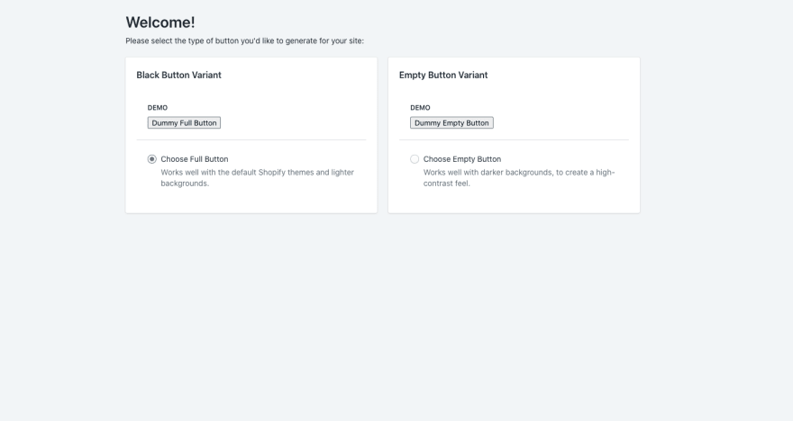
Try checking and unchecking both RadioButtons, and observe that only one of them can be checked at any given moment. This is due to each of them pulling its checked prop from the value of the buttonType state property.
That's enough for today, I think. :) We covered a lot of not-strictly-related ground, but I think it was a good detour into JavaScript and the cool features it has to offer.
An Offer
If you're working on a Shopify app, and your app uses Polaris for the front-end, I want to hear from you. I am willing to sit down and run a debug session / add a new feature with you for your application, if you agree to stream it live with me (or record it and publish it later). It's not easy writing a full-stack JS app, doubly so when you're not from within the ecosystem. Let's do it together and help all the people! :)
E-Mail me at hey@redcaptom.com, and let's set it up.

Top comments (1)
👉 Download Seers Cookie Consent Banner for your Shopify store today!
Make compliance easy and build trust with your customers.