Problem
The website looks nice in terms of its ease of use. It still has a lot of things missing like, categories, favourites etc. but those are simply additions that we can implement on a later date. The issue that I have noticed with the website is its "Search" button. I was wondering what the point is of making it a pop up? Is it for easier readability-- it is a huge pop up on the screen. Is it to simplify the navigation? There's barely anything there to begin with, and if it does get populated, we can simply style out similar ones.
Search Button Idle
Search Button Used

It doesn't look appealing to me. It does help with easier readability, but that's all its purpose. There's also the problem with having to click the "x" button to disable it (we can technically fix this by adding a few statement that will hide it again once the mouse press on anything but the search area).
There's also the ample amount of code required to make this code work.

This is simply just on the "Search.js" a few more are added in nav totalling somewhere around close to 300 lines of codes for this simple search bar, granted a lot of it comes from css
"So what's the point of having a search button?" I thought to myself. Wouldn't it be much easier and simple to have an input instead?
Setup
I have to first try to understand how their code works. Thankfully, they use REACT, which is exactly the type of code used from the previous pull request I had. I have a much better understanding compared to before.
I also was thinking that with what I'm about to implement, I will have to make sure it works perfectly on mobile so I had a bit of research in terms of stylizing.
Coding
The fix took quite a bit to understand. I mean having a 200 lines of codes confused me a bit in terms of what I'm supposed to be doing. I went to the directory where all of the navigation are kept; thankfully their entire project is well organized so it was easier to locate the problem.
The thing I love about REACT, is that it's so easy to locate where in the code a specific element is located as seen in the figure below

By simply opening the "developer's tool", I can view how the entire website is formatted in REACT. Once I located it, it made it much easier for me to see what to find in the file.
I first removed all of the codes that uses the Button (I of course made sure it is only used for this).

Codes such as this are deleted, and by removing just this, will have react warn me about "unused codes" as seen on the fiture below

Now I just delete these, and boom the search button is now gone.
Now to start the implementation of the search "textField". I first thought of using the actual "TextField" that is provided by REACT, but I realized that the need for a new library just to tweak the css isn't worth the effort, so I decided to go with the "input" tag instead, because I noticed that they were using "div" and other tags throughout the project.
With the use of "onKeyDown" I can write a function that would allow the user to filter out the search result based on the value given.
I thought I was done with the code, but I then remembered that I'm supposed to make sure that the code works with the mobile devices, so I had to add new stylized feature depending on the dimention of the screen.
Demo
Website Idle Mode
Typing on the search bar
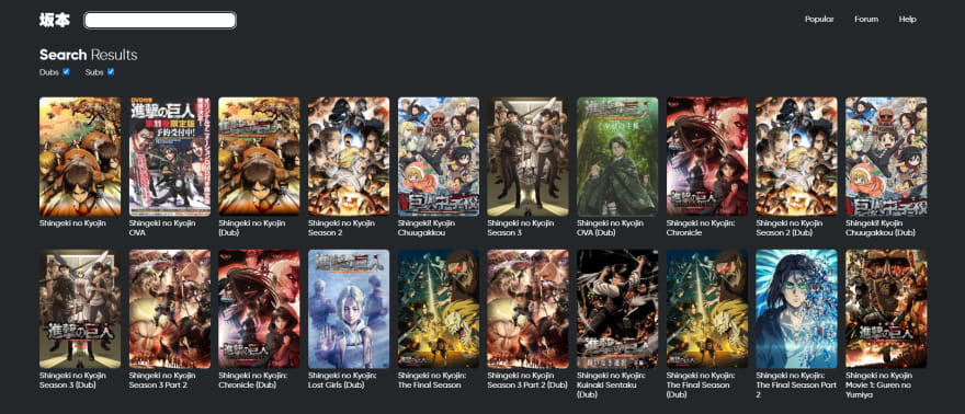
Filters out the result based on the search values
Difficulties
The most difficult part was trying to stylizied the search bar. The use of "TextField" was really not worth doing due to its requirement of having to install a new library to stylize it. It might look great, but I feel that it's just not worth having when a simple input can give the user the ability to do whatever they want with it.


Top comments (0)