
- Let's think inside the box!
- Default margin
- Margin Collapsing
- Shorthand properties
- Width & Height
- Box Sizing
display: nonev/svisibility:hidden- Pseudo Classes
- Pseudo Elements
- Pseudo what???
- Grouping CSS Rules
Let's think inside the box!
Every HTML element is interpreted as a box by CSS.
Every element has:
- A content; the blue area.
- A surrounding padding, the green area.
- A surrounding border, the orange area.
- A surrounding margin, the brown area.
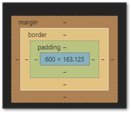
Content
It can be some text, an image, a video...
Border
A border surrounds the content.
Padding
The internal space, from the content to the border.
Margin
The distance between an element and its next sibling.
Content, Border, Padding and Margin form part of the Box Model in CSS.
<div id="boxModel">
  Hello Box Model!
</div>
#boxModel {
  background-color: violet;
  font-size:50px;
  padding: 20px;
  border: 10px solid red;
  margin: 30px;
}
By applying this CSS Rule, below we can see how the broswer interpreted each CSS declaration.

Content| the blue area
We have a CSS declaration of font-size:50px, hence we have height of 57px
Border | the orange area
We have a CSS declaration of border: 10px solid red, therefore 10px has been allocated to the surrounding border, with a solid red colour.
Padding | the green area
We have a CSS declaration of padding: 20px;, therefore 20px has been allocated to the surrounding padding.
Margin | the brown area
And, we have a CSS declaration of margin: 30px;, therefore 30px has been allocated to the surrounding margin.
Default margin
By the browser
The browser by default assigns a margin: 8px; to the body element.
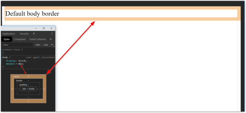
To remove this default margin, we can use this CSS rule:
body {
  margin: 0px;
}
Margin Collapsing
When we have two or more HTML elements (block element).
The margin between them collapse. This is done automatically by the browser to minimise excessive white spacing.
Below we can see that the margin-bottom for the first element and the margin-top for the second element has automatically been merged together.
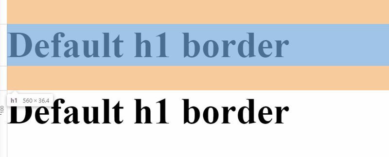
By default, the block element with the bigger margin wins.
Below, the margin-top for the second element has a bigger value than the margin-bottom of the first element.

Read more:
Shorthand properties
Shorthand properties combine values of multiple properties in a single CSS declaration.
For example:
margin: 8px
is a shorthand for
margin-top: 8px;
margin-right: 8px;
margin-left: 8px;
margin-bottom: 8px;
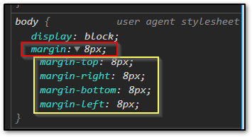
Shorthand makes it easier to pass in multiple values to one CSS property.
border: 10px dashed purple;

Shorthand properties in action
padding: 10px 20px; is a short hand for:
padding-top:    10px;
padding-right:  20px;
padding-bottom: 10px;
padding-left:   20px;
padding: 10px 20px 30px; is a short hand for:
padding-top: 10px;
padding-right: 20px;
padding-bottom: 30px;
padding-left: 20px;
padding: 10px 20px 30px 40px; is a short hand for:
padding-top: 10px;
padding-right: 20px;
padding-bottom: 30px;
padding-left: 40px;
Width & Height
Width
A block-level element always attempts to take the full available width of the browser or that of its enclosing element if it has one.
div {
  background: greenyellow;
}
<div>What is my width?</div>

If we set the width by giving it a percentage value, it'll take the percentage of the surrounding element.
In this case, the div element has no surrounding element, so it is taking the full available space of the browser's width.
div {
  background: greenyellow;
  width: 33%
}
If we wrap the div in an enclosing section element, and we give that section element a specific width.
<section>
  <div>What is my width?</div>
</section>
section {
   width: 500px;
   background: yellow;
}
div {
  background: greenyellow;
  width: 33%
}
The width of the div element will now be a % of its enclosing element.
Below, we can see that it has shrunk smaller.
Height
Height on the otherhand, sets the maximum vertical space an element needs to fit its content. It doesn't take the full height available for the broswer by default.
div {
  background: greenyellow;
  width: 100%;
  height: 100%;
}
If the html element is enclosed inside another element, its height will be relative to that element.
<section>
  <div>What is my height?</div>
</section>
section {
   width: 500px;
   background: yellow;
   width: 200px;
   height: 200px;
}

div {
  background: greenyellow;
  width: 80%;
  height: 100%;
}

To make use the full height of the browser, one trick is to apply this CSS rule:
html, body {
    height: 100%
    }
Box Sizing
box-sizing property allows us to include the padding and border in an element's total width and height.
But before that, let's understand how the browser allocates the space for each element.
Actual visible/rendered width of an element’s box
= width + padding + borderActual visible/rendered height of an element’s box
= height + padding + border
By default, margin, border & padding are given their respective spacing.
<div>How much space do I use?</div>
div {
  background: pink;
  width: 100px;
  height: 100px;
  padding: 10px;
  margin: 10px;
  border: 10px solid greenyellow;
}
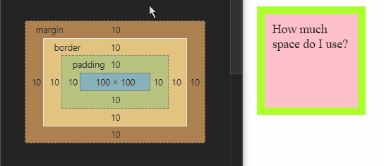
We can change the box model by assigning the box-sizing property one of the three possible values
content-boxpadding-box-
border-box(the most popular value)
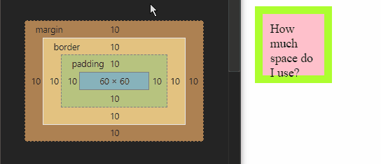
Example with box-sizing: border-box;
div {
  background: pink;
  width: 100px;
  height: 100px;
  padding: 10px;
  margin: 10px;
  border: 10px solid greenyellow;
  box-sizing: border-box;
}
box-sizing Reset Method
If we want to use border-box throughout our project, the following styling will do the quick fix.
html  {
    box-sizing: border-box;
}
*, *:before, *:after  {
    box-sizing: inherit;
}
Further reading:
Display Property
Block element
A block element is any element that starts a new line, like a paragraph, and uses the full width (all the available horizontal space) of the page or container. A block element can take up one line or multiple lines and has a line break before and after the element. We can set its margin-top and margin-bottom.
Examples of block-level elements :
| HTML Tag | Description |
|---|---|
<address> |
Shows contact information |
<applet> |
Embed a Java applet |
<article> |
Contains the article's content |
<aside> |
Describe a section of content |
<blockquote> |
Denote a section that is quoted |
<canvas> |
Draw graphics using JavaScript |
<caption> |
Add caption to table |
<center> |
Center text |
<details> |
Create an interactive widget to hide text |
<dir> |
Designate a collection of file names |
<div> |
Creates a document division |
<dl> |
Contain a list of definitions and their descriptions |
<dt> |
Designate a term within a description list |
<embed> |
Designate an area for interactive content |
<figure> |
Designate an area of self-contained content |
<form> |
Creates an input form to capture data |
<frame> |
Create a frame window of another page |
<h1> to <h6>
|
Creates a heading |
<header> |
Create a header section |
<hr> |
Create a horizontal line |
<iframe> |
Create a window frame of a page |
<li> |
Used to denote a list item |
<main> |
Contains the content specific to a certain page |
<marquee> |
Create scrolling text |
<nav> |
Contains a page's navigations links |
<noscript> |
Contains the content to use in browsers that don't support scripting |
<object> |
Designate an object embedded into a web page |
<ol> |
Contains an ordered list |
<p> |
Used to denote a paragraph |
<pre> |
Contains preformatted text |
<section> |
Group thematically similar content together |
<table> |
Contains a table |
<ul> |
Contains an unordered list |
The display property allows us to change the behaviour of an element to block, inline, or inline-block.
Inline Element
Inline as the name says “included as a part of the main text and not as a separate section”. Inline elements occupy the space as needed within the space defined by the main element, that is, they take up space they require to fit their content in. Unlike block-level elements, they do not begin on new lines. Therefore, two inline-elements can fit into the same line (as long as the combined content doesn't take up the entire space in which case a line break would be added). Setting a width or height on an inline element also has no effect.
Examples of inline elements:
| HTML Tag | Description |
|---|---|
<a> |
Create an anchor |
<abbr> |
Create an acronym or abbreviation |
<acronym> |
Create an acronym |
<audio> |
Embed sound files |
<b> |
Bold text |
<bdi> |
Confine text that may be formatted differently |
<bdo> |
Force text to go one way or another |
<big> |
Make text bigger |
<blink> |
Make text blink |
<br> |
Create a line break |
<button> |
Create a form button |
<cite> |
Mention any creative work |
<code> |
Designate text as code |
<del> |
Delete or strikethrough text |
<dfn> |
Represent the defining instance of a term |
<em> |
Give emphasis to text |
<font> |
Change the font |
<i> |
Italicizes text |
<img> |
Show an image file |
<input> |
Create an input box on a form |
<ins> |
Insert text |
<kbd> |
Indicate text was inserted using a keyboard |
<mark> |
Highlight text |
<meter> |
Create a meter |
<output> |
Show result of a user's action or a calculation |
<progress> |
Display the progress of a task |
<q> |
Designate text as a short quotation |
<rp> |
Designate parenthesis for browsers without Ruby annotations |
<rt> |
Designate the pronunciation of an East Asian word |
<ruby> |
Designate a ruby annotation on a web page |
<s> |
Strikethrough text |
<samp> |
Designate sample output from a computer |
<select> |
Drop |
<small> |
Make text smaller |
<span> |
Container for grouping or phrasing content |
<strike> |
Strikethrough text |
<strong> |
Mark text with a strong importance |
<sub> |
Create subscript text |
<sup> |
Make text superscript |
<strong> |
Give strong importance to text |
<textarea> |
Create text area for form |
<time> |
Designate a date and time that are readable by humans |
<tt> |
Make text teletype text |
<u> |
Underline text |
<var> |
Define text as a variable |
<video> |
Show a video file |
<wbr> |
Break a line of text |
Inline-block
An inline-block remains inline with all text around the element and appears the same as an inline element.
The advantage: we get the ability to have the vertical height for that element, so we can set margin-top, margin-bottom, padding-top, padding-bottom and vertical-align.
Further Reading
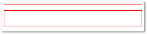
display: none v/s visibility:hidden
The CSS declaration display: none; removes the element from the document flow. This means that the element is no more visible and it also doesn't "block its position". Other elements can (and will) take its place instead.
The CSS declaration visibility: hidden; hides an element but keeps its place in the document. This means other elements won't fill its spot.
For example, if we have two div elements, one with display none and next one with visibilty hidden:
<section>
<div class="dnone">Display None</div>
</section>
<br>
<section>
<div class="vhidden">Visibility Hidden</div>
</section>
section {
  border: 1px solid red;
}
.dnone {
    display: none;
    height: 50px;
}

.vhidden{
    visibility: hidden;
    height: 50px;
}
The first div with CSS declaration display: none; has been removed entirely from the document flow.
Pseudo Classes
Pseudo Classes select elements under certain conditions:
- when their position is relative to their siblings.
- or when they’re under a particular state.
Example of common pseudo-classes:
Dynamic pseudo-classes
-
:link -
:visited -
:hover -
:active -
:focus
UI element states pseudo-classes
-
:enabled -
:disabled -
:checked
Structural pseudo-classes
-
:first-child -
:nth-child(n) -
:nth-last-child(n) -
:nth-of-type(n) -
:nth-last-of-type(n) -
:last-child -
:first-of-type -
:last-of-type -
:only-child -
:only-of-type -
:root -
:empty
Other pseudo-classes
-
:not(x) -
:target -
:lang(language)
Pseudo Elements
Pseudo-elements effectively create new elements that are not specified in the markup of the document and can be manipulated much like a regular element.
-
::before -
::after -
::first-letter -
::first-line
p::first-letter {
  color: Red;
  font-size: 25px;
  font-weight: bolder;
}

p::after {
  content: "<-- Remember this";
  background-color: yellow;
  color: red;
  font-weight: bold;
}
Pseudo what???
The difference between pseudo-classes and pseudo-elements can be a little confusing at first.
A pseudo-class is a selector that assists in the selection of something that cannot be expressed by a simple selector, for example :hover. Since :hover is an action.
A pseudo-element, on the other hand, allows us to create items that do not normally exist in the document tree, for example ::after.
So a pseudo-class selects, while a pseudo-element creates.
Grouping CSS Rules
If we have two CSS rules which share the same CSS declarations, we can group the rules separated by a ,.
Here, the , does not act as a combinator.
div:first-letter,
p::first-letter {
  font-family: sans-serif;
  font-weight: bold;
  color: orange;
  font-size: 30px;
}
How can I improve?
Thank you for reading this article. 🙏 🙏 🙏
Can you kindly tell me what I might have missed out, and how I can improve this article?
Thank you.

Top comments (0)