If you've ever felt that UI design for your project is daunting, don’t worry - it's more approachable than it seems. A great starting point is to focus on establishing a clear brand identity by selecting an appropriate color palette and typography. For instance, choosing colors that evoke the desired emotions and fonts that align with your app's tone can significantly enhance user experience.
In our journey with WhereNow, a friendship-centric social app, we began by focusing on these foundational elements. Let's walk through our design decisions to illustrate how thoughtful choices in color and typography can effectively convey an app's tone and purpose.
tldr
If you’re in a rush, here’s a quick rundown of the app's design decisions:
-
Color Palette:
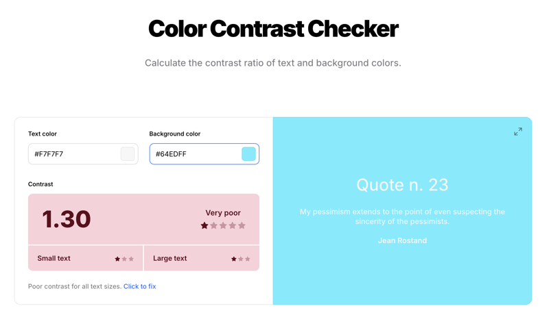
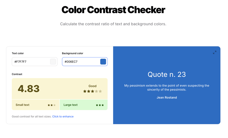
- Primary (Dark Blue #006EC7) - changed from light blue (#64EDFF) to ensure accessible color contrast
- Light (Background #F7F7F7)
- Dark (Text #181818)
-
Typography
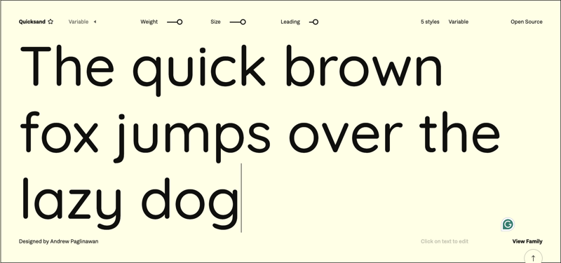
- Quicksand font (Fontshare) - rounded letters that convey warmth and approachability
- Type Scale (Golden Ratio) - adequate sizing contrast between headings and body text
-
Figma Design
- Start designing login + sign up page
- Crucial feature of the app
- Ready to code once designed
- Start designing login + sign up page
Color Palette
I began the design process by selecting the brand's color palette. Blue stood out as the primary choice, symbolizing calmness and trust—qualities essential to an app centered on friendship. Additionally, since our mascot is a harp seal, blue naturally complements the oceanic theme.
Originally I wanted to go with a baby blue, but after doing some accessibility contrast checks to ensure readability and inclusivity, I decided to go with a darker blue hue.
(Original Primary Color Choice)
(Final Primary Color Choice)
Typography
For typography, the Quicksand font from Fontshare was chosen to give off a more casual, friendly look with its bubble letters and lack of sharp angles. This font gives the site a warm and approachable feel to it.
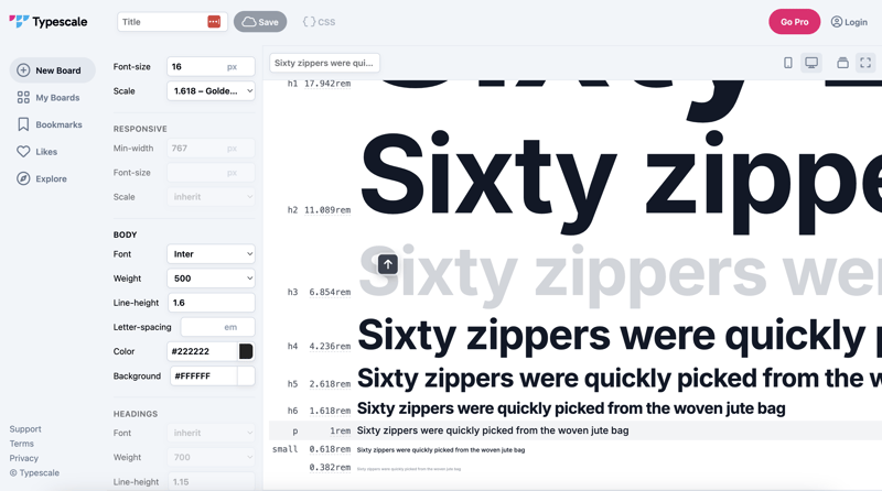
To establish a cohesive typographic hierarchy, I chose a golden ratio scale starting with a 16px base font size. Aesthetically, this scale looks great by providing harmonious contrast between headings and body text. However, one downside to the golden ratio is it causes heading sizes to increase rapidly, potentially leading to disproportionately large headings. To address this, I may switch to a different type scale in the future to maintain visual balance within the app’s design.
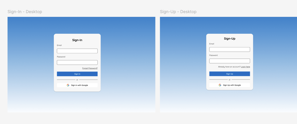
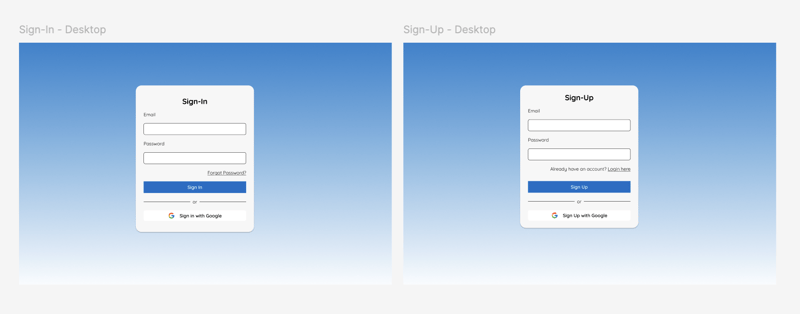
Designing User Authentication Pages
With the foundation in place, it was time to boot up Figma and start designing the user login and sign-up pages. These pages are crucial for user retention and overall app function.
Starting with them allows us to quickly transition into development. Incorporating best practices, such as offering alternative account sign-up options and avoiding the simultaneous use of 'sign in' and 'sign up' on the same screen, also enhances the user experience.
It’s best to keep the design simple at this stage to focus on building the core functionality before introducing any creative complexity.
Conclusion
Establishing a thoughtful design foundation is essential in creating an app that resonates with users. By carefully selecting colors and typography that reflect the app's brand and implementing user-centric design practices, we aim to deliver an intuitive and engaging experience. As we progress into the development phase, these design choices will guide the creation of a platform that embodies the spirit of WhereNow.
What is your approach to product design? Comment down below!
(WhereNow Log 2)

Top comments (0)