In an era where everyone is connected and engaged; everyone wants everything instantly. So making sure the designs you produce are well structured and built around the user is a must.
In this article, I want to look at all aspects which make up a homepage. The design of a homepage has evolved year after year, constantly developing in line with the need of originality. As designers, we challenge ourselves to come up with revolutionary designs that utilise modern technology in order to showcase the very best of our abilities. However, some things have remained constant for the typical website homepage and I’m going to run through some of the key principles with you in this article.
To start, we will look at the architecture of a homepage; examples of a good homepage, and finally at some of my own examples to showcase how I approach the build of a homepage.
Information Architecture
Information architecture is essentially the structure of content. It’s a process which requires designers to balance key elements to the website, from imagery, to video, to text content.
The main goal of this process is to inform the user, but prevent the user feeling overwhelmed with the page. This is done by making sure content is concise, descriptive and communicative. It is also important to introduce a structure that outlines relationships between sections of content. This allows navigation to be easy and effective for visitors of the site.
For a web designer, the ability to carry out an informational architecture task is invaluable. Not only does it mean that the designs will look good aesthetically, it also means that the design will succeed in terms of its key aims and goals.
Planning is Key.
As a wise Benjamin Franklin once said, fail to prepare, prepare to fail. Before even starting the design process in your design software of choice, making sure you have a complete grasp of the website content, it’s users, and the users needs is key for you to be able to design effectively.
The questions you begin to ask yourself during the IA process are:
- Do I know all the different groups of users? Eg: for a school website, general public, students, parents
- Do you know exactly what content is on the site, do you know what content is a priority for the different types of users?
Once the answer to both of the above is yes, you’re ready to start planning the homepage in terms of content. From using the gathered information, you should be able to give a list of content priorities to be able to work out what’s going to work best on the homepage, so your users can get to where they want to quickly, efficiently, and effectively.
I tend to categorise each page for each type of user into a rank of importance for each user group, from low to high. This allows me to quickly identify common elements from each group, which gives me an idea as to what elements need to be prioritised when planning the architecture of the homepage.
There is no right and wrong way to approach information architecture. Each website presents unique challenges and problems that you need to overcome and sometimes this does need to be done in a creative way. Trying to create a process in which you can replicate is a good idea moving forward so you can make sure you apply things you learn along the way into every project going forward.
Planning Navigation
IA works in hand in hand with navigation. Making sure content has suitable follow on actions, whether that be a link through to other pages to read more or a direct call to action.
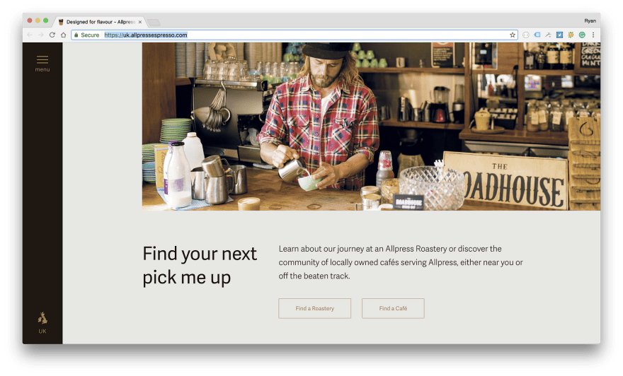
Allpress Espresso have a very clean and minimalist homepage which have follow on actions for each of their main sections. It’s a really good example of catering for all the different types of users.
When you’ve prioritised content for the user types, planning the navigation is a vital step in creating a successful website homepage. In my opinion, the website should introduce key areas of the site, and make sure every aspect on the “high importance rank is available from ideally one click, or at very worst, a maximum of two.
4C
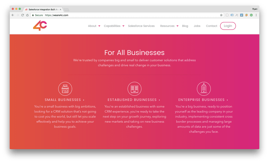
The 4C site identified businesses as a very high priority. Implementing a section on the homepage for the user to choose their type of business allowed them to get to the relevant content very quickly.
Jetty
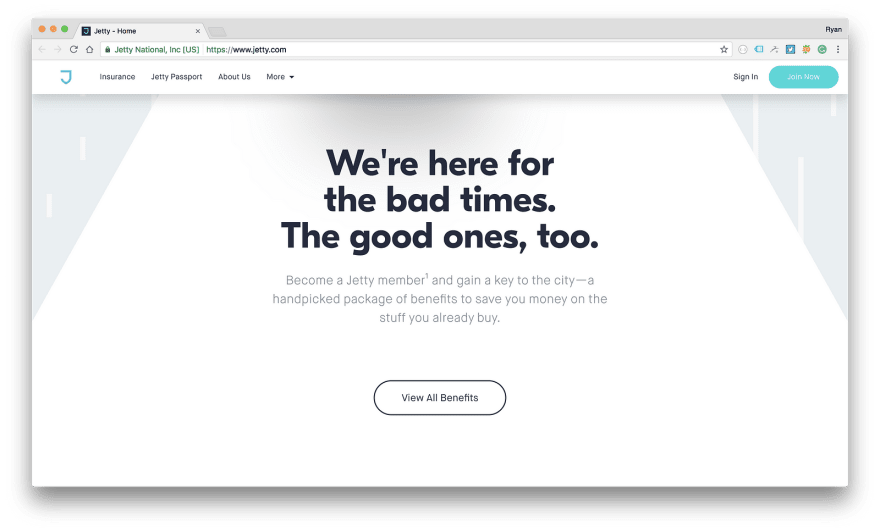
Jetty does a really good job in introducing key sections to the site, basically most of the main links from the main website navigation. This is a great example of good information architecture and reiterates all my points mentioned in this article. The clear headings along with concise descriptions make it really easy to follow Jetty’s main selling points, with clear action text to allow the user to get more information very quickly.
Strava
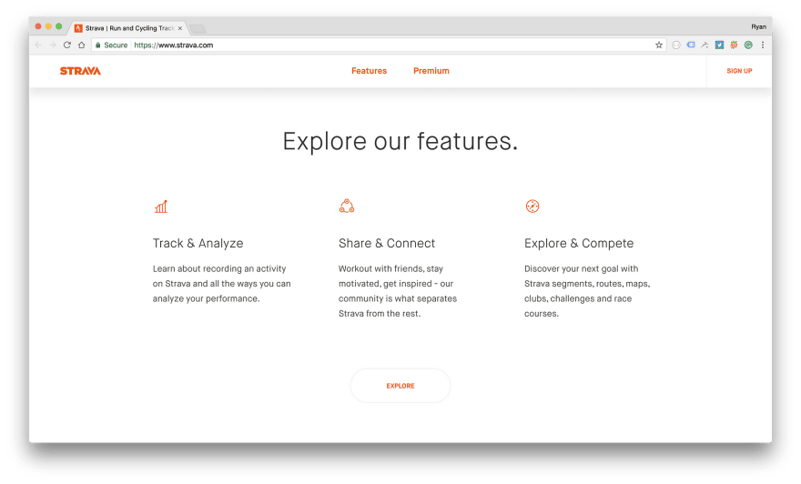
Strava have an interactive and unique homepage whilst still maintaining good information architecture and very good unique user experience. They provide a good overview of the platform features and provide content on demand.
Implementing Content on Demand
To be able to get all the required content on the homepage, keeping content concise and relevant is key. Content on demand is a very good way to allow you to introduce content concisely, efficiently and effectively on the homepage.
I personally implement content on demand using a particular design pattern that utilises several “sections across the homepage. This allows for the homepage to become a brief overview of what the site contains, almost like a type of ‘brochure’, introducing a paragraph for each key section, with a call to action to allow the user to continue reading on. This introduces a flow that allows the user to browse through the site effortlessly. It also allows for a more controlled flow, creating a funnel to make sure your user browses the pages you want them to browse, whether that be a product purchase, a phone call, or even a contact form enquiry.
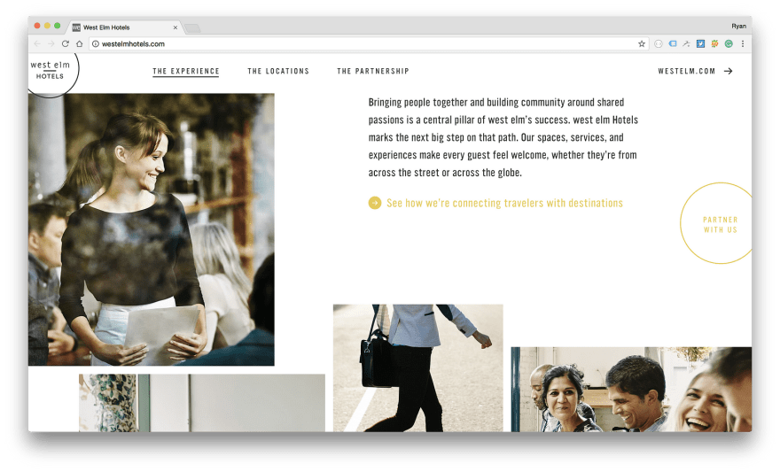
West Elm Hotels break down content effectively and concisely, with follow on call to actions to allow users get more content on demand. The design is quite expansive and bold but what is also really does well is adhere to core fundamentals of what a successful website needs.
Building Trust
Building trust is another very important element to a successful homepage. Including elements that build trust are a really good addition and this can be done in a variety of ways. A few examples of what does work are testimonials, social media integration and utilising recognised brands associated with the site.
When you’re dedicating areas of the homepage purely for building trust, I tend to place these types of elements towards the bottom, as in terms of priority, it’s not a must see for users. However, it is vital to build trust and reinforce everything you’ve mentioned on the site, to establish an authority.

Milanote implements a section dedicated for big brand names and testimonials from the press, which really increases the products authority and builds trust. It also includes a testimonial for reputable names to convince users about the reputation that the product has.
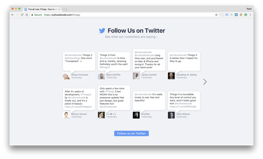
Cultured Code utilise Twitter to reinforce the quality of the product, whilst also giving the user the option to follow them on Twitter. Utilising social media allows building of trust with your user base. It’s a good way to get testimonials on the website in a natural way, whilst getting verified users to reiterate and build trust about a product.
Value of Good Content
Making sure a website is engaging in terms of design is only half the story. Good content allows a website to communicate with it’s users in whichever manor they want to. Being able to accurately break down content concisely and in such away that keeps the user interested, whilst trying to make sure the user is not overwhelmed. This will allow you to create an effective homepage that serves its purpose.
Content comes in all forms, whether it be a video, a photo, or just text. Making sure each element you include is detailed to a high level of polish helps reinforce all the hard structural work. If the content isn’t up to scratch, what’s the point in creating a perfect information architecture? It all slots together like a jigsaw puzzle to create one harmonious experience and that’s where good project management and communication comes in.
The cold harsh life of being a web designer in the digital era we’re in is that you only get a first impression once, more than likely this is via your homepage. Making a user feel an emotion is what I try to achieve with every homepage I build. This will help give you that everlasting first impression and getting that all important conversion.
Good content is vital in making a user feel a type of emotion, whether that be through a video that emotes core brand philosophies, or even descriptive and emotive text that gets that response from the user you’re looking for. Using the structure we’ve discussed in the article earlier helps you create a story through your homepage, communicating everything you need to on that first impression, so if users do bounce, you know you’ve done everything in your power to try and get everything you want to say across.
Post Launch
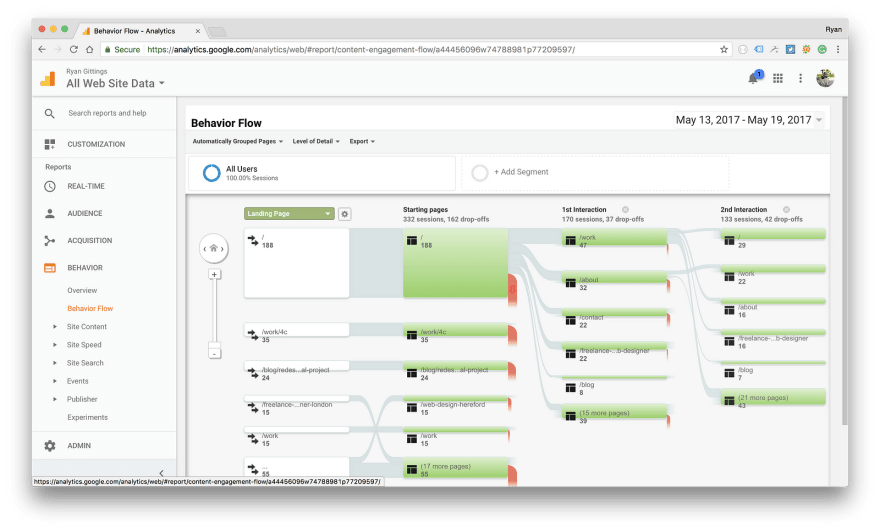
Once the site has been launched, making sure you review all the stats and figures is, in my opinion, another important part of the process. Tools such as Google Analytics allows developers to review what users are doing, where users are coming from and what pages they’re going to and this is super powerful.
If you take one thing away from this article, my advice would be to don’t be scared to change and try things. Every project is different and sometimes some projects turn out to require more refinement then others, perhaps updating a heading, or changing an image to something that builds trust and communicates with your users more.
Analysing what your users are doing via the Behaviour Flow tool is good to track if the IA you’ve implemented is working. I try an aim for < 40% bounce rate with most every site I build. I try to ensure my users flow from my homepage into an informational page so that they can learn about my services, what I do and what I can offer there business.
Conclusion
Information Architecture can take a lot of time for new designers starting out. The web is constantly evolving, things are always changing. So as web designers, we’re always learning, improving and adapting to improve our skillset. Making sure you’re thinking about users in every design you make is a great start in designing for the web, making sure they get to where they need to be should is one of the be the biggest priorities in terms of a homepage design. It should introduce the brand and give users an informative idea as to what’s on the site so that user groups can get to where they need to be within two clicks.
I love getting new ideas and discussing ideologies with other designers, it’s what makes me love the web design community. Feel free to leave me a comment, let me know on Twitter or drop me a message on my website.
Original post: Medium


Top comments (4)
Great guide. This has always been a real haphazard thing for me.
Thanks Ben!
Awesome guide. Thank you for sharing!
Thank you for sharing ! Your article is lit 🔥🔥🔥