 This is a submission for the KendoReact Free Components Challenge.
What I Built
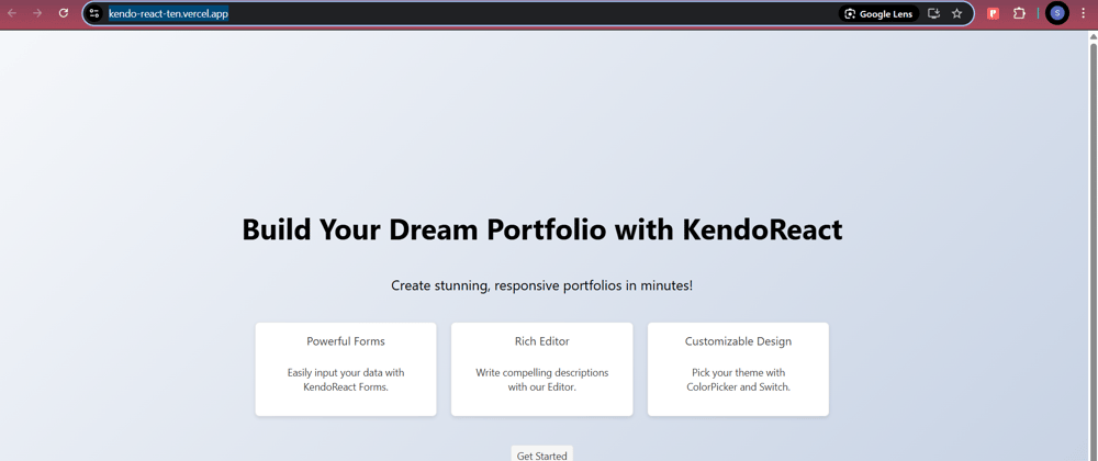
I created a Personal Portfolio Builder—a React application designed to help developers craft stunning, customizable portfolio webpages effortlessly. The project features a responsive landing page with captivating animations to draw users in, followed by an intuitive builder workflow where users can input their About, Projects, and Contact details. With real-time previews and theme customization, this tool is perfect for showcasing skills and projects to the DEV.to community. Built with over 10 KendoReact free components, it combines functionality with a delightful user experience, making it a practical and visually appealing solution for developers.
Demo
Live Demo:kendo-react-ten.vercel.app
Source Code:https://github.com/ShivamSoni20/kendo-react
KendoReact Experience
I leveraged 10+ KendoReact free components to build a robust and interactive UI, showcasing their versatility and ease of use:
-
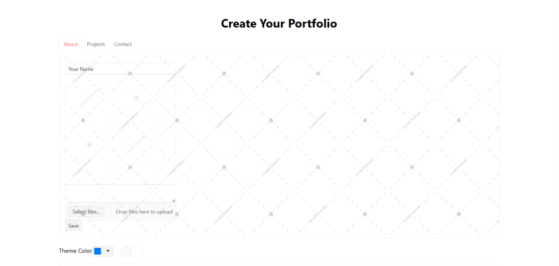
Form&Field: Structured input fields for About and Contact sections, making data entry seamless. -
Input&TextArea: Captured basic text (name, email) and skills list. -
Editor: Enabled rich text bio descriptions with formatting options. -
Upload: Allowed profile picture uploads with file restrictions (e.g.,.jpg,.png). -
Grid: Provided an editable table for adding and managing projects. -
Button: Powered actions like saving data and adding projects across the app. -
ColorPicker: Let users pick a custom theme color for their portfolio. -
Switch: Toggled between dark and light modes for accessibility. -
TabStrip&TabStripTab: Organized the builder into intuitive sections (About, Projects, Contact). -
Avatar: Displayed the profile picture in the preview pane. -
PanelBar&PanelBarItem: Created a collapsible preview section for real-time updates. -
Card,CardTitle,CardBody: Highlighted features on the landing page with a clean, modern look.
These components worked together seamlessly, allowing me to focus on functionality while KendoReact handled the heavy lifting of UI design. The TypeScript support was a bonus, though I had to tweak some prop definitions (e.g., Button’s look) to align with my vision.
Delightfully Designed
To elevate the app’s aesthetics, I used Progress ThemeBuilder to customize the KendoReact theme. I started with the default theme (@progress/kendo-theme-default) and imported it into my project. Then, I headed to ThemeBuilder, where I adjusted the primary color to complement the landing page’s gradient background (#f5f7fa to #c3cfe2). I also fine-tuned typography and button styles for a cohesive look.
ThemeBuilder was a game-changer—its intuitive interface let me iterate quickly, and the live preview ensured my changes matched the app’s vibe. Exporting the custom CSS was straightforward, and swapping it into index.tsx gave my app a professional polish that screams "Delightfully Designed."
-
Experience:The landing page’s animations (via Framer Motion) paired with KendoReact’s
Cardcomponents added a dynamic flair, making the first impression unforgettable. The result is a visually cohesive app that’s both functional and delightful to use.

Top comments (3)
It's really good
thank you soo much
Great work, hope you had fun @shivam_soni_244deacdd4b3e ! I am the Product Manager behind KendoReact and I'd really appreciate if you can share your experience with our product in a quick chat. Ping me here or at antoniya.boynovska@progress.com