Hello, I'm Shrijith. I'm building git-lrc, an AI code reviewer that runs on every commit. It is free, unlimited, and source-available on Github. Star Us to help devs discover the project. Do give it a try and share your feedback for improving the product.
If you've ever stared at a design mockup and wondered how to turn it into a pixel-perfect, responsive layout without pulling your hair out, you're not alone. This can be one of the most tedious and time-consuming parts of web development. Fortunately, there are some powerful tools that can help streamline this process and make your life easier. Today, I want to introduce you to a few techniques and resources that will empower you to create stunning layouts with minimal effort. Let's dive in!ir out, this guide is for you. We're diving into a structured curriculum for learning CSS layouts, starting from the basics and building up to handling intricate, real-world setups. No fluff—just practical steps, code examples, and tips to make your layouts rock-solid. Let's get started. ## Lay the Groundwork: Mastering the CSS Box Model and Positioning Every complex layout starts with understanding how elements behave in the browser. The **CSS Box Model** is key: it defines how width, height, padding, border, and margin interact. Remember, **total width = width + padding + border + margin**. Miscalculating this leads to overflows or gaps. Positioning lets you control where elements sit. Use **static** (default flow), **relative** (offset from normal position), **absolute** (relative to nearest positioned ancestor), **fixed** (viewport-relative), or **sticky** (scrolls until stuck). For a quick example, here's a simple positioned layout: ```html- Home
- About
- Contact
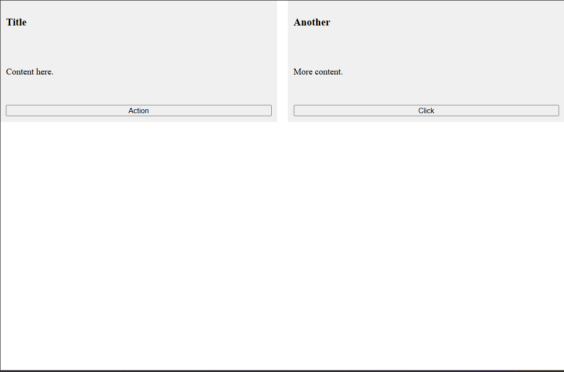
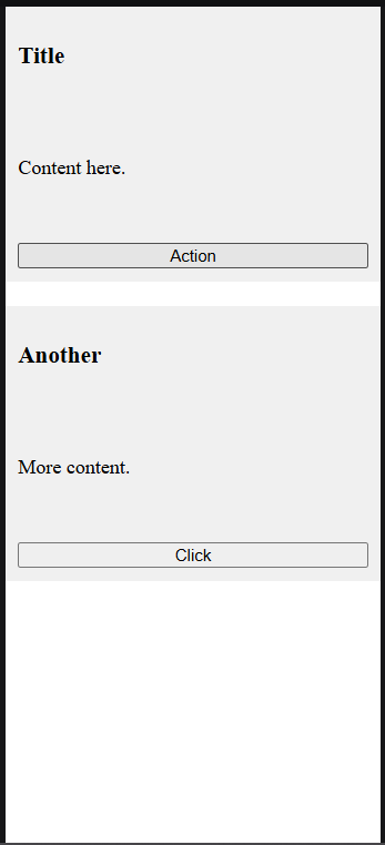
Title
Content here.
  <button>Action</button>
</div>
<div class="card">
  <h3>Another</h3>
  <p>More content.</p>
  <button>Click</button>
</div>
This adapts to screen size. For more hybrids, check [Smashing Magazine's article](https://www.smashingmagazine.com/2018/05/css-grid-flexbox/).
## Adapt on the Fly: Implementing Responsive Design Techniques
Responsive layouts adjust to devices. Use **media queries** like `@media (max-width: 600px) { ... }` to change styles. Combine with **viewport units** (vw, vh) and **clamp()** for fluid sizing.
Key: **Mobile-first**—style for small screens, enhance for larger.
Table of responsive units:
| Unit | Description | Use Case |
|----------|------------------------------------|------------------------------------|
| % | Relative to parent | Fluid widths |
| vw/vh | Relative to viewport | Full-screen elements |
| rem | Relative to root font-size | Consistent scaling |
Example responsive menu:
```html
<!DOCTYPE html>
<html lang="en">
<head>
<meta charset="UTF-8">
<meta name="viewport" content="width=device-width, initial-scale=1.0">
<title>Responsive Menu</title>
<style>
nav ul {
display: flex;
list-style: none;
padding: 0;
}
@media (max-width: 600px) {
nav ul {
flex-direction: column;
}
}
</style>
</head>
<body>
<nav>
<ul>
<li>Home</li>
<li>About</li>
<li>Contact</li>
</ul>
</nav>
</body>
</html>
<!-- Output: Horizontal menu on wide screens, stacks vertically on narrow ones. -->


Test in browser dev tools. Reference: MDN Media Queries.
Unlock Advanced Tools: Subgrid, Container Queries, and More
For next-level control, use subgrid (child inherits parent's grid lines), container queries (@container for styles based on parent size), and masonry layout in Grid.
Subgrid avoids repeating definitions: grid-template-columns: subgrid;.
Example with container queries (note: requires browser support):
<!DOCTYPE html>
<html lang="en">
<head>
  <meta charset="UTF-8">
  <meta name="viewport" content="width=device-width, initial-scale=1.0">
  <title>Container Query</title>
  <style>
    .container {
      container-type: inline-size;
    }
    .card {
      background: lightblue;
      padding: 10px;
    }
    @container (min-width: 300px) {
      .card {
        display: grid;
        grid-template-columns: 1fr 1fr;
      }
    }
  </style>
</head>
<body>
  <div class="container" style="width: 400px;">
    <div class="card">
      <p>Section 1</p>
      <p>Section 2</p>
    </div>
  </div>
</body>
</html>
<!-- Output: Card splits into two columns if container >=300px wide; otherwise stacked. -->
Explore subgrid on MDN: MDN Subgrid.
Troubleshoot Effectively: Debugging Layout Issues
Bugs happen—overlaps, misalignments. Use browser dev tools: Inspect elements, toggle styles, check computed values. Outline everything with * { outline: 1px solid red; } to visualize boxes.
Common fixes: Clear floats if legacy, check overflow: hidden, or use z-index for stacking.
Tools table:
| Tool | Purpose |
|---|---|
| Chrome DevTools | Inspect, edit CSS live |
| Firefox Grid Inspector | Visualize grid lines |
| CSS Lint | Catch syntax errors |
For a stubborn overlap:
Add position: relative; z-index: 1; to the front element.
Learn more from CSS-Tricks Debugging.
Build and Iterate: Tackling a Full Complex Layout Project
Now apply it all: Create a dashboard with sidebar (Flex), content grid, responsive cards.
Full example code:
<!DOCTYPE html>
<html lang="en">
<head>
  <meta charset="UTF-8">
  <meta name="viewport" content="width=device-width, initial-scale=1.0">
  <title>Dashboard Layout</title>
  <style>
    body {
      display: grid;
      grid-template-columns: 200px 1fr;
      height: 100vh;
      margin: 0;
    }
    aside {
      background: #333;
      color: white;
      padding: 10px;
    }
    main {
      display: flex;
      flex-wrap: wrap;
      padding: 10px;
      gap: 10px;
    }
    .widget {
      flex: 1 1 200px;
      background: lightgray;
      padding: 20px;
    }
    @media (max-width: 768px) {
      body {
        grid-template-columns: 1fr;
      }
      aside {
        order: 2;
      }
    }
  </style>
</head>
<body>
  <aside>Sidebar Menu</aside>
  <main>
    <div class="widget">Chart</div>
    <div class="widget">Table</div>
    <div class="widget">Form</div>
  </main>
</body>
</html>
<!-- Output: Sidebar left, widgets in flex row on wide screens; stacks on mobile with sidebar below. -->


Iterate by adding media queries or subgrids. Share your builds on CodePen for feedback.
Leveling Up Your Layout Skills in Practice
To solidify this, tackle open-source repos or redesign sites like a news portal using Grid/Flex hybrids. Track browser support on CanIUse.com—aim for 95% coverage. Remember, performance matters: Minimize reflows by avoiding layout-thrashing JS. Join communities like Stack Overflow for edge cases, and keep experimenting with tools like Tailwind CSS for rapid prototyping. Your layouts will evolve from basic to bulletproof with consistent practice. Keep coding!

*AI agents write code fast. They also silently remove logic, change behavior, and introduce bugs -- without telling you. You often find out in production.
git-lrc fixes this. It hooks into git commit and reviews every diff before it lands. 60-second setup. Completely free.*
Any feedback or contributors are welcome! It's online, source-available, and ready for anyone to use.
⭐ Star it on GitHub:
 HexmosTech
/
git-lrc
HexmosTech
/
git-lrc
Free, Unlimited AI Code Reviews That Run on Commit
| 🇩🇰 Dansk | 🇪🇸 Español | 🇮🇷 Farsi | 🇫🇮 Suomi | 🇯🇵 日本語 | 🇳🇴 Norsk | 🇵🇹 Português | 🇷🇺 Русский | 🇦🇱 Shqip | 🇨🇳 中文 |
git-lrc
Free, Unlimited AI Code Reviews That Run on Commit

AI agents write code fast. They also silently remove logic, change behavior, and introduce bugs -- without telling you. You often find out in production.
git-lrc fixes this. It hooks into git commit and reviews every diff before it lands. 60-second setup. Completely free.
See It In Action
See git-lrc catch serious security issues such as leaked credentials, expensive cloud operations, and sensitive material in log statements
git-lrc-intro-60s.mp4
Why
- 🤖 AI agents silently break things. Code removed. Logic changed. Edge cases gone. You won't notice until production.
- 🔍 Catch it before it ships. AI-powered inline comments show you exactly what changed and what looks wrong.
- 🔁 Build a…

Top comments (0)